1.3 Exploring Categorical Data
This chapter focuses on categorical data — variables whose values are categories or labels rather than numbers. We begin with visualizations for a single categorical variable (bar charts, pie charts, waffle charts), then move to tools for exploring the relationship between two categorical variables (contingency tables and stacked bar charts). We close with principles for creating effective, honest data visualizations.
Key Concepts
- Display information from a categorical variable in a table or a graph
- Use information about a categorical variable to find and report a proportion, using correct notation
- Display information about a relationship between two categorical variables in a contingency table
- Use a contingency table to find proportions
Technology for Chapter
StatLens Use the One Categorical Variable explorer for bar charts and pie charts. Use the Two Categorical Variables explorer for contingency tables and stacked bar charts.
jamovi Use Analyses>Exploration>Descriptives for bar charts for one categorical variable. Use Analyses>Frequencies>Independent Samples for two categorical variables.
One Categorical Variable
The proportion (or relative frequency) in a category is found by dividing the number of cases in that category by the total number of cases.
When we want to summarize one categorical variable, we use a proportion which tells us what fraction of the sample is in each group. In this course, we will use \(p\) to represent the population proportion, and \(\widehat{p}\) (p-hat) to represent the sample proportion. The sample proportion is given by \[ \widehat{p} = \frac{x}{n} \] where \(x\) is the number of cases in a given category and \(n\) is the total number of cases.
Numerical displays
A frequency table is a table that displays the count for each category.
A relative frequency table is a table that displays the proportion of the sample in each category.
A single categorical variable is often summarized using a frequency table to display the number of observations that fall into each category. An alternative to the frequency table is the relative frequency table which displays the proportion of the sample that is in each category.
Class Example 1.3.1: Hair Color
The table below gives the frequency of hair color for a random sample of 54 UWL students. Find the proportions of students with each hair color and use them fill in the relative frequency column.
| Frequency | Relative Frequency | |
|---|---|---|
| Brown | 30 | |
| Blonde | 14 | |
| Red | 2 | |
| Black | 5 | |
| Colorful | 3 | |
| Total | 54 |
Graphical summaries
A bar chart includes one bar for each category, and the height of the bar is the frequency the category appears.
In a pie chart, the proportions correspond to the areas of sectors of a circle.
The standard graphical summaries for a categorical variable are the bar chart and the pie chart. A bar chart is the most common way to display the distribution of a single categorical variable. Each category gets its own bar, and the height (or length) of the bar represents either the count or the proportion of observations in that category. A pie chart divides a circle into slices, where each slice represents a category and the size of the slice corresponds to the proportion of observations in that category.
Class Example 1.3.2: Hair Color revisited
Sketch a bar chart and a pie chart for the hair color of random sample of 54 UWL students.
Pie charts can give a quick high-level overview, especially when a variable has only a few levels or when each level represents a simple fraction (one-half, one-quarter, etc.). However, bar charts are almost always easier to read because our eyes are better at comparing lengths than angles or areas.
Two Categorical Varaibles
A contingency table summarizes the data for two categorical variables. The rows represent the levels of one variables, the columns represent the levels of the other.
Sometimes our goal is to examine whether there is a relationship between two categorical variables. To investigate these relationships, we use a contingency table, or two-way table. In a two-way table, the rows represent the groups of the first category, and the columns represent the groups of the second category. Each cell of the table contains the number of cases that are in both the row and the column category.
Class Example 1.3.3: Relationship status and class level
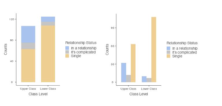
169 college students were asked about their relationship status and class year (lower=freshman/sophomore, upper=junior/senior). The results are given in the table.
| Upper | Lower | Total | |
|---|---|---|---|
| In a relationship | 32 | 10 | 42 |
| It’s complicated | 12 | 7 | 19 |
| Single | 63 | 45 | 108 |
| Total | 107 | 62 | 169 |
- What proportion of students in this sample are in a relationship?
- What proportion of lower class students in this sample are in a relationship?
- What proportion of upper class students in this sample are in a relationship?
- Using \(\widehat{p}_U\) to represent the proportion of upper class students in a relationship and \(\widehat{p}_L\) to represent the proportion of lower class students in a relationship, find the difference in proportions \(\widehat{p}_U - \widehat{p}_L\)
- What proportion of the people who are in a relationship in this sample are upper class students?
- What proportion of the people in this sample are upper class students and in a relationship?
- Answers c), e) and f) are all ways of representing upper class students in a relationship. Why are they different numbers?
Contingency tables can be displayed graphically using an extension of the bar chart. There are two common variants: a stacked bar chart and a side-by-side bar chart.
Class Example 1.3.4: Handedness and occupation
In a study of handedness in occupations, 10 of 118 psychiatrists were left-handed, 26 of 148 architects were left-handed, 5 of 132 orthopedic surgeons were left-handed, and 16 of 105 lawyers were left-handed.
- Make a two-way table of this relationship.
- What proportion of the people in the sample are left-handed?
- What proportion of left-handed people are architects?
- Is your answer in part c) the same or different than the proportion of architects who are left-handed?
Effective Data Visualization
Graphs can powerfully communicate ideas directly and quickly. However, there are times when a visualization conveys a message that is inaccurate or misleading. The following are guiding principles for creating clear, honest, and effective visualizations.
Keep it simple: Colors should be used purposefully and can be used to draw attention
- Colors used only for decoration can be distracting and can confuse readers
Tell a story: Include annotations (text, lines or labels that provide context beyond the raw data)
Order matters: The arrangement of categories in a bar chart can help or hinder understanding
- Alphabetical order is rarely the most informative choice
Make labels readable
Select meaningful colors: Default or rainbow color schemes are not always the best choice
Summary
This chapter introduced tools for exploring categorical data.
-For a single categorical variable, bar charts are the primary visualization, with pie charts reserved for simple cases.
-For two categorical variables, contingency tables organize counts, and stacked and side-by-side bar charts provide visual comparisons.
-Effective visualizations follow principles of simplicity, purposeful use of color, meaningful ordering, and accessibility.