19 Correlation
When we have two quantitative variables, we often want to understand the relationship between them. Does one variable increase as the other increases? Does it decrease? Or is there no apparent pattern? In this chapter, we introduce tools for visualizing and quantifying the strength and direction of the linear relationship between two quantitative variables. We begin with scatterplots, then introduce the correlation coefficient \(r\), discuss its properties and limitations, and address the ever-important distinction between correlation and causation.
19.1 Scatterplots
A scatterplot displays the relationship between two quantitative variables. Each point represents a single observation, with one variable on the horizontal axis and the other on the vertical axis. Scatterplots are the most useful tool for visualizing the relationship between two quantitative variables.
When examining a scatterplot, we look for four key features:
- Direction: Is the relationship positive (upward trend), negative (downward trend), or neither?
- Form: Is the relationship linear (points cluster around a line) or nonlinear (points follow a curve)?
- Strength: How tightly do the points cluster around the trend? A strong relationship has little scatter; a weak relationship has lots of scatter.
- Unusual observations: Are there any outliers that deviate from the overall pattern?
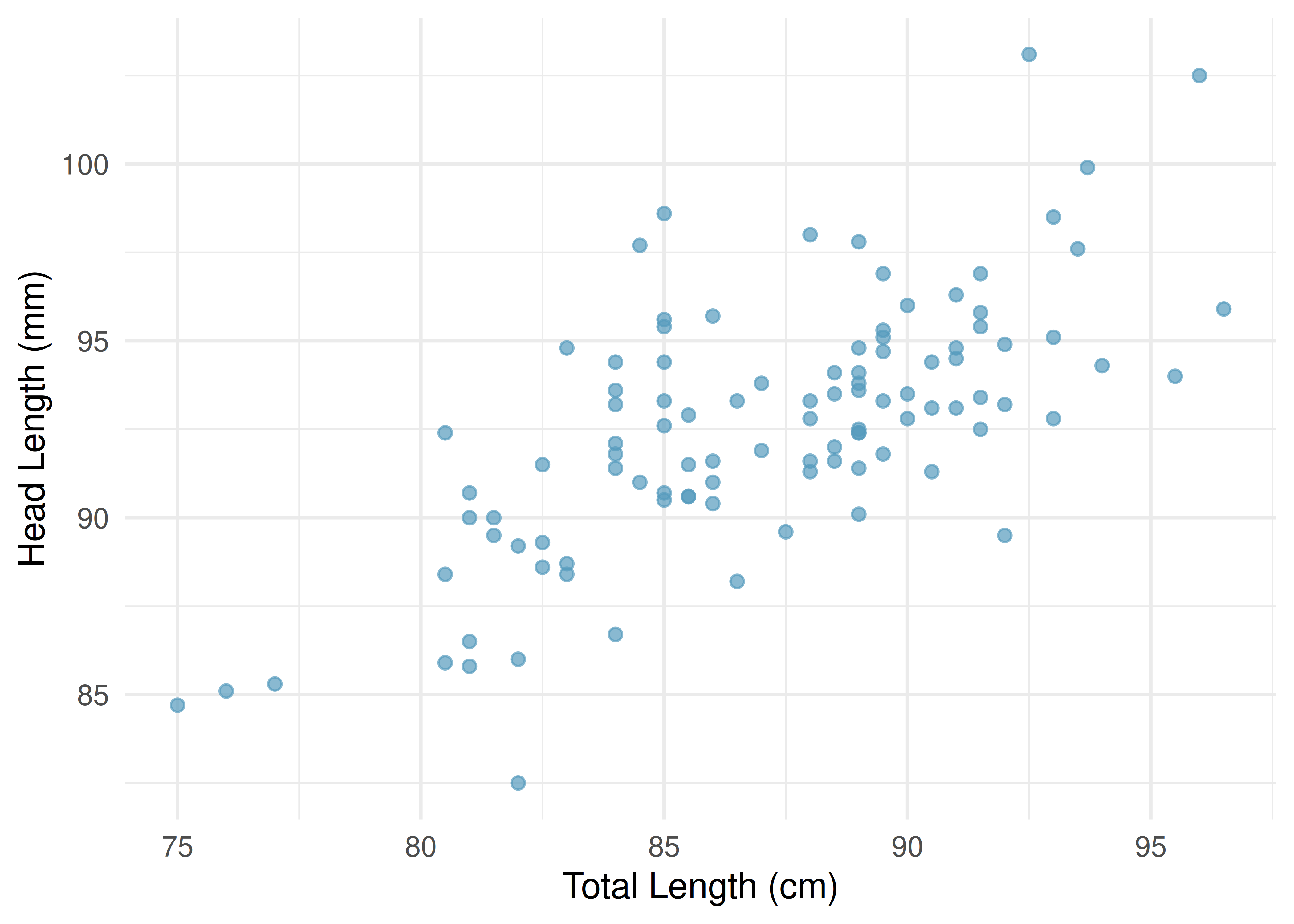
Researchers captured 104 brushtail possums in Australia and took body measurements before releasing them. Consider the relationship between total body length (cm) and head length (mm).
Describe the relationship between total length and head length.
The relationship is positive (possums with longer total lengths tend to have longer heads), linear (the points cluster around a straight line, not a curve), and moderate in strength (the points are somewhat scattered around the trend, but the pattern is clear). There do not appear to be any extreme outliers.
19.1.1 When linear models are not appropriate
There are cases where fitting a straight line to the data is not helpful, even if there is a clear relationship between the variables.
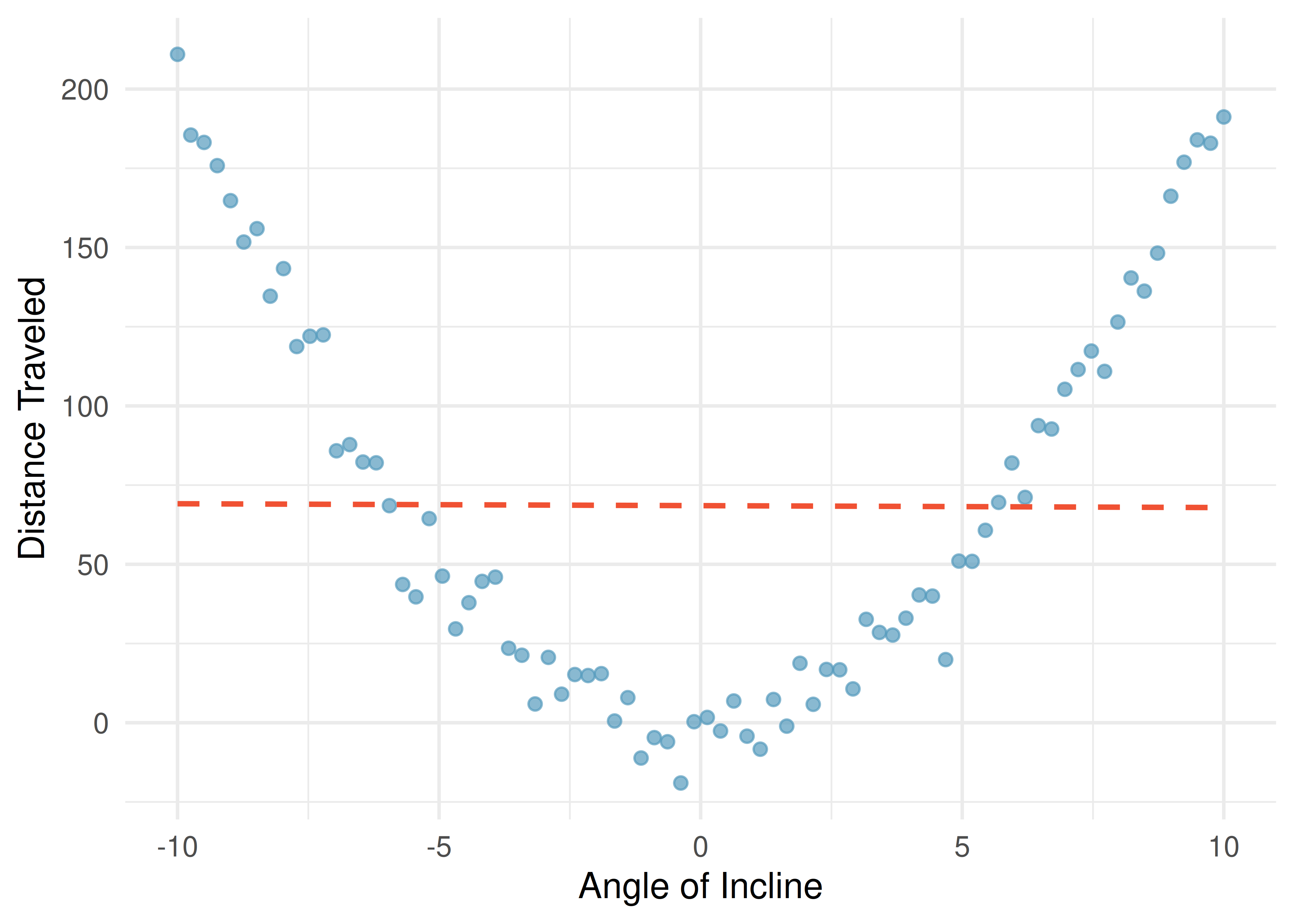
When the relationship is nonlinear, fitting a straight line can be misleading. We must always examine scatterplots before computing correlations or fitting linear models.
19.2 The correlation coefficient
We need a way to quantify the strength and direction of a linear relationship. The correlation coefficient \(r\) does exactly this.
Correlation: strength of a linear relationship.
Correlation, denoted \(r\), always takes values between \(-1\) and \(1\) and describes the strength and direction of the linear relationship between two variables.
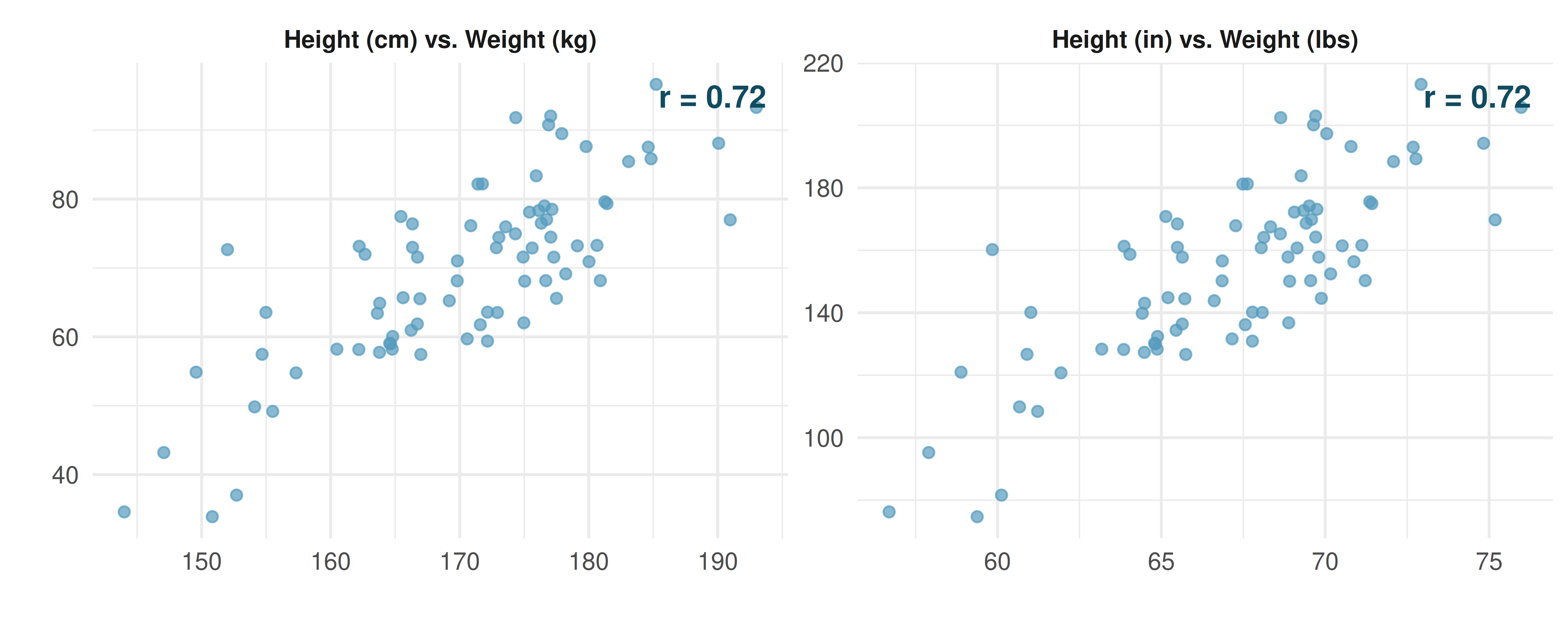
The correlation is unitless and is not affected by linear changes in the units of measurement (e.g., converting from inches to centimeters).
The formula for the correlation coefficient is:
\[r = \frac{1}{n-1} \sum_{i=1}^{n} \frac{x_i - \bar{x}}{s_x} \cdot \frac{y_i - \bar{y}}{s_y}\]
where \(\bar{x}\) and \(\bar{y}\) are the sample means, and \(s_x\) and \(s_y\) are the sample standard deviations for each variable. In practice, we always use a computer or calculator to compute \(r\).
19.2.1 Interpreting correlation values
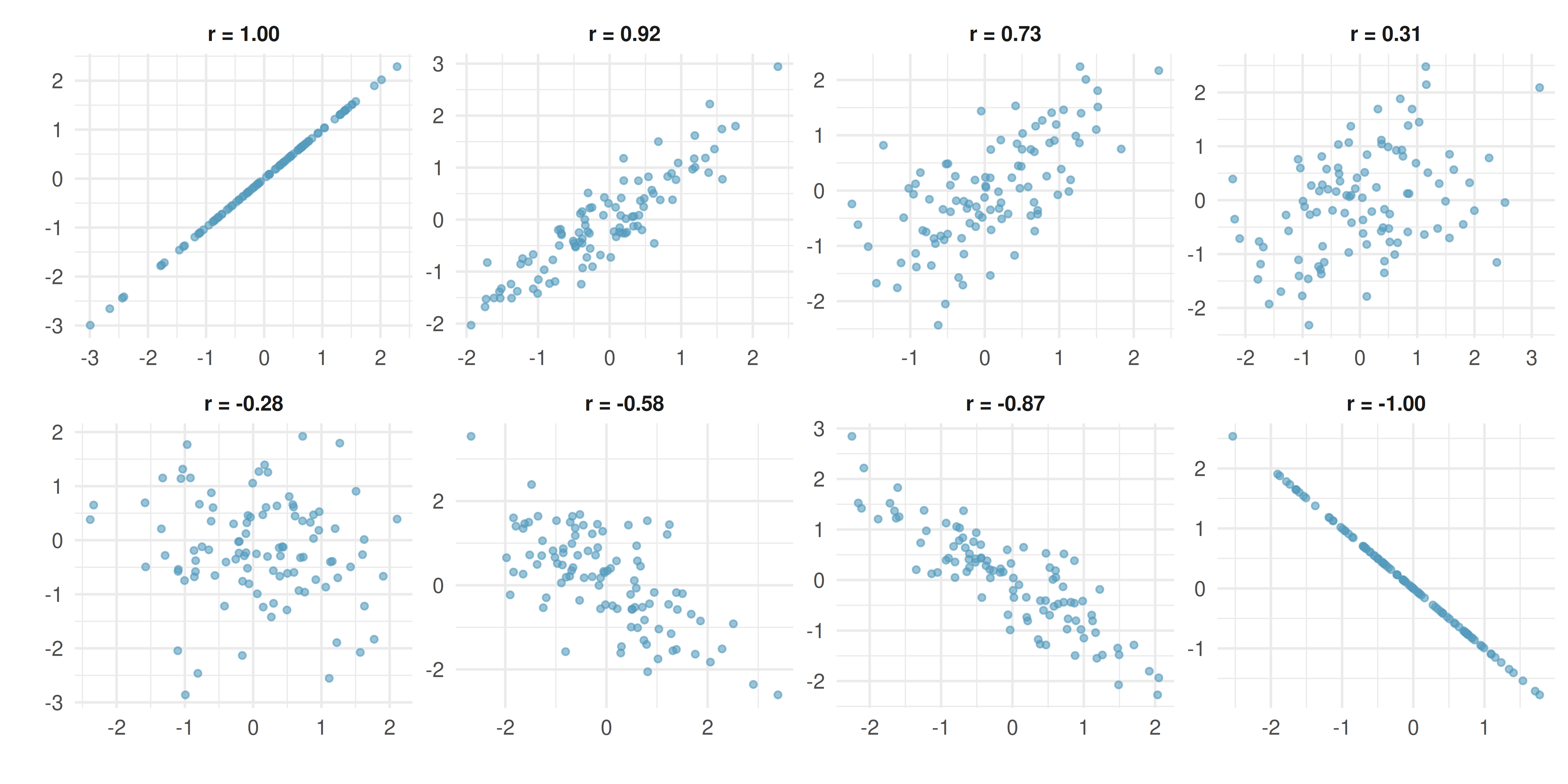
Key patterns to notice:
- When \(r = 1\) or \(r = -1\), all points fall exactly on a straight line (a perfect linear relationship).
- When \(r\) is close to \(+1\) or \(-1\), the relationship is strong and linear.
- When \(r\) is close to 0, there is no linear relationship (but there could still be a nonlinear relationship!).
- Positive \(r\) means both variables tend to increase together; negative \(r\) means one tends to decrease as the other increases.
19.2.2 Properties of correlation
The correlation coefficient has several important properties:
- Range: \(-1 \le r \le 1\).
- Unitless: Correlation has no units. Changing the units of \(x\) or \(y\) (e.g., from cm to inches) does not change \(r\).
- Symmetric: The correlation of \(x\) with \(y\) is the same as the correlation of \(y\) with \(x\).
- Not affected by linear transformations: Adding a constant to or multiplying a variable by a positive constant does not change \(r\).
- Only measures linear relationships: Correlation can be misleading for nonlinear relationships.
19.2.3 Correlation does not capture nonlinear relationships
The correlation coefficient is designed to measure the strength of linear trends. Nonlinear trends, even when strong, can produce misleading correlations.
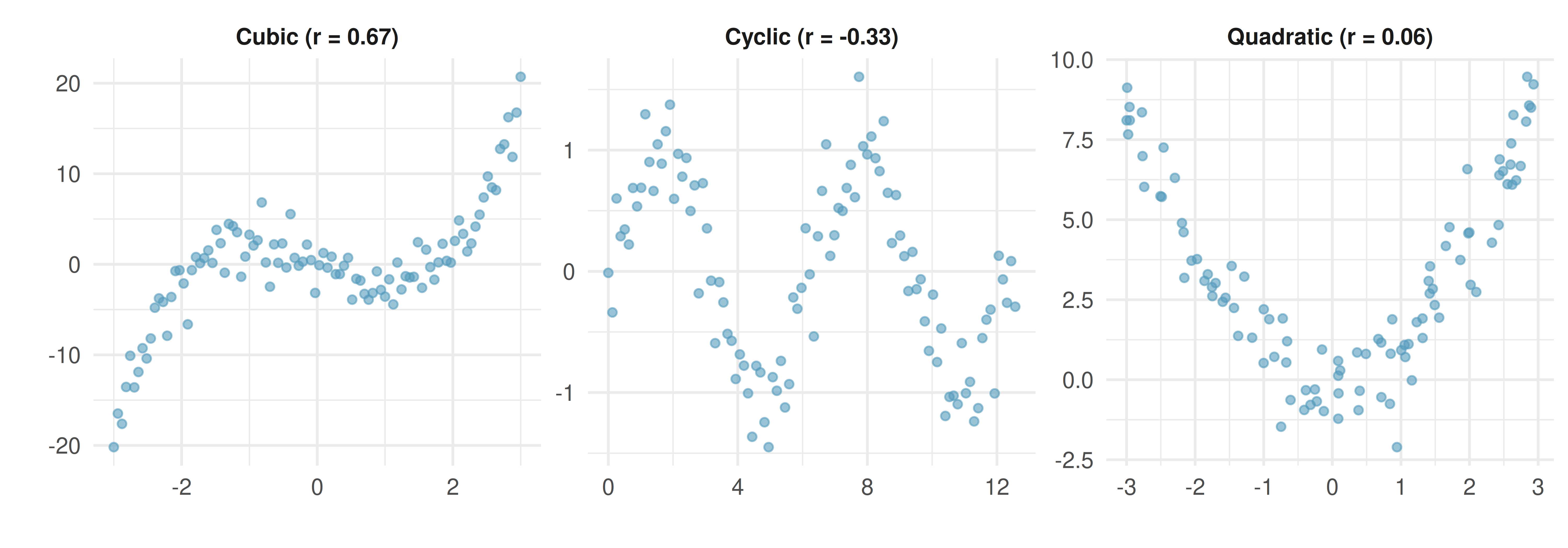
No straight line is a good fit for any of the datasets in the figure above. If you drew nonlinear curves on each plot, what general features would be important in your fit?
Show answer
The curves should be close to most points and reflect the overall nonlinear trend in the data.Correlation only measures linear relationships. Always examine a scatterplot before computing or interpreting a correlation. A correlation near zero does not necessarily mean there is no relationship – it means there is no linear relationship. There may still be a strong nonlinear association.
Examine the scatterplots below showing the relationships between various crop yields across countries. Each point is a country, and each variable is the percentage of that country’s total yield over the past 50 years that came from the given crop (countries that did not grow a crop are omitted from that plot). Order the plots from strongest negative to strongest positive linear relationship.
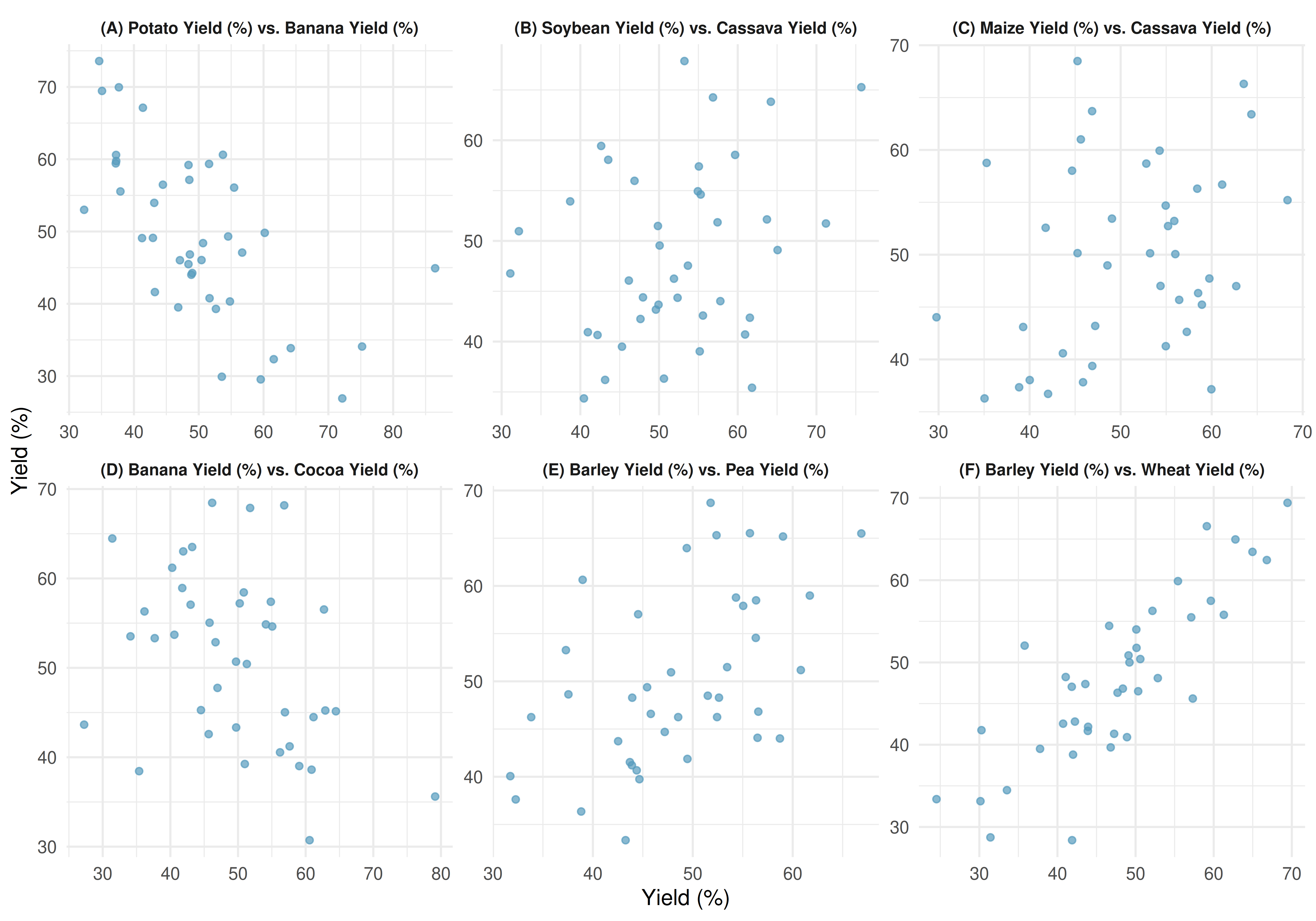
Ordering from most negative to most positive correlation: the plots showing (A) bananas vs. potatoes (\(r =\) -0.45), (D) bananas vs. cocoa (\(r =\) 0.01), (B) cassava vs. soybeans (\(r =\) 0.19), (C) cassava vs. maize (\(r =\) 0.41), (E) barley vs. peas (\(r =\) 0.71), and (F) barley vs. wheat (\(r =\) 0.86).
19.3 Correlation and causation
Correlation does not imply causation.
Just because two variables are correlated does not mean that one causes the other. There may be a confounding variable (also called a lurking variable) that is associated with both \(x\) and \(y\), creating a correlation between them even though there is no direct causal link.
Studies have found a positive correlation between the number of firefighters sent to a fire and the amount of damage the fire causes. Does this mean sending more firefighters causes more damage?
No. The confounding variable is the severity of the fire. Larger fires cause more damage and require more firefighters. The number of firefighters does not cause the damage; both are driven by the severity of the fire.
To establish causation, we need one of the following:
- A randomized experiment where the explanatory variable is randomly assigned.
- Strong theoretical justification combined with careful control of confounding variables.
Observational studies can reveal associations (correlations), but they cannot establish causation on their own.
19.4 Sampling variability of correlation
Like any sample statistic, the correlation coefficient \(r\) computed from a sample is just an estimate of the true population correlation \(\rho\) (the Greek letter “rho”). Different samples from the same population will produce different values of \(r\).
When the sample size is small, \(r\) can vary substantially from sample to sample, even when the true population correlation is zero. This means we should be cautious about interpreting correlations from small samples.
Suppose the true population correlation between two variables is \(\rho = 0\) (no linear relationship). If we draw random samples of size \(n = 10\), the sample correlation \(r\) could reasonably fall anywhere between about \(-0.63\) and \(+0.63\) just by chance.
With larger samples (\(n = 100\)), the sampling variability shrinks, and \(r\) would typically fall between about \(-0.20\) and \(+0.20\).
This illustrates why a formal test of discernibility is important: we need to determine whether an observed correlation is large enough to be unlikely under the null hypothesis that \(\rho = 0\).
The next chapter, on linear regression, runs a randomization test of whether the population slope of a regression line is zero. That test is equivalent to testing whether the population correlation is zero, so it answers the same question about \(\rho\).
See it in action. Guess the Correlation — a short scored warmup that calibrates your eye on what “\(r = 0.7\)” actually looks like. For inference, the Randomization Test for Correlation shuffles \(y\) to break the \(x\)–\(y\) pairing and builds a null distribution of \(r\). For general exploration, use the Regression Explorer.
19.5 Chapter review
19.5.1 Summary
In this chapter, we introduced scatterplots as the primary tool for visualizing the relationship between two quantitative variables. We then defined the correlation coefficient \(r\) as a measure of the strength and direction of the linear relationship. Key properties of \(r\) include: it ranges from \(-1\) to \(+1\), it is unitless, it is symmetric, and it measures only linear relationships. We emphasized that correlation does not imply causation – confounding variables can create spurious associations. Finally, we noted that the sample correlation is subject to sampling variability, especially in small samples.
19.5.2 Key terms
- Scatterplot
- Correlation (\(r\))
- Positive association / negative association
- Nonlinear relationship
- Confounding variable
- Correlation does not imply causation
- Population correlation (\(\rho\))
19.6 Exercises
Answers to odd-numbered exercises are provided in the Exercise Solutions appendix at the back of the book.
- Identify relationships, I. For each of the six plots, identify the strength of the relationship (e.g., weak, moderate, or strong) in the data and whether fitting a linear model would be reasonable.
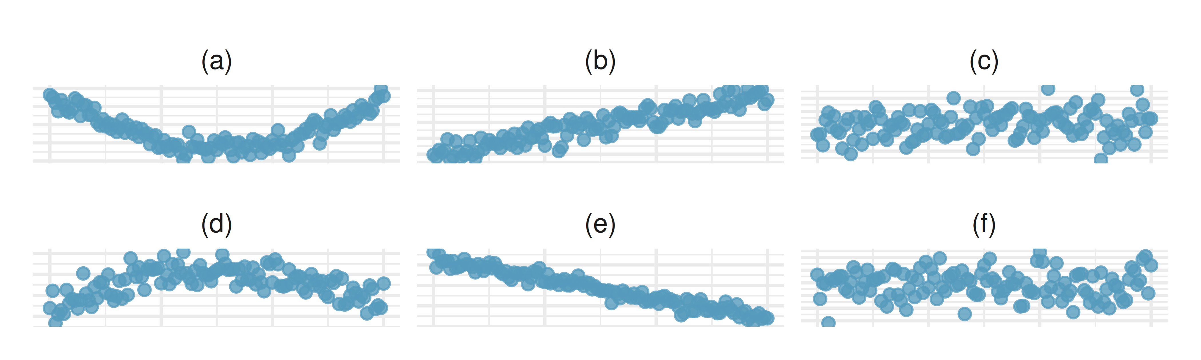
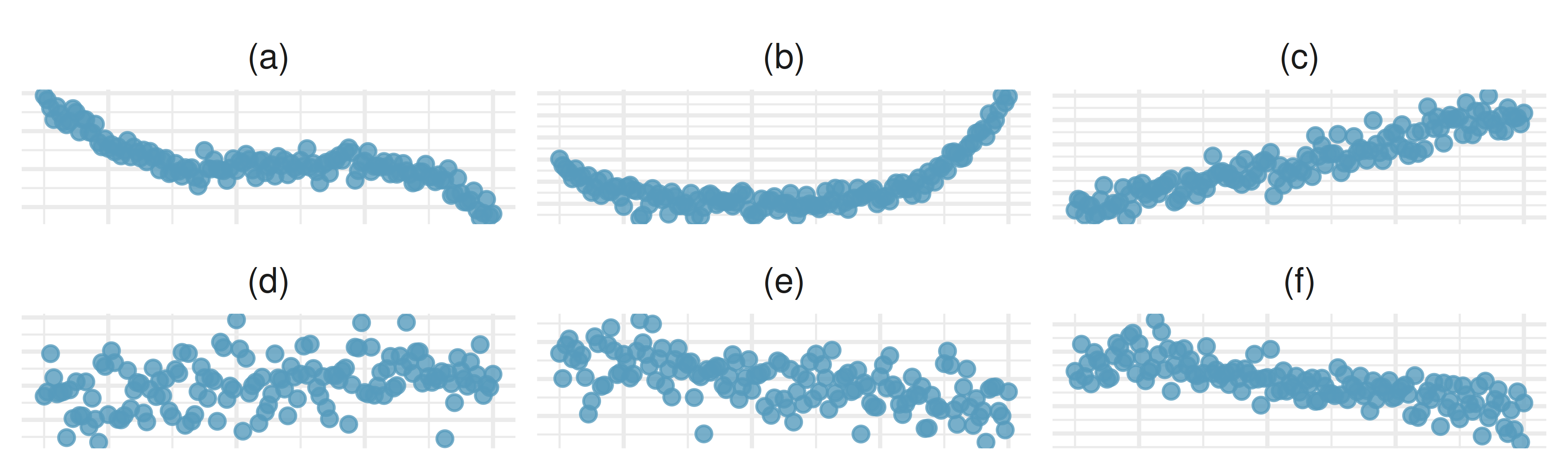
- Identify relationships, II. For each of the six plots, identify the strength of the relationship (e.g., weak, moderate, or strong) in the data and whether fitting a linear model would be reasonable.
- Midterms and final. The two scatterplots below show the relationship between the overall course average and two midterm exams (Exam 1 and Exam 2) recorded for 233 students during several years for a statistics course at a university.
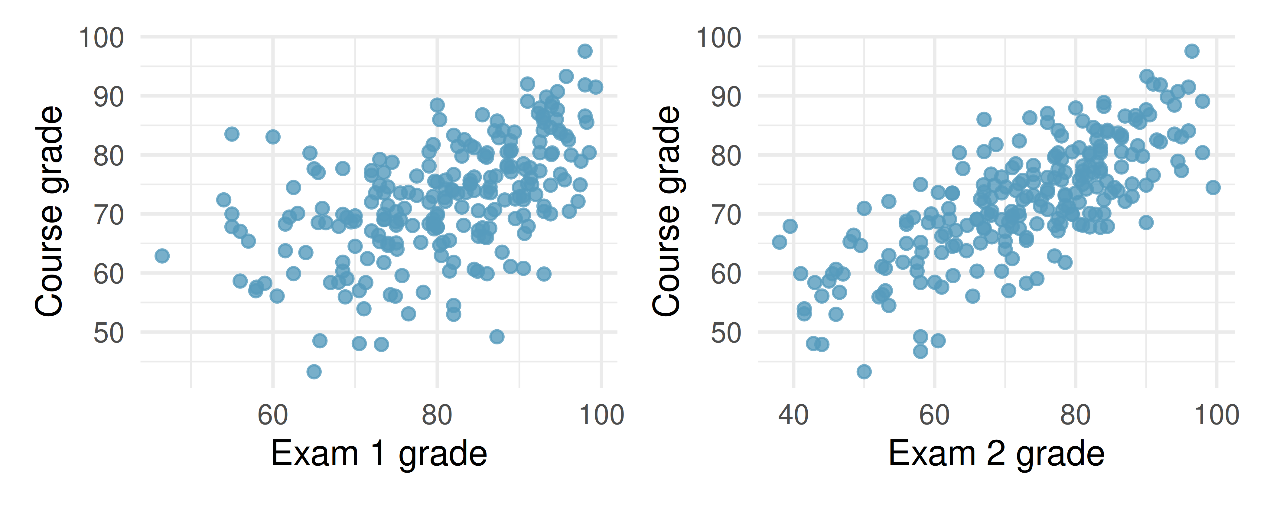
Based on these graphs, which of the two exams has the strongest correlation with the course grade? Explain.
Can you think of a reason why the correlation between the exam you chose in part (a) and the course grade is higher?
- Meat consumption and life expectancy. In data collected for You et al. (2022), total meat intake is associated with life expectancy (at birth) in 175 countries. Meat intake is measured in kg per capita per year (averaged over 2011 to 2013). Additionally, the authors collected data on carbohydrate crops (e.g., cereals, root, sugar, etc.) in kg per capita per year (averaged over 2011 and 2013). The scatterplot on the left shows the life expectancy at birth plotted against the per capita meat consumption. The scatterplot on the right shows the amount of carbohydrate consumption plotted against the per capita meat consumption.
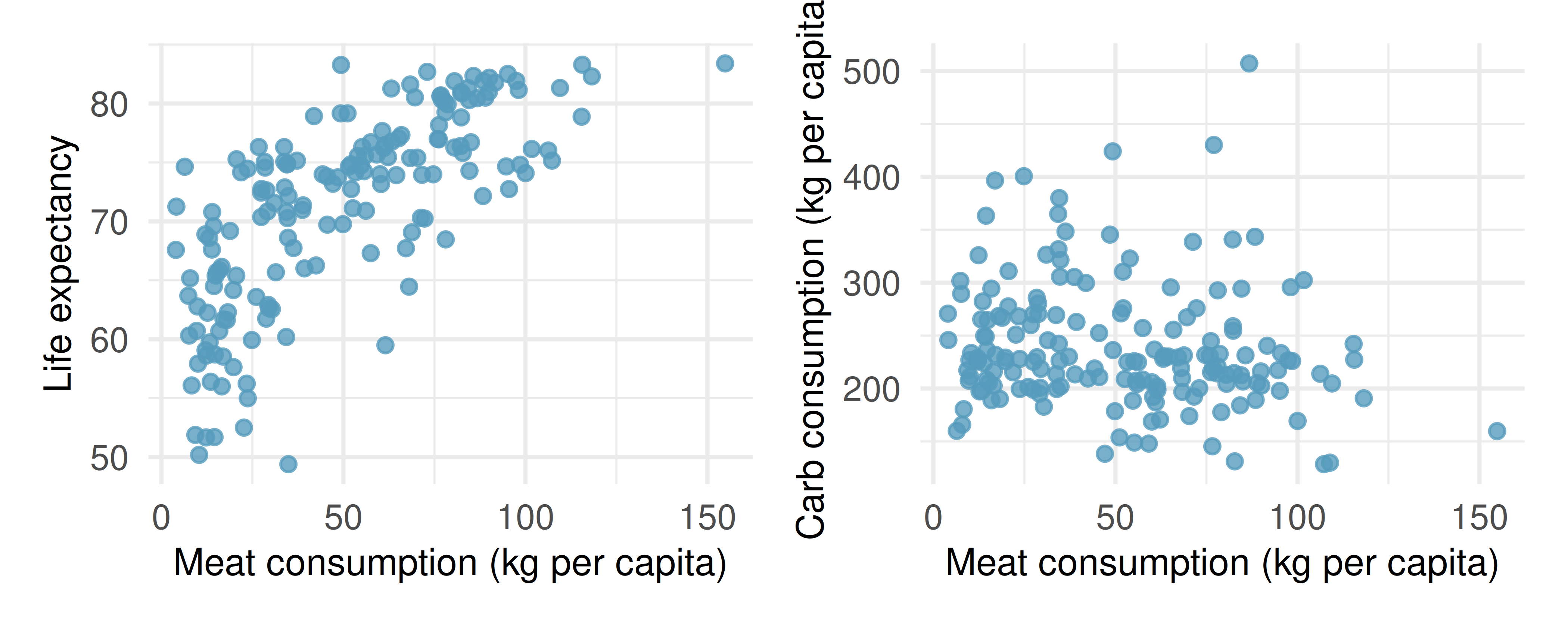
Describe the relationship between meat consumption and life expectancy.
Describe the relationship between meat consumption and carbohydrate consumption.
Which plot shows a stronger correlation? Explain your reasoning.
Data on consumption were originally collected in kilograms. How would the plots above and the correlation values change if the consumption variables were converted to pounds?
- Match the correlation, I. Match each correlation to the corresponding scatterplot.
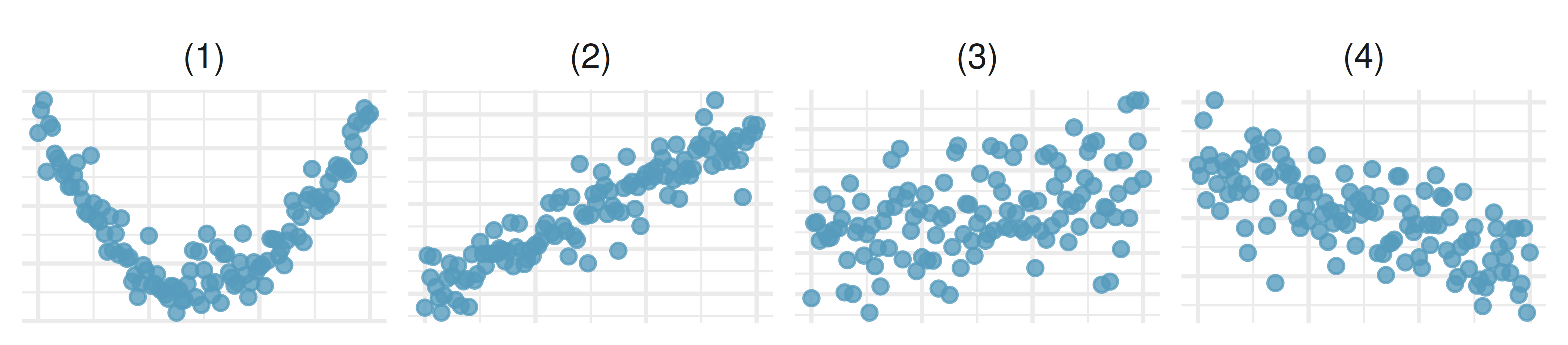
\(r = -0.7\)
\(r = 0.45\)
\(r = 0.06\)
\(r = 0.92\)
- Match the correlation, II. Match each correlation to the corresponding scatterplot.
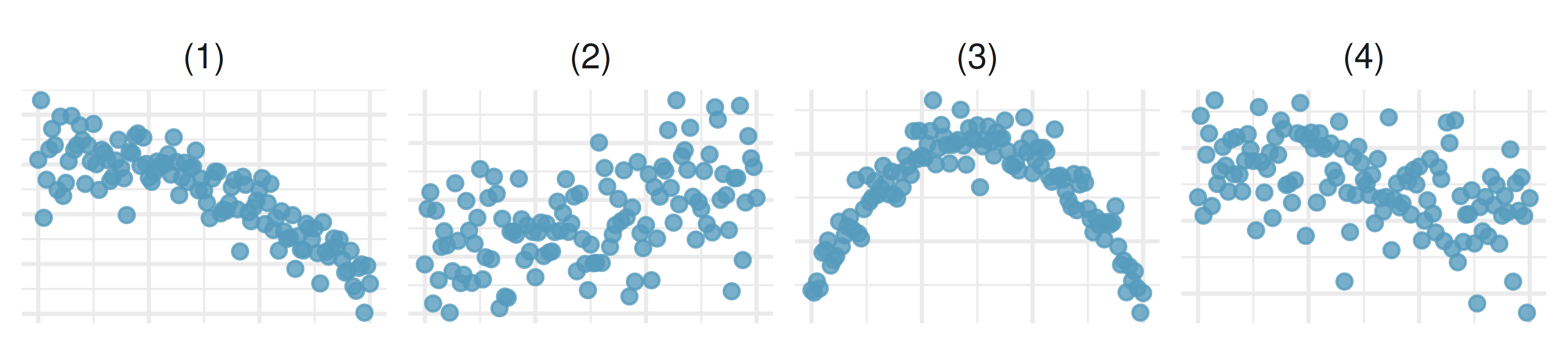
\(r = 0.49\)
\(r = -0.48\)
\(r = -0.03\)
\(r = -0.85\)
- Body measurements, correlation. Researchers studying anthropometry collected body and skeletal diameter measurements, as well as age, weight, height and sex for 507 physically active individuals. The scatterplot below shows the relationship between height and shoulder girth (circumference of shoulders measured over deltoid muscles), both measured in centimeters. (Heinz et al. 2003)
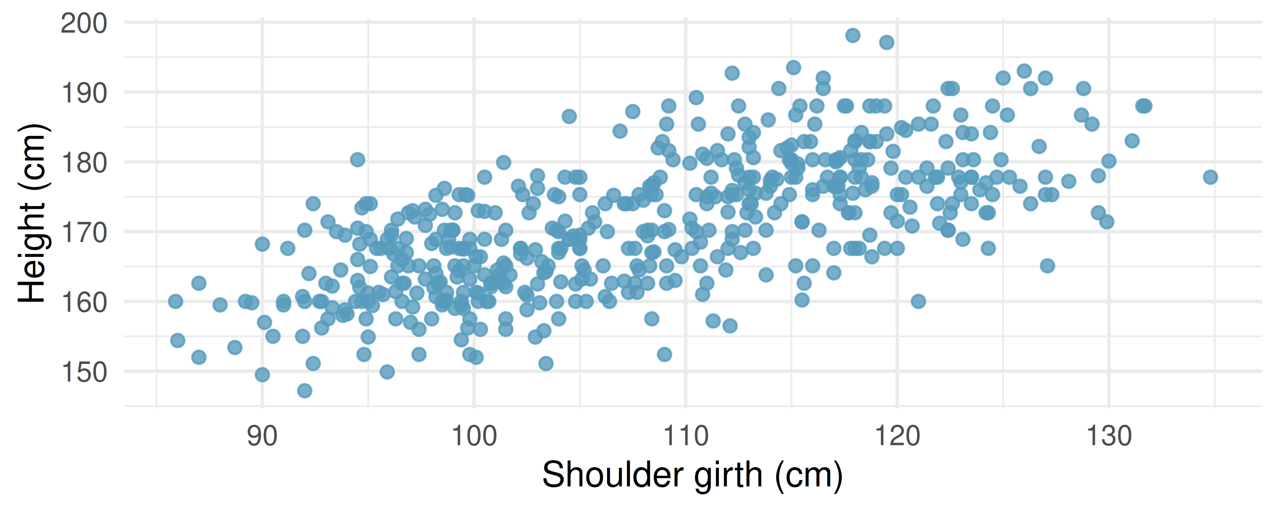
Describe the relationship between shoulder girth and height.
How would the relationship change if shoulder girth was measured in inches while the units of height remained in centimeters?
- Compare correlations. Eduardo and Rosie are both collecting data on number of rainy days in a year and the total rainfall for the year. Eduardo records rainfall in inches and Rosie in centimeters. How will their correlation coefficients compare?
- The Coast Starlight, correlation. The Coast Starlight Amtrak train runs from Seattle to Los Angeles. The scatterplot below displays the distance between each stop (in miles) and the amount of time it takes to travel from one stop to another (in minutes).
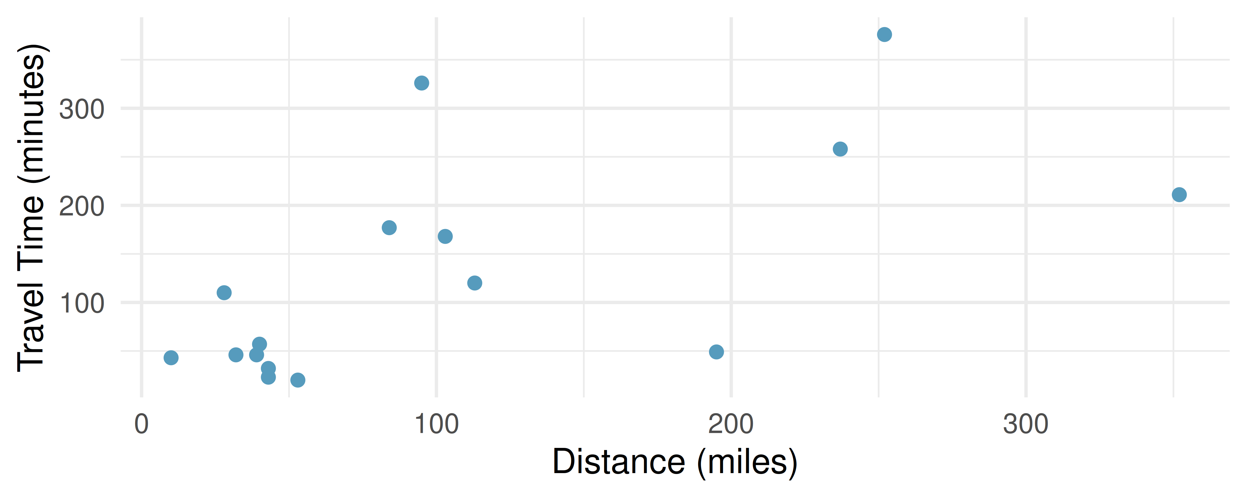
Describe the relationship between distance and travel time.
How would the relationship change if travel time was instead measured in hours, and distance was instead measured in kilometers?
Correlation between travel time (in miles) and distance (in minutes) is \(r = 0.636\). What is the correlation between travel time (in kilometers) and distance (in hours)?
- Crawling babies, correlation. A study conducted at the University of Denver investigated whether babies take longer to learn to crawl in cold months, when they are often bundled in clothes that restrict their movement, than in warmer months. Infants born during the study year were split into twelve groups, one for each birth month. We consider the average crawling age of babies in each group against the average temperature when the babies are six months old (that’s when babies often begin trying to crawl). Temperature is measured in degrees Fahrenheit (F) and age is measured in weeks. (Benson 1993)
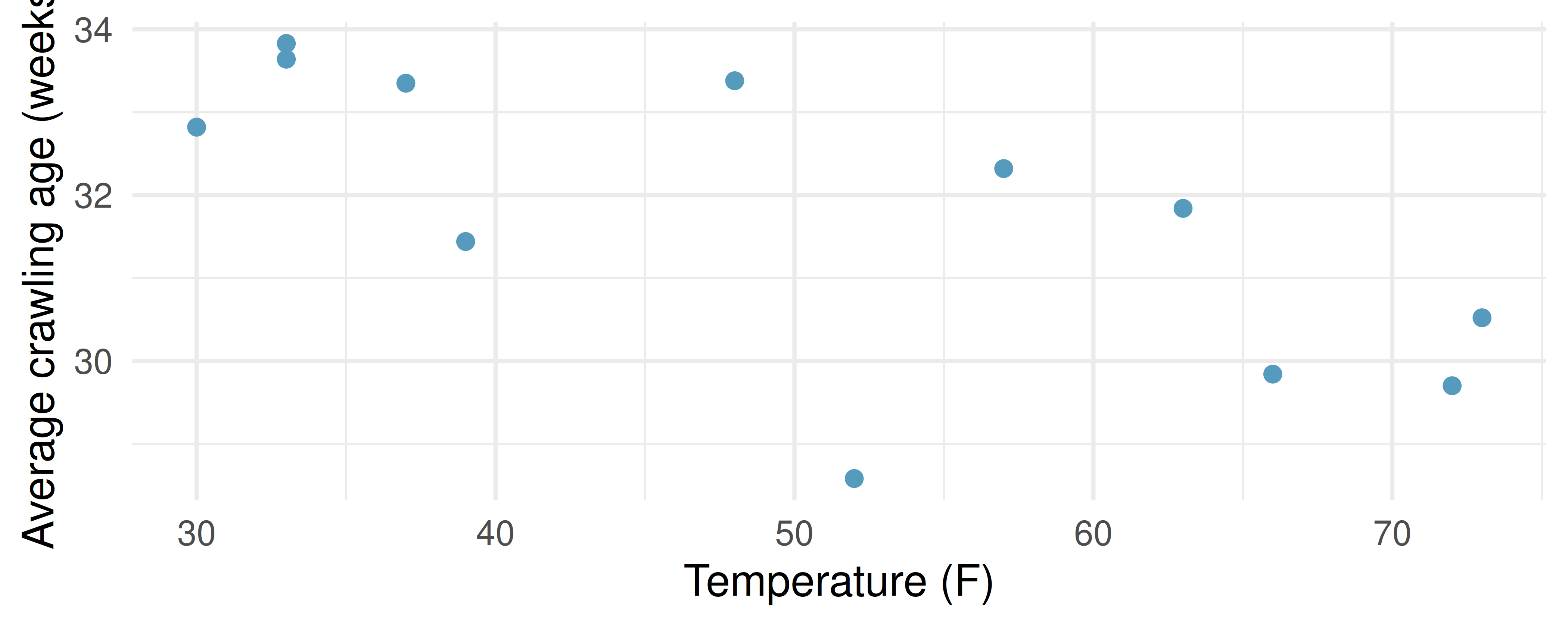
Describe the relationship between temperature and crawling age.
How would the relationship change if temperature was measured in degrees Celsius (C) and age was measured in months?
The correlation between temperature in F and age in weeks was \(r=-0.70\). If we converted the temperature to C and age to months, what would the correlation be?
Meat and carbohydrate consumption. What would be the correlation between the per capita meat consumption and per capita carbohydrate consumption if, for each country, people always consumed
3 kg more of meat than of carbohydrates each year?
2 kg less of meat than of carbohydrates each year?
half as much meat as carbohydrates each year?
- Graduate degrees and salaries. What would be the correlation between the annual salaries of people with and without a graduate degree at a company if, for a certain type of position, someone with a graduate degree always made
$5,000 more than those without a graduate degree?
25% more than those without a graduate degree?
15% less than those without a graduate degree?
- True / False. Determine if the following statements are true or false. If false, explain why.
A correlation coefficient of -0.90 indicates a stronger linear relationship than a correlation of 0.5.
Correlation is a measure of the association between any two variables.
- Cherry trees. The scatterplots below show the relationship between height, diameter, and volume of timber in 31 felled black cherry trees. The diameter of the tree is measured 4.5 feet above the ground.
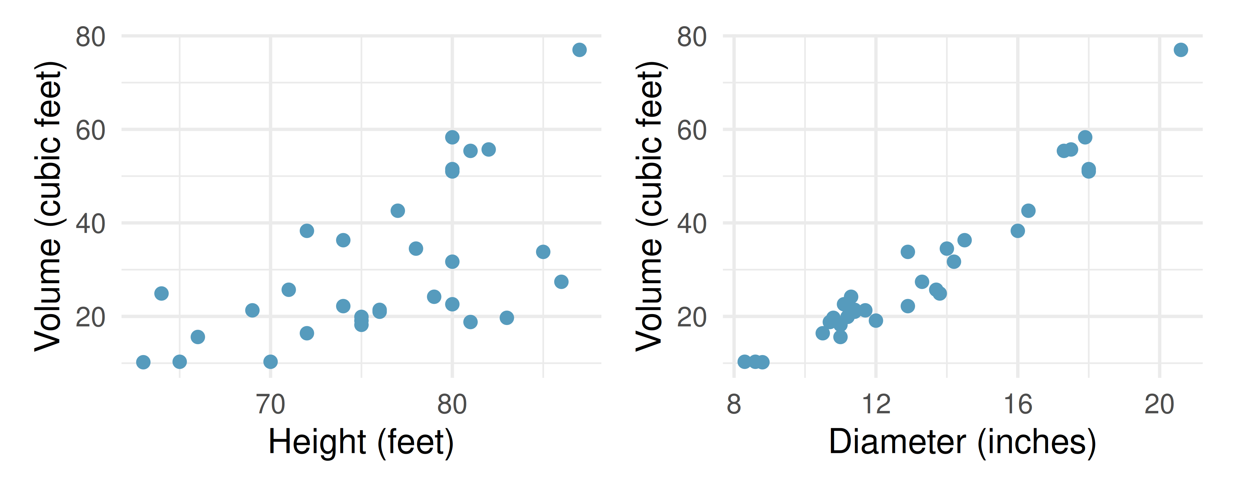
Describe the relationship between volume and height of these trees.
Describe the relationship between volume and diameter of these trees.
Suppose you have height and diameter measurements for another black cherry tree. Which of these variables would be preferable to use to predict the volume of timber in this tree using a simple linear regression model? Explain your reasoning.
- Match the correlation, III. Match each correlation to the corresponding scatterplot.
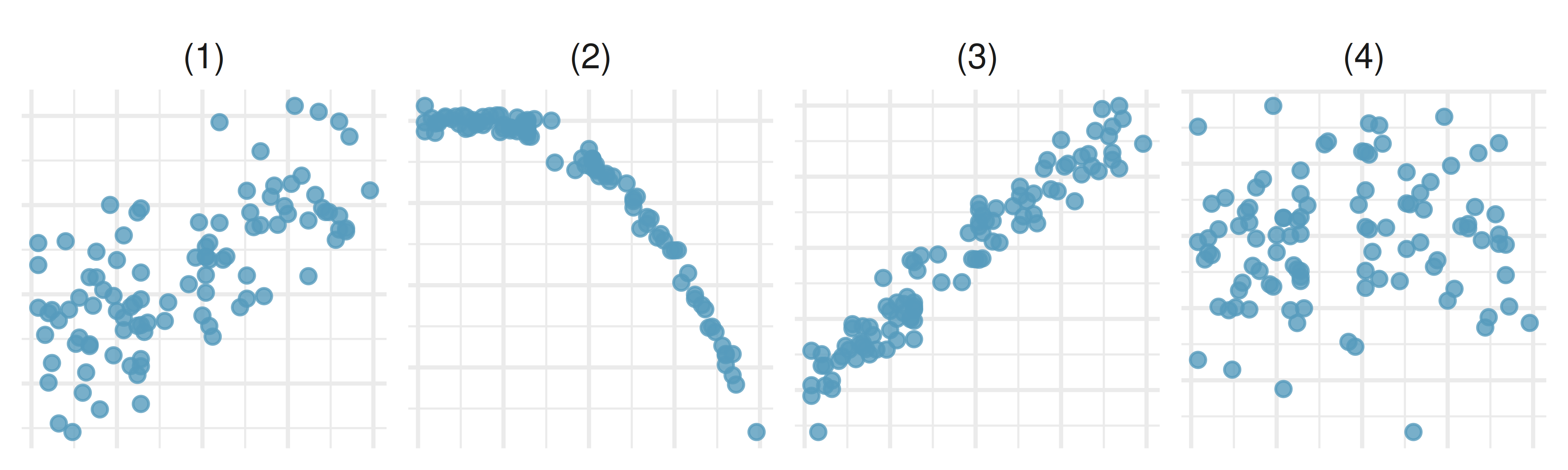
r = 0.69
r = 0.09
r = -0.91
r = 0.97
Dataset sources
exam_grades (openintro) | corr_match (openintro) | bdims (openintro) | coast_starlight (openintro) | babies_crawl (openintro) | trees (datasets)
StatLens Exercises
Let StatLens do the arithmetic; spend your effort on the reasoning a calculator can’t do.
Calibrate your eye. Open Guess the Correlation and play one round of at least 10 scatterplots.
- What is your score? How well did you do on the strong correlations (\(|r| > 0.7\)) versus the weak ones (\(|r| < 0.3\))?
- Were you more often over- or under-estimating \(|r|\)? Why might that be? (Hint: most people see a slight pattern and call it \(r = 0.6\) when it’s actually around \(r = 0.3\).)
- Two scatterplots can have the same \(r\) but tell very different stories — e.g., a clean line and a curve might both register the same \(r\). What does this say about only reporting \(r\) without also showing the scatterplot?
Choose the procedure. For each scenario, name the most appropriate procedure — Pearson correlation \(r\), randomization test for \(\rho = 0\), two-sample \(t\)-test, or not a correlation problem.
- Is there a linear association between hours studied and exam score?
- Test whether the population correlation between two variables differs from zero.
- Is the mean exam score different for students who study with music vs. without?
- Visualize whether one variable tends to go up as another goes up.
- Test whether the median income is higher in one region than another.
Check the conditions before you trust \(r\). Open the Regression Explorer with any two-quantitative-variable dataset.
- What three features of the scatterplot would make you uneasy about reporting \(r\)?
- Suppose the scatter shows a strong curved pattern but \(r\) comes out near 0. What’s the right report — “no association” or “no linear association”?
- Suppose two outliers in the upper-right corner inflate \(r\) from 0.1 (without them) to 0.6 (with them). What should you do — report both? Trust one? Remove the outliers and not mention it?
Run the test for \(\rho = 0\). Open the Randomization Correlation tool with any two-quantitative dataset.
Report the observed \(r\) and the simulation p-value (after shuffling \(y\) many times).
Write a one-sentence conclusion in context, naming both variables.
Why does shuffling only \(y\) (or equivalently shuffling only \(x\), but not both) simulate the world where \(\rho = 0\)?
Which statement is the correct interpretation of a p-value of 0.04?
- The probability that the variables are unrelated is 4%.
- If the variables were unrelated, we’d see a correlation at least as extreme as ours about 4% of the time by chance.
- The correlation has only a 4% chance of being a real effect.
Correlation, causation, and confounders. A study reports a strong positive correlation between ice-cream sales and drowning deaths in summer months across U.S. cities.
- Could ice-cream sales cause drowning deaths? Could drowning deaths cause ice-cream sales? Name a likely confounder that makes both variables move together.
- Suppose a new study controls for that confounder and finds that ice-cream sales and drowning deaths are uncorrelated once the confounder is held constant. What does the original \(r\) now mean?
- In general, what kind of study design would let you draw a causal conclusion from a correlation? (Open the Regression Slope tool if it helps to think about regression and randomization together.)
- A news article reports “Coffee Linked to Lower Risk of Death” from an observational study. List two specific reasons you should not take this as a causal claim.
Benson, J. B. 1993. “Season of Birth and Onset of Locomotion: Theoretical and Methodological Implications.” Infant Behavior and Development 16 (1): 69–81. https://doi.org/10.1016/0163-6383(93)80029-8.
Heinz, G., L. J. Peterson, R. W. Johnson, and C. J. Kerk. 2003. “Exploring Relationships in Body Dimensions.” Journal of Statistics Education 11 (2). http://www.openintro.org/redirect.php?go=textbook-body_dim_2003.
You, Wenpeng, Renata Henneberg, Arthur Saniotis, Yanfei Ge, and Maciej Henneberg. 2022. “Total Meat Intake Is Associated with Life Expectancy: A Cross-Sectional Data Analysis of 175 Contemporary Populations.” International Journal of General Medicine 15: 1833–51. https://doi.org/10.2147/IJGM.S333004.