5 Relationships Between Variables
The preceding chapters focused on exploring one variable at a time. But the most interesting statistical questions involve relationships between variables. Does higher education lead to higher income? Is a drug more effective for one group than another? This chapter introduces tools for exploring relationships: side-by-side box plots and faceted histograms for comparing a quantitative variable across groups, and scatterplots for examining the association between two quantitative variables. We close with the critical distinction between association and causation.
5.1 Comparing groups
Some of the most interesting investigations involve comparing a quantitative variable across groups defined by a categorical variable.
5.1.1 Side-by-side box plots
Side-by-side box plots place a box plot for each group on the same scale, making it easy to compare centers, spreads, and shapes.
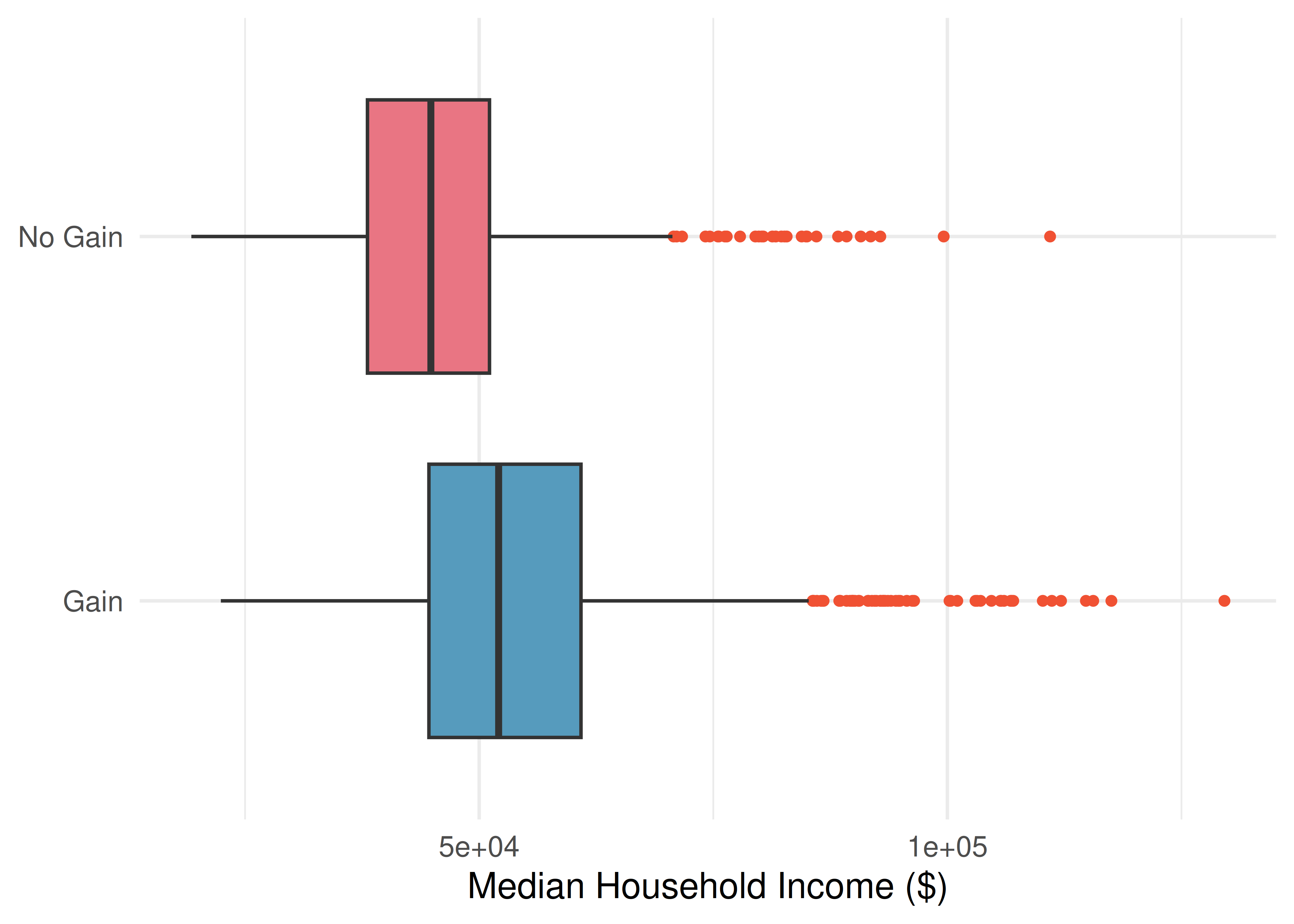
Consider comparing median household income for US counties, grouped by whether the county experienced population growth from 2010 to 2017:
Using the box plots, compare the income distributions for the two groups. What do you notice about the centers, spreads, and shapes?
Show answer
Counties with population gains tend to have higher income (median about $52,000) compared to counties without gains (median about $45,000). The variability is also slightly larger for the gain group, as seen in the wider IQR. Both distributions show slight to moderate right skew, with outliers on the high end.When are side-by-side box plots particularly useful? When might histograms be better?
Side-by-side box plots are excellent for comparing centers (medians) and spreads (IQRs) across groups in a compact display. However, they cannot reveal details about shape such as bimodality. Histograms or density plots are better when you want to see the full shape of each distribution, including the number of modes and the exact nature of the skew.
5.1.2 Faceted histograms
Faceting splits a graphical display into panels based on the levels of a categorical variable. Each panel shows the distribution for one group, using the same scale for easy comparison.
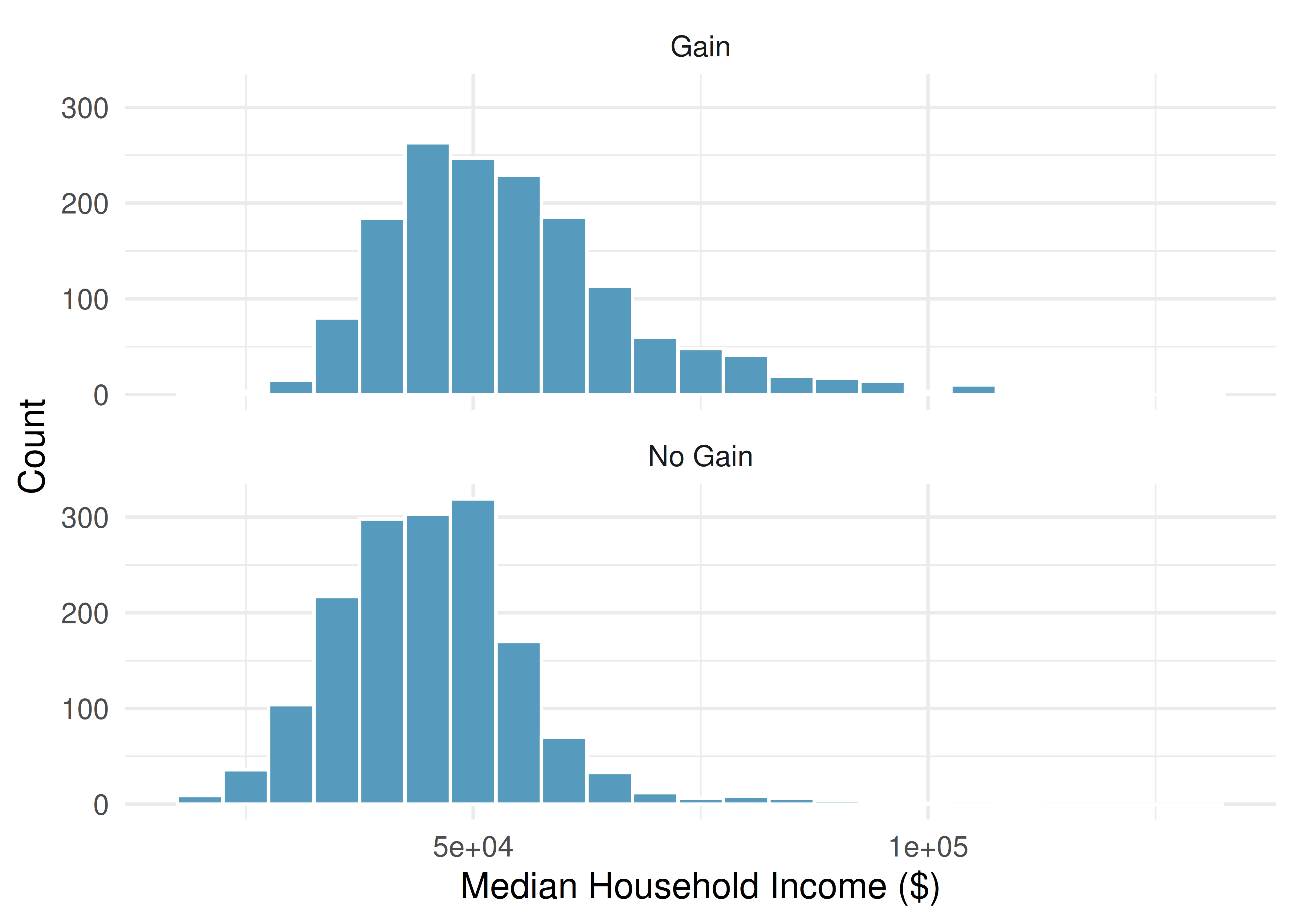
Faceting extends naturally to multiple categorical variables. For example, we could split the income data by both population change and whether the county is in a metropolitan area, creating a 2-by-2 grid of histograms.
What are the advantages of faceted histograms compared to side-by-side box plots?
Faceted histograms reveal the full shape of each distribution, including modality (unimodal vs. bimodal), the exact nature of any skewness, and gaps or clusters. Box plots, on the other hand, are more compact and make it easier to compare medians and IQRs at a glance, but they cannot show features like bimodality. The two displays complement each other well.
5.1.3 Ridge plots
A ridge plot (also called a joy plot) is a set of overlapping density plots, one for each group, drawn on the same horizontal scale but offset vertically. Ridge plots are useful for comparing the shapes of many distributions at once while maintaining a compact display. With only two groups, as in the figure below, the density curves can simply be overlaid on a shared baseline instead of being offset.
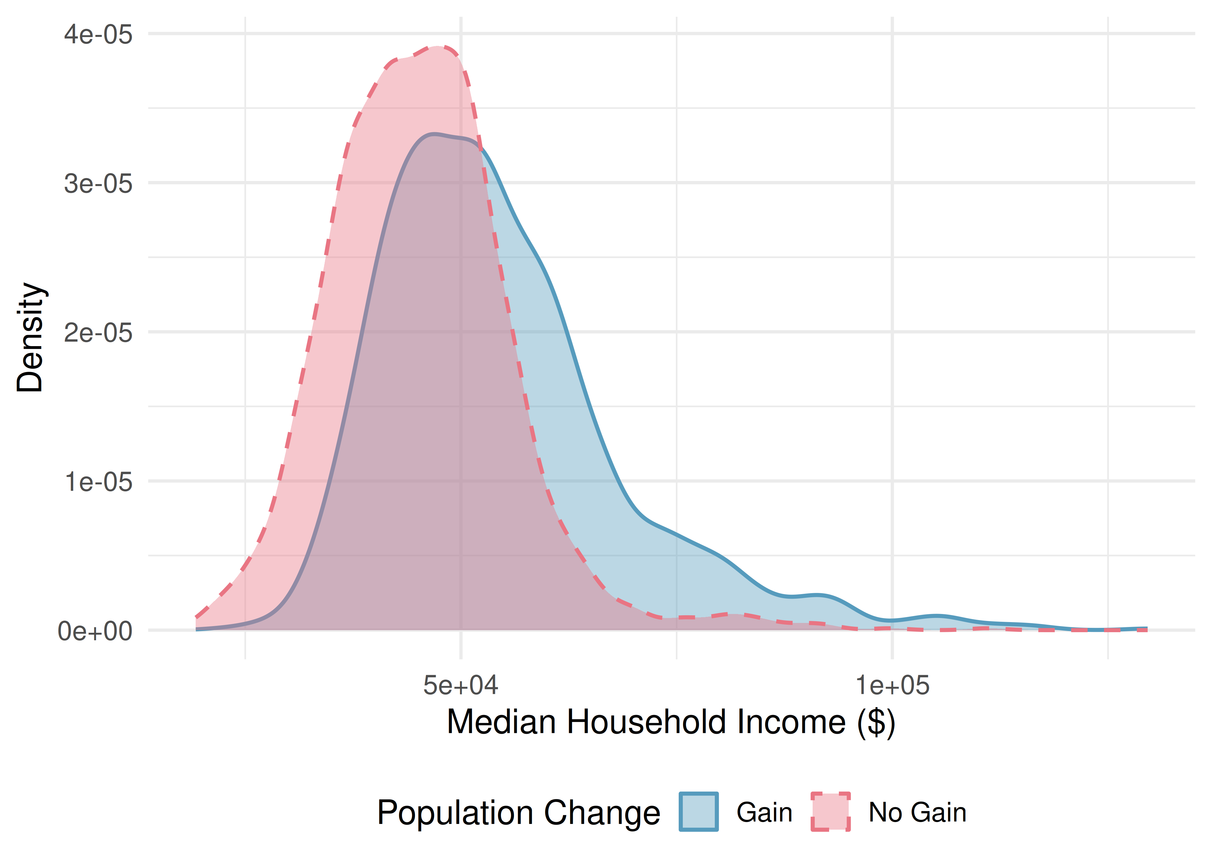
What does a ridge plot reveal that side-by-side box plots do not?
Show answer
Ridge plots show the full shape of each distribution, including modality and skewness, similar to histograms. Box plots compress all of this shape information into a five-number summary. Ridge plots are especially useful when you want to compare shapes across many groups in a compact space.See it in action. Open the Comparing Distributions Across Groups activity to walk through side-by-side box plots, histograms, and density overlays on birth weight grouped by maternal smoking status.
5.2 Scatterplots
5.2.1 Visualizing two quantitative variables
A scatterplot displays the relationship between two quantitative variables. Each observation is represented as a point, with one variable on the horizontal axis and the other on the vertical axis.
A scatterplot provides a case-by-case view of data for two quantitative variables. Each point represents one observation. The horizontal axis shows the values of one variable and the vertical axis shows the values of the other.
Consider a dataset of 50 loans, where we plot total income on the horizontal axis and loan amount on the vertical axis:
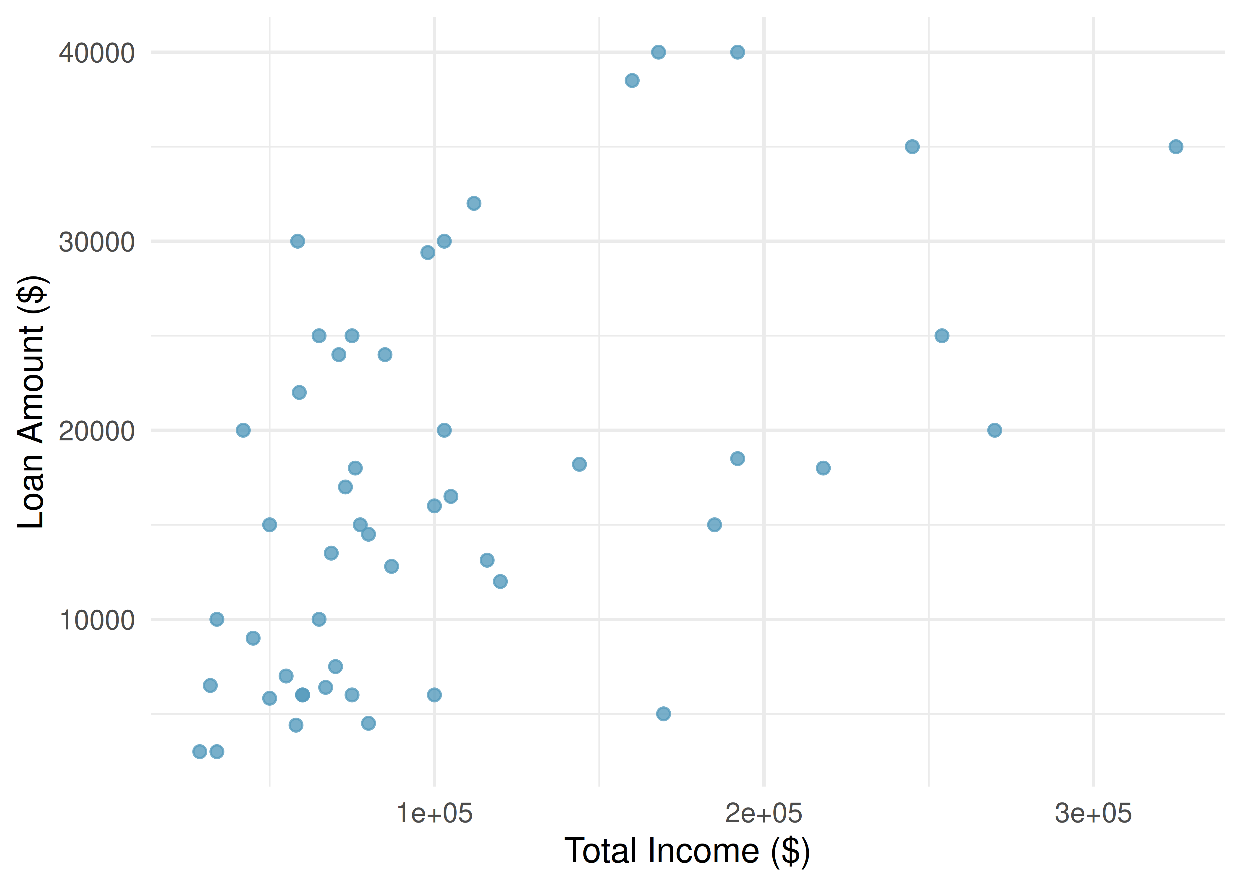
What do scatterplots reveal about the data, and how are they useful?
Show answer
Scatterplots are helpful for quickly spotting associations between two quantitative variables — whether they tend to increase together, decrease together, or show no pattern. They can also reveal whether the relationship is linear or curved, how strong the association is, and whether there are any unusual points.5.2.2 Describing associations
When examining a scatterplot, we describe the association using four characteristics:
Describing the association between two quantitative variables:
Direction: Is the association positive (both variables tend to increase together) or negative (one increases as the other decreases)?
Form: Is the relationship approximately linear (following a straight-line pattern) or nonlinear (curved)?
Strength: Is the association strong (points closely follow a pattern), moderate, or weak (points are loosely scattered)?
Unusual observations: Are there any outliers — points that deviate markedly from the overall pattern?
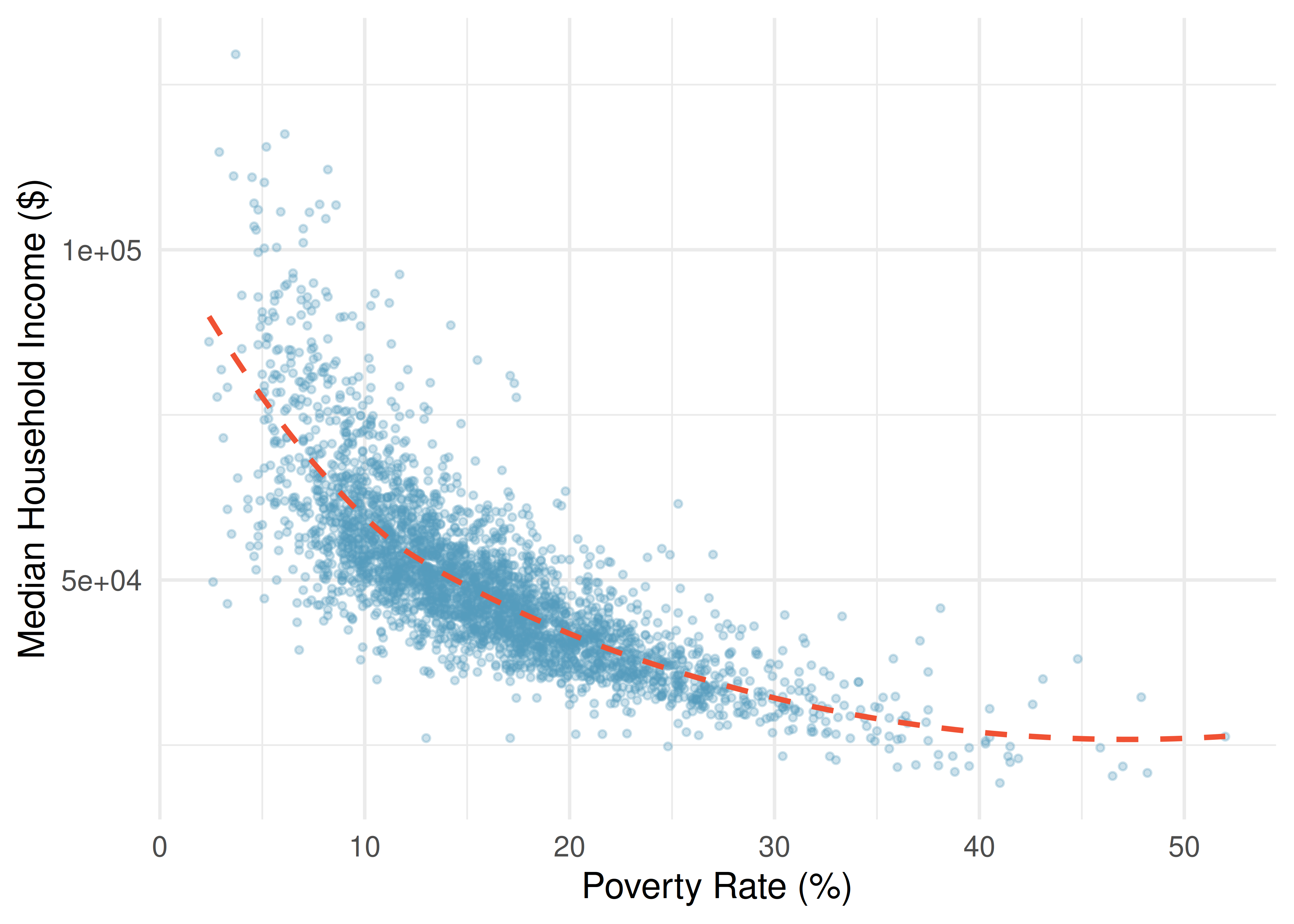
A scatterplot shows the poverty rate vs. median household income for over 3,000 US counties. How would you describe the association?
The association is negative (as poverty rate increases, median household income tends to decrease), nonlinear (the relationship curves, with income decreasing more steeply at lower poverty rates and leveling off at higher poverty rates), and moderately strong (the points follow the curving pattern fairly closely, though there is noticeable scatter). There do not appear to be any extreme outliers, though counties with very high poverty rates or very high incomes stand out somewhat.
Describe two variables that would have a horseshoe-shaped (\(\cap\)) association in a scatterplot.
Show answer
Consider a situation where the vertical axis represents something “good” and the horizontal axis represents something that is good only in moderation. For example, health and water consumption: we need some water to survive, but consuming too much becomes dangerous. Athletic performance and practice time is another example — some practice improves performance, but overtraining leads to injury and decline.For the 50-loan dataset, the scatterplot of total income versus loan amount shows that borrowers with higher incomes tend to take out larger loans. Describe this association.
The association is positive (higher income is associated with higher loan amounts), approximately linear (the general trend follows a straight line, though the pattern is loose), and weak to moderate (there is considerable scatter — many borrowers with similar incomes take out very different loan amounts). There are a few borrowers with income above $250,000 who stand out on the right side of the plot.
See it in action. Open the Describing Associations in Scatterplots activity to practice identifying direction, form, strength, and unusual observations on possum body measurements.
5.2.3 Scatterplots with a third variable
We can add a third variable to a scatterplot by using color, shape, or size to represent a categorical or quantitative variable. For example, in a scatterplot of income vs. poverty rate, we could color the points by whether the county is in a metropolitan area. This technique helps reveal whether the relationship between two quantitative variables differs across groups.
5.3 Association vs. causation
Throughout this chapter, we have explored associations between variables. But association is not the same as causation.
Association does not imply causation.
When two variables are associated (correlated), it means they tend to vary together — but that does not necessarily mean one causes the other. There may be a confounding variable (a third variable) that is related to both, creating the illusion of a direct relationship.
A study finds a strong positive association between ice cream sales and drowning deaths. Does eating ice cream cause drowning?
Of course not. The association exists because both ice cream sales and drowning are related to a confounding variable: temperature (or season). In hot weather, people buy more ice cream and more people go swimming, which increases the risk of drowning. Temperature is the lurking variable that drives both.
A confounding variable (also called a lurking variable) is a variable that is related to both the explanatory and response variables. Confounding variables can create misleading associations between two variables that have no direct causal relationship.
A study finds that students who eat breakfast tend to have higher GPAs than students who skip breakfast. Can we conclude that eating breakfast causes higher GPAs?
Show answer
Not from this information alone. This is likely an observational study, and there could be confounding variables. For example, students who eat breakfast may come from more supportive home environments, may have better time management skills, or may generally take better care of their health — all of which could independently contribute to higher GPAs. To establish a causal connection, we would need a randomized experiment.5.3.1 When can we infer causation?
Establishing a causal relationship between two variables generally requires:
A randomized experiment: Randomly assigning subjects to treatment and control groups helps eliminate confounding variables. If a difference is observed between groups, we can more confidently attribute it to the treatment.
Temporal precedence: The cause must precede the effect in time.
Ruling out confounders: We must be able to argue that no lurking variables explain the observed association.
In observational studies (where we observe but do not control the variables), we can identify associations but generally cannot draw causal conclusions. This is one of the most important distinctions in statistics.
Be especially skeptical of causal claims from observational data. Media reports often say “X causes Y” when the underlying study only found an association. Always ask: Was this a randomized experiment? Could there be confounding variables?
5.4 Chapter review
5.4.1 Summary
This chapter introduced tools for exploring relationships between variables. For comparing a quantitative variable across groups defined by a categorical variable, side-by-side box plots provide a compact comparison of centers and spreads, faceted histograms reveal full distributional shapes, and ridge plots overlay density curves for compact multi-group comparison. For two quantitative variables, scatterplots reveal the direction, form, strength, and unusual features of an association. We closed with the fundamental principle that association does not imply causation — confounding variables can create misleading associations, and establishing causation generally requires a randomized experiment.
5.4.2 Key terms
- Side-by-side box plot, faceted plot, ridge plot
- Scatterplot
- Positive association, negative association
- Linear, nonlinear
- Direction, form, strength (of an association)
- Confounding variable (lurking variable)
- Association vs. causation
5.5 Exercises
Answers to odd-numbered exercises are provided in the Exercise Solutions appendix at the back of the book.
- Meat consumption and life expectancy. In data collected for You et al. (2022), total meat intake is associated with life expectancy (at birth) in 175 countries. Meat intake is measured in kg per capita per year (averaged over 2011 to 2013). The two ridge plots show an association between income and meat consumption (higher income countries tend to eat more meat) and an association between income and life expectancy (higher income countries have higher life expectancy).
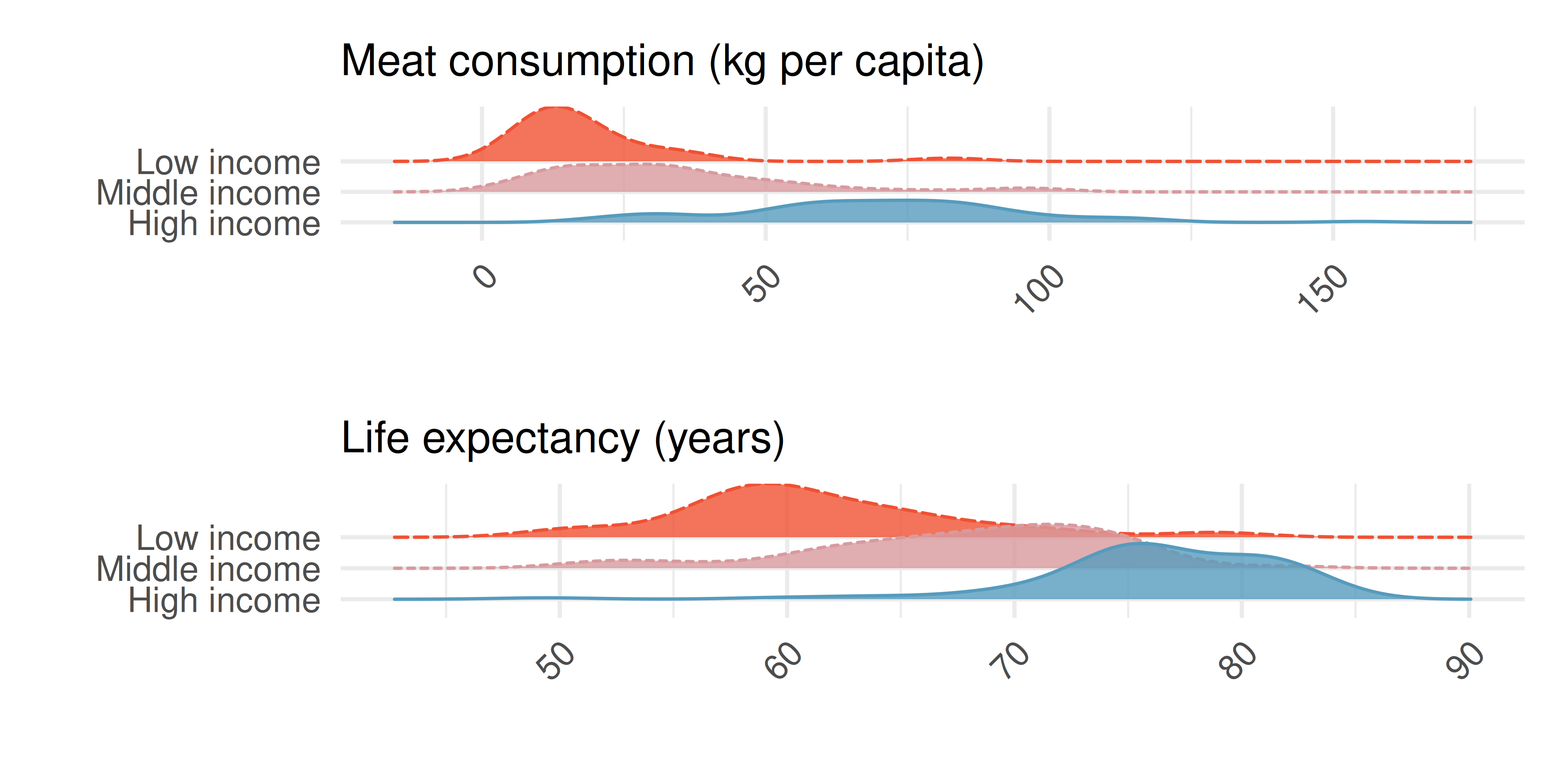
Do the graphs above demonstrate that meat consumption and life expectancy are associated? That is, can you tell if countries with low meat consumption have low life expectancy? Explain.
Let’s assume that you had a plot comparing meat consumption and life expectancy, and they do seem associated. Your friend says that the plot shows that high meat consumption leads to a longer life. You correctly say, no, we can’t tell if there is a causal realtionship because the relationship is confounded by income level. Explain what you mean.
How can you investigate the relationship between meat consumption and life expectancy in the presence of confounding variables (like income)?
- Florence Nightingale. Florence Nightingale was a nurse in the Crimean War and an early statistician. In her notes, she opined, “In comparing the deaths of one hospital with those of another, any statistics are justly considered absolutely valueless which do not give the ages, the sexes, and the diseases of all the cases.” (Nightingale 1859)
Nightingale describes three confounding variables to consider when comparing death rates across hospitals. What are they? Describe what makes each variable potentially confounding.
Provide two additional potential confounding variables for this situation. Check to make sure that the variables are associated with both the explanatory variable (hospital) and the response variable (death).
Why does Nightingale say that the statistics are “valueless” if given without being broken down by age, sex, and disease? Explain.
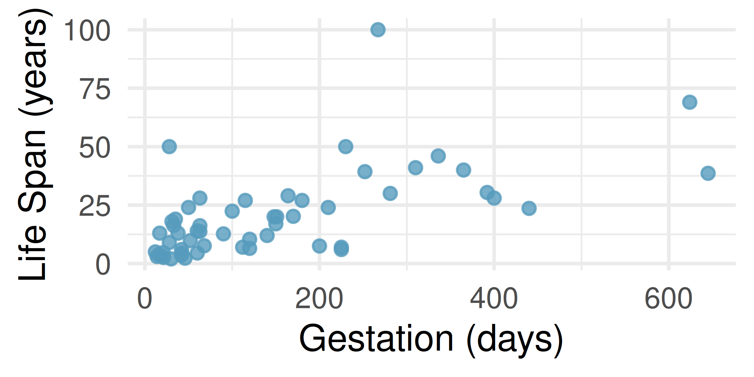
- Mammal life spans. Data were collected on life spans (in years) and gestation lengths (in days) for 62 mammals. A scatterplot of life span versus length of gestation is shown below. (Allison and Cicchetti 1975)
What type of an association is apparent between life span and length of gestation?
What type of an association would you expect to see if the axes of the plot were reversed, i.e., if we plotted length of gestation versus life span?
Are life span and length of gestation independent? Explain your reasoning.
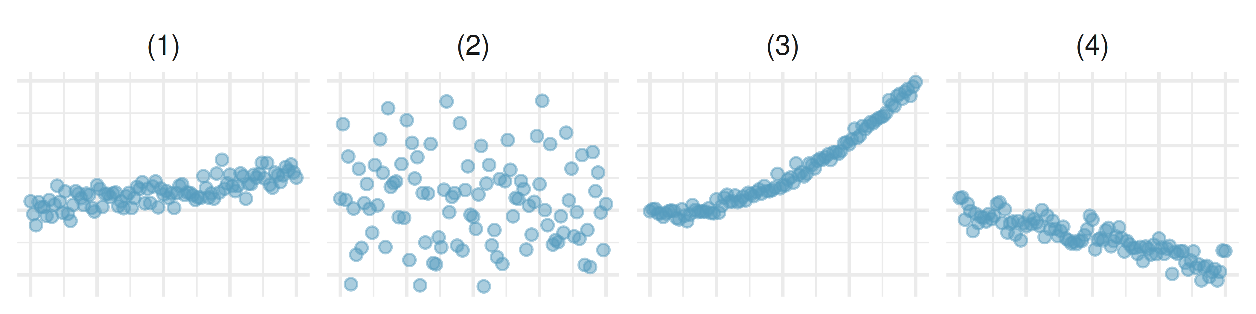
- Associations. Indicate which of the plots show (a) a positive association, (b) a negative association, or (c) no association. Also determine if the positive and negative associations are linear or nonlinear. Each part may refer to more than one plot.
- Reproducing bacteria. Suppose that there is only sufficient space and nutrients to support one million bacterial cells in a petri dish. You place a few bacterial cells in this petri dish, allow them to reproduce freely, and record the number of bacterial cells in the dish over time. Sketch a plot representing the relationship between number of bacterial cells and time.
- Office productivity. Office productivity is relatively low when the employees feel no stress about their work or job security. However, high levels of stress can also lead to reduced employee productivity. Sketch a plot to represent the relationship between stress and productivity.
- Oscar winners. The first Oscar awards for best actor and best actress were given out in 1929. The histograms below show the age distribution for all of the best actor and best actress winners from 1929 to 2019. Summary statistics for these distributions are also provided. Compare the distributions of ages of best actor and actress winners.
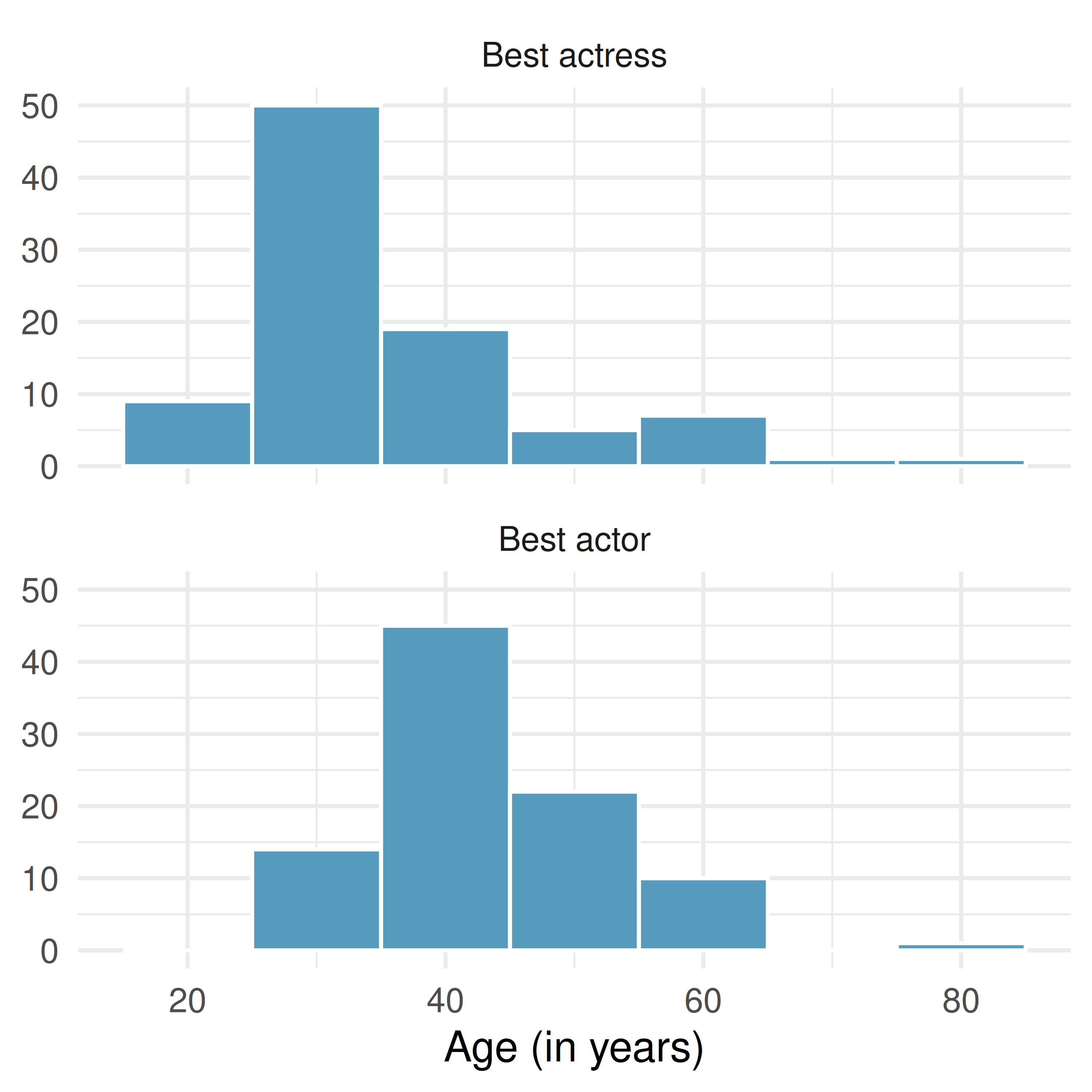
| Mean | SD | n | |
|---|---|---|---|
| Best actor | 43.8 | 8.8 | 92 |
| Best actress | 36.2 | 11.9 | 92 |
- NYC marathon winners. The histogram and box plots below show the distribution of finishing times for male and female (combined) winners of the New York City Marathon between 1970 and 2023.
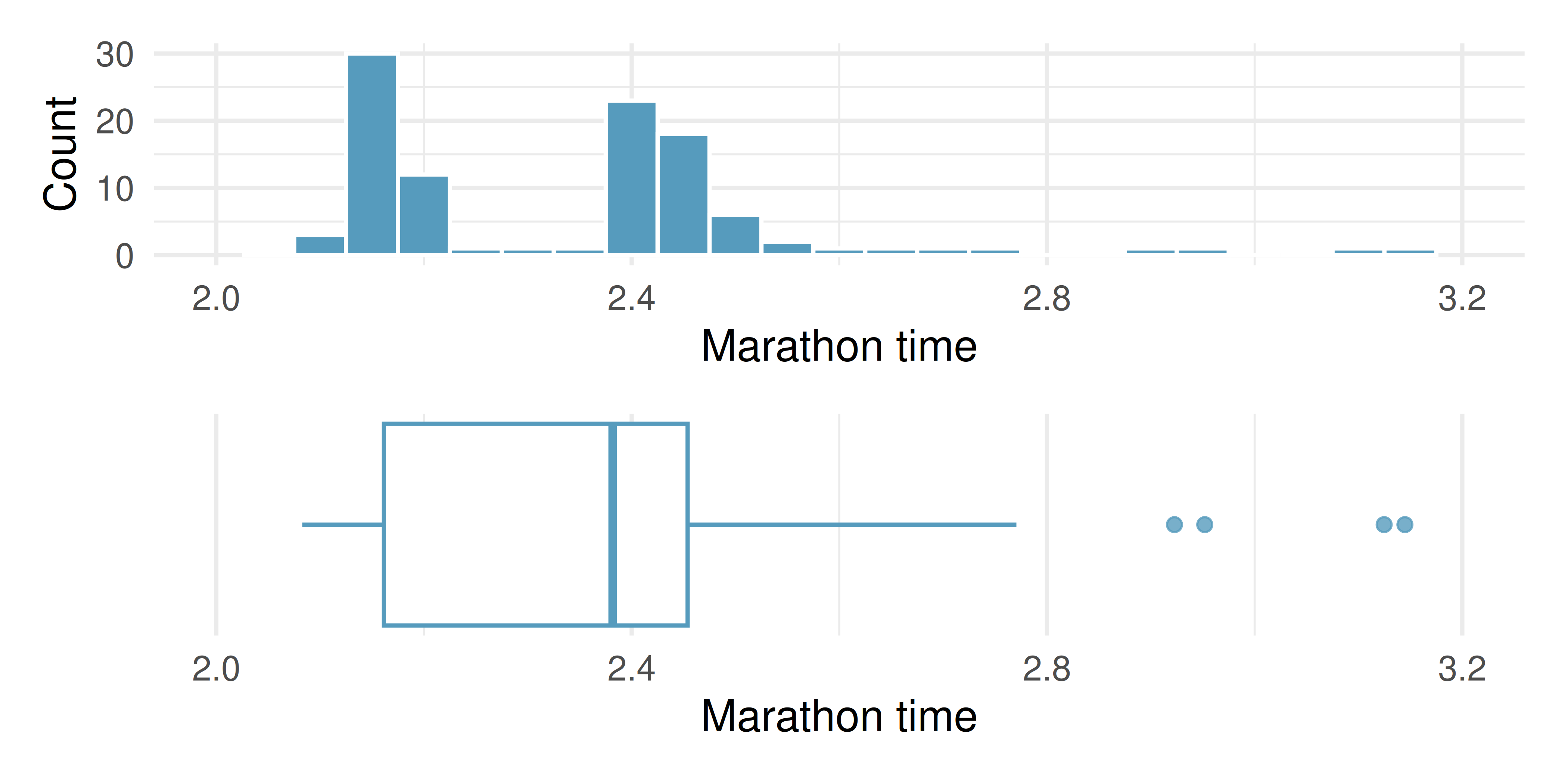
What features of the distribution are apparent in the histogram and not the box plot? What features are apparent in the box plot but not in the histogram?
What may be the reason for the bimodal distribution? Explain.
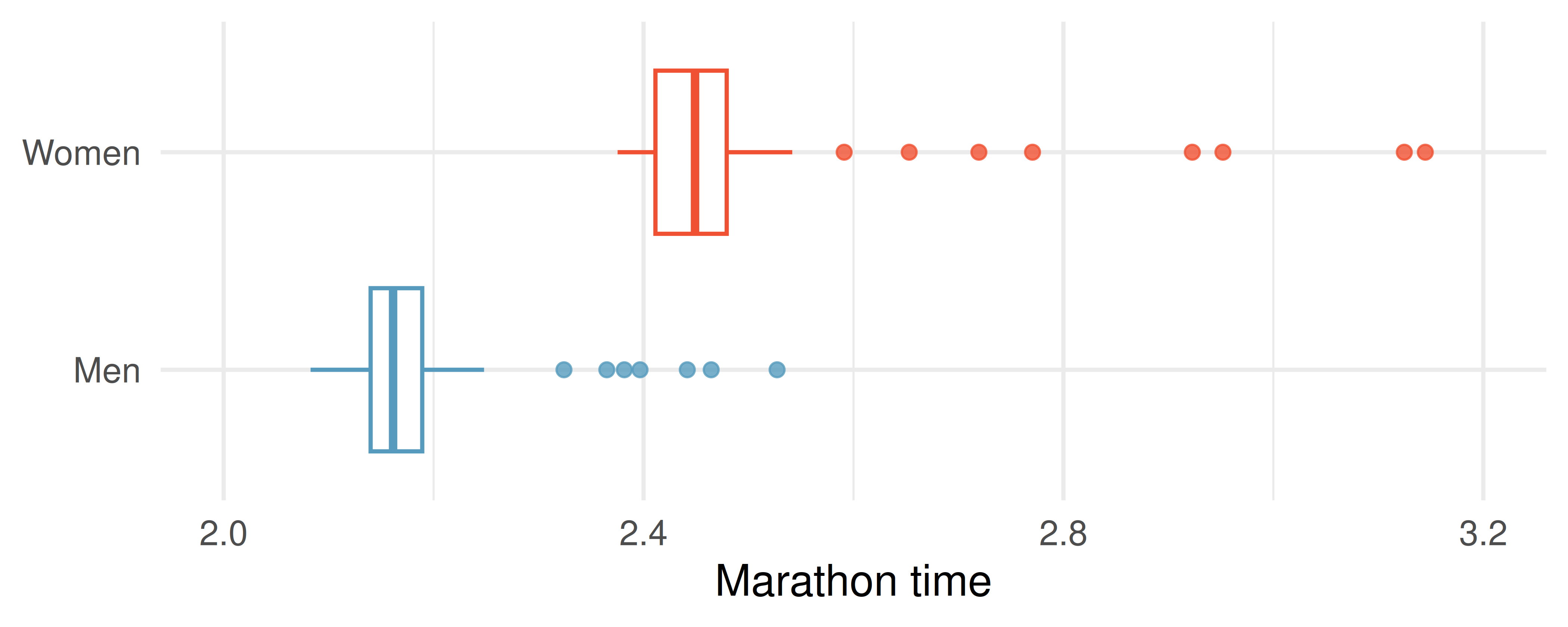
Compare the distribution of marathon times for men and women based on the box plot shown below.
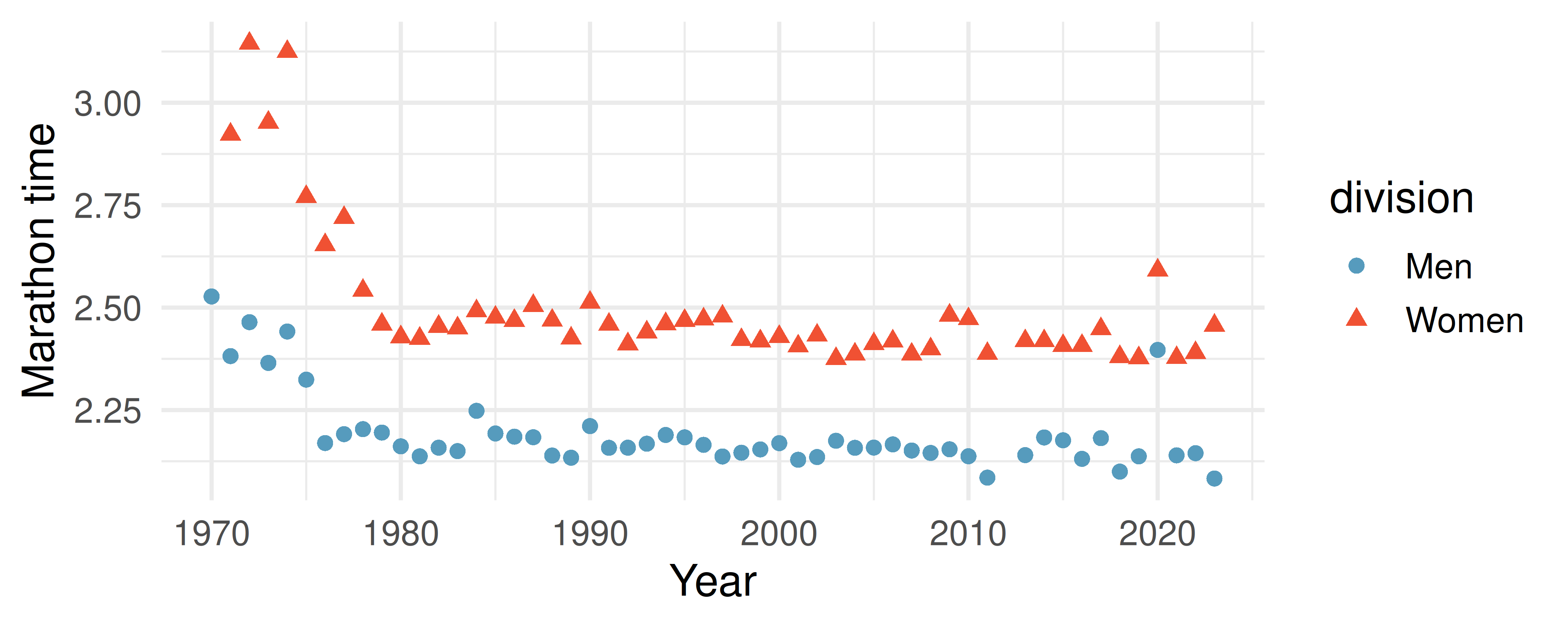
- The time series plot shown below is another way to look at these data. Describe what is visible in this plot but not in the others.
StatLens Exercises
The following exercises use StatLens, an interactive statistics tool. Each exercise includes a link that opens a pre-loaded dataset — explore, interact, and answer the questions.
Fuel efficiency by transmission type. Open the EPA fuel economy data in StatLens. This dataset contains city miles per gallon (MPG) for 201 vehicles from the 2021 EPA fuel economy guide, grouped by transmission type (automatic vs. manual).
Start with the box plots. Compare the two groups: which transmission type has the higher median city MPG? Which group has more variability (larger IQR)?
Switch to Histogram view. Describe the shape of each group’s distribution. Are they symmetric or skewed? Unimodal or bimodal?
Switch to Density overlay. Where do the two curves overlap the most? Based on this overlap, would you say the difference between transmission types is large relative to the variability within each group?
Using the summary statistics table, write a complete comparison of the two groups that includes shape, center, spread, and any unusual features.
Starbucks nutrition: calories and protein. Open the Starbucks nutrition data in StatLens. This dataset contains calorie and protein information for Starbucks food menu items.
Describe the direction of the association between calories and protein. Is it positive, negative, or neither?
Describe the form. Does the relationship appear to be linear or nonlinear?
Describe the strength. Are the points tightly clustered around a trend, or widely scattered?
Are there any unusual observations — menu items that have much more (or less) protein than you would expect for their calorie count? Identify approximately where they fall on the plot.
Write a one-sentence summary that describes the association using all four characteristics (direction, form, strength, unusual observations).
Allison, T., and D. V. Cicchetti. 1975. “Sleep in Mammals: Ecological and Constitutional Correlates.” Arch. Hydrobiol 75: 442. https://doi.org/10.1126/science.982039.
Nightingale, Florence. 1859. Notes on Nursing: What It Is, and What It Is Not. Harrison & Sons.
You, Wenpeng, Renata Henneberg, Arthur Saniotis, Yanfei Ge, and Maciej Henneberg. 2022. “Total Meat Intake Is Associated with Life Expectancy: A Cross-Sectional Data Analysis of 175 Contemporary Populations.” International Journal of General Medicine 15: 1833–51. https://doi.org/10.2147/IJGM.S333004.