28 More About the Normal Distribution
The normal distribution is powerful precisely because so many real-world variables are approximately normal. But approximately is a word doing a lot of work — some variables really are close to normal, others are clearly not, and it matters which is which before you use the normal model to compute probabilities or run a formula-based test. This chapter gives you two tools for making that call.
28.1 Checking whether data are normal
Before using the normal distribution as a model, we should check whether the assumption of normality is reasonable. Two visual methods are commonly used, and they complement each other.
28.1.1 Method 1: Histogram with a normal curve overlay
The simplest approach is to plot a histogram of the data and overlay the best-fitting normal curve (using \(\bar{x}\) for \(\mu\) and \(s\) for \(\sigma\)). If the histogram closely matches the curve, the normal model is reasonable. If the histogram is skewed, bimodal, or has long tails the curve doesn’t capture, the model is a poor fit.
This works well when \(n\) is large enough for the histogram to reveal the true shape — typically \(n \geq 50\) or so. With smaller samples, the histogram is noisy and even genuinely normal data can look ragged.
28.1.2 Method 2: Normal probability plots (QQ plots)
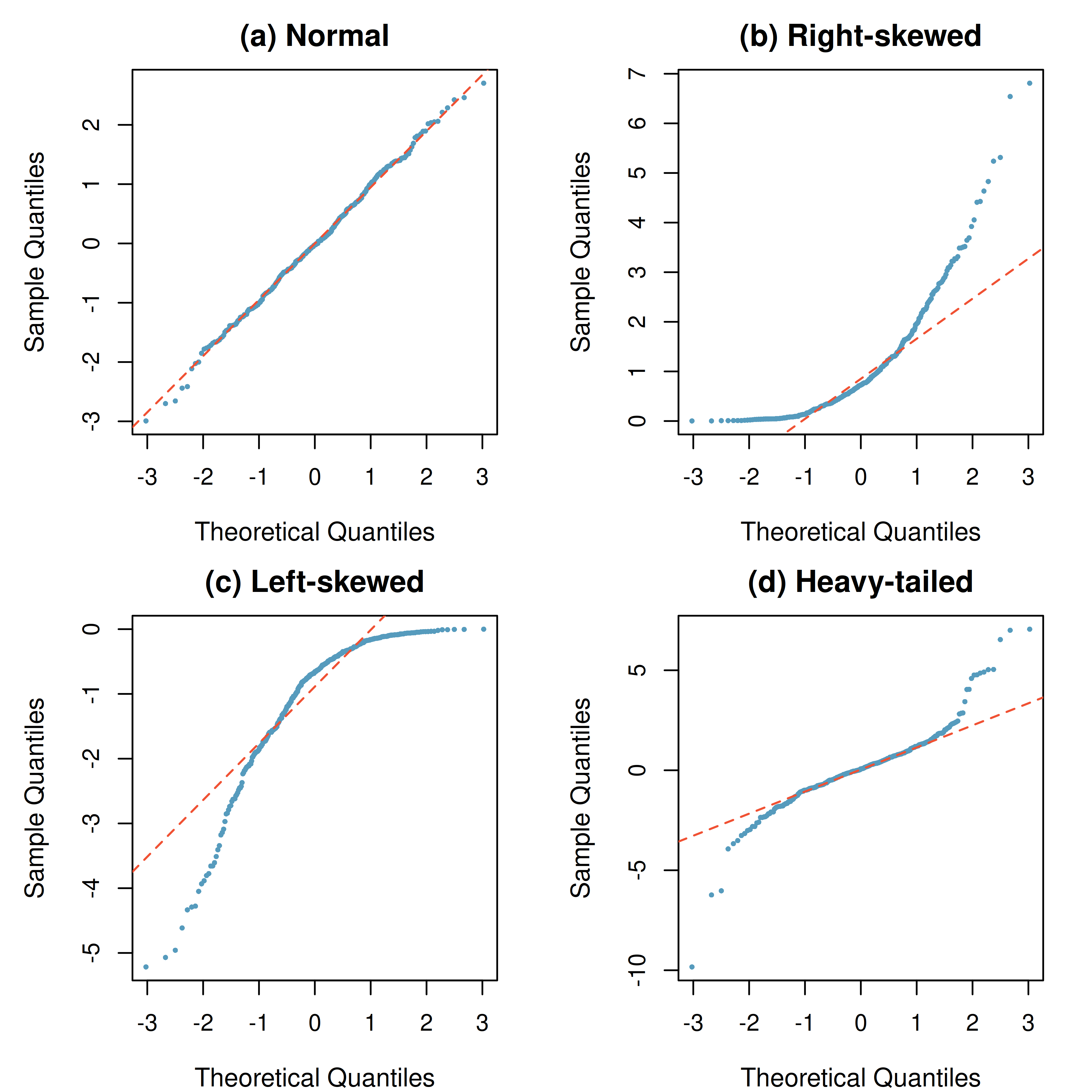
A normal probability plot (also called a QQ plot, short for “quantile-quantile plot”) plots the observed data values against the values we would expect if the data were perfectly normal. If the data are approximately normal, the points will fall close to a straight line.
How to read a QQ plot:
- Points on or near the line: The data are consistent with a normal distribution.
- Points curving up at the right end: The distribution is right-skewed (a long upper tail).
- Points curving down at the left end: The distribution is left-skewed (a long lower tail).
- Points curving away from the line at both ends: The distribution has heavier tails than normal — more extreme values than the normal predicts.
Figure 28.1 shows the four patterns you will see most often.
Sample size matters. With small sample sizes (\(n < 30\)), we should expect more variability in the QQ plot even when the data truly come from a normal distribution. Deviations must be more severe to be considered evidence against normality when \(n\) is small.
A researcher collects data and creates a QQ plot. The points follow the diagonal line closely in the middle of the distribution but curve upward at the right end. What does this suggest about the shape of the data?
Show answer
The QQ plot suggests the data are right-skewed. The bulk of the data are approximately normal, but there are larger values in the upper tail than the normal distribution would predict.28.2 When to use — and not use — the normal model
The normal distribution is a good model for data that are:
- Symmetric: The histogram is roughly mirror-image around the center.
- Unimodal: There is a single peak.
- Bell-shaped: The histogram has the characteristic tapered shape of the normal curve.
- No extreme outliers: Outliers distort both the mean and standard deviation, making the normal model a poor fit.
Many variables are approximately normal:
- Standardized test scores (SAT, ACT, GRE)
- Heights of adults (within a sex)
- Measurement errors in scientific instruments
- Many biological measurements (blood pressure, cholesterol levels)
- Averages of many small independent effects — which is why sample means behave normally by the Central Limit Theorem
Many variables are not normal:
- Income distributions — strongly right-skewed; a few very high earners pull the tail out.
- Waiting times — typically right-skewed, often bounded below by zero.
- Count data — usually better modeled by the binomial or Poisson, not the normal.
- Individual values that are percentages (e.g., each person’s body-fat percentage) — bounded, so they can’t be strictly normal. (A sample proportion \(\hat{p}\) from a large sample is different: as a statistic, it is approximately normal.)
- Ages — bounded below by 0 and often bounded above by natural limits, so the tails don’t behave like a normal.
When the normal model doesn’t fit, don’t force it. For skewed data, consider a transformation (e.g., log for right-skewed positive data), a different model (binomial for counts of successes, Poisson for rare event counts), or a simulation-based method like the bootstrap or a randomization test. Those simulation methods (developed in the randomization-tests and bootstrap-CI chapters) don’t require normality — though with very small samples from skewed populations they also tend to give intervals that are too narrow.
A hospital measures the time patients wait to be seen in the emergency room. The data range from 3 minutes to 6 hours, with most patients waiting under 45 minutes but a long right tail. A researcher wants to run a one-sample \(t\)-test to see if the mean wait time exceeds 30 minutes. Is a \(t\)-test appropriate?
The data are strongly right-skewed and bounded below by zero, so they are clearly not normal. A one-sample \(t\)-test may still be reasonable if the sample size is large — the CLT says the sampling distribution of \(\bar{x}\) will be approximately normal even when the population is skewed. But with a small sample (say, \(n < 30\)), the \(t\)-test could give misleading results. A bootstrap interval avoids assuming a normal population but does not rescue a tiny sample: with \(n = 8\) from a strongly right-skewed population, StatLens’s CI Coverage Simulator shows 95% percentile intervals capturing the mean only about 84% of the time (about 88% for the \(t\)-interval). With strongly skewed data, the real remedy is more data.
See it in action. Open the Descriptive Statistics Explorer on any bundled dataset — switch to the histogram view to eyeball symmetry and unimodality, then check the sample statistics for extreme outliers. For a QQ plot, open the One-Sample t-Test page, load a dataset, and switch its conditions panel to QQ Plot.
28.3 Chapter review
28.3.1 Summary
- Before applying the normal model, check whether the data are approximately normal. Two visual tools help: a histogram with a normal-curve overlay, and a QQ plot (points near the diagonal = approximately normal; systematic curvature = departure from normality).
- The four QQ-plot patterns worth recognizing: normal (straight), right-skewed (curves up at the right), left-skewed (curves down at the left), and heavy-tailed (curves away at both ends).
- The normal model fits symmetric, unimodal, bell-shaped variables without extreme outliers. Standardized test scores, adult heights, and measurement errors are canonical examples.
- The normal model does not fit strongly skewed data (income, waiting times), bounded data (proportions, ages), or count data (better handled by the binomial or Poisson).
- When the normal model doesn’t fit, use a simulation-based method (bootstrap CI, randomization test) or a different distribution family appropriate for the data — and remember that no method rescues a very small sample from a strongly skewed population.
28.3.2 Key terms
QQ plot (normal probability plot), normality assessment, histogram-with-normal-overlay, symmetric / unimodal / bell-shaped, heavy-tailed distribution, right-skewed / left-skewed, bootstrap alternative to normal-based inference.
28.4 Exercises
Answers to odd-numbered exercises are provided in the Exercise Solutions appendix at the back of the book.
- Reading a QQ plot. For each described pattern below, name the shape of the underlying data distribution and briefly explain how you can tell.
Points fall very close to the reference line across the whole range.
Points hug the line in the middle but curve upward away from the line at the right end.
Points hug the line in the middle but curve downward away from the line at the left end.
Points fall below the line at the left end and above the line at the right end.
- Which of these variables would you model as normal? For each variable, decide whether the normal distribution is a reasonable model for individual observations. Answer yes, no, or depends, and explain in one sentence.
Adult male heights in a large city.
Household incomes in the United States.
The number of car accidents at a given intersection per day.
The average of many random draws from any distribution.
The proportion of a small sample that responds “yes” to a survey question.
Systolic blood pressure of healthy adults.
- Small-sample QQ plot interpretation. A researcher has a sample of \(n = 15\) measurements. The QQ plot shows some scatter around the reference line — the points don’t fall perfectly on it, but there’s no clear systematic curve either.
Is this stronger evidence for or against the data being approximately normal? Explain.
If the same amount of scatter appeared in a QQ plot with \(n = 500\), would your conclusion change? Why?
A colleague says “the points don’t fall exactly on the line, so we can’t use a \(t\)-test.” Is this reasoning sound? Explain.
- Pick a method. For each scenario, decide whether a one-sample \(t\)-test is reasonable, or whether a bootstrap CI (or different approach) would be safer. Explain in one sentence.
You want to estimate the mean commute time in a city. A histogram of your \(n = 40\) commute-time observations is roughly symmetric with no outliers.
You want to estimate the mean insurance claim amount. Your \(n = 25\) observations are strongly right-skewed with three extreme outliers.
You want to estimate the mean systolic blood pressure of adult women. Your \(n = 200\) observations look approximately normal.
You want to test whether the mean wait time at an emergency room exceeds 30 minutes. Your \(n = 8\) observations are strongly right-skewed and bounded below by 0.
- Two normality checks, one dataset. You have a dataset of daily rainfall (inches) for 300 days at a weather station. You plot both a histogram with a fitted normal overlay and a QQ plot. The histogram is strongly right-skewed with many days near 0 and a few days with heavy rain; the QQ plot’s points curve sharply upward at the right end.
Do the two plots agree or disagree on normality?
Suggest one transformation of the data that might make the transformed values more nearly normal, and explain why it would help.
Suppose you compute a 95% one-sample \(t\) confidence interval for the mean daily rainfall from these 300 observations. Given the CLT and \(n = 300\), do you trust it? What’s the caveat?
StatLens Exercises
Let StatLens do the arithmetic; spend your effort on the reasoning a calculator can’t do.
The empirical rule, checked against the actual normal. Open the Normal tool preset to \(\mu = 0, \sigma = 1\).
- Set the middle-region boundaries to \(\pm 1\). What is the area? Is it 68%?
- Now \(\pm 2\). Is it 95%?
- Now \(\pm 3\). Is it 99.7%?
- The empirical rule says “68–95–99.7.” Where do the exact percentages come from — the rule or the curve?
Standardizing across different normals. Adult resting heart rates are approximately \(N(\mu = 72, \sigma = 12)\) beats per minute. Adult body temperatures are approximately \(N(\mu = 98.6, \sigma = 0.7)\) °F.
- A patient has a heart rate of 90. What is the patient’s \(z\)-score?
- Another patient has a body temperature of 99.6 °F. What is that patient’s \(z\)-score?
- Which patient is more unusual relative to their respective population? Why does the \(z\)-score answer this even though the two measurements are in different units?
- Use the standard normal \(z\) tool to find the percentile rank of each patient (the area to the left of their \(z\)-score). Are they in roughly the same percentile?
Inverse-normal (working backward). A standardized test has scores \(\sim N(500, 100)\).
- What score corresponds to the top 10% of test-takers? Use the normal tool to set the right-tail area to 0.10 and read off the boundary.
- What score is at the 25th percentile? Use the left-tail area of 0.25.
- What is the interquartile range of the score distribution?
- A scholarship is offered to students scoring above the 90th percentile. The college says: “Half of our applicants miss out by 50 points or fewer.” Is this surprising, given the distribution?
Within vs. between normals — a common confusion. A factory measures the diameters of bolts. The population of individual diameters is \(N(\mu = 10.0\text{ mm}, \sigma = 0.05\text{ mm})\). The quality team measures samples of \(n = 25\) bolts at a time and computes the sample mean diameter \(\bar{x}\).
- Find \(P(\text{individual bolt} > 10.10\text{ mm})\) using the normal tool at \(\mu = 10, \sigma = 0.05\).
- Find \(P(\bar{x} > 10.10\text{ mm})\) using the normal tool at the sampling-distribution parameters (\(\mu = 10\), \(\sigma_{\bar{x}} = 0.05/\sqrt{25} = 0.01\)).
- Which is smaller, and by how much? Why does the same threshold (10.10 mm) become much more “extreme” for \(\bar{x}\) than for an individual bolt?
- A quality engineer says: “We never see sample means above 10.10 mm — the process is in control.” How would you push back if the individual-bolt rate of “above 10.10” is 2%?
The normal distribution as a model — not reality. Heights of adult males are approximately normal. Hourly wages in a population are not.
- Why is height well-modeled by a normal — and what feature of the data-generating process makes it so?
- Why are hourly wages typically not well-modeled by a normal? Sketch the shape you’d expect.
- Suppose you use a normal model anyway to predict wage percentiles. What kind of errors are you likely to make?
- When does the normal still help, even when the underlying variable isn’t normal? (Hint: think back to the sampling distributions chapter.)