Project — Inference for Proportions. A project is a small statistical analysis you carry out end to end and communicate as a short report. Do the analysis in Jamovi (or R — pick the tab that matches your section) and submit the deliverable described at the end.
The question
A 2011 trial tested whether the experimental PfSPZ malaria vaccine lowers the rate of infection. Twenty healthy volunteers were randomly assigned to receive either the vaccine or a placebo, then all were exposed to malaria under controlled conditions. Researchers recorded whether each volunteer became infected.
Does the vaccine reduce the proportion of people who become infected?
The data
The malaria dataset (20 rows) has two categorical variables: treatment (vaccine or placebo) and outcome (infection or no infection). It is the kind of small randomized experiment where the method of data collection — random assignment — is what licenses a cause-and-effect conclusion.
Plan it first
Before you touch a tool, write down the plan. This is the part a calculator can’t do for you.
Parameter. Define \(p_1 - p_2\) in words (vaccine infection rate minus placebo infection rate).
Hypotheses. State \(H_0\) and \(H_A\) for “the vaccine lowers the infection rate.” One- or two-sided?
Procedure. This compares two groups on a yes/no outcome → a two-proportion comparison.
Conditions. Build the 2×2 table and check the success–failure counts. You will find the placebo group has zero non-infected people — so the normal-approximation \(z\)-procedure is not trustworthy here. That is your cue to rely on a simulation-based (randomization) test, the approach this course leads with.
Tip
This is a feature, not a snag: deciding which procedure the data can support is exactly the judgment the project is assessing. The honest answer here is “conditions for the \(z\)-test fail, so I’ll use a randomization test.”
Exploration → Contingency Tables → Independent Samples. Put treatment in Rows, outcome in Columns. Read off the 2×2 counts and the row percentages (the infection rate in each group).
Under Statistics, the χ² test is reported; because a cell count is very small, also request Fisher’s exact test — the small-sample-safe version. Record its p-value.
Exploration → Descriptives, split by treatment, or build a bar plot of outcome filled by treatment to show the two infection rates.
(Jamovi screenshots to be added.)
library(infer)library(dplyr)library(ggplot2)library(openintro)data(malaria)# Infection rate in each groupmalaria |>group_by(treatment) |>summarize(infected =mean(outcome =="infection"), n =n())
# A tibble: 2 × 3
  treatment infected     n
  <fct>        <dbl> <int>
1 placebo      1         6
2 vaccine      0.357    14
# Observed difference in infection proportions (vaccine - placebo)obs_diff <- malaria |>specify(outcome ~ treatment, success ="infection") |>calculate(stat ="diff in props", order =c("vaccine", "placebo"))obs_diff
Response: outcome (factor)
Explanatory: treatment (factor)
# A tibble: 1 × 1
    stat
   <dbl>
1 -0.643
# Randomization test: permute the treatment labels under "no effect"set.seed(145)null_dist <- malaria |>specify(outcome ~ treatment, success ="infection") |>hypothesize(null ="independence") |>generate(reps =1000, type ="permute") |>calculate(stat ="diff in props", order =c("vaccine", "placebo"))# One-sided p-value: does the vaccine LOWER infection?null_dist |>get_p_value(obs_stat = obs_diff, direction ="less")
# A tibble: 1 × 1
  p_value
    <dbl>
1   0.015
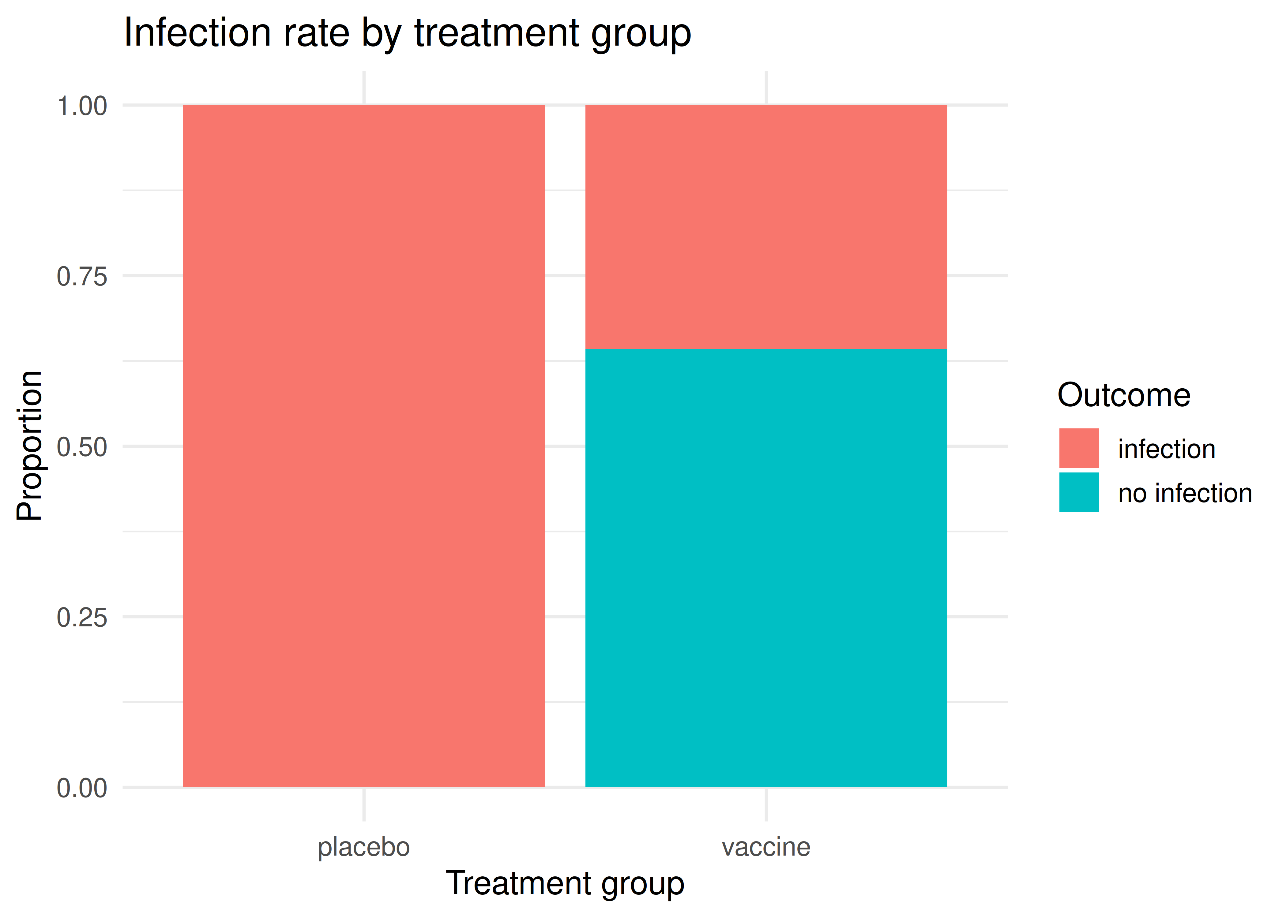
# A graphic for the reportggplot(malaria, aes(x = treatment, fill = outcome)) +geom_bar(position ="fill") +labs(x ="Treatment group", y ="Proportion", fill ="Outcome",title ="Infection rate by treatment group") +theme_minimal(base_size =13)
Infection rate by treatment group in the malaria vaccine trial. Every placebo volunteer became infected; the vaccine group’s rate is much lower.
Your deliverable
Submit a short report containing all of:
Graphic — a labeled bar chart of the infection rate in each group.
Numerical result — the two infection proportions, their difference \(\hat{p}_1 - \hat{p}_2\), and the randomization p-value.
Conditions — one sentence stating why the normal-approximation \(z\)-test is not appropriate here, and what you used instead.
Conclusion in context — 3–4 sentences answering the research question: the direction of the effect, whether the evidence is discernible, and — because volunteers were randomly assigned — whether a causal claim is justified.
One limitation — e.g., the very small sample, or generalizability beyond these 20 volunteers.
How it’s graded
Criterion
What we look for
Appropriate, labeled graphic
infection rate by group, axes labeled
Procedure & conditions
recognizes the \(z\)-test fails; uses a randomization test
Correct numerical result
proportions, difference, and p-value reported correctly
Conclusion in context
answers the question, names direction + discernibility + causality
Communication
clear, correct interpretation; no probability-of-hypothesis fallacy
Want to see the idea first? Warm up with the malaria randomization activity before you build the deliverable — then come back and produce the report in Jamovi or R.