3 Exploring Categorical Data
This chapter focuses on categorical data — variables whose values are categories or labels rather than numbers. The distinct values a categorical variable can take are called its levels. For example, homeownership status is a single categorical variable with three levels (rent, mortgage, own) — it is one variable, not three, even though it has three levels. Keeping the variable separate from its levels avoids a common miscount. We begin with visualizations for a single categorical variable (bar charts, pie charts, waffle charts), then move to tools for exploring the relationship between two categorical variables (contingency tables and stacked bar charts). We close with principles for creating effective, honest data visualizations.
3.1 Visualizing one categorical variable
3.1.1 Bar charts
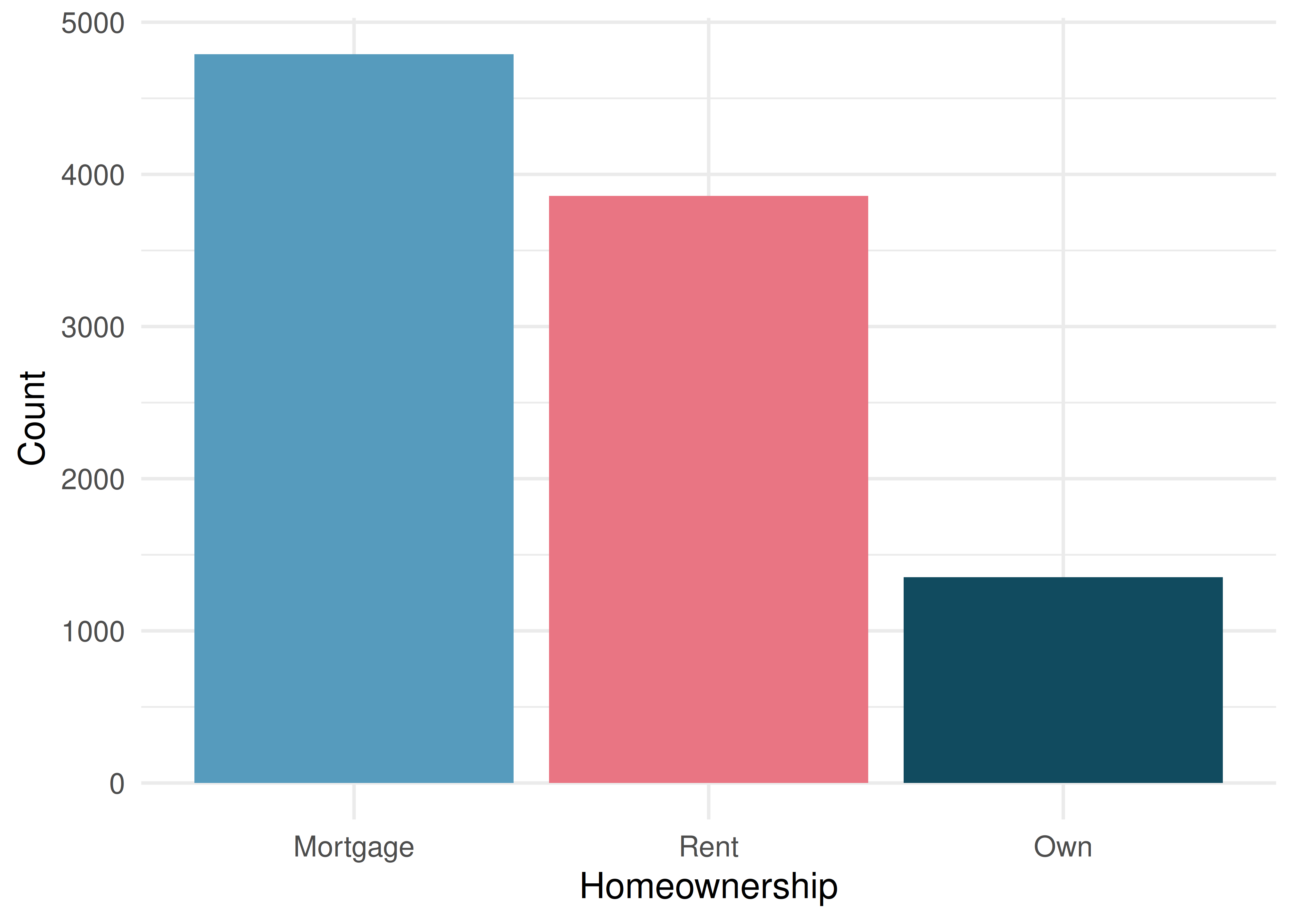
A bar chart is the most common way to display the distribution of a single categorical variable. Each level (category) gets its own bar, and the height (or length) of the bar represents either the count or the proportion of observations in that level.
Consider a dataset of 10,000 loans from a lending platform. Each borrower’s homeownership status is recorded as rent, mortgage, or own. The frequency table below summarizes the data:
| Homeownership | Count |
|---|---|
| Rent | 3,858 |
| Mortgage | 4,789 |
| Own | 1,353 |
| Total | 10,000 |
A bar chart of proportions conveys the same information but rescales the vertical axis so the bars represent the fraction of observations in each category. In the homeownership example, about 47.9% of borrowers have a mortgage, 38.6% rent, and 13.5% own their home outright.
To find a proportion, divide the number of observations in a category by the total number of observations. We write a sample proportion as \(\hat{p}\) (read “p-hat”). For instance, the proportion of borrowers who rent is \[\hat{p} = \frac{\text{number who rent}}{\text{total number of borrowers}} = 0.386, \text{ or } 38.6\%.\] We will use \(\hat{p}\) throughout the course, so it is worth getting comfortable computing a proportion now.
In the homeownership bar chart, which category is most common? Which is least common? About what fraction of borrowers rent?
Show answer
Mortgage is the most common category and own is the least common. About 38.6% of borrowers rent their home.3.1.2 Pie charts
A pie chart divides a circle into slices, where each slice represents a category and the size of the slice corresponds to the proportion of observations in that category.
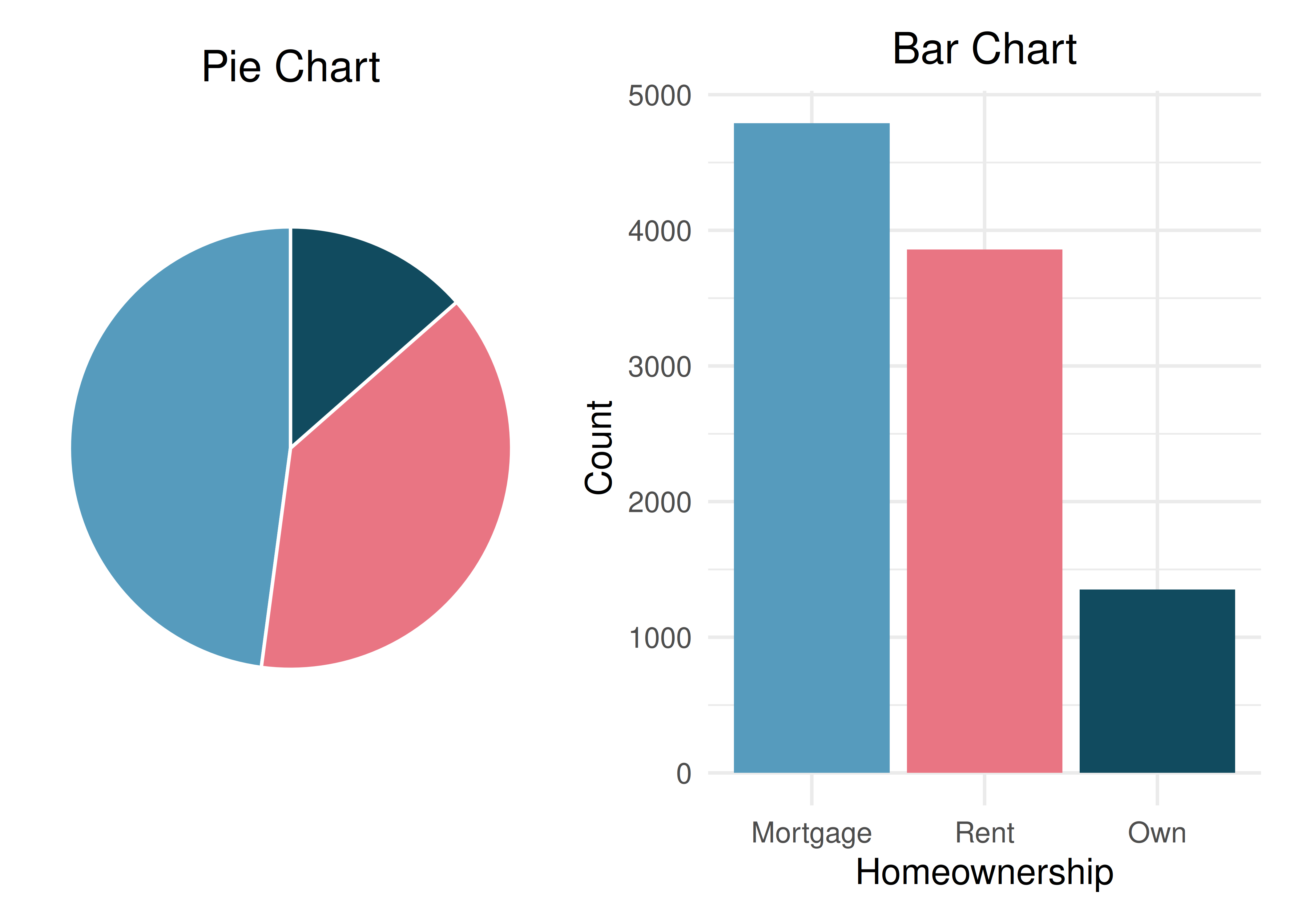
Pie charts can give a quick high-level overview, especially when a variable has only a few levels or when each level represents a simple fraction (one-half, one-quarter, etc.). However, bar charts are almost always easier to read because our eyes are better at comparing lengths than angles or areas.
Bar charts vs. pie charts. When a categorical variable has many levels, bar charts are far superior to pie charts for making comparisons. Reserve pie charts for situations where the variable has very few categories and the goal is to show how a whole breaks into parts.
3.1.3 Waffle charts
A waffle chart is another way to visualize proportions. It uses a grid (often 10 by 10 = 100 squares) where each square represents 1% of the data. Squares are shaded according to the categories. Like pie charts, waffle charts work best when the number of categories is small, but they can make it easier to compare proportions that do not correspond to simple fractions.
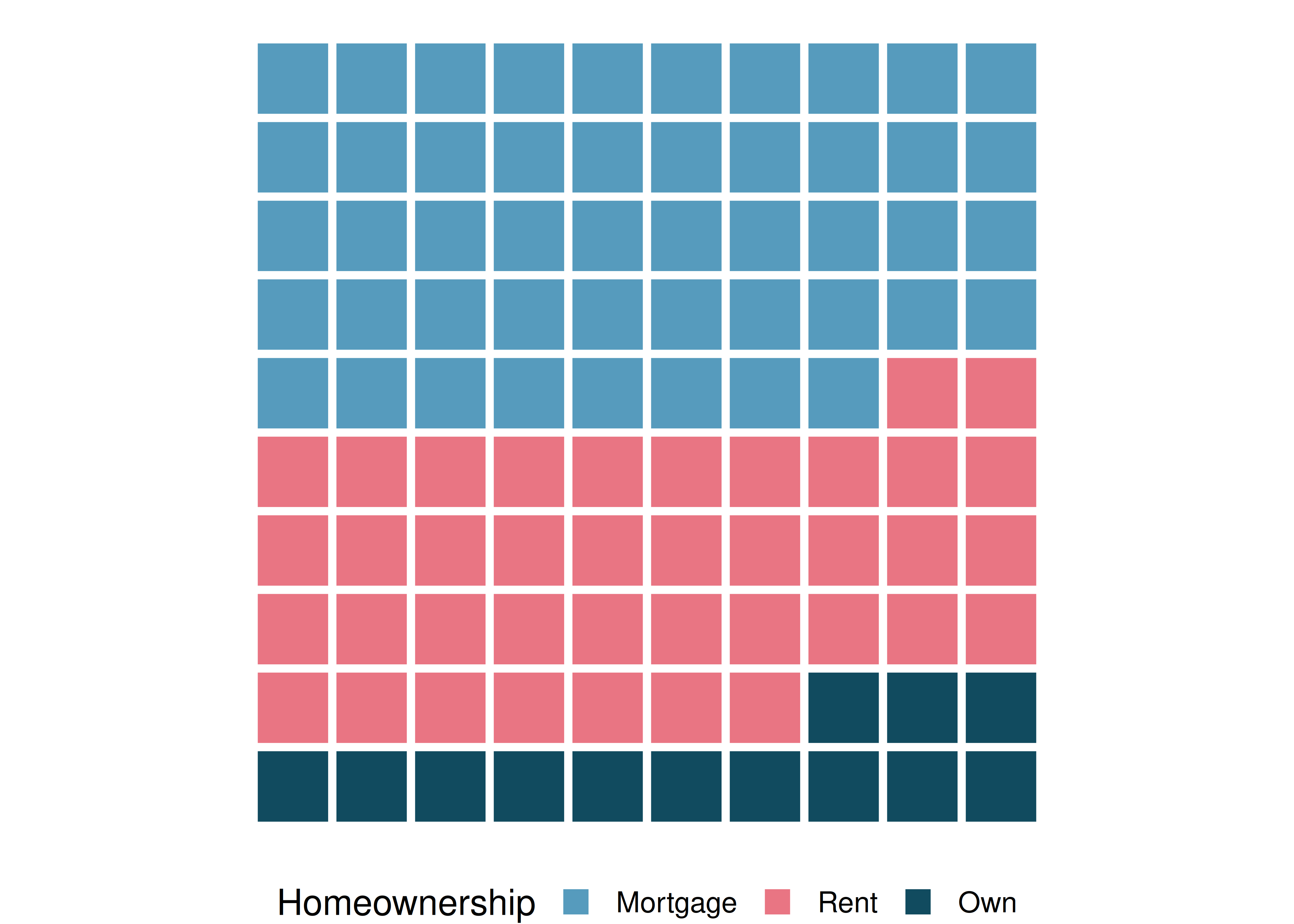
Why might a waffle chart be easier to read than a pie chart when comparing two categories with similar proportions (say, 38% and 42%)?
Show answer
In a waffle chart, you can count the number of shaded squares for each category, making it straightforward to see the difference. In a pie chart, the angle difference between 38% and 42% is very subtle and hard to judge visually.See it in action. Open the Comparing Charts for Categorical Data activity to switch between bar, pie, and waffle displays on Brexit survey data and see which makes it easiest to compare five response categories.
3.2 Two categorical variables
When we want to explore the relationship between two categorical variables, we organize the data in a contingency table and display it with stacked or grouped bar charts.
3.2.1 Contingency tables
A contingency table summarizes data for two categorical variables. The rows represent the levels of one variable, the columns represent the levels of the other, and each cell contains the count of observations in that combination. Row totals and column totals give the marginal distributions.
Consider a dataset of 10,000 loans. Each loan has a homeownership status (rent, mortgage, or own) and an application type (joint or individual). The contingency table below summarizes these two variables:
| Rent | Mortgage | Own | Total | |
|---|---|---|---|---|
| Joint | 362 | 950 | 183 | 1,495 |
| Individual | 3,496 | 3,839 | 1,170 | 8,505 |
| Total | 3,858 | 4,789 | 1,353 | 10,000 |
Each cell represents a count. For example, 3,496 loans were made by individuals who rent their home. The row totals tell us that 1,495 loans were joint applications and 8,505 were individual applications. The column totals tell us the overall distribution of homeownership.
What does the value 950 in the table represent? What does the column total 4,789 represent?
Show answer
The value 950 represents the number of loans that were joint applications from borrowers with a mortgage. The column total 4,789 represents the total number of borrowers (both joint and individual) who have a mortgage.3.2.2 Row and column proportions
Raw counts can be hard to compare when group sizes differ. Instead, we can compute row proportions or column proportions to see conditional relationships.
Row proportions are computed by dividing each count by its row total. They show how a variable is distributed within each level of the row variable.
Column proportions are computed by dividing each count by its column total. They show how a variable is distributed within each level of the column variable.
Both row and column proportions are examples of conditional proportions — the proportion of observations in one category, conditional on (given) the level of the other variable.
Row proportions (each count divided by its row total):
| Rent | Mortgage | Own | Total | |
|---|---|---|---|---|
| Joint | 0.242 | 0.635 | 0.122 | 1.000 |
| Individual | 0.411 | 0.451 | 0.138 | 1.000 |
For example, \(3{,}496 / 8{,}505 = 0.411\), meaning 41.1% of individual applicants rent their home.
Column proportions (each count divided by its column total):
| Rent | Mortgage | Own | |
|---|---|---|---|
| Joint | 0.094 | 0.198 | 0.135 |
| Individual | 0.906 | 0.802 | 0.865 |
| Total | 1.000 | 1.000 | 1.000 |
The value 0.906 tells us that 90.6% of renters applied individually. This rate is higher than for borrowers with mortgages (80.2%) or who own their home (86.5%). Because these rates vary across the levels of homeownership, there is evidence that application type and homeownership may be associated.
What does 0.451 represent in the row proportions table? What does 0.802 represent in the column proportions table?
Show answer
0.451 represents the proportion of individual applicants who have a mortgage. 0.802 represents the fraction of applicants with mortgages who applied as individuals.Data scientists use statistics to build email spam filters. One characteristic examined is email format (HTML or plain text). A contingency table of email format and spam status is shown below:
| HTML | Text | Total | |
|---|---|---|---|
| Not spam | 2,568 | 986 | 3,554 |
| Spam | 158 | 209 | 367 |
| Total | 2,726 | 1,195 | 3,921 |
Which would be more useful for classifying email: row or column proportions?
A data scientist would want to know how the proportion of spam changes depending on email format. This corresponds to column proportions: \(209/1{,}195 = 17.5\%\) of plain text emails are spam, compared to \(158/2{,}726 = 5.8\%\) of HTML emails. Plain text emails are more likely to be spam. Row or column proportions are not equivalent — before computing, consider which variable you want to “condition on” (usually the explanatory variable).
In the spam example, which variable would you consider the explanatory variable and which the response?
Show answer
Email format (HTML vs. text) is the explanatory variable — it is a characteristic of the email that might help explain or predict whether the email is spam. Spam status (spam vs. not spam) is the response variable.3.2.3 Bar charts for two categorical variables
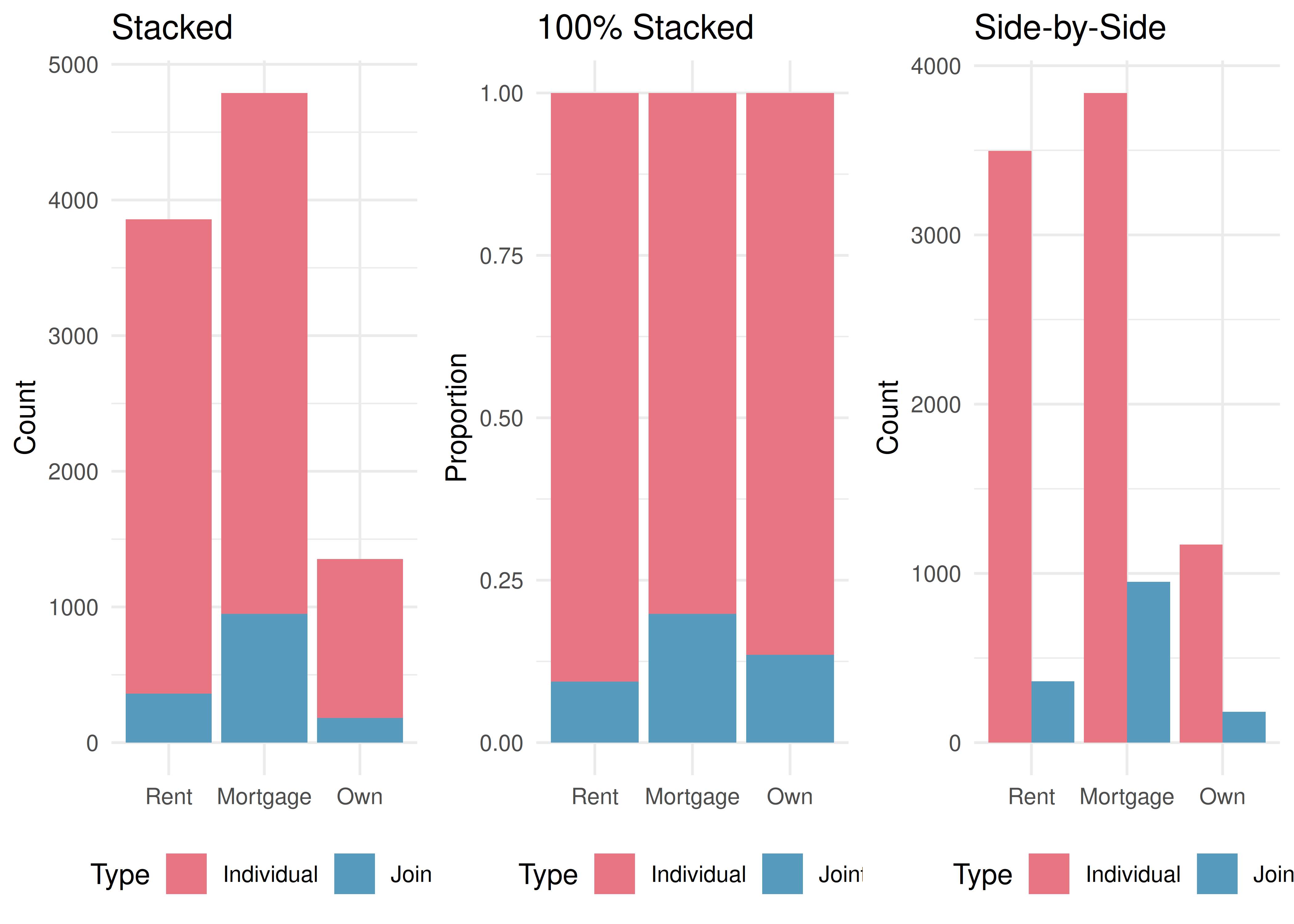
Bar charts can be extended to display the relationship between two categorical variables. There are three common variants:
A stacked bar chart stacks the bars for the second variable on top of each other within each level of the first variable. It shows both the total count and the breakdown by the second variable.
A 100% stacked bar chart (also called a standardized or filled bar chart) is like a stacked bar chart, but the bars are scaled to the same height (100%). It shows the proportion of each category of the second variable within each level of the first variable.
A side-by-side bar chart (also called a grouped or dodged bar chart) places bars for the second variable next to each other within each level of the first variable. It makes it easy to compare counts across groups.
When is each type of bar chart most useful?
- The stacked bar chart is most useful when you want to see both the total count for each group and the breakdown by the second variable.
- The 100% stacked bar chart is helpful when comparing proportions across groups, especially when the groups have very different sizes. However, it sacrifices information about the total count.
- The side-by-side bar chart makes it easy to compare individual counts directly. It works well for showing both variables without implying one is the explanatory variable. However, it requires more horizontal space.
Detecting association in a 100% stacked bar chart. If the proportional breakdown of the response variable is the same across all levels of the explanatory variable, then the variables are not associated — the colored segments will line up at the same heights. If the breakdown differs across levels, the variables are associated.
In the 100% stacked bar chart above, how can you tell whether homeownership and application type are associated?
Show answer
If the variables were not associated, the division between joint and individual would occur at the same height in every bar. Since the bars are divided at different heights — mortgage holders have a higher proportion of joint applications than renters or owners — the variables appear to be associated.See it in action. Open the Exploring Two-Way Tables activity to walk through counts, row / column / joint proportions, and three bar-chart types on a diabetes clinical trial’s contingency table.
3.3 Effective data visualization
Graphs can powerfully communicate ideas directly and quickly. However, there are times when a visualization conveys a message that is inaccurate or misleading. This section provides guiding principles for creating clear, honest, and effective visualizations.
3.3.1 Keep it simple
Colors should be used purposefully — to group items or differentiate levels in meaningful ways. Colors used only for decoration can be distracting.
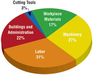
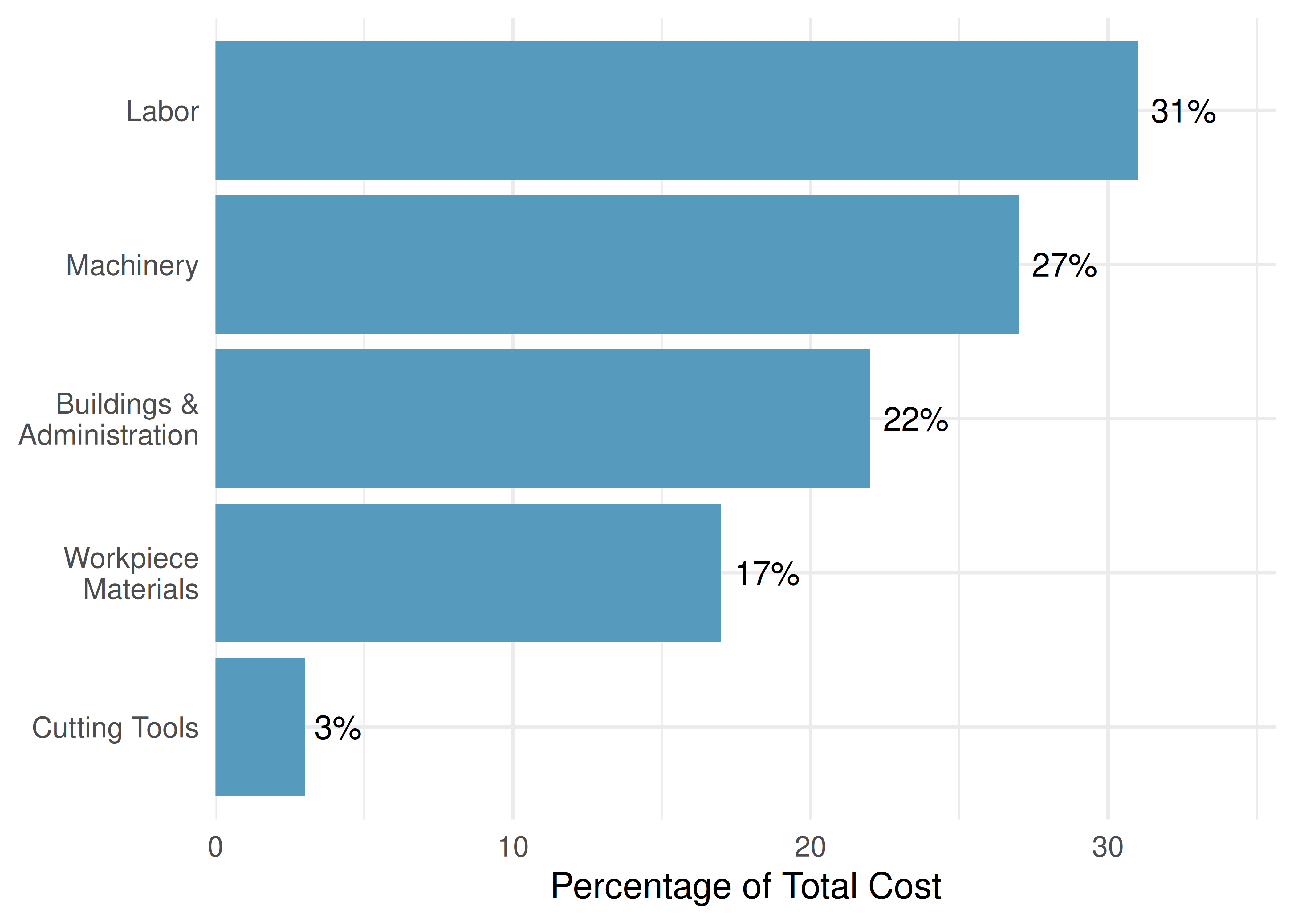
Consider a company that has summarized its costs into five categories. A three-dimensional pie chart makes it hard to compare the sizes of the slices, and the unnecessary 3D effect distorts the proportions. A simple bar chart conveys the same information much more clearly.
A simple bar chart of the same data makes the comparisons effortless:
3.3.2 Use color to draw attention
An important principle is to use color to draw attention to the most important part of your graphic. Default rainbow coloring often adds no meaning and can confuse readers.
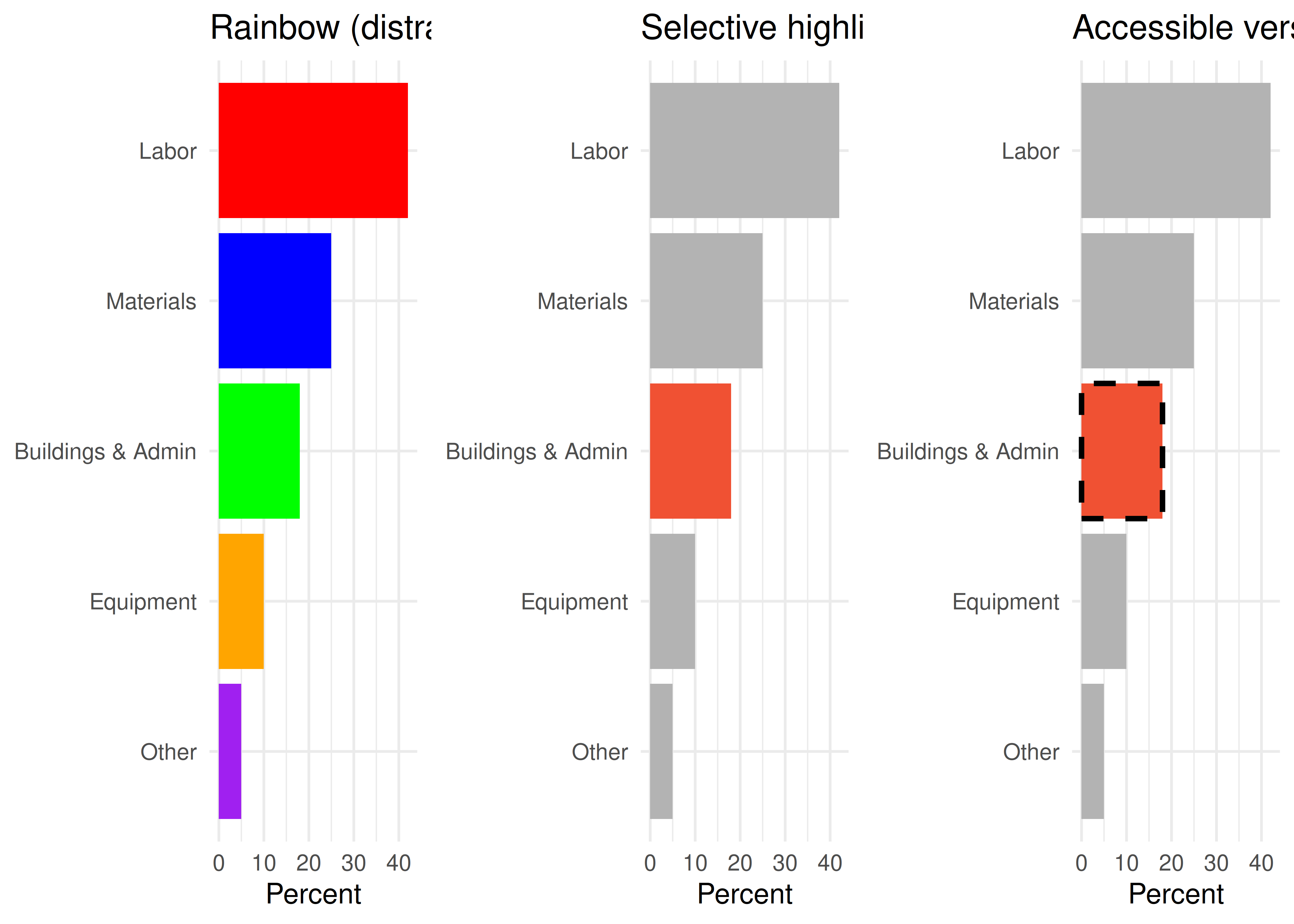
Accessibility matters. Not everyone perceives color the same way. When using color to draw attention, also consider adding a secondary visual cue (such as a pattern, line style, or border) so that the highlighted feature is distinguishable even for people with color vision deficiency.
3.3.3 Tell a story
Effective graphs often include annotations — text, lines, or labels that provide context beyond the raw data. For example, adding a note that “July is the start of the fiscal year” to a time series of monthly hiring can explain why there is a spike every July.
3.3.4 Order matters
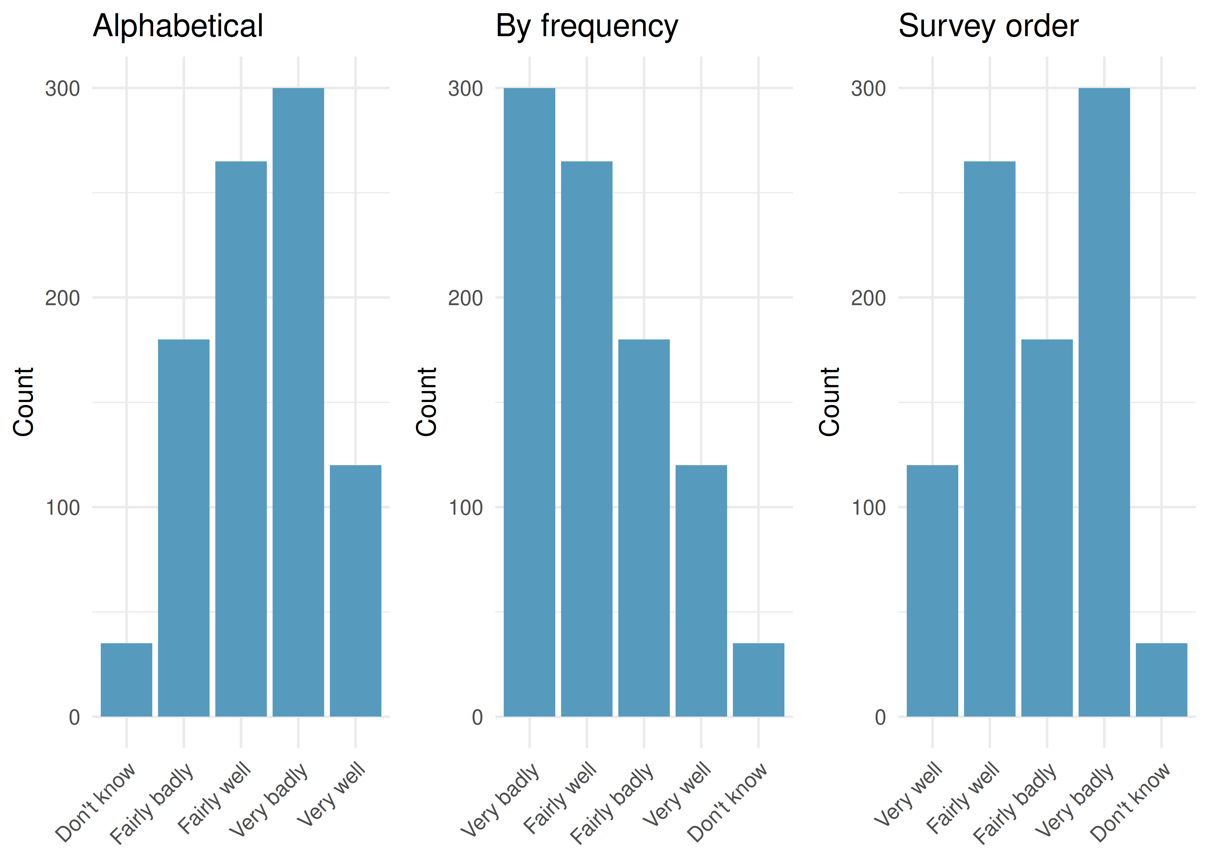
The arrangement of categories in a bar chart can help or hinder understanding. Alphabetical order is rarely the most informative choice. Consider ordering bars by frequency (tallest to shortest) or by a meaningful sequence (such as the order the options appeared in a survey question).
3.3.5 Make labels readable
When category labels are long, consider using horizontal bars (where labels appear along the vertical axis with plenty of space) rather than vertical bars (where labels must be angled or truncated).
3.3.6 Pick a purpose
Every graphical decision should be made with a purpose. Before choosing a chart type, ask:
- What is the key comparison I want the reader to make?
- Which chart type makes that comparison easiest?
- Am I showing proportions, counts, distributions, or relationships?
A survey asks residents of five regions about their opinion on a policy, with responses ranging from “Very well” to “Very badly.” You want to compare how opinions differ across regions. What visualization would you choose?
A 100% stacked bar chart would be useful if the main comparison is about proportions within each region. A side-by-side bar chart would work if comparing raw counts across regions matters. A faceted bar chart — one panel per region — would allow the most detailed comparison. The best choice depends on which comparison is most important to the story you are telling.
3.3.7 Select meaningful colors
Default or rainbow color schemes are not always the best choice. Perceptually uniform color scales (such as the viridis or cividis scales) are designed to be distinguishable by people with a variety of color vision abilities and to be readable when printed in grayscale. For ordinal data, a sequential color scale (light to dark) communicates the ordering effectively.
Summary of data visualization principles:
- Keep it simple — avoid unnecessary 3D effects, decorative colors, and chart junk
- Use color with purpose — to group, differentiate, or draw attention
- Include context — titles, axis labels, annotations, and data sources
- Choose appropriate ordering — by frequency, natural order, or meaningful sequence
- Make labels readable — flip axes if labels are long; avoid angled text
- Consider your audience — use accessible color schemes and secondary visual cues
- Match the chart to the question — each chart type has strengths; choose deliberately
3.4 Chapter review
3.4.1 Summary
This chapter introduced tools for exploring categorical data. For a single categorical variable, bar charts are the primary visualization, with pie charts reserved for simple cases and waffle charts useful for estimating percentages. For two categorical variables, contingency tables organize counts, row and column proportions reveal conditional relationships, and stacked, 100% stacked, and side-by-side bar charts provide visual comparisons. When the proportional breakdown of one variable differs across levels of the other, the variables are associated. Effective visualizations follow principles of simplicity, purposeful use of color, meaningful ordering, and accessibility.
3.4.2 Key terms
- Bar chart, pie chart, waffle chart
- Frequency table, proportion
- Contingency table, row totals, column totals
- Row proportions, column proportions, conditional proportions
- Stacked bar chart, 100% stacked bar chart, side-by-side bar chart
- Association (between categorical variables)
- Explanatory variable, response variable
3.5 Exercises
Answers to odd-numbered exercises are provided in the Exercise Solutions appendix at the back of the book.
- Antibiotic use in children. The bar plot and the pie chart below show the distribution of pre-existing medical conditions of children involved in a study on the optimal duration of antibiotic use in treatment of tracheitis, which is an upper respiratory infection.
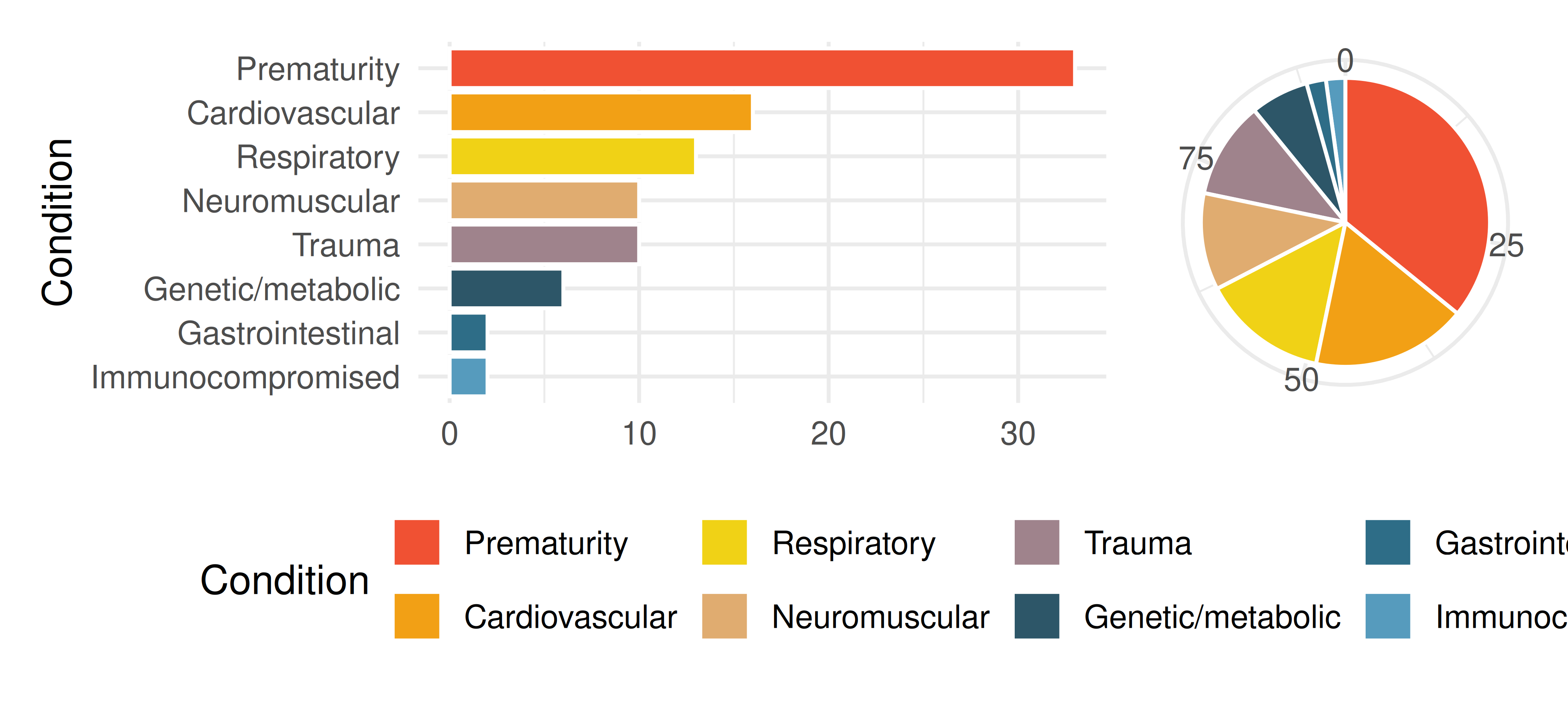
What features are apparent in the bar plot but not in the pie chart?
What features are apparent in the pie chart but not in the bar plot?
Which graph would you prefer to use for displaying these categorical data?
- Views on immigration. Nine-hundred and ten (910) randomly sampled registered voters from Tampa, FL were asked if they thought workers who have illegally entered the US should be (i) allowed to keep their jobs and apply for US citizenship, (ii) allowed to keep their jobs as temporary guest workers but not allowed to apply for US citizenship, or (iii) lose their jobs and have to leave the country. The results of the survey by political ideology are shown below.
| Response | Conservative | Liberal | Moderate | Total |
|---|---|---|---|---|
| Apply for citizenship | 57 | 101 | 120 | 278 |
| Guest worker | 121 | 28 | 113 | 262 |
| Leave the country | 179 | 45 | 126 | 350 |
| Not sure | 15 | 1 | 4 | 20 |
| Total | 372 | 175 | 363 | 910 |
What percent of these voters identify themselves as conservatives?
What percent of these voters are in favor of the citizenship option?
What percent of these voters identify themselves as conservatives and are in favor of the citizenship option?
What percent of these voters who identify themselves as conservatives are also in favor of the citizenship option? What percent of moderates share this view? What percent of liberals share this view?
Do political ideology and views on immigration appear to be associated? Explain your reasoning.
Conjecture other variables that might explain the potential relationship between these two variables.
- Black Lives Matter. A Washington Post-Schar School poll conducted in the United States in June 2020, among a random national sample of 1,006 adults, asked respondents whether they support or oppose protests following George Floyd’s killing that have taken place in cities across the US. The survey also collected information on the age of the respondents. (Washington Post 2020) The results are summarized in the stacked bar plot below.
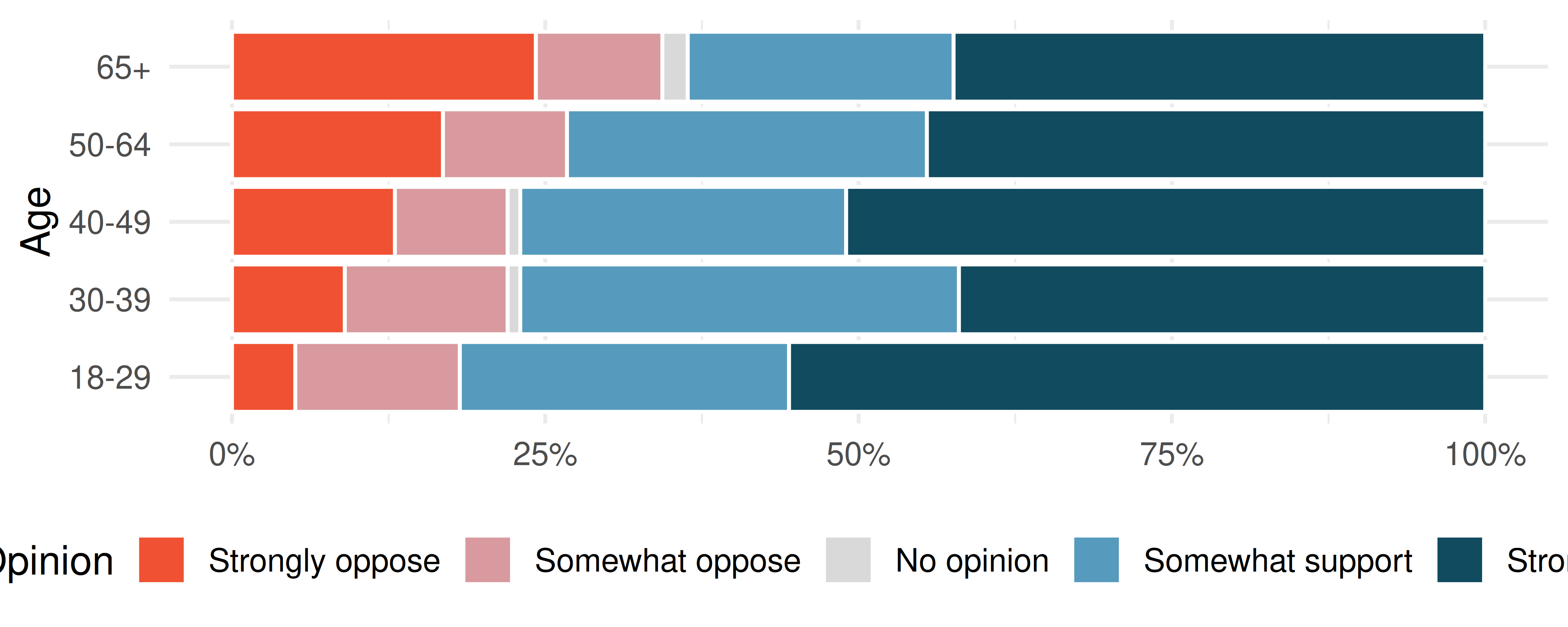
Based on the stacked bar plot, do views on the protests and age appear to be associated? Explain your reasoning.
Conjecture other possible variables that might explain the potential association between these two variables.
- Raise taxes. A random sample of registered voters nationally were asked whether they think it’s better to raise taxes on the rich or raise taxes on the poor. The survey also collected information on the political party affiliation of the respondents. (Polling 2015)
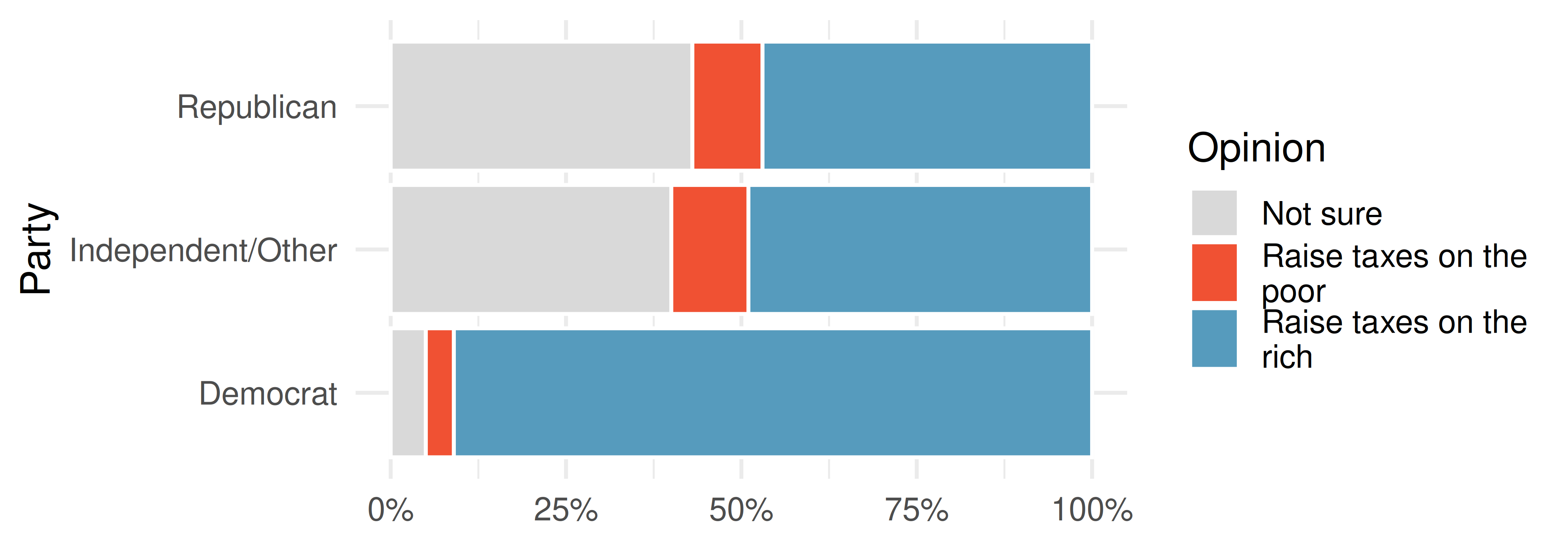
Based on the stacked bar plot shown above, do views on raising taxes and political affiliation appear to be associated? Explain your reasoning.
Conjecture other possible variables that might explain the potential association between these two variables.
- Heart transplant data display. The Stanford University Heart Transplant Study was conducted to determine whether an experimental heart transplant program increased lifespan. Each patient entering the program was officially designated a heart transplant candidate, meaning that they were gravely ill and might benefit from a new heart. Patients were randomly assigned into treatment and control groups. Patients in the treatment group received a transplant, and those in the control group did not. The visualizations below display two different versions of the study results. (Turnbull, Brown, and Hu 1974)
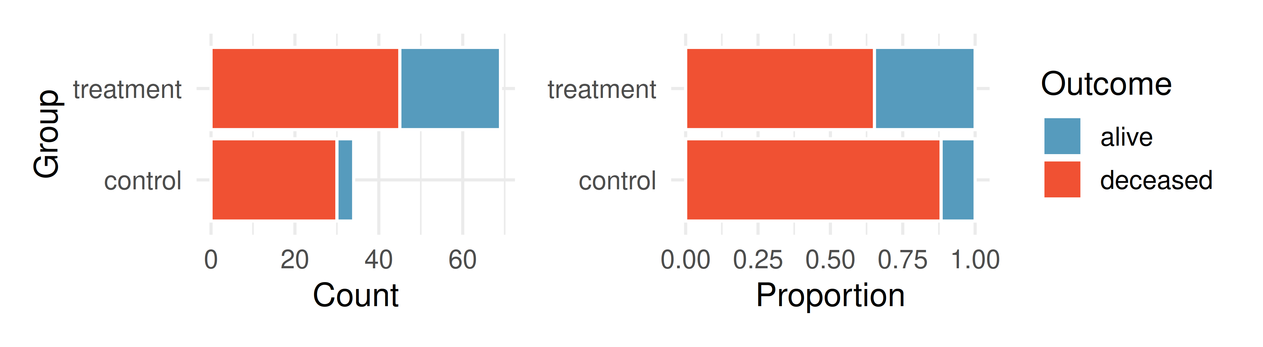
Provide one aspect of the two group comparison that is easier to see from the stacked bar plot (left)?
Provide one aspect of the two group comparison that is easeir to see from the standardized bar plot (right)?
For the Heart Transplant Study which of those aspects would be more important to display? That is, which bar plot would be better as a data visualization?
- Shipping holiday gifts data display. A local news survey asked 500 randomly sampled Los Angeles residents which shipping carrier they prefer to use for shipping holiday gifts. The bar plots below show the distribution of responses by age group as well as distribution of responses by shipping method.
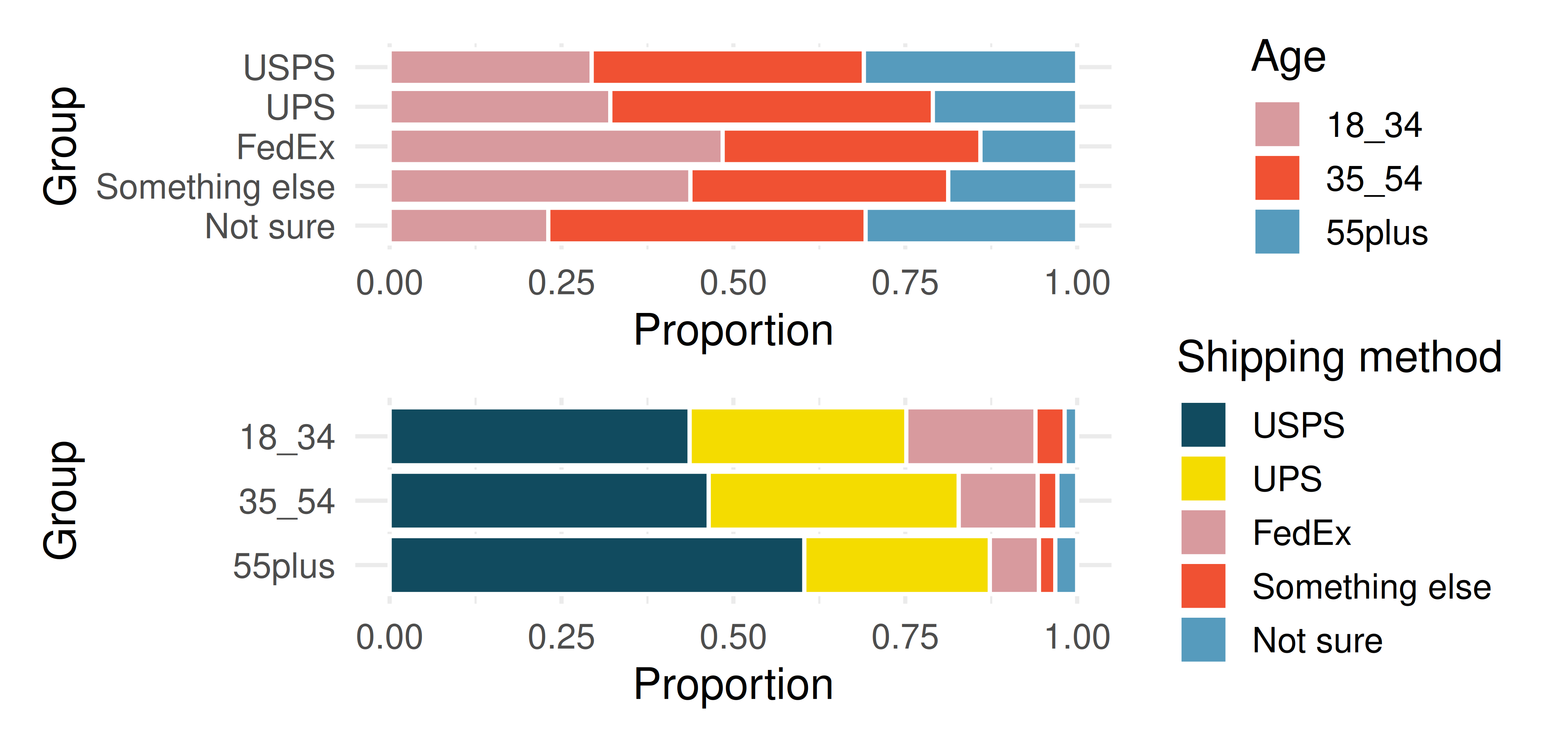
Which graph (top or bottom) would you use to understand the shipping choices of people of different ages? Explain.
Which graph (top or bottom) would you use to understand the age distribution across different types of shipping choices? Explain.
A new shipping company would like to market to people over the age of 55. Who will be their biggest competitor? Explain.
FedEx would like to reach out to grow their market share so as to balance the age demographics of FedEx users. To what age group should FedEx market?
- On-time arrivals. Consider all of the flights out of New York City in 2013 that flew into Puerto Rico (BQN), Los Angeles (LAX), or San Francisco (SFO) on the following two airlines: JetBlue (B6) or United Airlines (UA). Below are the tabulated counts for the number of flights
delayedandon timefor each airline into each city.
| dest | carrier | status | count |
|---|---|---|---|
| BQN | B6 | delayed | 271 |
| BQN | B6 | on time | 322 |
| BQN | UA | delayed | 144 |
| BQN | UA | on time | 151 |
| LAX | B6 | delayed | 670 |
| LAX | B6 | on time | 999 |
| LAX | UA | delayed | 2368 |
| LAX | UA | on time | 3402 |
| SFO | B6 | delayed | 405 |
| SFO | B6 | on time | 615 |
| SFO | UA | delayed | 2694 |
| SFO | UA | on time | 4034 |
What percent of all JetBlue flights were delayed? What percent of all United Airlines flights were delayed? (Note, the overall delay proportions are typically what would be reported and associated with an airline.)
For each of the three airports, find the percent of delayed flights for each of JetBlue and United (you should have 6 numbers).
United has a higher proportion of delayed flights for each of the three cities, yet JetBlue has a higher proportion of delayed flights overall. Explain, using the data counts provided, how the seeming paradox could happen.
- US House of Representatives. The US House of Representatives is dominated by two political parties: Democrats and Republicans. Democrats are thought to be the more liberal party and Republicans are considered to be the more conservative party. However, within each party there is an internal spectrum of liberal to conservative. For example, conservative Democrats and liberal Republicans would be labeled moderate. Consider an election where the only change in membership is that the most conservative Democrats are replaced by a set of liberal Republicans who are more liberal than the incumbent Republicans but more conservative than the Democrats they replaced.
After the election, is the Democratic wing of the House more conservative or more liberal? Explain.
After the election, is the Republican wing of the House more conservative or more liberal? Explain.
After the election, is the overall House membership more conservative or more liberal? Explain.
In what settings would you report the outcome of the change in House membership to be more conservative? And in what settings would you report the outcome of the change in House membership to be more liberal?
Dataset sources
antibiotics (openintro) | immigration (openintro) | heart_transplant (openintro) | flights (nycflights13)
StatLens Exercises
The following exercises use StatLens, an interactive statistics tool. Each exercise includes a link that opens a pre-loaded dataset — explore, interact, and answer the questions.
Which chart for categorical data? Open the jury racial composition data in StatLens. This dataset records the race of 275 jurors from a county. The chart opens with numeric labels hidden so you can focus on the visual patterns.
Start with the bar chart. Using only the bar heights, rank the four racial groups from most to least represented. Which group is clearly the largest?
Switch to a pie chart. Try to rank the four groups from largest to smallest using only the visual size of each slice. Is it easier or harder than with the bar chart? Check the Show values box to reveal the numbers — how close was your ranking?
Switch to a waffle chart (uncheck Show values first). Count the squares for the White group to estimate their percentage. Then check Show values to see the actual number. Is estimating percentages easier from the waffle chart or the pie chart? Why?
If a community advocacy group wanted to argue that the jury pool does not reflect the racial makeup of the county, which chart type would make the strongest visual case? Explain your reasoning.
Detecting association in a two-way table. Open the heart transplant data in StatLens. This dataset records whether patients in a heart transplant study were in the treatment group (received a transplant) or the control group, and whether they survived or died.
Look at the contingency table (counts). How many patients received a transplant? How many survived overall? How many patients both received a transplant and survived?
Switch the table to Row Proportions. What proportion of the treatment group survived? What proportion of the control group survived? Based on these proportions, does there appear to be an association between receiving a transplant and survival?
Now switch to Column Proportions. Among those who survived, what proportion were in the treatment group? Why does this answer a different question than what you found in part (b)?
View the data as a 100% Stacked bar chart. If group assignment and survival were independent (not associated), what would the bar chart look like? Describe how the actual chart differs from that independent scenario.
Polling, Public Policy. 2015. “Americans on College Degrees, Classic Literature, the Seasons, and More, Data Collected Feb 20-22, 2015.” http://www.openintro.org/redirect.php?go=textbook-PPP_30215.
Turnbull, B., B. Brown, and M. Hu. 1974. “Survivorship of Heart Transplant Data.” Journal of the American Statistical Association 69: 74–80. https://doi.org/10.1080/01621459.1974.10480130.
Washington Post. 2020. “Washington Post-Schar School National Poll, Data Collected June 2-7, 2020.” http://www.openintro.org/redirect.php?go=exercise-wapo-2020-blm-poll.