4 Exploring Quantitative Data
In the previous chapter we explored categorical data. Now we turn to quantitative data — variables that take numerical values where arithmetic makes sense (heights, incomes, interest rates). This chapter teaches you to both see and measure distributions. We first visualize a distribution with dot plots and histograms, then measure its center and spread, flag any outliers, and pull it all together with a box plot. By the end, you will be able to describe any distribution in terms of its shape, center, spread, and unusual features.
4.1 Visualizing quantitative data
4.1.1 Dot plots
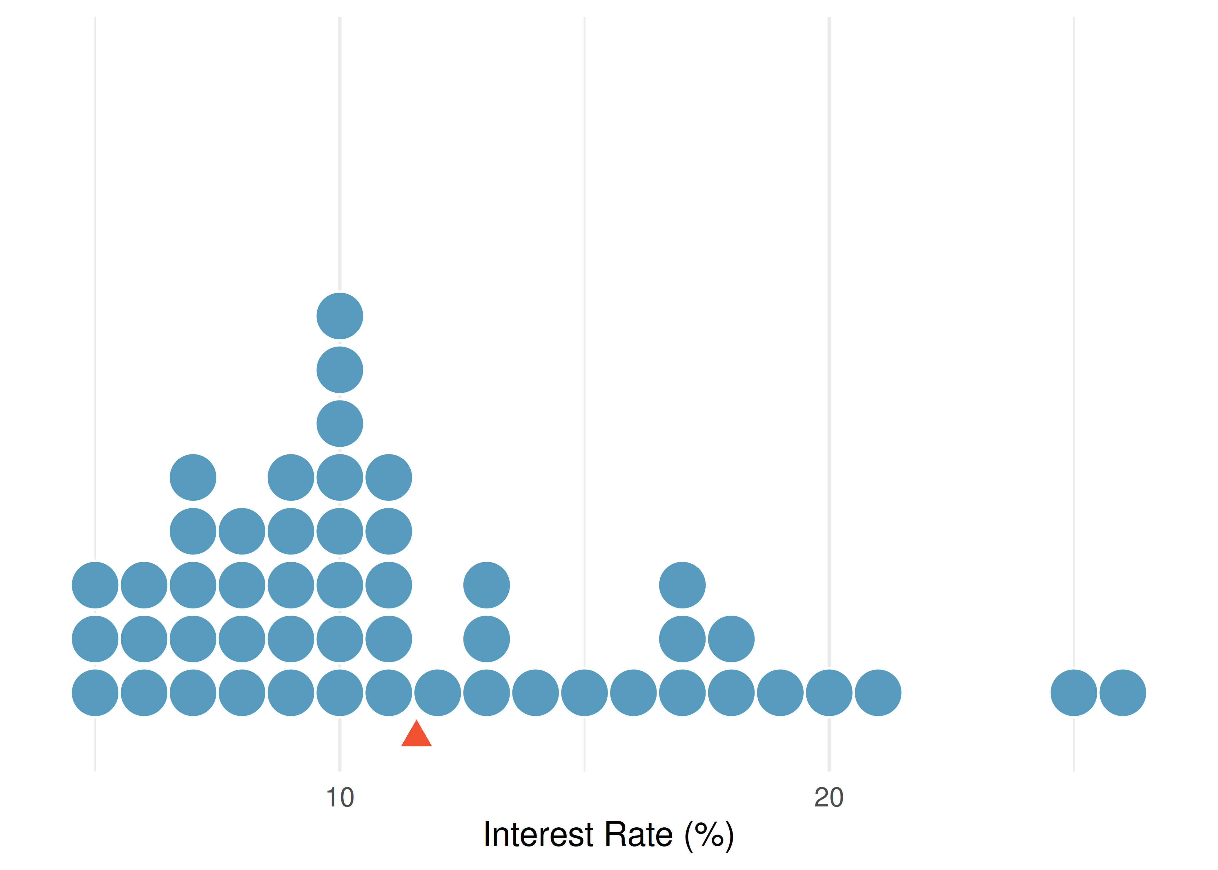
A dot plot is the simplest display for a single quantitative variable. Each observation is represented by a dot placed above its value on a number line. When observations share the same value (or are rounded to the same value), the dots stack vertically.
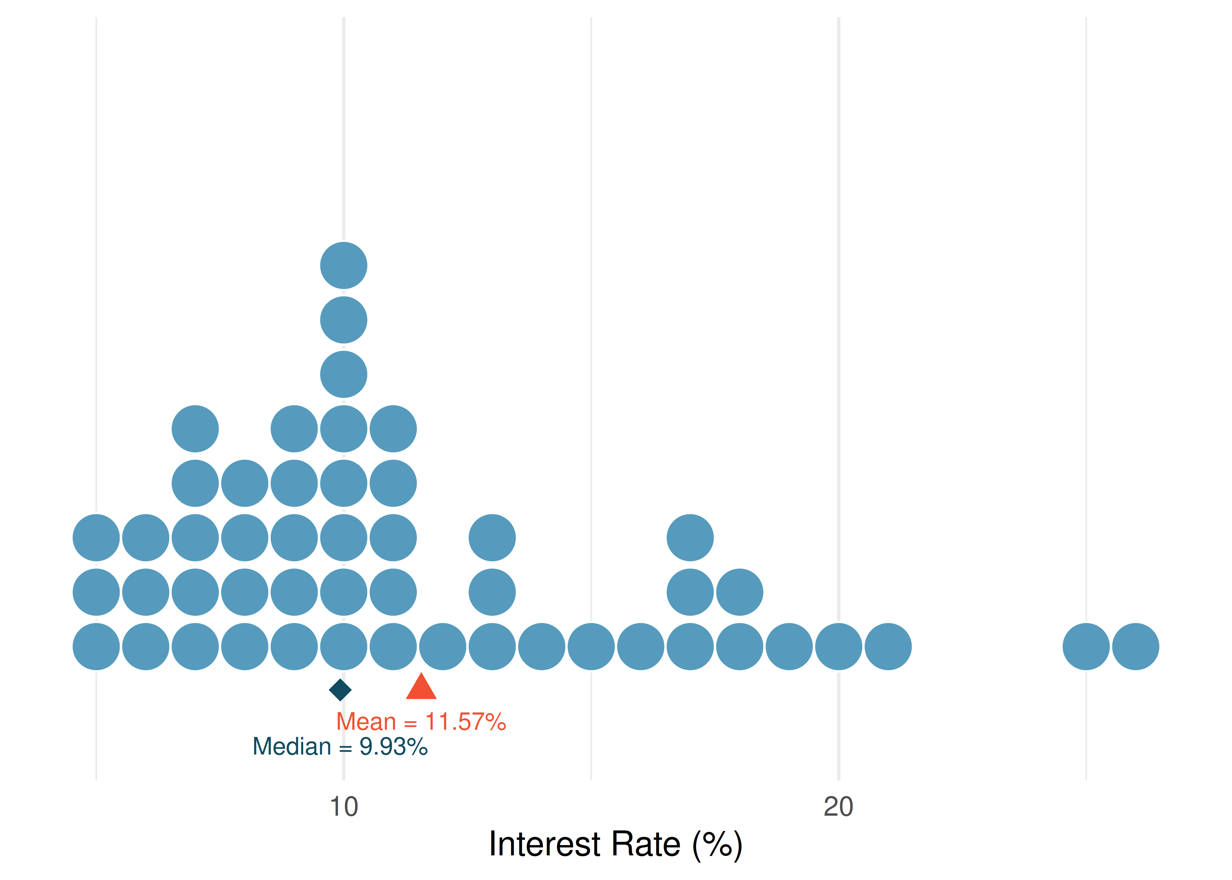
Consider the interest rates on 50 loans from a lending platform. In a dot plot, each of the 50 loans is a single dot. The red triangle marks the mean.
Dot plots are most useful for small datasets (up to about 50–100 observations) where you want to see every individual value. For larger datasets, histograms provide a better summary.
4.1.2 Histograms
A histogram groups quantitative data into bins (intervals) and displays the count or proportion of observations in each bin as a bar. Unlike bar charts for categorical data, histogram bars touch each other because the bins represent a continuous range of values.
To build a histogram, we:
- Choose a bin width (e.g., 2.5 percentage points for interest rates)
- Count how many observations fall in each bin
- Draw bars whose heights equal the counts
| Interest rate bin | Count |
|---|---|
| (5.0% - 7.5%] | 11 |
| (7.5% - 10.0%] | 15 |
| (10.0% - 12.5%] | 8 |
| (12.5% - 15.0%] | 4 |
| (15.0% - 17.5%] | 5 |
| (17.5% - 20.0%] | 4 |
| (20.0% - 22.5%] | 1 |
| (22.5% - 25.0%] | 1 |
| (25.0% - 27.5%] | 1 |
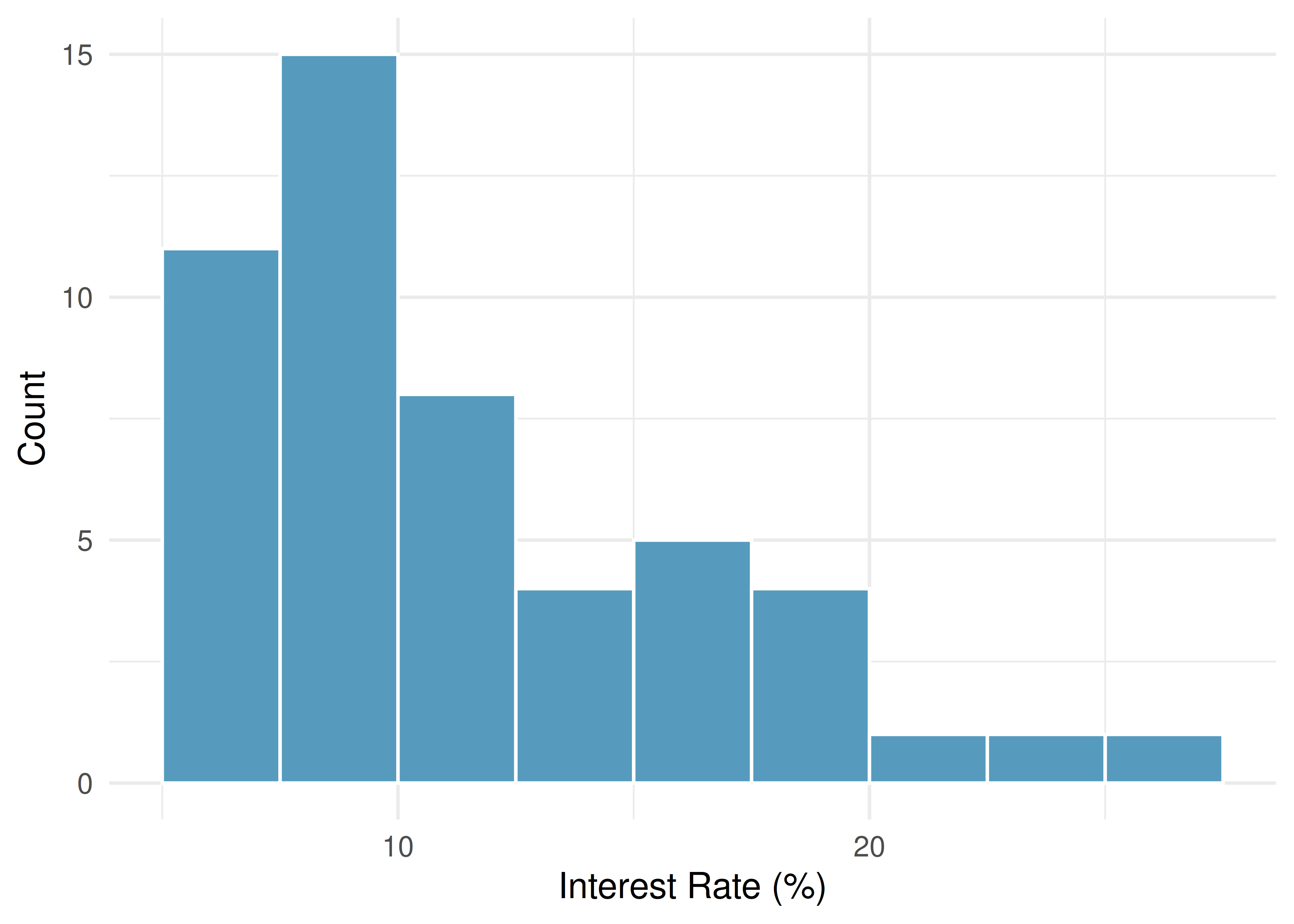
Histograms provide a view of the data density: higher bars indicate where data values are more common, and lower bars indicate where they are less common.
Choosing bin width. The bin width affects the appearance of a histogram. Too few bins (wide bins) can obscure important features; too many bins (narrow bins) can create a jagged display that is hard to interpret. There is no single “correct” bin width — experiment with different choices and look for the display that best reveals the shape of the data.
4.1.3 Density plots
A density plot is a smoothed version of a histogram. Instead of bars, it draws a smooth curve that estimates the distribution of the data. The area under the entire curve equals 1.
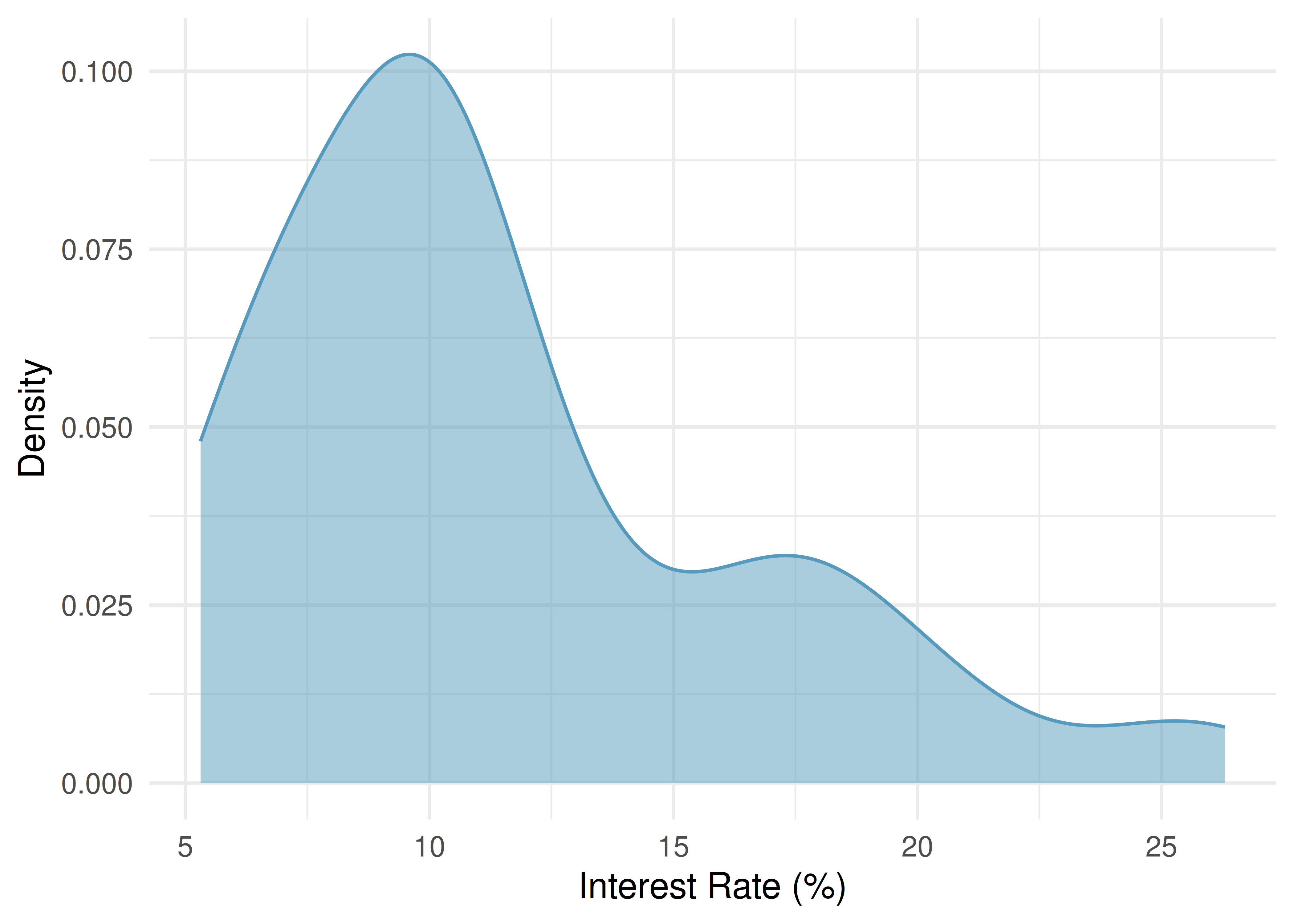
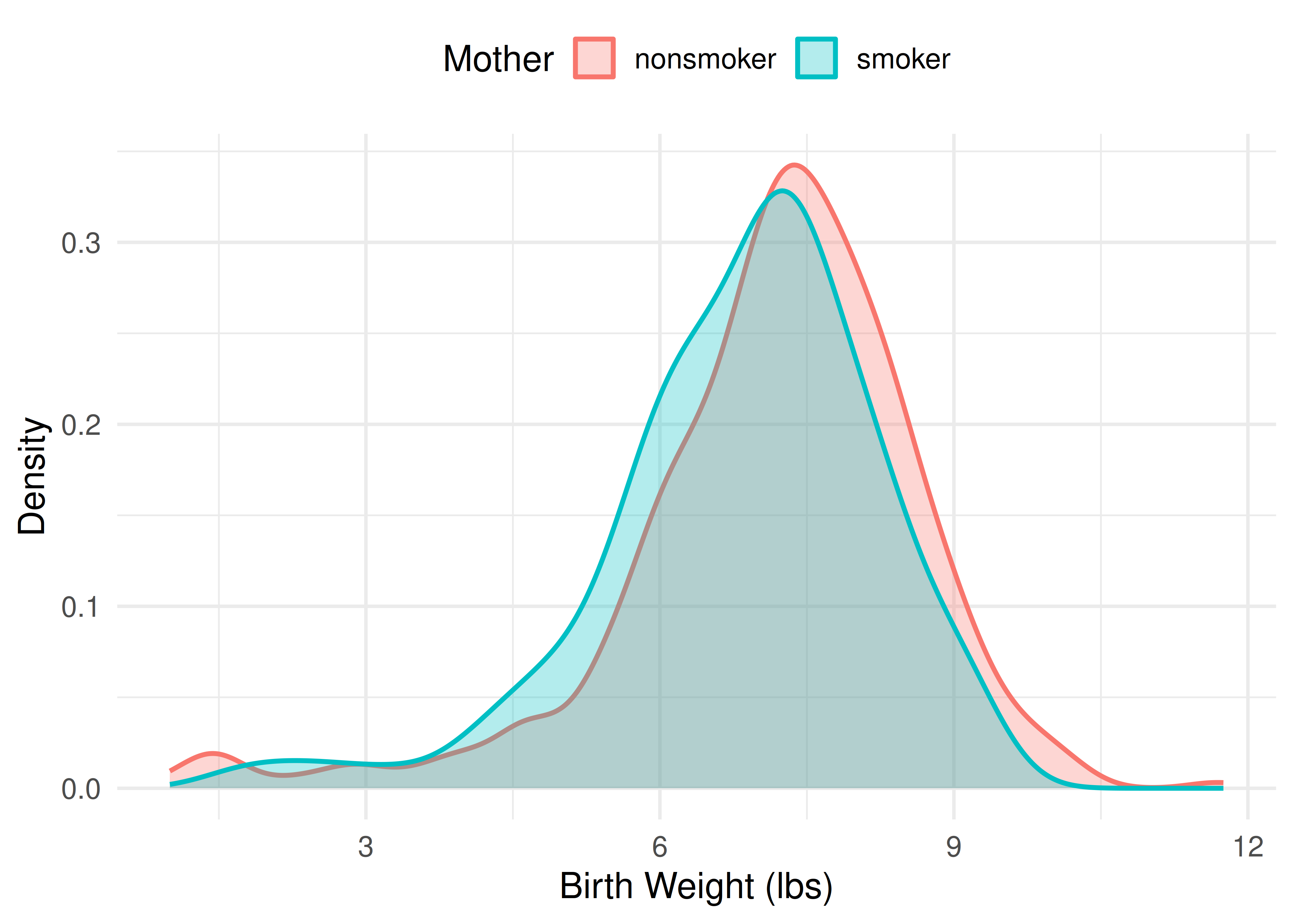
Density plots are particularly useful for comparing the shapes of distributions because overlapping curves are easier to read than overlapping histogram bars. Figure 4.4 overlays the birth-weight distributions for babies of nonsmoking and smoking mothers. Both curves have a similar bell-like shape, but the smokers’ curve sits slightly to the left — a lower average birth weight — a shift that is much easier to see with two overlaid curves than it would be with two sets of competing histogram bars.
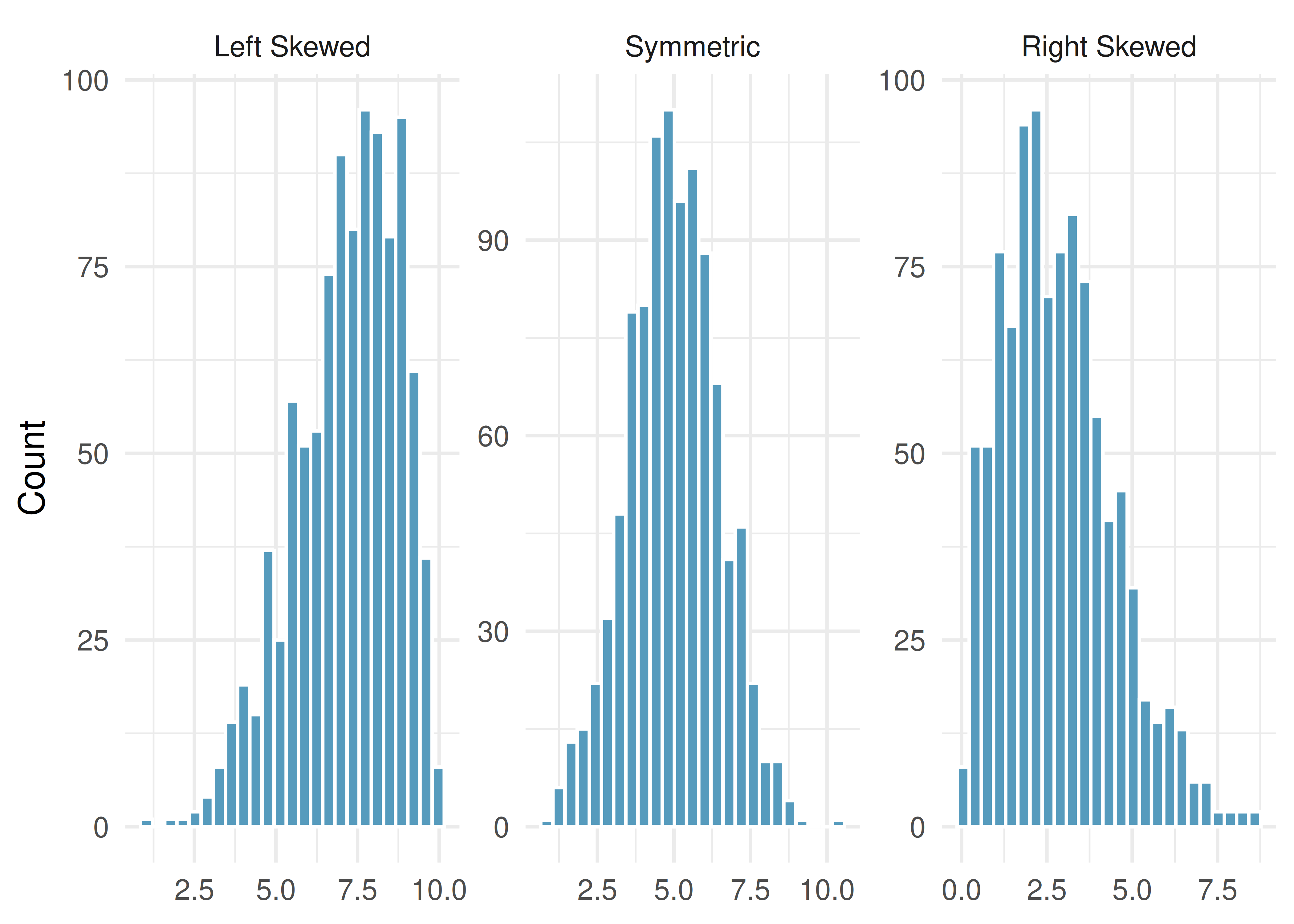
4.1.4 Skewness
Histograms are especially useful for identifying the shape of a distribution. One key characteristic is symmetry.
A distribution is symmetric if the left and right sides are approximately mirror images of each other.
A distribution is right skewed (or skewed to the right) if the right tail — the thinner end of the distribution — is longer. Most observations are on the left, with a few large values pulling the tail to the right.
A distribution is left skewed (or skewed to the left) if the left tail is longer. Most observations are on the right, with a few small values pulling the tail to the left.
Identifying skew. The direction of skew refers to the direction of the long tail, not the direction where most data are concentrated. A distribution with a long tail stretching to the right is right skewed, even though the bulk of the data is on the left side.
Consider the distribution of home prices in a city. Would you expect this distribution to be symmetric, left skewed, or right skewed? Explain your reasoning.
Show answer
Home prices tend to be right skewed. Most homes fall in a moderate price range, but a small number of very expensive homes create a long right tail. This is common with income, wealth, and price data.4.1.5 Modality
A mode is a prominent peak in a distribution. A distribution with a single prominent peak is called unimodal. A distribution with two prominent peaks is bimodal, and a distribution with more than two prominent peaks is multimodal.
A distribution with no prominent peaks — where all values are roughly equally likely — is called uniform.
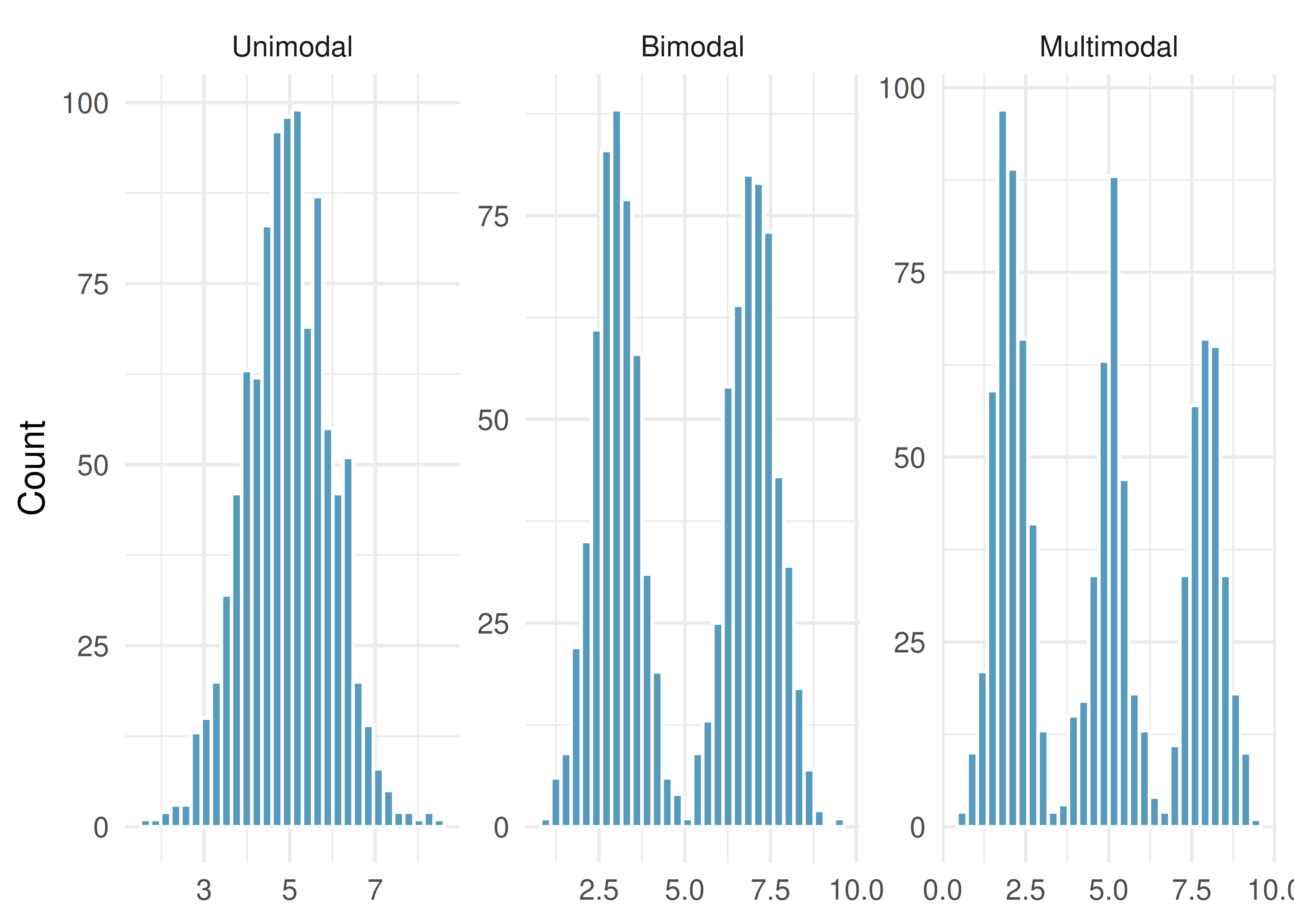
Height measurements were collected from a group of young students and adult teachers at an elementary school. How many modes would you expect in a histogram of these heights?
You would likely expect two modes (bimodal): one centered on the typical height of children and another centered on the typical height of adults.
A histogram of interest rates shows one prominent peak near 7%. There is a very small bump near 20%, but it differs from its neighboring bins by only one or two observations. Would you call this distribution unimodal or bimodal?
Show answer
Unimodal. The small bump near 20% is not a prominent peak — it differs only slightly from its neighbors. We look for prominent peaks when identifying modes.4.1.6 Transforming skewed data (optional)
This topic is optional; later chapters do not depend on it.
Strongly right-skewed variables — incomes, populations, prices — can be hard to read on their original scale, because a long tail of large values squeezes most of the data into a narrow band on the left. A transformation re-expresses the data on a new scale to make the distribution easier to see and describe. The most common choice is the logarithm.
Taking the log of each value pulls in the long right tail and often makes a right-skewed distribution roughly symmetric. Figure 4.7 shows the annual incomes of the 50 loan applicants on the original dollar scale and after a base-10 log transformation.
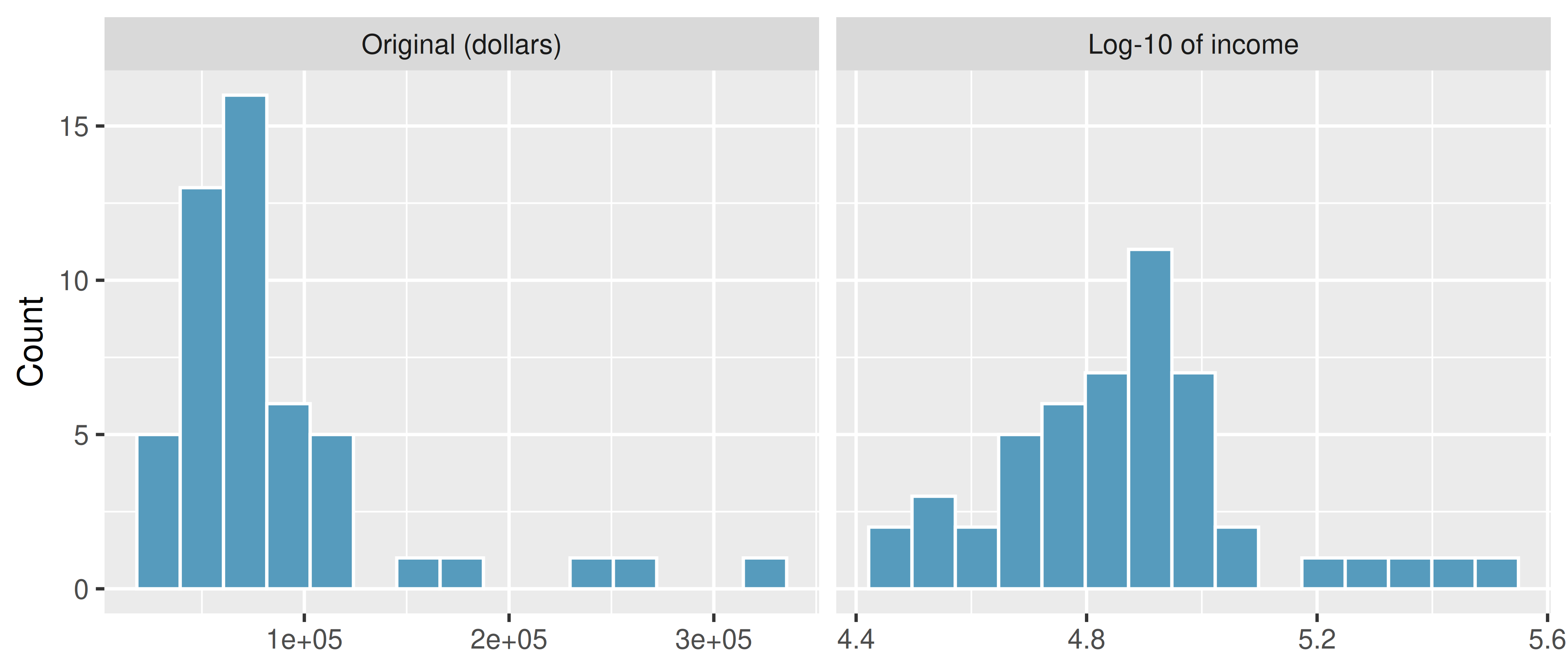
On the log scale a one-unit increase corresponds to a tenfold increase in income (because we used base 10), so the transformed values are easier to compare and summarize. After transforming, you can describe shape, center, and spread on the new scale just as you would for any distribution — but remember that those summaries now describe the log of income, not income in dollars.
When (and when not) to transform. A log transformation is useful for strongly right-skewed, positive-valued data such as incomes, city populations, or reaction times. It cannot be applied to values that are zero or negative, and it is rarely needed for roughly symmetric data. A square-root transformation is a milder alternative for moderate skew. Whether to transform depends on your goal: transformations help reveal structure, but the original scale is usually what readers ultimately care about.
4.2 Measures of center
4.2.1 The mean
The mean (also called the average) is computed by adding up all the observed values and dividing by the number of observations.
Mean.
The sample mean can be calculated as the sum of the observed values divided by the number of observations:
\[\bar{x} = \frac{x_1 + x_2 + \cdots + x_n}{n}\]
The notation \(\bar{x}\) (read “x-bar”) represents the sample mean. It’s useful to think of the mean as the balancing point of a distribution. In the dot plot above, the mean of 11.57% is where the data would balance if placed on a seesaw — the few high interest rates on the right pull the balance point away from where most of the dots are concentrated.
The population mean is denoted by the Greek letter \(\mu\) (pronounced “mew”). We often cannot measure \(\mu\) directly because we rarely have access to every member of the population. Instead, we estimate \(\mu\) using the sample mean \(\bar{x}\).
In the formula for the mean, what does \(x_1\) correspond to? And \(x_2\)? What does \(x_i\) represent in general?
Show answer
\(x_1\) is the value of the variable for the first observation in the dataset, \(x_2\) is the value for the second observation, and \(x_i\) is the value for the \(i\)th observation. For example, if the variable is interest rate, \(x_4\) is the interest rate of the fourth loan.Suppose we want to compute the average income per person in the US. We might think to take the mean of per capita incomes across all 3,142 counties. What is wrong with this approach?
Each county represents a different number of people. If we simply average the county-level incomes, we treat a county with 5,000 residents the same as one with 5,000,000 residents. Instead, we should compute the total income for each county, add up all counties’ totals, and divide by the total population. This is called a weighted mean. Failing to weight by population would underestimate the true average because larger, higher-income urban counties would be underrepresented.
4.2.2 The median
The median is the value in the middle of the ordered data. It divides the dataset in half: 50% of the observations fall below the median and 50% fall above it.
Median: the number in the middle.
If the data are ordered from smallest to largest, the median is the observation right in the middle. If there are an even number of observations, the median is the average of the two middle values.
The dot plot below shows both the mean and the median marked on the interest rate data. Notice that the median (9.93%) is lower than the mean (11.57%) — the few loans with very high interest rates pull the mean to the right, but the median stays anchored in the middle of the data.
For a dataset with 7 observations arranged in order, which observation is the median?
Show answer
The 4th observation. With an odd number of observations, the median is the single middle value. There are 3 observations below it and 3 above it.4.2.3 The mode
The mode is the most frequently occurring value in a dataset. While useful for categorical data (e.g., the most common eye color), the mode is less useful for continuous quantitative data because many values may occur only once.
In practice, when we refer to the “mode” of a quantitative distribution, we usually mean the location of a prominent peak in a histogram or density plot (as discussed in Section 4.1), rather than a single repeated value.
4.2.4 How skewness affects the mean and median
Now we can connect what we see in a histogram to the sample statistics we computed earlier.
In a symmetric distribution, the mean and median are approximately equal.
In a right-skewed distribution, the mean is pulled toward the right tail and is larger than the median.
In a left-skewed distribution, the mean is pulled toward the left tail and is smaller than the median.
Relationship between mean, median, and skewness.
- Right skewed: \(\text{mean} > \text{median}\)
- Symmetric: \(\text{mean} \approx \text{median}\)
- Left skewed: \(\text{mean} < \text{median}\)
The direction of skew pulls the mean toward the tail. The median is more resistant to this pull.
The interest rate distribution is right skewed, with a mean of 11.57% and a median of 9.93%. How does the skewness explain the gap between these two values?
The few loans with very high interest rates (above 20%) pull the mean to the right. The median, which simply finds the middle value, is not affected by how extreme those high rates are. This is why the mean (11.57%) is larger than the median (9.93%) in a right-skewed distribution.
See it in action. Open the Descriptive Statistics Explorer on the interest-rate data — switch between histograms, dot plots, and box plots, and compare the mean and median in the summary panel.
4.2.5 When to use the mean vs. the median
The mean and median measure different things. The choice between them depends on the context:
A company wants to understand its profit per customer. Should it use the mean or the median?
It depends on the question:
- If the concern is overall profitability (total profit divided by number of customers), the mean is the right statistic. A company could have a positive median profit per customer and still be unprofitable if a few customers generate large losses.
- If the concern is understanding what the typical customer experience looks like, the median tells you more about the profit from a representative customer.
Mean vs. median: which to choose?
- The mean is best when you care about the total or aggregate (e.g., total revenue, total time spent).
- The median is best when you care about the typical observation, especially when the distribution is skewed or contains outliers.
- For symmetric distributions without extreme outliers, the mean and median are approximately equal and either is appropriate.
The distribution of home prices in a city is strongly right skewed. If you wanted to describe the price of a typical home, should you report the mean or the median? Why?
Show answer
The median. In a right-skewed distribution, a few very expensive homes pull the mean upward, making it unrepresentative of a typical home price. The median is not affected by these extreme values and better represents what a typical buyer would encounter.4.3 Measures of spread
Knowing the center of a distribution is important, but it tells only part of the story. Two distributions can have the same center but look very different if one is tightly clustered and the other is widely dispersed. We need measures of variability (also called spread or dispersion).
4.3.1 Range
The simplest measure of spread is the range: the difference between the maximum and minimum values.
\[\text{Range} = \text{Maximum} - \text{Minimum}\]
While easy to compute, the range has a major weakness: it depends entirely on the two most extreme observations. A single outlier can dramatically increase the range, giving a misleading impression of the overall variability. For this reason, we usually prefer the IQR or standard deviation.
4.3.2 The interquartile range (IQR)
The interquartile range measures the spread of the middle 50% of the data. It will reappear as the length of the box when we construct box plots later in this chapter.
Interquartile range (IQR).
The IQR is computed as:
\[\text{IQR} = Q_3 - Q_1\]
where \(Q_1\) is the first quartile (25th percentile) and \(Q_3\) is the third quartile (75th percentile). To find them by hand, split the ordered data at the median: \(Q_1\) is the median of the lower half and \(Q_3\) is the median of the upper half. When the number of observations is odd, the median itself is left out of both halves.
For the 50-loan interest rate data, \(Q_1 = 7.96\%\) and \(Q_3 = 13.72\%\). What is the IQR, and what does it tell us?
\(\text{IQR} = 13.72\% - 7.96\% = 5.76\) percentage points. This means the middle 50% of loans have interest rates spanning a range of about 6 percentage points. Half of all loans have rates between about 8% and 14%.
4.3.3 Variance and standard deviation
The standard deviation is the most commonly used measure of spread. It roughly describes how far the typical observation is from the mean.
We start with the concept of a deviation: the distance of an observation from the mean.
\[\text{deviation of } x_i = x_i - \bar{x}\]
Some deviations are positive (observations above the mean) and some are negative (observations below the mean). If we simply averaged the deviations, the positives and negatives would cancel out, giving us zero. To avoid this, we square each deviation before averaging.
The variance (denoted \(s^2\)) is the average of the squared deviations, using \(n-1\) in the denominator:
\[s^2 = \frac{\sum_{i=1}^{n}(x_i - \bar{x})^2}{n-1} = \frac{(x_1 - \bar{x})^2 + (x_2 - \bar{x})^2 + \cdots + (x_n - \bar{x})^2}{n-1}\]
The standard deviation (denoted \(s\)) is the square root of the variance:
\[s = \sqrt{s^2} = \sqrt{\frac{\sum_{i=1}^{n}(x_i - \bar{x})^2}{n-1}}\]
We divide by \(n - 1\) rather than \(n\) when computing a sample’s variance. The mathematical reasons are beyond this course, but the practical effect is that this makes the statistic slightly more reliable as an estimate of the population variance.
Why do we square the deviations instead of just taking the absolute value? What are the two consequences of squaring?
Show answer
Squaring the deviations does two things: (1) it eliminates negative signs (since any number squared is non-negative), and (2) it makes large deviations relatively much larger than small ones. An observation that is 10 units from the mean contributes 100 to the sum of squared deviations, while one that is 2 units away contributes only 4. This means the variance and standard deviation are especially sensitive to outliers.The following histogram shows the interest rate data with shaded bands marking one and two standard deviations from the mean. The standard deviation of 5.05 percentage points gives us a sense of how spread out the data are around the mean of 11.57%.
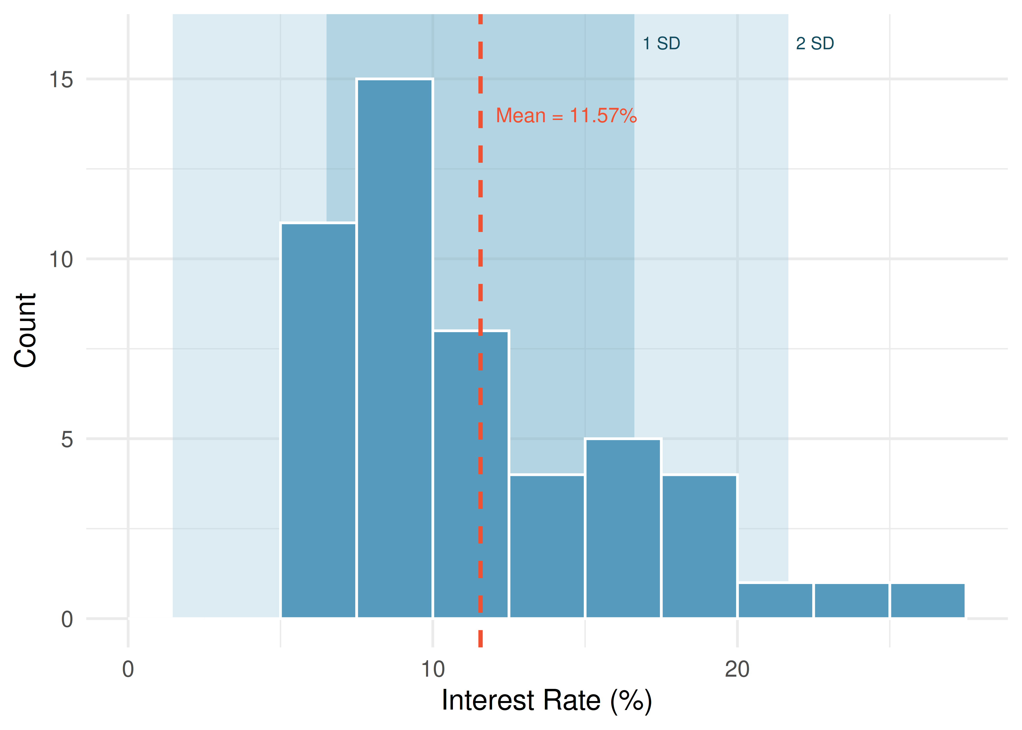
For the 50-loan interest rate data, the variance is \(s^2 = 25.52\) and the standard deviation is \(s = \sqrt{25.52} = 5.05\) percentage points. What does a standard deviation of 5.05 percentage points mean in context?
The standard deviation tells us that interest rates typically deviate about 5 percentage points from the mean (11.57%). Most loans have rates that are within one standard deviation of the mean — roughly between 6.5% and 16.6%.
Like the mean, the population values for variance and standard deviation have special symbols: \(\sigma^2\) for the variance and \(\sigma\) for the standard deviation. The Greek letter \(\sigma\) is pronounced “sigma.”
Variance and standard deviation.
The variance is the average squared distance from the mean. The standard deviation is the square root of the variance. The standard deviation represents the typical deviation of observations from the mean. Often about 68% of the data will be within one standard deviation of the mean and about 95% will be within two standard deviations. However, these percentages are not strict rules.
4.4 Outliers and robust statistics
4.4.1 Identifying outliers
An outlier is an observation that appears extreme relative to the rest of the data.
Examining data for outliers serves several purposes:
- Identifying strong skew in the distribution
- Identifying possible data collection or data entry errors
- Providing insight into interesting or unusual properties of the data
Not all outliers are errors, and not all errors are outliers. Some datasets naturally have long tails and outlying points are legitimate observations. Never remove an outlier without a substantive reason (e.g., confirmed data entry error). Blindly removing outliers can lead to misleading conclusions.
A common rule for identifying outliers in the context of box plots is the 1.5 IQR rule: any observation more than \(1.5 \times \text{IQR}\) below \(Q_1\) or above \(Q_3\) is flagged as a potential outlier. This is the rule used to determine which points appear as dots beyond the whiskers of a box plot.
4.4.2 Robust statistics
A statistic is called robust (or resistant) if extreme observations have little effect on its value.
Consider what happens when we change a single extreme observation in the interest rate data. The table below shows how the median, IQR, mean, and standard deviation respond when the most extreme value (26.3%) is moved:
| Scenario | Median | IQR | Mean | SD |
|---|---|---|---|---|
| Original data | 9.93 | 5.76 | 11.57 | 5.05 |
| Move 26.3% to 15% | 9.93 | 5.76 | 11.34 | 4.61 |
| Move 26.3% to 35% | 9.93 | 5.76 | 11.74 | 5.68 |
In the table above, the median and IQR are unchanged across all three scenarios, but the mean and standard deviation shift. Why?
The median and IQR are determined by the values near the middle of the ordered data (\(Q_1\), the median, and \(Q_3\)). Moving a single extreme value does not change the positions of these middle values. The mean and standard deviation, however, use every data value in their calculations. The mean adds up all values, so changing one extreme value changes the sum. The standard deviation squares deviations from the mean, so extreme values have an outsized effect.
Robust vs. non-robust statistics.
| Robust (resistant to outliers) | Not robust (sensitive to outliers) |
|---|---|
| Median | Mean |
| IQR | Standard deviation |
| Range |
When a distribution is skewed or contains outliers, robust statistics (median and IQR) often give a more representative summary of the “typical” observation. When a distribution is roughly symmetric with no extreme outliers, the mean and standard deviation work well and carry additional mathematical advantages.
The distribution of salaries at a company is right skewed because a few executives earn much more than most employees. Which pair of sample statistics would better represent the “typical” salary and its variability: (mean, standard deviation) or (median, IQR)?
Show answer
The median and IQR. In a right-skewed distribution, the mean is pulled upward by the high executive salaries, making it unrepresentative of the typical employee. The median is not affected by these extreme values, and the IQR captures the spread of the middle 50% of salaries.The distribution of loan amounts is right skewed. If you wanted to understand the typical loan size, should you be more interested in the mean or the median?
Show answer
If the goal is to understand what a typical individual loan looks like, the median is probably more useful. However, if the goal is to understand something that scales — such as the total amount of money needed on hand to fund 1,000 loans — then the mean would be more useful.See it in action. Open the Outliers and Robust Statistics activity on US county populations — one of the most skewed distributions you’ll encounter — to see firsthand why the mean and SD mislead and the median and IQR don’t.
4.5 Box plots
A box plot (also called a box-and-whisker plot) provides a compact summary of a distribution using five numbers: the minimum, first quartile (\(Q_1\)), median, third quartile (\(Q_3\)), and maximum — with special handling for outliers.
4.5.1 Constructing a box plot
The components of a box plot are:
The box: Spans from \(Q_1\) (the 25th percentile) to \(Q_3\) (the 75th percentile). This box contains the middle 50% of the data. The length of the box is the interquartile range (IQR = \(Q_3 - Q_1\)).
The median line: A line inside the box marks the median (the 50th percentile), which divides the data in half.
The whiskers: Lines extending from the box toward the smallest and largest observations that are not outliers. Specifically, the whiskers extend to the most extreme data points within \(1.5 \times \text{IQR}\) of the box.
Outlier points: Any observations beyond \(1.5 \times \text{IQR}\) from the edges of the box are plotted individually as dots. These are potential outliers.

The first quartile (\(Q_1\)) is the 25th percentile — 25% of the data fall below this value. The third quartile (\(Q_3\)) is the 75th percentile — 75% of the data fall below this value.
The interquartile range (IQR) is the range of the middle 50% of the data: \(\text{IQR} = Q_3 - Q_1\).
4.5.2 Interpreting a box plot
A box plot of interest rates shows: the left edge of the box at about 8%, the median line at about 10%, and the right edge of the box at about 14%. Two dots appear beyond the right whisker at about 25% and 26%. What can we learn from this display?
The middle 50% of interest rates fall between about 8% and 14% (the IQR is about 6 percentage points). The median rate is about 10%. The right whisker extends to about 21%, and the two dots beyond the whisker at 25% and 26% indicate unusually high interest rates. The box plot also reveals right skew, since the median is closer to the left edge of the box and the right whisker is longer than the left whisker.
What percentage of observations fall between \(Q_1\) and the median? What percentage fall between the median and \(Q_3\)?
Show answer
25% of the data fall between \(Q_1\) and the median, and another 25% fall between the median and \(Q_3\). Together, the middle 50% of the data lie within the box.See it in action. Open the Comparing Charts for Quantitative Data activity to walk through dot plots, histograms, and box plots on home sale prices and see what each chart type reveals (and hides).
4.6 Describing a distribution
A complete description of a distribution should address three things: shape, center, and spread.
A good description of a distribution should always:
- Name the shape: symmetric or skewed (and direction), and the number of modes
- Give the center: report the mean and/or median with units
- Give the spread: report the standard deviation and/or IQR with units
- Note any unusual features: outliers, gaps, clusters
- Use context: refer to the actual variable and its units, not just abstract numbers
Example: “The distribution of commute times is unimodal and right skewed, with a median of 22 minutes and an IQR of 15 minutes. A few commuters have commute times exceeding 90 minutes.”
Write a complete description of the interest rate distribution from the loan dataset.
The distribution of interest rates is unimodal and right skewed. The center is around 10–12% (median = 9.93%, mean = 11.57%). The spread is moderate: the standard deviation is 5.05 percentage points and the IQR is about 6 percentage points. There are a few unusually high interest rates above 20%, which contribute to the right skew and the gap between the mean and median.
A description says: “The mean is 15 and the standard deviation is 3.” What is missing from this description?
Show answer
The description lacks context (what variable? what units?), shape information (symmetric? skewed? unimodal?), and any mention of unusual features. A better version might be: “The distribution of wait times (in minutes) is approximately symmetric and unimodal, with a mean of 15 minutes and a standard deviation of 3 minutes. There are no obvious outliers.”4.7 The empirical rule and Chebyshev’s theorem
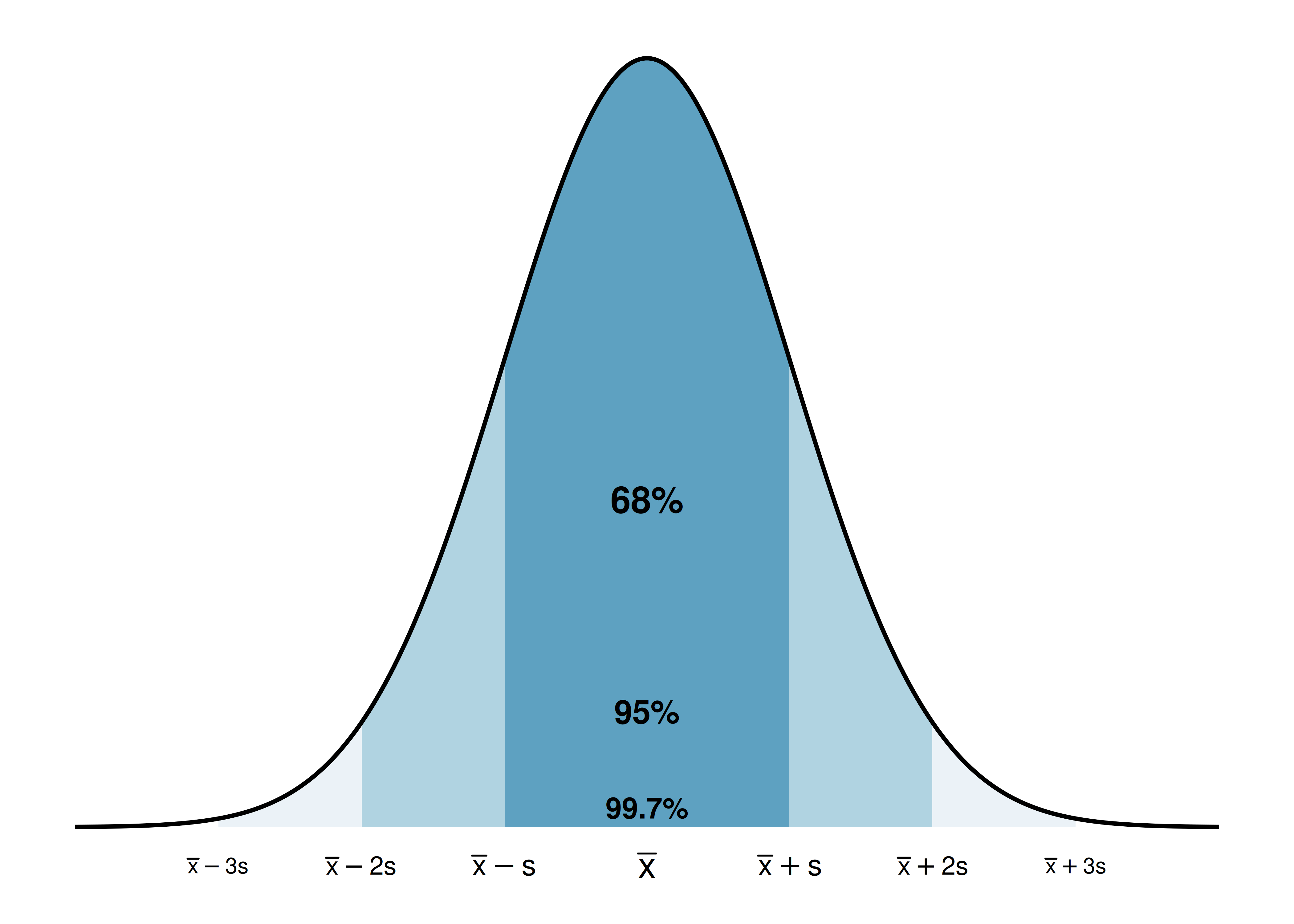
4.7.1 The empirical rule (68-95-99.7 rule)
For distributions that are approximately bell-shaped (symmetric and unimodal), the standard deviation provides a useful ruler. The most important bell-shaped model is the normal distribution — it comes up so often in statistics that it has its own name. We’ll study it formally later. Not every bell-shaped distribution is exactly normal, but the rule below works well for any roughly bell-shaped distribution.
The empirical rule.
For a roughly bell-shaped distribution:
- About 68% of the data fall within 1 standard deviation of the mean: \((\bar{x} - s, \ \bar{x} + s)\)
- About 95% of the data fall within 2 standard deviations of the mean: \((\bar{x} - 2s, \ \bar{x} + 2s)\)
- About 99.7% of the data fall within 3 standard deviations of the mean: \((\bar{x} - 3s, \ \bar{x} + 3s)\)
The heights of adult women in the US are approximately bell-shaped with a mean of 64.5 inches and a standard deviation of 2.5 inches. Use the empirical rule to estimate the range of heights for the middle 95% of women.
By the empirical rule, about 95% of the data fall within 2 standard deviations of the mean:
\[64.5 - 2(2.5) = 59.5 \text{ inches} \quad \text{to} \quad 64.5 + 2(2.5) = 69.5 \text{ inches}\]
So about 95% of adult women in the US are between 59.5 inches (4’11.5”) and 69.5 inches (5’9.5”) tall.
Using the same height distribution (mean = 64.5 inches, SD = 2.5 inches), what percentage of women are shorter than 59.5 inches?
Show answer
By the empirical rule, about 95% of women are between 59.5 and 69.5 inches. That means about 5% are outside this range. Since the distribution is symmetric, about half of that 5% (i.e., about 2.5%) are below 59.5 inches.The empirical rule is only an approximation, and it works best for distributions that are roughly bell-shaped. For skewed or multimodal distributions, the percentages can be quite different. For example, in a right-skewed distribution, more than 68% of the data may fall within one standard deviation of the mean because the bulk of the data is concentrated on one side.
Three distributions all have the same mean (0) and the same standard deviation (1), but one is bimodal, one is bell-shaped, and one is right skewed. Would the empirical rule work well for all three? Why or why not?
Show answer
No. The empirical rule works well only for the bell-shaped distribution. The bimodal distribution would have more data near the edges (near the two peaks) and less in the middle. The right-skewed distribution would have more data close to the mean on one side and a long tail on the other. In both cases, the 68-95-99.7 percentages would be poor approximations.4.7.2 Chebyshev’s theorem
While the empirical rule applies only to bell-shaped distributions, Chebyshev’s theorem provides a guarantee that works for any distribution, regardless of shape:
Chebyshev’s theorem.
For any distribution (regardless of shape), at least \(\left(1 - \frac{1}{k^2}\right) \times 100\%\) of the data fall within \(k\) standard deviations of the mean, for any \(k > 1\).
| Standard deviations (\(k\)) | At least this % of data |
|---|---|
| 2 | 75% |
| 3 | 89% |
| 4 | 93.75% |
Chebyshev’s theorem is weaker than the empirical rule (it guarantees “at least 75%” within 2 standard deviations, while the empirical rule says “about 95%” for bell-shaped data), but it has the advantage of applying to every distribution. It is most useful when you cannot assume the distribution is bell-shaped.
4.8 Chapter review
4.8.1 Summary
This chapter introduced the tools for exploring quantitative data — both visual and numerical. Dot plots show individual values for small datasets, histograms reveal the shape and density of a distribution, density plots provide smoothed alternatives, and box plots give a compact five-number summary. Distribution shape is described using symmetry (left skewed, symmetric, right skewed) and modality (unimodal, bimodal, multimodal). The mean and median measure center, with the mean being the balancing point and the median being the middle value. The standard deviation and IQR measure spread, with the standard deviation roughly representing the typical deviation from the mean and the IQR representing the range of the middle 50%. The median and IQR are robust to outliers, while the mean and standard deviation are sensitive to extreme values. The empirical rule connects the standard deviation to the distribution shape for bell-shaped data: about 68%, 95%, and 99.7% of observations fall within 1, 2, and 3 standard deviations of the mean.
4.8.2 Key terms
- Dot plot, histogram, density plot, box plot
- Data density, bin width
- Symmetric, left skewed, right skewed, tail
- Unimodal, bimodal, multimodal, uniform
- Mean (\(\bar{x}\)), median, mode
- Population mean (\(\mu\)), weighted mean
- Deviation, variance (\(s^2\)), standard deviation (\(s\))
- Population variance (\(\sigma^2\)), population standard deviation (\(\sigma\))
- Range, interquartile range (IQR)
- First quartile (\(Q_1\)), third quartile (\(Q_3\)), percentile
- Outlier, robust statistic (resistant statistic)
- Empirical rule (68-95-99.7 rule), Chebyshev’s theorem
4.9 Exercises
Answers to odd-numbered exercises are provided in the Exercise Solutions appendix at the back of the book.
- Make-up exam. In a class of 25 students, 24 of them took an exam in class and 1 student took a make-up exam the following day. The professor graded the first batch of 24 exams and found an average score of 74 points with a standard deviation of 8.9 points. The student who took the make-up the following day scored 64 points on the exam.
Does the new student’s score increase or decrease the average score?
What is the new average?
Does the new student’s score increase or decrease the standard deviation of the scores?
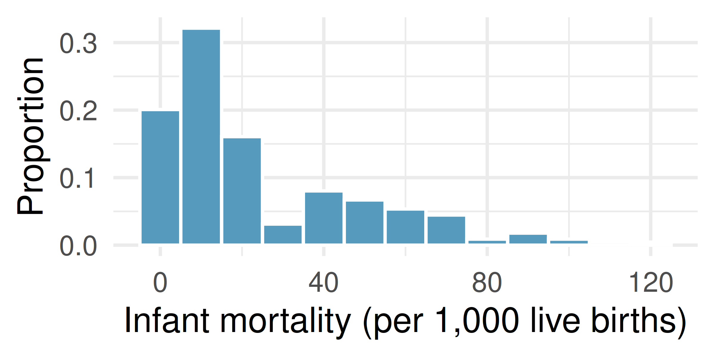
- Infant mortality. The infant mortality rate is defined as the number of infant deaths per 1,000 live births. This rate is often used as an indicator of the level of health in a country. The relative frequency histogram below shows the distribution of estimated infant death rates for 224 countries for which such data were available in 2014.
Estimate Q1, the median, and Q3 from the histogram.
Would you expect the mean of this dataset to be smaller or larger than the median? Explain your reasoning.
- Days off at a mining plant. Workers at a particular mining site receive an average of 35 days paid vacation, which is lower than the national average. The manager of this plant is under pressure from a local union to increase the amount of paid time off. However, he does not want to give more days off to the workers because that would be costly. Instead he decides he should fire 10 employees in such a way as to raise the average number of days off that are reported by his employees. In order to achieve this goal, should he fire employees who have the most number of days off, least number of days off, or those who have about the average number of days off?
- Medians and IQRs. For each part, compare distributions A and B based on their medians and IQRs. You do not need to calculate these statistics; simply state how the medians and IQRs compare. Make sure to explain your reasoning. Hint: It may be useful to sketch dot plots of the distributions.
A: 3, 5, 6, 7, 9; B: 3, 5, 6, 7, 20
A: 3, 5, 6, 7, 9; B: 3, 5, 7, 8, 9
A: 1, 2, 3, 4, 5; B: 6, 7, 8, 9, 10
A: 0, 10, 50, 60, 100; B: 0, 100, 500, 600, 1000
- Means and SDs. For each part, compare distributions A and B based on their means and standard deviations. You do not need to calculate these statistics; simply state how the means and the standard deviations compare. Make sure to explain your reasoning. Hint: It may be useful to sketch dot plots of the distributions.
A: 3, 5, 5, 5, 8, 11, 11, 11, 13; B: 3, 5, 5, 5, 8, 11, 11, 11, 20
A: -20, 0, 0, 0, 15, 25, 30, 30; B: -40, 0, 0, 0, 15, 25, 30, 30
A: 0, 2, 4, 6, 8, 10; B: 20, 22, 24, 26, 28, 30
A: 100, 200, 300, 400, 500; B: 0, 50, 300, 550, 600
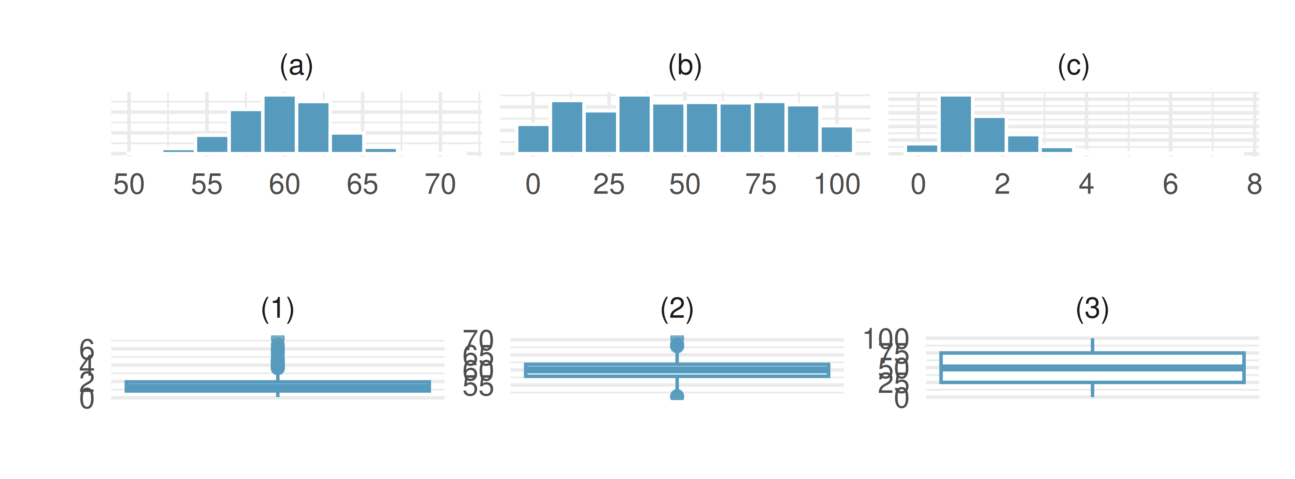
- Histograms and box plots. Describe (in words) the distribution in the histograms below and match them to the box plots.
- Air quality. Daily air quality is measured by the air quality index (AQI) reported by the Environmental Protection Agency. This index reports the pollution level and what associated health effects might be a concern. The index is calculated for five major air pollutants regulated by the Clean Air Act and takes values from 0 to 300, where a higher value indicates lower air quality. AQI was reported for a 356 days in 2022 in Durham, NC. The histogram below shows the distribution of the AQI values on these days.
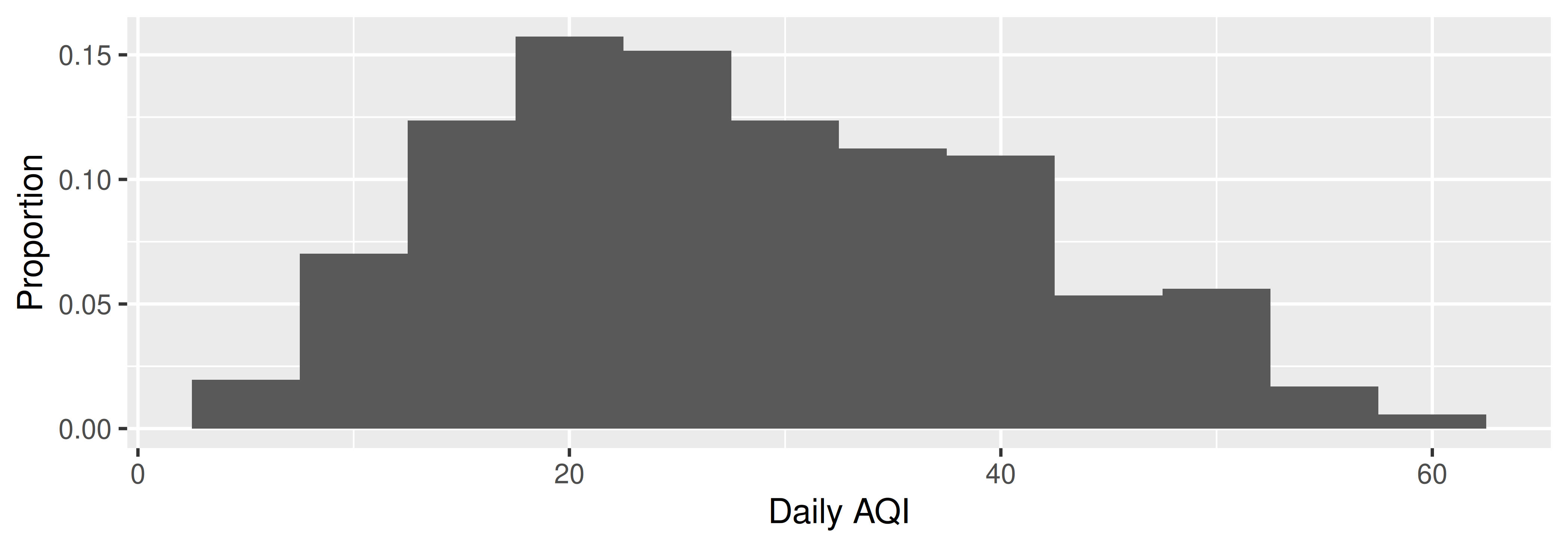
Estimate the median AQI value of this sample.
Would you expect the mean AQI value of this sample to be higher or lower than the median? Explain your reasoning.
Estimate Q1, Q3, and IQR for the distribution.
Would any of the days in this sample be considered to have an unusually low or high AQI? Explain your reasoning.
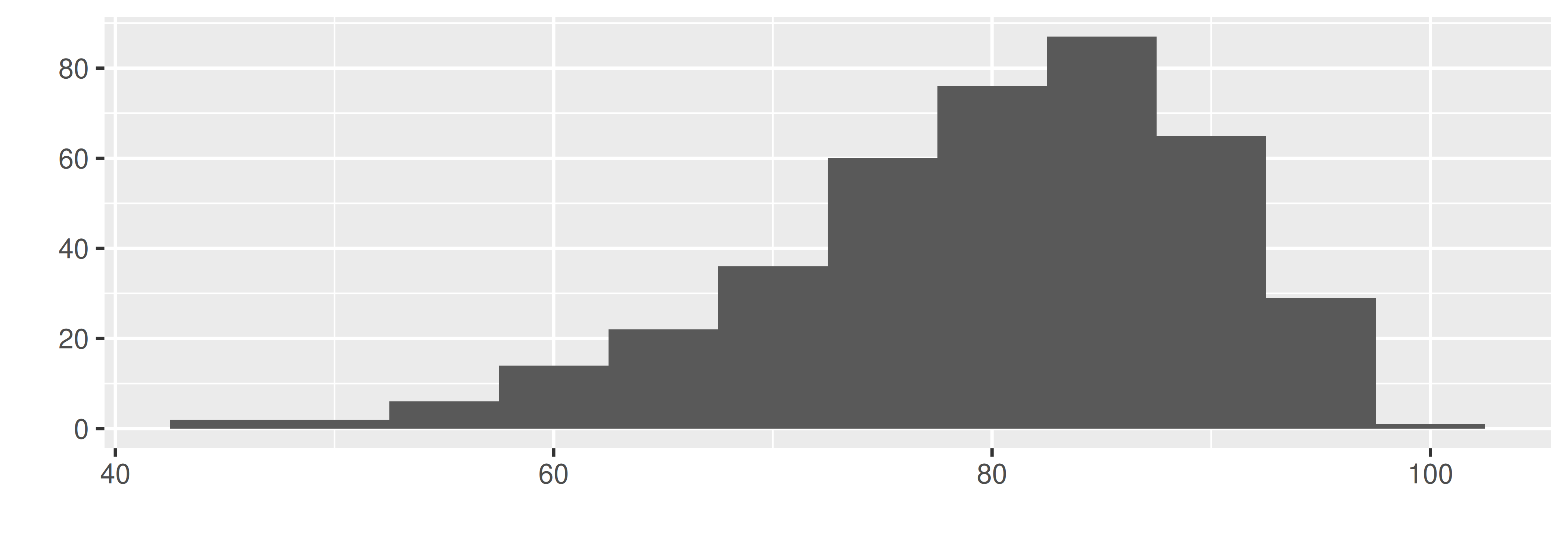
- Median vs. mean. Estimate the median for the 400 observations shown in the histogram, and note whether you expect the mean to be higher or lower than the median.
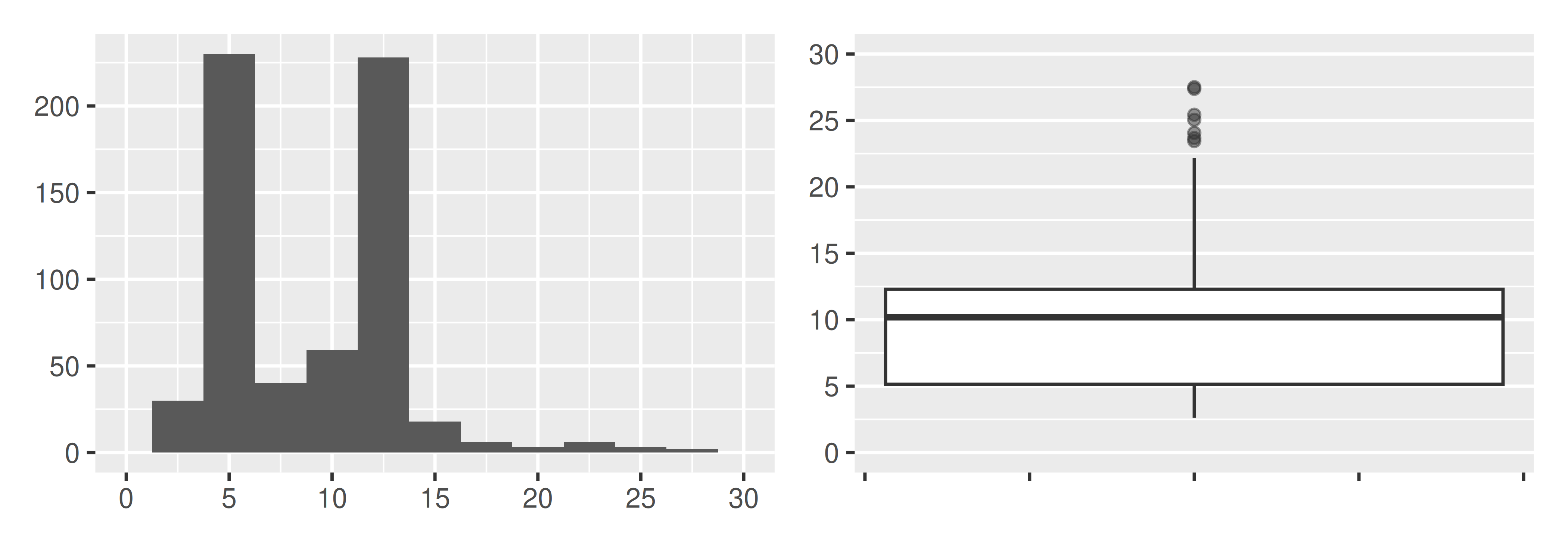
- Histograms vs. box plots. Compare the two plots below. What characteristics of the distribution are apparent in the histogram and not in the box plot? What characteristics are apparent in the box plot but not in the histogram?
- Facebook friends. Facebook data indicate that 50% of Facebook users have 100 or more friends, and that the average friend count of users is 190. What do these findings suggest about the shape of the distribution of number of friends of Facebook users? (Backstrom 2011)
- Distributions and appropriate statistics. For each of the following, state whether you expect the distribution to be symmetric, right skewed, or left skewed. Also specify whether the mean or median would best represent a typical observation in the data, and whether the variability of observations would be best represented using the standard deviation or IQR. Explain your reasoning.
Number of pets per household.
Distance to work, i.e., number of miles between work and home.
Heights of adult males.
Age at death.
Exam grade on an easy test.
- Distributions and appropriate statistics. For each of the following, state whether you expect the distribution to be symmetric, right skewed, or left skewed. Also specify whether the mean or median would best represent a typical observation in the data, and whether the variability of observations would be best represented using the standard deviation or IQR. Explain your reasoning.
Housing prices in a country where 25% of the houses cost below $350,000, 50% of the houses cost below $450,000, 75% of the houses cost below $1,000,000, and there are a meaningful number of houses that cost more than $6,000,000.
Housing prices in a country where 25% of the houses cost below $300,000, 50% of the houses cost below $600,000, 75% of the houses cost below $900,000, and very few houses that cost more than $1,200,000.
Number of alcoholic drinks consumed by college students in a given week. Assume that most of these students don’t drink since they are under 21 years old, and only a few drink excessively.
Annual salaries of the employees at a Fortune 500 company where only a few high level executives earn much higher salaries than all the other employees.
Gestation time in humans where 25% of the babies are born by 38 weeks of gestation, 50% of the babies are born by 39 weeks, 75% of the babies are born by 40 weeks, and the maximum gestation length is 46 weeks.
- TV watchers. College students in a statistics class were asked how many hours of television they watch per week, including online streaming services. This sample yielded an average of 8.28 hours, with a standard deviation of 7.18 hours. Is the distribution of number of hours students watch television weekly symmetric? If not, what shape would you expect this distribution to have? Explain your reasoning.
- Exam scores. The average on a history exam (scored out of 100 points) was 85, with a standard deviation of 15. Is the distribution of the scores on this exam symmetric? If not, what shape would you expect this distribution to have? Explain your reasoning.
- Midrange. The midrange of a distribution is defined as the average of the maximum and the minimum of that distribution. Is this statistic robust to outliers and extreme skew? Explain your reasoning.
- Stats scores. The final exam scores of twenty introductory statistics students, arranged in ascending order, as as follows: 57, 66, 69, 71, 72, 73, 74, 77, 78, 78, 79, 79, 81, 81, 82, 83, 83, 88, 89, 94. Suppose students who score above the 75th percentile on the final exam get an A in the class. How many students will get an A in this class?
- Income at the coffee shop. The first histogram below shows the distribution of the yearly incomes of 40 patrons at a college coffee shop. Suppose two new people walk into the coffee shop: one making $225,000 and the other $250,000. The second histogram shows the new income distribution. Summary statistics are also provided, rounded to the nearest whole number.
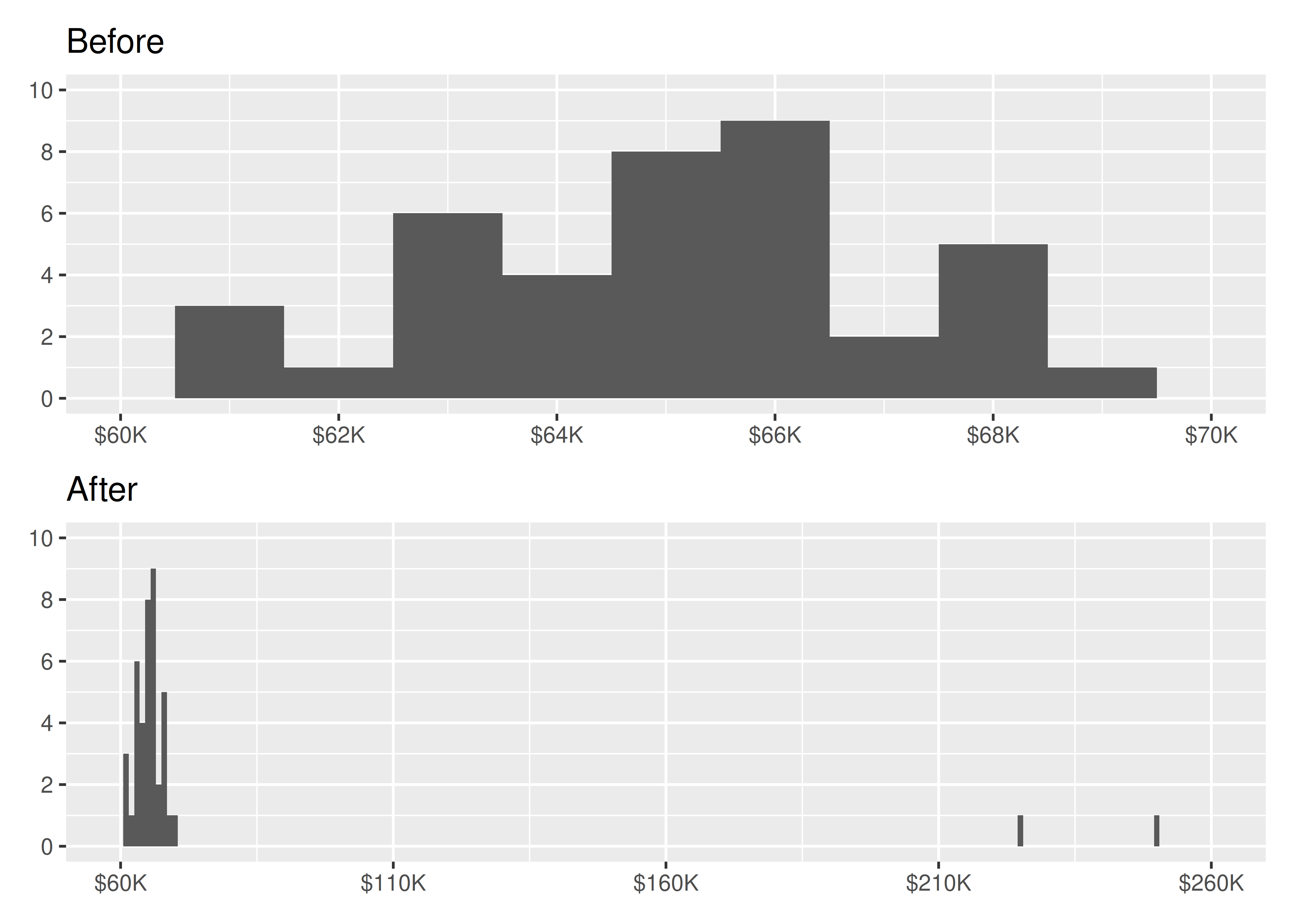
| n | Min | Q1 | Median | Mean | Max | SD | |
|---|---|---|---|---|---|---|---|
| Before | 40 | $60,679 | $60,818 | $65,238 | $65,089 | $69,885 | $2,122 |
| After | 42 | $60,679 | $60,838 | $65,352 | $73,299 | $250,000 | $37,321 |
Would the mean or the median best represent what we might think of as a typical income for the 42 patrons at this coffee shop? What does this say about the robustness of the two measures?
Would the standard deviation or the IQR best represent the amount of variability in the incomes of the 42 patrons at this coffee shop? What does this say about the robustness of the two measures?
- A new statistic. The statistic \(\frac{\bar{x}}{median}\) can be used as a measure of skewness. Suppose we have a distribution where all observations are greater than 0, \(x_i > 0\). What is the expected shape of the distribution under the following conditions? Explain your reasoning.
\(\frac{\bar{x}}{median} = 1\)
\(\frac{\bar{x}}{median} < 1\)
\(\frac{\bar{x}}{median} > 1\)
- Commute times. The US census collects data on the time it takes Americans to commute to work, among many other variables. The histogram below shows the distribution of mean commute times in 3,142 US counties in 2017. Also shown below is a spatial intensity map of the same data.
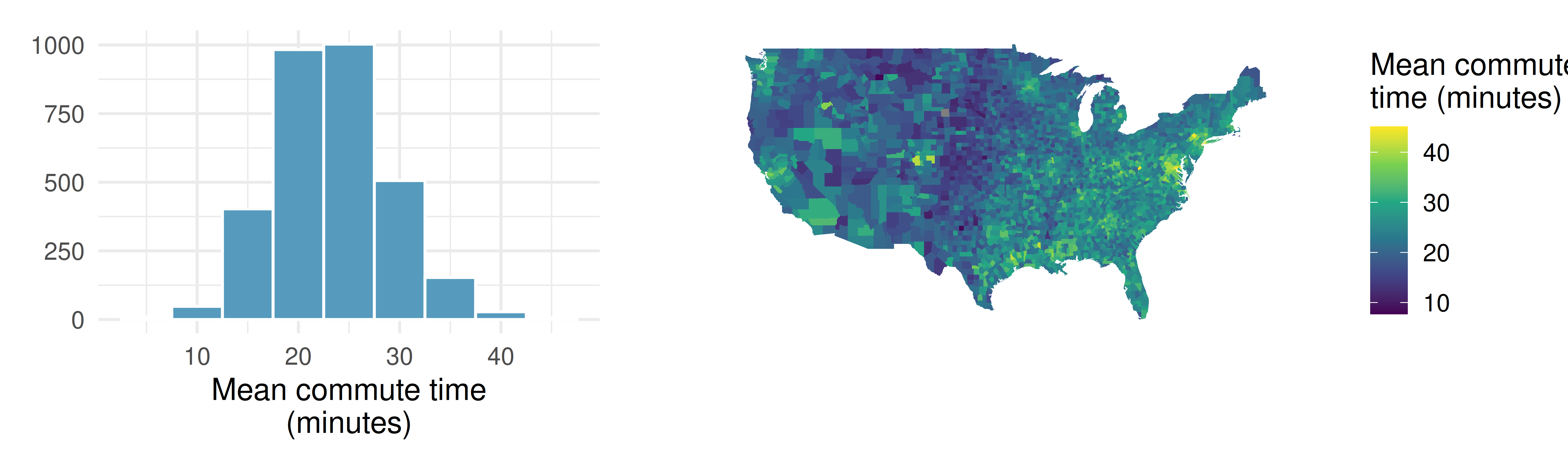
Describe the numerical distribution and comment on whether a log transformation may be advisable for these data.
Describe the spatial distribution of commuting times using the map.
- Hispanic population. The US census collects data on race and ethnicity of Americans, among many other variables. The histogram below shows the distribution of the percentage of the population that is Hispanic in 3,142 counties in the US in 2010. Also shown is a histogram of logs of these values.
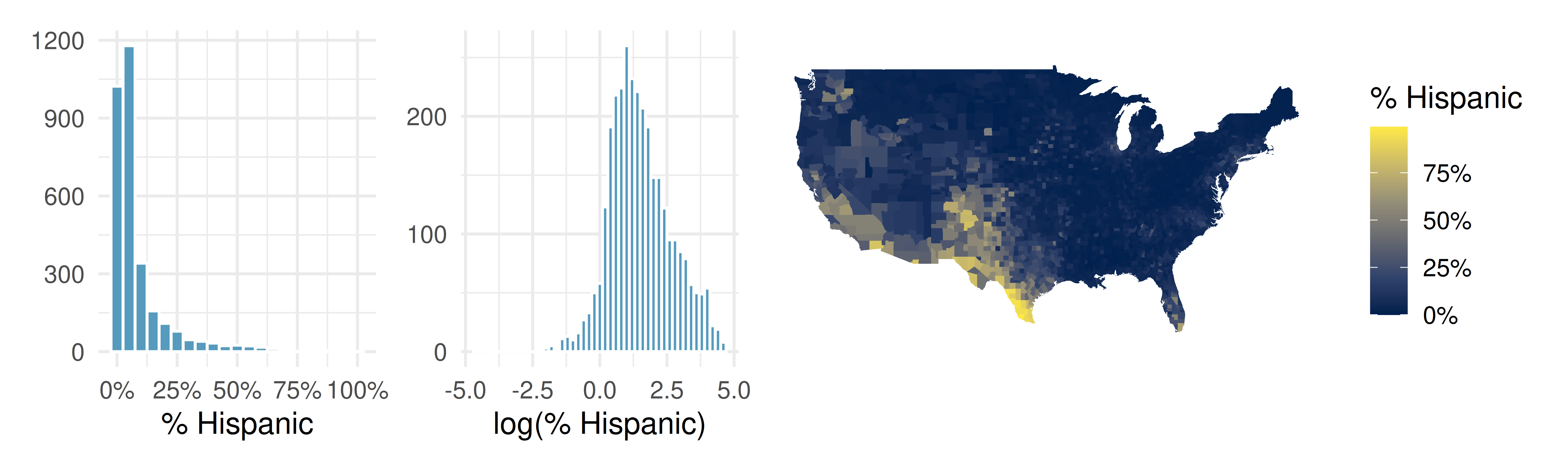
Describe the numerical distribution and comment on why we might want to use log-transformed values in analyzing or modeling these data.
What features of the distribution of the Hispanic population in US counties are apparent in the map but not in the histogram? What features are apparent in the histogram but not the map?
Is one visualization more appropriate or helpful than the other? Explain your reasoning.
- Empirical rule for adult IQ scores. Adult IQ scores are approximately bell-shaped with mean \(\mu = 100\) and standard deviation \(\sigma = 15\).
According to the empirical rule, about 68% of adults have IQ scores in what range?
About 95% of adults have IQ scores in what range?
About 99.7% of adults have IQ scores in what range?
A common cutoff for “gifted” is \(\text{IQ} \ge 130\). Roughly what percent of adults fall at or above this cutoff? (Hint: 130 is exactly two SDs above the mean, and the empirical rule tells you about the two-tailed range.)
- When the empirical rule fails. A dataset of annual household incomes in a large city has a mean of $68,000 and a standard deviation of $54,000. A student uses the empirical rule to claim that about 95% of households in this city earn between \(\$68{,}000 - 2(\$54{,}000) = -\$40{,}000\) and \(\$68{,}000 + 2(\$54{,}000) = \$176{,}000\).
What’s obviously wrong with the lower endpoint of the interval? What does this suggest about the distribution’s shape?
Why is the empirical rule inappropriate for this dataset even at the upper end?
What shape would you expect a distribution of household incomes to have? Sketch or describe it in words.
For a distribution shaped like this one, would the mean or the median be a better summary of a “typical” household income? Why?
StatLens Exercises
The following exercises use StatLens, an interactive statistics tool. Each exercise includes a link that opens a pre-loaded dataset — explore, interact, and answer the questions.
Does binning change the story? Open the US county poverty rates in StatLens. This dataset contains poverty rates (%) for 3,137 US counties.
Describe the shape of the distribution with the default number of bins. Is it symmetric, left-skewed, or right-skewed? Is it unimodal?
Use the Bins control to reduce the number of bins to about 5–6. Does your conclusion about the shape change? What detail is lost?
Now increase the bins to 30–40. Does your shape conclusion change? What new detail (if any) becomes visible?
Based on your exploration, explain in your own words why two histograms of the same data can look somewhat different yet tell the same story.
What do box plots hide? Open the email character counts in StatLens. This dataset records the number of characters (in thousands) in 50 emails. Numeric labels are hidden so you can focus on visual patterns.
View the data as a histogram. Describe the shape. Are there any gaps or clusters that stand out?
Switch to a dotplot. With only 50 observations, can you see individual emails? Identify approximately how many emails have more than 25,000 characters.
Now switch to a boxplot. Can you still tell whether the distribution has one peak or two? Can you identify the same gaps or clusters you saw in the histogram?
A classmate claims “box plots and histograms show the same information, just in different ways.” Do you agree? Use what you observed to explain why or why not.
Choosing the right chart for the question. Open the US county population data in StatLens. This dataset contains the 2017 population of 3,137 US counties.
For each question below, state which chart type (histogram, dotplot, or boxplot) would be most useful, then switch to that chart type to answer it.
What is the approximate median county population? Which chart type shows this most directly?
Are there counties with populations over 5 million? How many? Which chart type makes this easiest to determine?
Is the distribution symmetric, left-skewed, or right-skewed? Which chart type makes the skewness most visually obvious?
Try increasing the number of histogram bins to 50 or more. What happens? Why does this dataset pose a challenge for histograms?
Mean vs. median: which tells the truth? Open the NBA player heights in StatLens, then answer parts (a)–(b). Next, open the Ames home sale prices and answer parts (c)–(d).
For the NBA heights data, view the histogram and describe the shape. Now look at the mean and median in the summary statistics panel. Are they close together or far apart?
Would it matter much whether you reported the mean or the median as the “typical” NBA player height? Why or why not?
For the Ames home prices, view the histogram and describe the shape. Look at the mean and median. How far apart are they? Which is larger?
A real estate agent wants to tell a client what a “typical” home costs in Ames. Should the agent report the mean or the median? Explain, using the shape of the distribution to support your answer.
Checking the empirical rule. Open the NBA player heights in StatLens. Heights of professional basketball players are approximately bell-shaped.
Record the mean and standard deviation from the summary statistics panel.
Compute the interval for “within 1 standard deviation of the mean”: \((\bar{x} - s, \ \bar{x} + s)\). According to the empirical rule, about what percentage of players should have heights in this range?
Look at the histogram. Estimate (roughly) whether about 68% of the data appears to fall within the interval you computed. Does the empirical rule seem to hold?
Now compute the interval for “within 2 standard deviations”: \((\bar{x} - 2s, \ \bar{x} + 2s)\). According to the empirical rule, about what percentage should fall in this range? Looking at the histogram, does nearly all the data fall within this interval?
Would you expect the empirical rule to work as well for the Ames home price data? Why or why not? (Hint: think about the shape.)
Backstrom, L. 2011. “Anatomy of Facebook.” Facebook Data Team’s Notes. http://www.openintro.org/redirect.php?go=textbook-anatomy-of-facebook.