Tech Tutorial — Explore. A Tech Tutorial shows you how to carry out the techniques from this unit in the software your section uses. Pick one tool and follow its tab; the question, the data, and the statistical reasoning are identical across all three.
StatLens — nothing to install; runs in your browser. The fundamentals path.
Jamovi — a free, menu-driven statistics program.
R — code-based; reproducible and what the wider community uses.
Your choice of tool persists across every tabset in the book, so you only pick once.
The data
We use a small, synthetic first-day class survey — 50 students, with two categorical variables and three numerical ones. (It stands in for a real survey; no actual student records are involved.)
Variable
Type
Meaning
year
categorical
First-year, Sophomore, Junior, Senior
housing
categorical
On-campus or Off-campus
study_hours
numerical
hours spent studying in a typical week
sleep_hours
numerical
typical nightly sleep
commute_min
numerical
one-way commute, in minutes
Get the file:class_survey.csv. The Jamovi and StatLens steps below load this exact file.
What you’ll do
Five core Explore skills, each in your chosen tool:
Get to know the data and classify variables
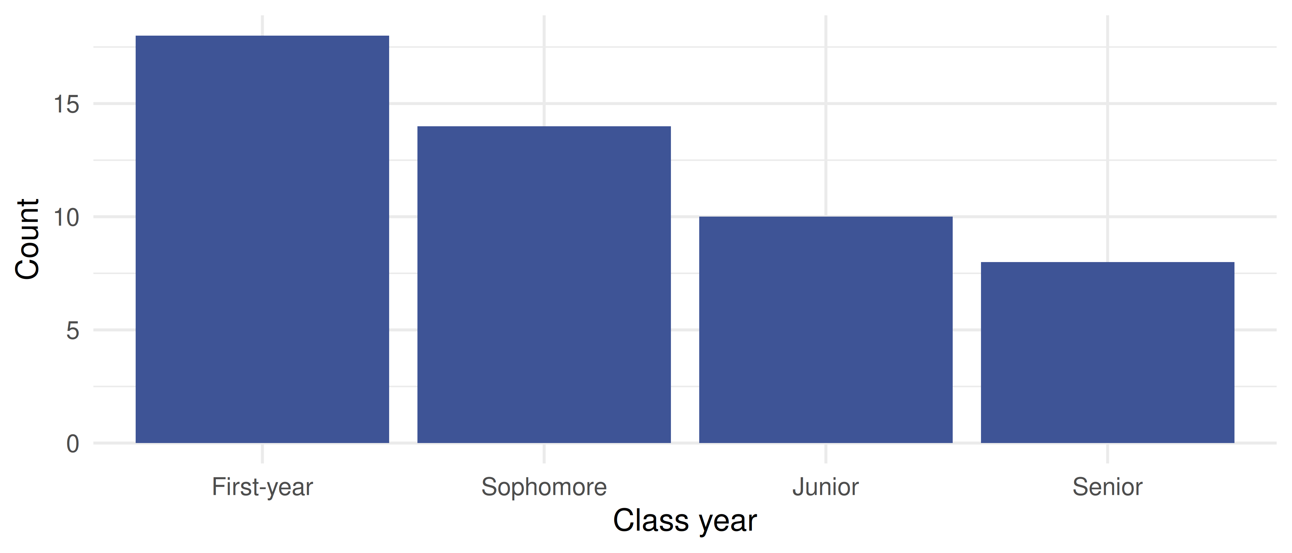
Summarize one categorical variable
Summarize one numerical variable
Compare a numerical variable across groups
Explore the relationship between two numerical variables
1. Get to know the data
Before any chart, look at the data and decide each variable’s type — categorical (labels) or numerical (measured amounts). This is a thinking step, not a calculation: no tool decides it for you.
Use the variable dropdown to see every column. Numerical variables (study_hours, sleep_hours, commute_min) can be charted here; the categorical ones (year, housing) you’ll explore in steps 2 and 4.
Download class_survey.csv (link above) and open it: ☰ → Open → This PC.
In the Data tab, click each variable and check its Measure type — set year and housing to Nominal, and the three counts to Continuous.
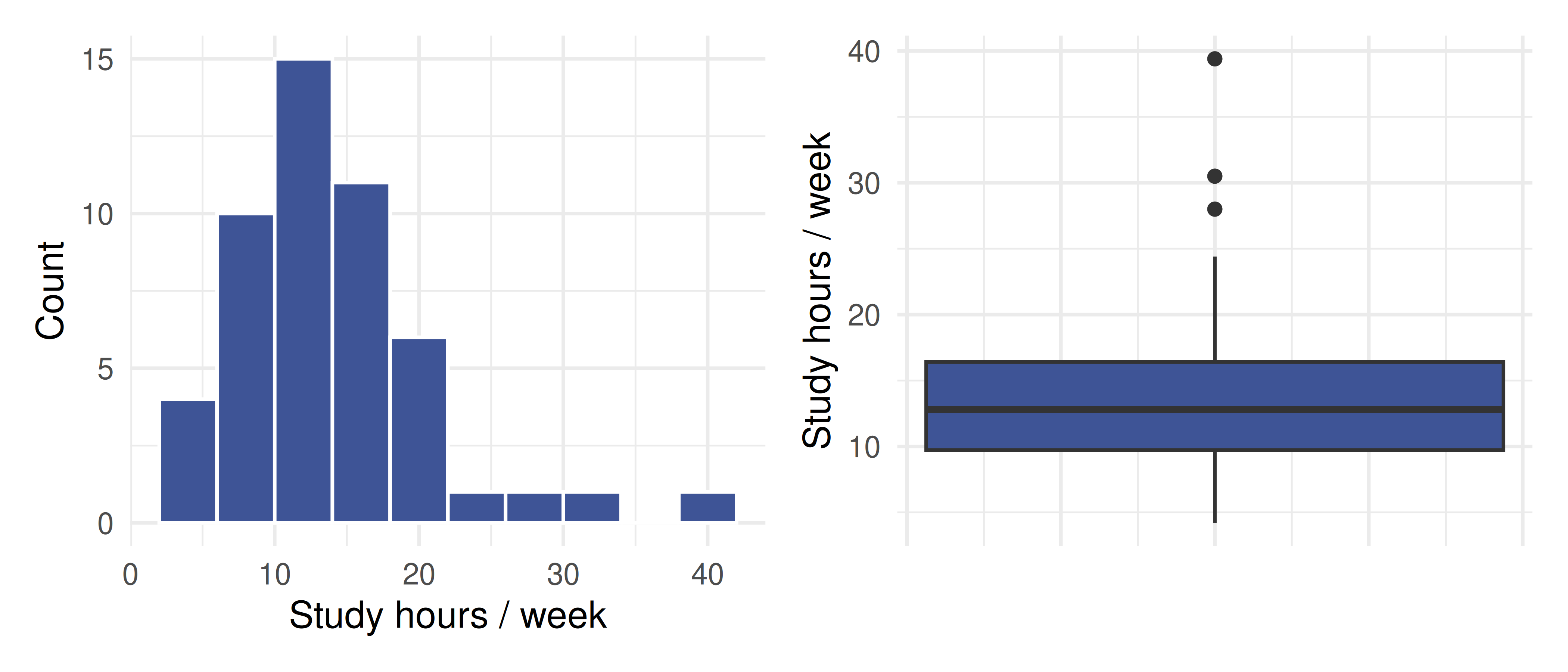
For a numerical variable we describe shape, center, and spread, and watch for outliers. We’ll use study_hours. Because the distribution is right-skewed with a high outlier, the median and IQR are more trustworthy than the mean and SD.
Choose study_hours. Read the histogram (note the right skew and the lone high value), then switch the chart to a box plot.
Read the mean, median, SD, and IQR from the summary panel.
Exploration → Descriptives. Put study_hours in Variables.
Request Mean, Median, Std. deviation, IQR.
Under Plots, turn on Histogram and Box plot.
(Jamovi screenshots to be added.)
library(patchwork)# Mean/SD vs. median/IQR — note the mean sits above the median (skew)survey |>summarize(mean =mean(study_hours), median =median(study_hours),sd =sd(study_hours), IQR =IQR(study_hours))
# A tibble: 1 × 4
   mean median    sd   IQR
  <dbl>  <dbl> <dbl> <dbl>
1  13.9   12.8  6.64  6.67
Weekly study hours: histogram (left) and box plot (right). The distribution is right-skewed with one high outlier.
4. Compare a numerical variable across groups
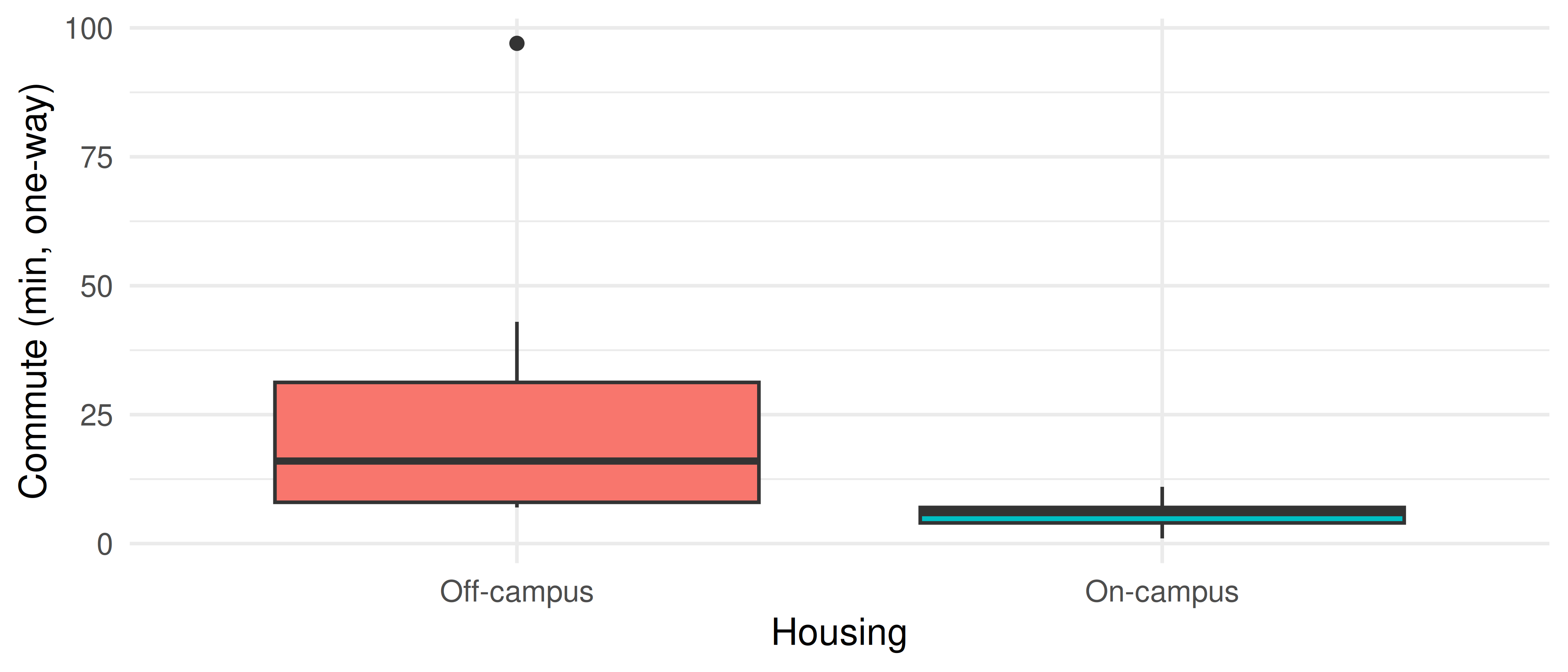
To see whether a numerical variable differs between groups, use side-by-side box plots and a grouped summary. We’ll compare commute_min for On-campus vs. Off-campus students.
Set the response to commute_min and the grouping variable to housing. Compare the two box plots and the group medians.
Exploration → Descriptives. Put commute_min in Variables and housing in Split by.
Request Median and IQR; under Plots, turn on Box plot.
(Jamovi screenshots to be added.)
survey |>group_by(housing) |>summarize(median =median(commute_min), IQR =IQR(commute_min), n =n())
# A tibble: 2 × 4
  housing    median   IQR     n
  <chr>       <dbl> <dbl> <int>
1 Off-campus     16  23.2    28
2 On-campus       6   3      22
ggplot(survey, aes(x = housing, y = commute_min, fill = housing)) +geom_boxplot(show.legend =FALSE) +labs(x ="Housing", y ="Commute (min, one-way)") +theme_minimal(base_size =12)
One-way commute time for on-campus vs. off-campus students.
5. Explore a relationship between two numerical variables
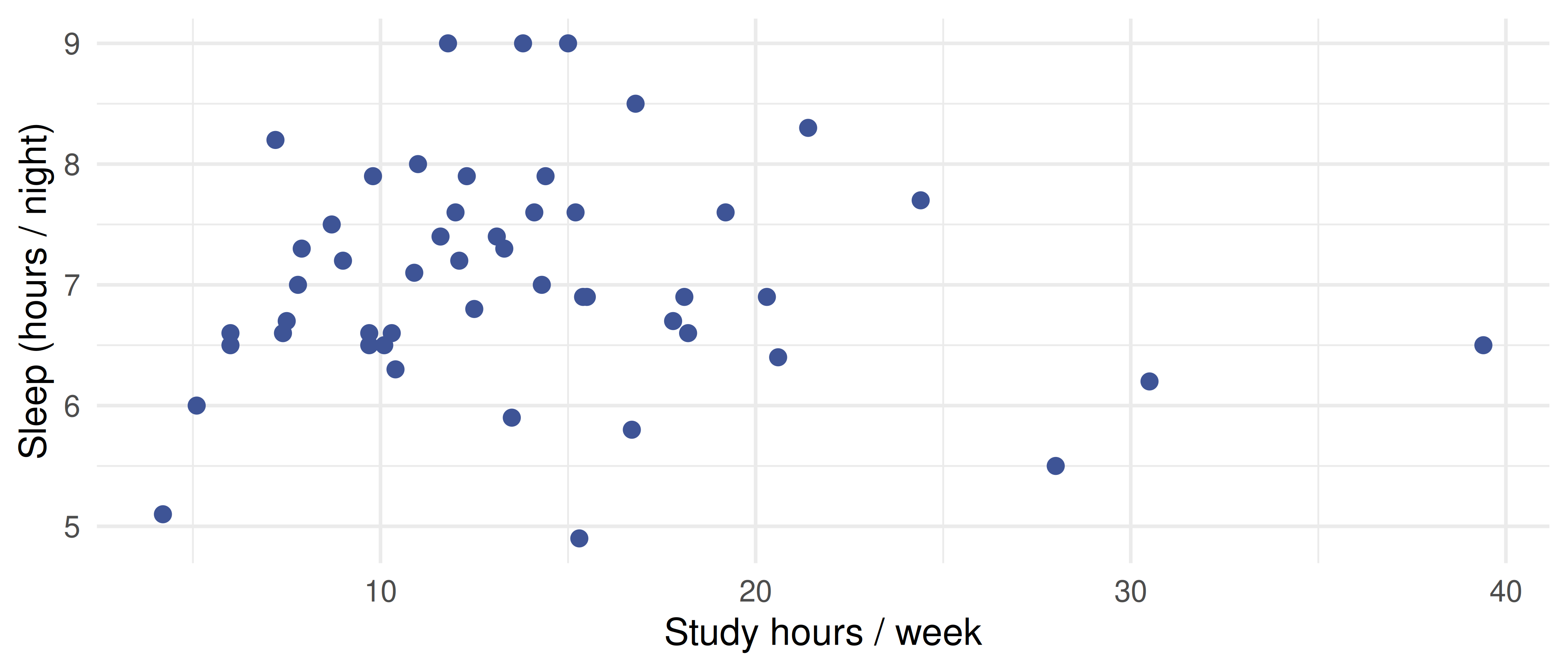
For two numerical variables, use a scatterplot and the correlationr. We’ll look at study_hours vs. sleep_hours. Not every pair is related — part of the skill is reading a weak relationship honestly.
Study hours vs. nightly sleep. The cloud of points shows little association.
Going further in R (optional)
If you chose the R path and want guided, hands-on practice, the OpenIntro IMS interactive tutorials cover this unit in depth (free, runs in your browser):