21 Prediction and Model Fit
In the previous chapter, we developed the least squares regression line, interpreted its slope and intercept, and performed inference to test whether a linear relationship exists. In this chapter, we focus on using the regression model for prediction and assessing how well it fits the data. We discuss the dangers of extrapolation, introduce residual diagnostics for identifying problems with the model, examine leverage and influential points, and briefly introduce confidence intervals and prediction intervals for forecasts.
21.1 Making predictions
One of the primary uses of a regression model is to predict the value of the response variable \(y\) for a given value of the explanatory variable \(x\). To make a prediction, we simply plug the value of \(x\) into the regression equation.
The least squares line for predicting gift aid from family income at Elmhurst College is:
\[\widehat{\text{aid}} = 24.3 - 0.0431 \times \text{family\_income}\]
Predict the gift aid for a student whose family income is $80,000 (i.e., \(x = 80\) in $1,000s).
\[\widehat{\text{aid}} = 24.3 - 0.0431 \times 80 = 24.3 - 3.45 = 20.85\]
The model predicts this student will receive approximately $20,850 in gift aid.
Suppose a high school senior is considering Elmhurst College. Can they simply use the linear equation to calculate their financial aid?
They may use it as an estimate, but with important qualifiers. First, the data come from a single year, and aid policies may change. Second, the equation provides an imperfect estimate – while the linear model captures the overall trend, individual students’ aid will vary around the predicted value.
21.2 Extrapolation
Use the Elmhurst model to estimate the aid for a student whose family has an income of $1 million (i.e., \(x = 1000\)).
\[\widehat{\text{aid}} = 24.3 - 0.0431 \times 1000 = -18.8\]
The model predicts \(-\$18,800\) in aid! Elmhurst College does not charge extra tuition to wealthy students. This nonsensical prediction illustrates the danger of extrapolation.
Extrapolation is treacherous.
Extrapolation means applying a model to make predictions outside the range of the observed data. A linear model is only an approximation of the true relationship, and that approximation may break down badly outside the range of the data used to build it.
Generally, predictions should only be made within the range of the observed predictor values. Predictions far outside this range are unreliable and should be treated with great skepticism.
Before making a prediction, always check whether the value of \(x\) falls within the range of the data used to build the model. If it does not, acknowledge that you are extrapolating and that the prediction may be unreliable.
21.3 Residual diagnostics
In the previous chapter, we introduced residual plots as a way to assess whether a linear model is appropriate. In this section, we examine residual diagnostics in more detail.
21.3.1 Patterns in residual plots
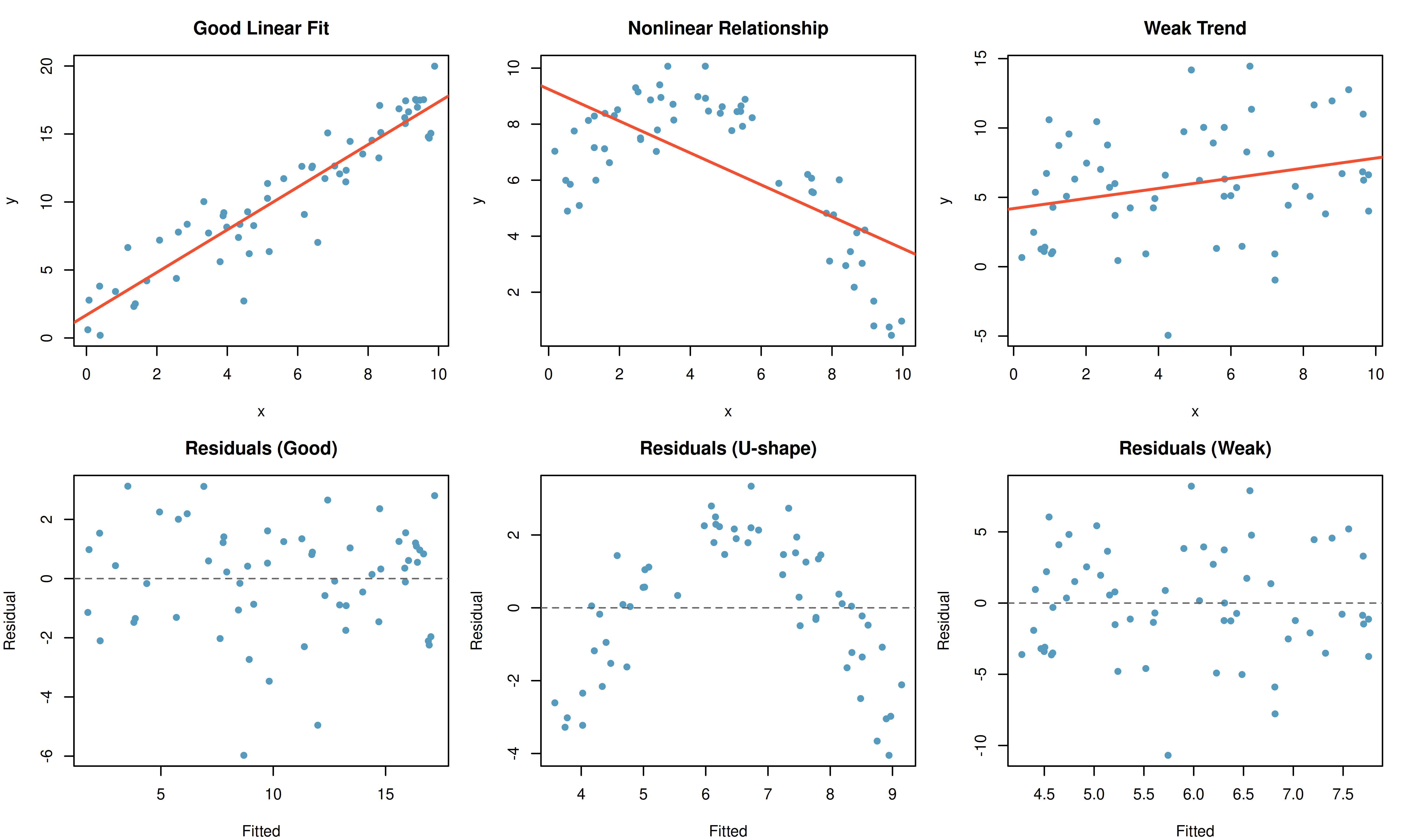
A well-fitting linear model produces residuals that appear randomly scattered around zero. Systematic patterns in the residuals indicate problems:
Consider the three pairs of scatterplots and residual plots below.
Describe any patterns in the residuals.
Dataset 1: The residuals show no obvious patterns. They are scattered randomly around zero. The linear model is appropriate.
Dataset 2: There is a curved pattern in the residuals – they are negative at the edges and positive in the middle. This indicates a nonlinear relationship. A straight line is not a good model for these data.
Dataset 3: The residuals show no patterns, but the trend is very weak. The linear model is technically appropriate, but the relationship may not be practically meaningful.
21.3.2 Non-constant variability (heteroscedasticity)
When the spread of the residuals changes as the predicted value increases, we have non-constant variability (also called heteroscedasticity). This often appears as a “fan shape” in the residual plot – residuals spread out (or narrow) as the predicted values increase.
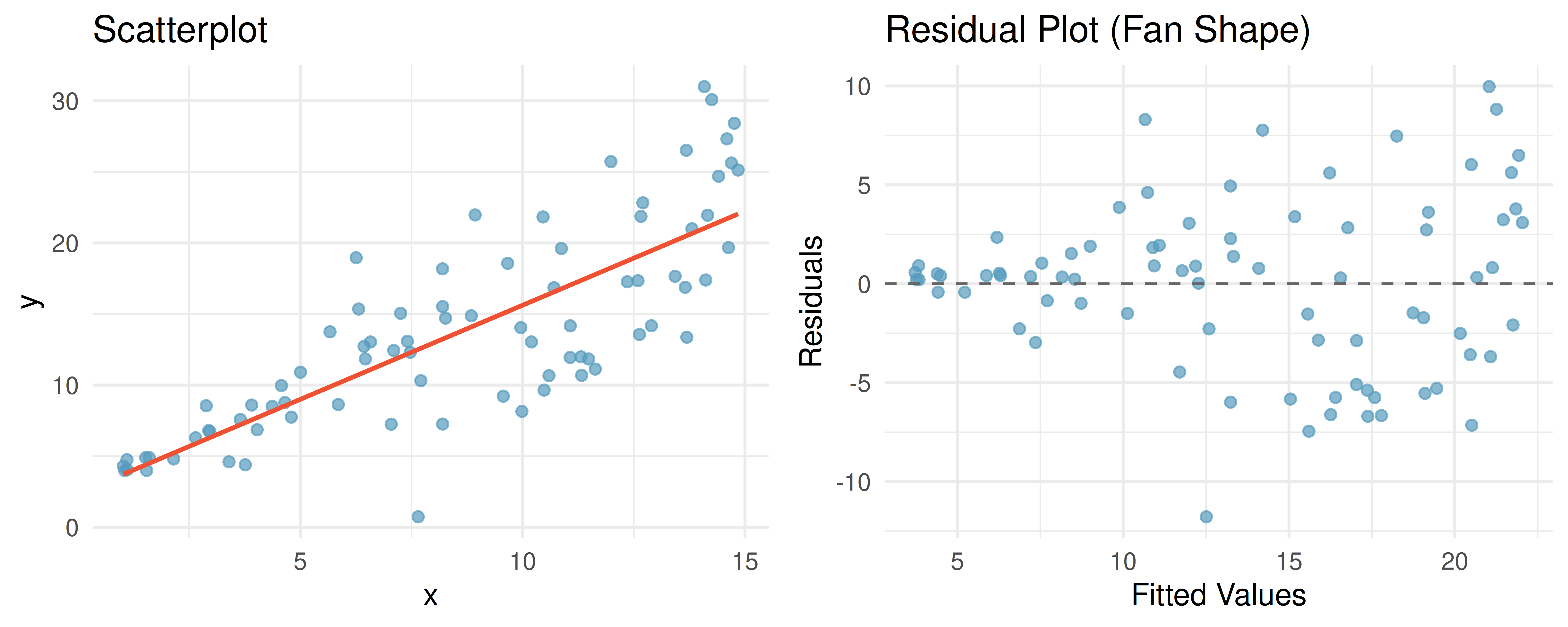
Non-constant variability does not bias the regression line itself, but it does affect inference: standard errors, confidence intervals, and \(p\)-values may be unreliable.
21.4 Leverage and influential points
Not all observations have the same impact on the regression line. Some points, by virtue of their position, can exert a disproportionate influence on the model.
21.4.1 Leverage
Leverage.
A point has high leverage if its \(x\)-value is far from \(\bar{x}\) (the mean of the predictor variable). High-leverage points have the potential to strongly influence the slope and intercept of the regression line.
High leverage does not automatically mean the point is problematic. If a high-leverage point falls close to the trend established by the other data, it may actually strengthen the model. A high-leverage point is only problematic if its \(y\)-value does not follow the pattern of the rest of the data.
21.4.2 Influential points
Influential point.
A point is influential if removing it would substantially change the regression line (i.e., the estimated slope or intercept). Influential points are typically high-leverage points that do not follow the pattern of the rest of the data.
Consider three scenarios:
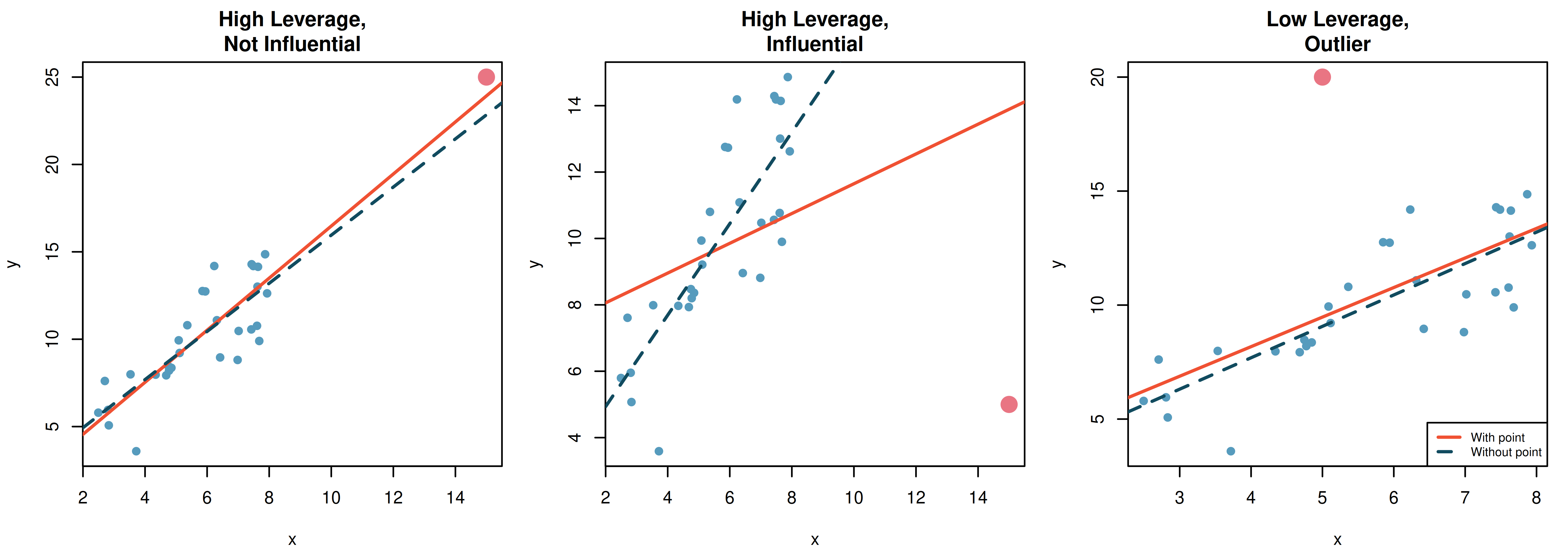
Scenario 1: The point in the far right corner has high leverage (it is far from \(\bar{x}\)), but it falls along the trend of the other data. Removing it would barely change the regression line. It is not influential.
Scenario 2: The point in the far right corner has high leverage and falls far from the trend. Removing it would substantially change the slope. It is influential.
Scenario 3: The point near the center of the \(x\)-values is an outlier in the \(y\)-direction. It has low leverage because its \(x\)-value is near \(\bar{x}\). Removing it would change the intercept slightly but not the slope very much. It has limited influence.
Dealing with influential points.
When you identify an influential point:
- Verify that it is not a data entry error.
- Run the analysis with and without the point and report both results.
- Do not automatically remove it – if it is a legitimate observation, it contains real information.
- Be transparent about its effect on the conclusions.
See it in action. Regression Explorer with CI + PI bands — toggles the 95% confidence band (mean response — the hourglass) and the wider 95% prediction band. For numeric bounds at a specific \(x_0\), use the Slope tool point interval: type \(x_0\) and get \(\hat{y}\), the CI for the mean, and the prediction interval (with extrapolation warnings).
21.5 Confidence and prediction intervals
When we use a regression model to make predictions, there are two types of uncertainty to consider:
21.5.1 Confidence intervals for the mean response
A confidence interval for the mean response estimates the average value of \(y\) for all individuals with a particular value of \(x\). This interval captures the uncertainty in estimating the population regression line.
For example, we might ask: “What is the average gift aid for all Elmhurst students with a family income of $80,000?” The confidence interval for the mean response at \(x = 80\) would give a range of plausible values for this population average.
The formula for a \((1-\alpha) \times 100\%\) confidence interval for the mean response at \(x = x^*\) is:
\[\hat{y} \pm t_{n-2}^* \cdot SE_{\hat{y}}\]
where the standard error depends on the distance of \(x^*\) from \(\bar{x}\):
\[SE_{\hat{y}} = s_e \sqrt{\frac{1}{n} + \frac{(x^* - \bar{x})^2}{\sum (x_i - \bar{x})^2}}\]
Here \(s_e = \sqrt{MSE}\) is the residual standard error.
21.5.2 Prediction intervals for individual observations
A prediction interval estimates the value of \(y\) for a single new individual with a particular value of \(x\). This interval is always wider than the confidence interval for the mean response because it must account for both:
- The uncertainty in estimating the regression line (same as the confidence interval).
- The natural variability of individual observations around the line.
The prediction interval at \(x = x^*\) is:
\[\hat{y} \pm t_{n-2}^* \cdot s_e \sqrt{1 + \frac{1}{n} + \frac{(x^* - \bar{x})^2}{\sum (x_i - \bar{x})^2}}\]
Notice the extra “\(1 +\)” under the square root compared to the confidence interval formula. This is what makes the prediction interval wider.
21.5.3 Comparing the two intervals
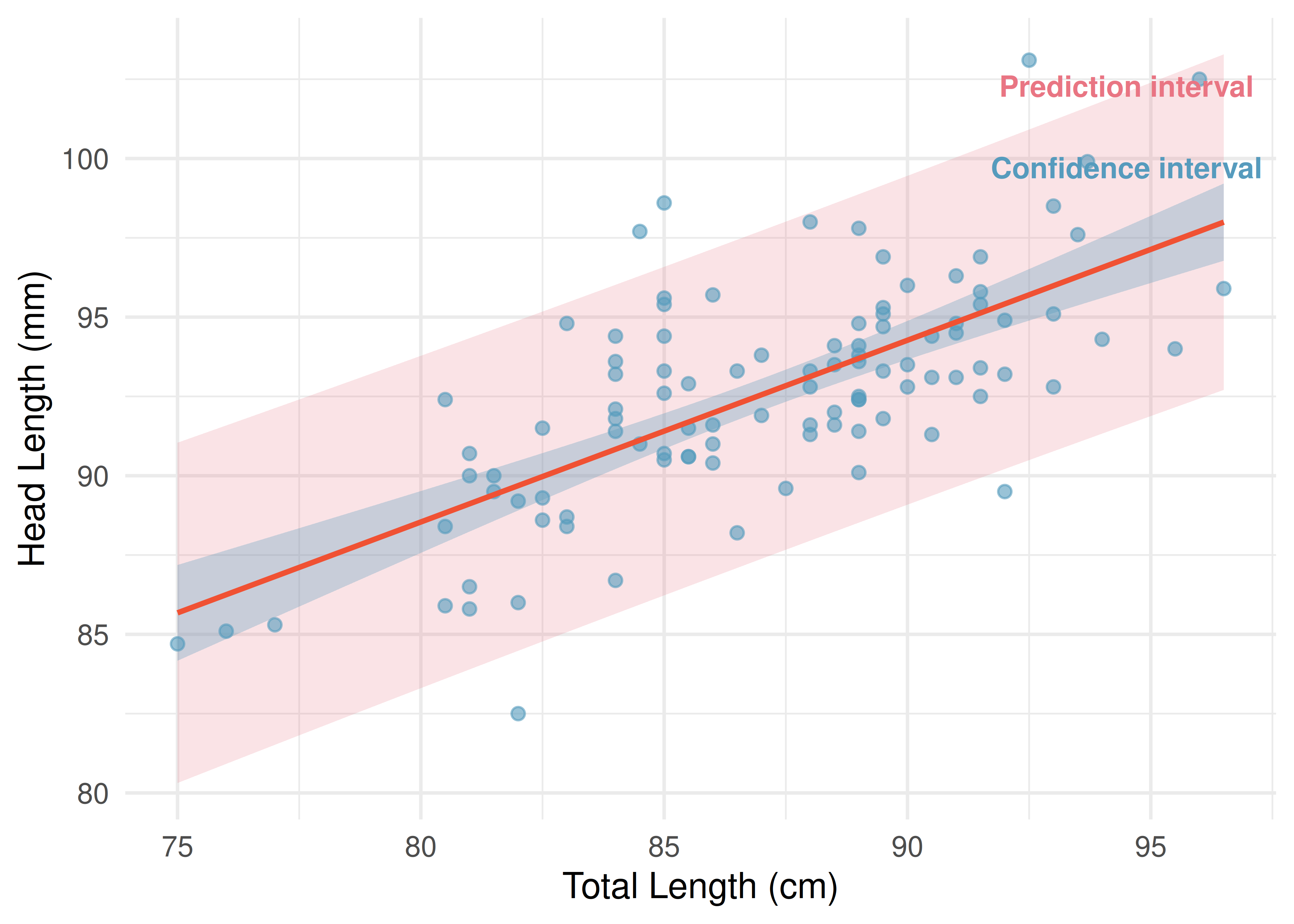
For the possum data, suppose we want to predict the head length for possums with a total length of 85 cm.
The least squares fit computed by software is \(\hat{y} = 42.71 + 0.573x\), so the point prediction is \(\hat{y} = 91.41\) mm. (The rounded line \(\hat{y} = 41 + 0.59x\) from the previous chapter gives nearly the same prediction, 91.15 mm.)
- A 95% confidence interval for the mean head length of all possums with total length 85 cm is (90.84, 91.97) mm.
- A 95% prediction interval for the head length of a single possum with total length 85 cm is (86.23, 96.58) mm.
The confidence interval is relatively narrow because it estimates an average, which is estimated with moderate precision. The prediction interval is much wider because it must also account for the natural variation among individual possums – even possums with the same total length have different head lengths.
Confidence interval vs. prediction interval.
- A confidence interval for the mean response estimates the average \(y\) for a given \(x\). It accounts for uncertainty in the regression line.
- A prediction interval estimates the \(y\) for a single new observation at a given \(x\). It accounts for both the uncertainty in the regression line and the variability of individual observations.
- Prediction intervals are always wider than confidence intervals.
- Both intervals are narrowest at \(x = \bar{x}\) and widen as \(x\) moves away from \(\bar{x}\).
The fact that both intervals widen as \(x\) moves away from \(\bar{x}\) connects back to the danger of extrapolation: predictions become increasingly uncertain farther from the center of the data.
21.6 Chapter review
21.6.1 Summary
In this chapter, we focused on using regression models for prediction and evaluating their fit. We learned that extrapolation – predicting outside the range of the observed data – is dangerous and can lead to nonsensical predictions. Residual diagnostics help us identify violations of the model assumptions, including nonlinearity, non-constant variance, and the influence of unusual points. Leverage measures how far a point’s \(x\)-value is from the center of the data; influential points are high-leverage observations that do not follow the overall trend and substantially affect the regression line when removed. Finally, we distinguished between confidence intervals for the mean response and prediction intervals for individual observations, noting that prediction intervals are always wider because they account for individual variability.
21.6.2 Key terms
- Extrapolation
- Residual diagnostics
- Non-constant variability (heteroscedasticity)
- Leverage
- Influential point
- Confidence interval for the mean response
- Prediction interval
21.7 Exercises
Answers to odd-numbered exercises are provided in the Exercise Solutions appendix at the back of the book.
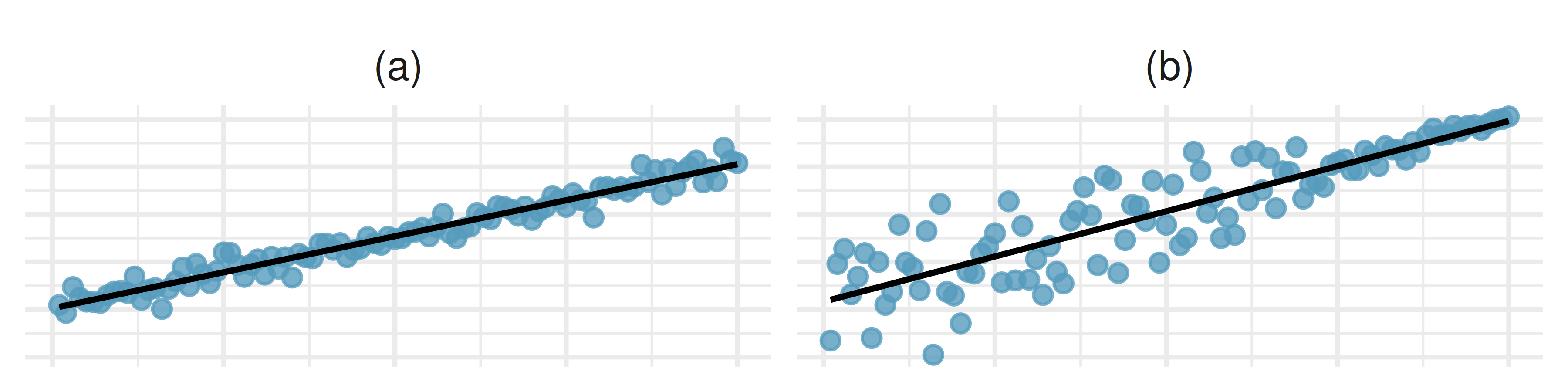
- Visualizing residuals. The scatterplots shown below each have a superimposed regression line. If we were to construct a residual plot (residuals versus \(x\)) for each, describe in words what those plots would look like.
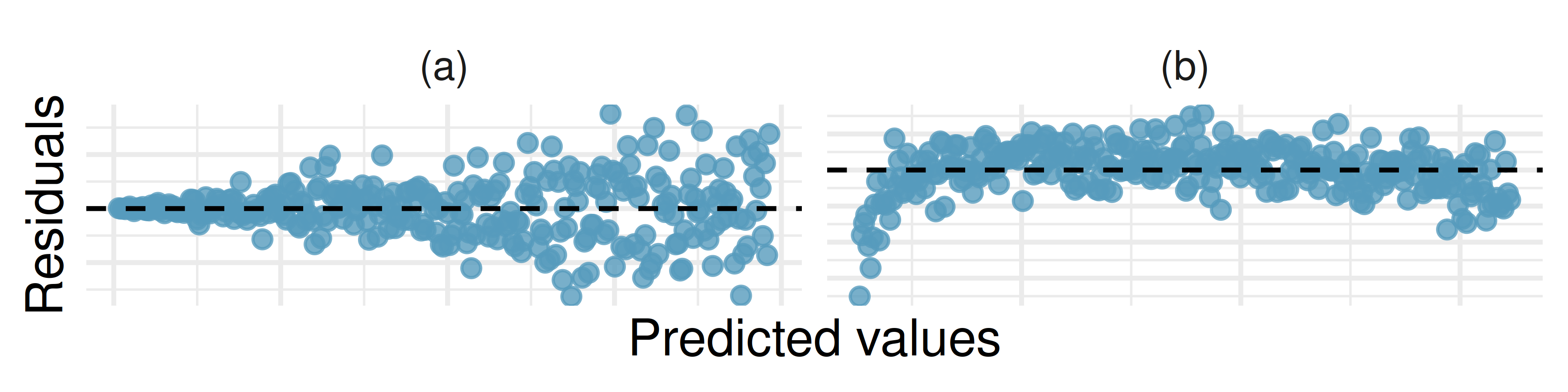
- Trends in residuals. Shown below are two plots of residuals remaining after fitting a linear model to two different sets of data. For each plot, describe important features and determine if a linear model would be appropriate for these data. Explain your reasoning.
- Over-under, I. Suppose we fit a regression line to predict the shelf life of an apple based on its weight. For a particular apple, we predict the shelf life to be 4.6 days. The apple’s residual is -0.6 days. Did we over or under estimate the shelf-life of the apple? Explain your reasoning.
- Over-under, II. Suppose we fit a regression line to predict the number of incidents of skin cancer per 1,000 people from the number of sunny days in a year. For a particular year, we predict the incidence of skin cancer to be 1.5 per 1,000 people, and the residual for this year is 0.5. Did we over or under estimate the incidence of skin cancer? Explain your reasoning.
- Starbucks, calories, and protein. The scatterplot below shows the relationship between the number of calories and amount of protein (in grams) Starbucks food menu items contain. Since Starbucks only lists the number of calories on the display items, we might be interested in predicting the amount of protein a menu item has based on its calorie content.
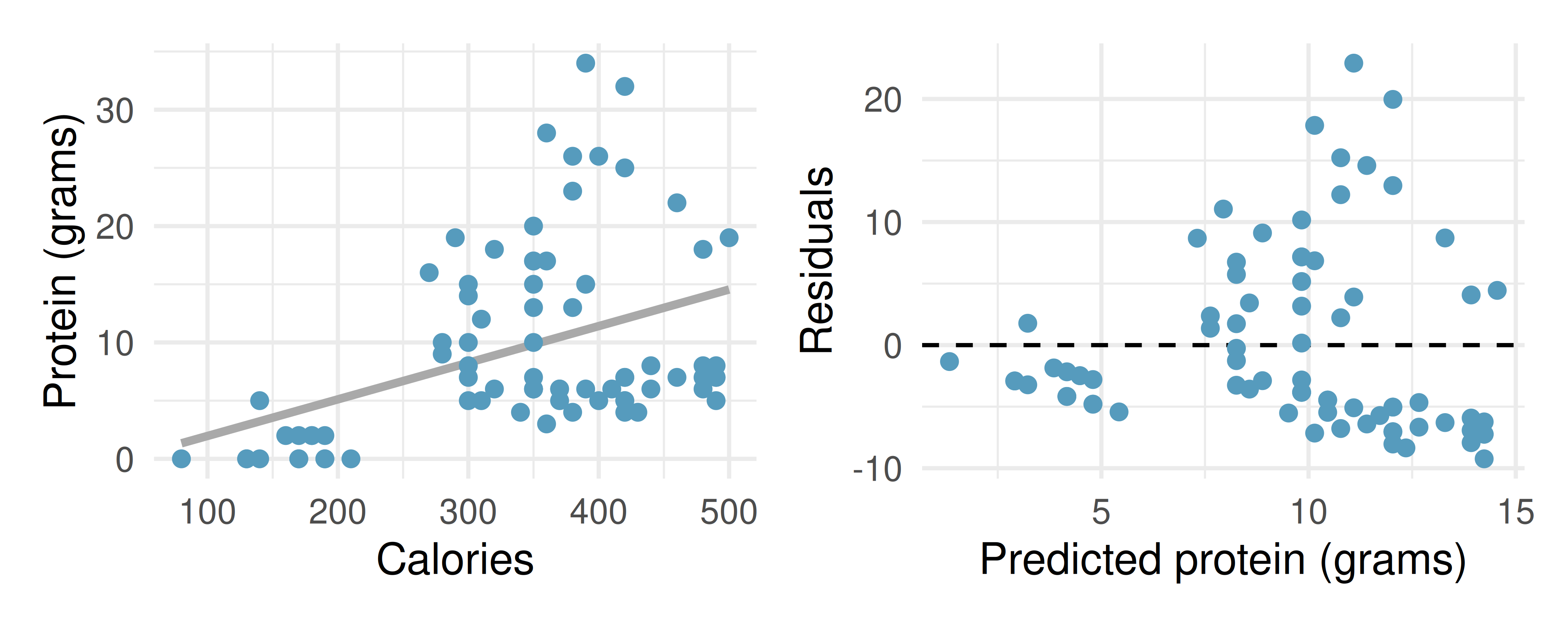
Describe the relationship between number of calories and amount of protein (in grams) that Starbucks food menu items contain.
In this scenario, what are the predictor and outcome variables?
Why might we want to fit a regression line to these data?
What does the residuals vs. predicted plot tell us about the variability in prediction errors based on this model for items with lower vs. higher predicted protein?
- Starbucks, calories, and carbs. The scatterplot below shows the relationship between the number of calories and amount of carbohydrates (in grams) Starbucks food menu items contain. Since Starbucks only lists the number of calories on the display items, we might be interested in predicting the amount of carbs a menu item has based on its calorie content.
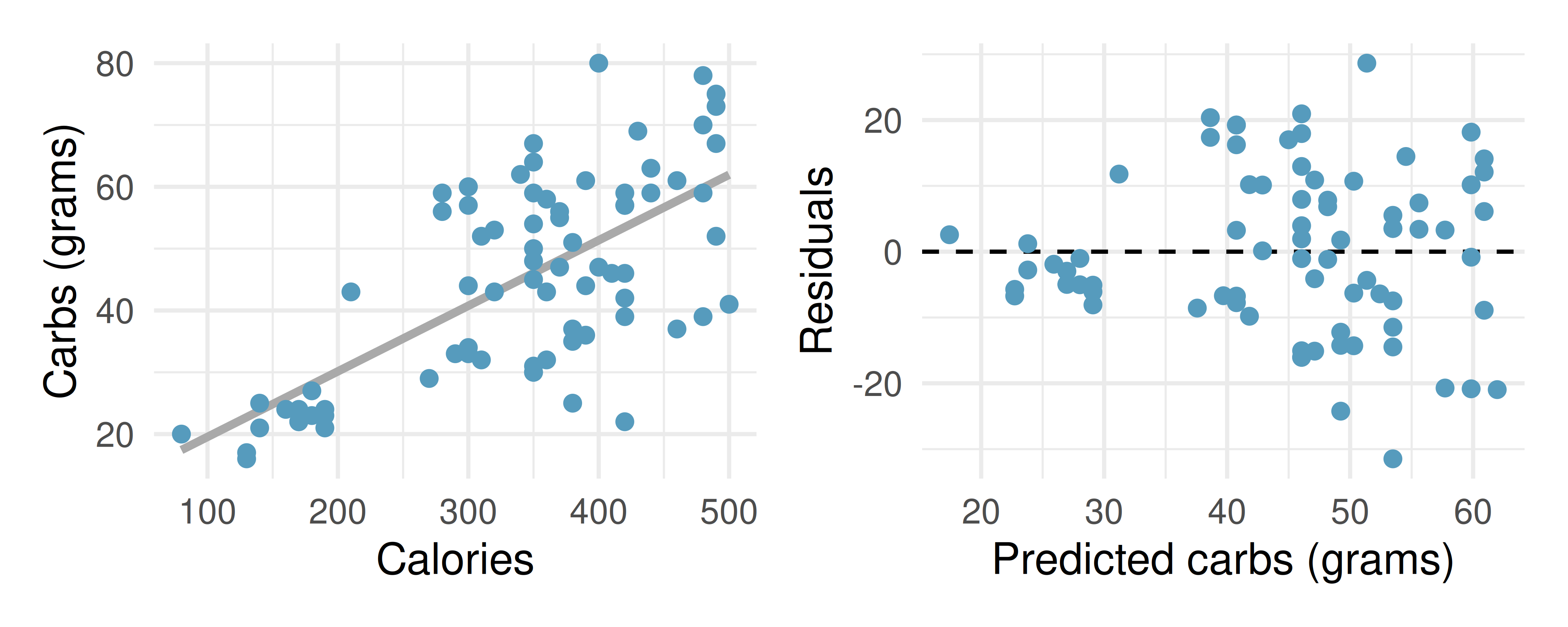
Describe the relationship between number of calories and amount of carbohydrates (in grams) that Starbucks food menu items contain.
In this scenario, what are the predictor and outcome variables?
Why might we want to fit a regression line to these data?
What does the residuals vs. predicted plot tell us about the variability in prediction errors based on this model for items with lower vs. higher predicted carbs?
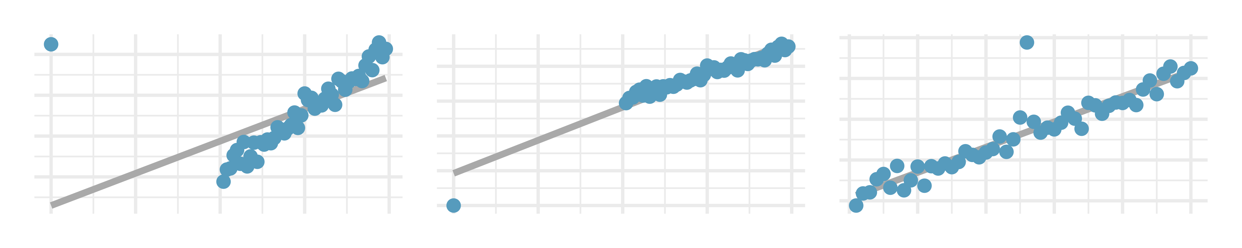
- Outliers, I. Identify the outliers in the scatterplots shown below, and determine what type of outliers they are. Explain your reasoning.
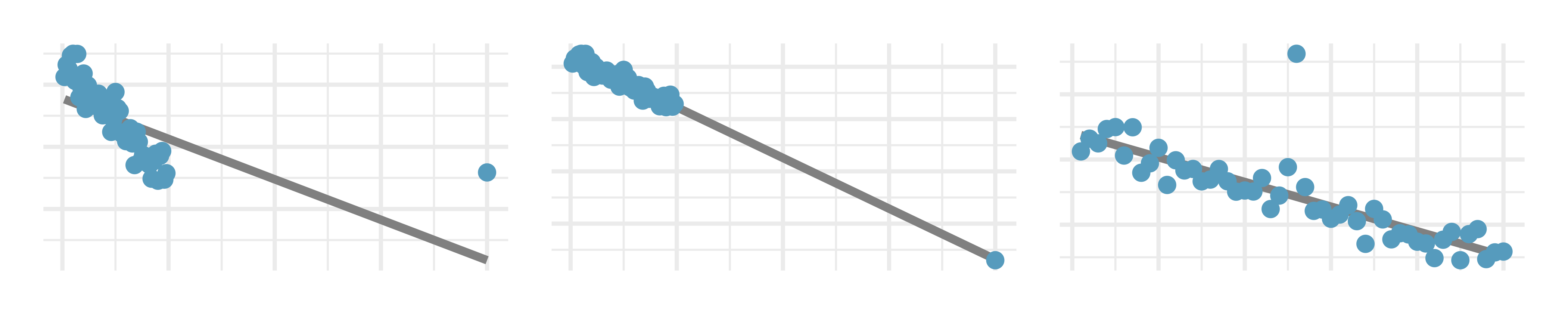
- Outliers, II. Identify the outliers in the scatterplots shown below and determine what type of outliers they are. Explain your reasoning.
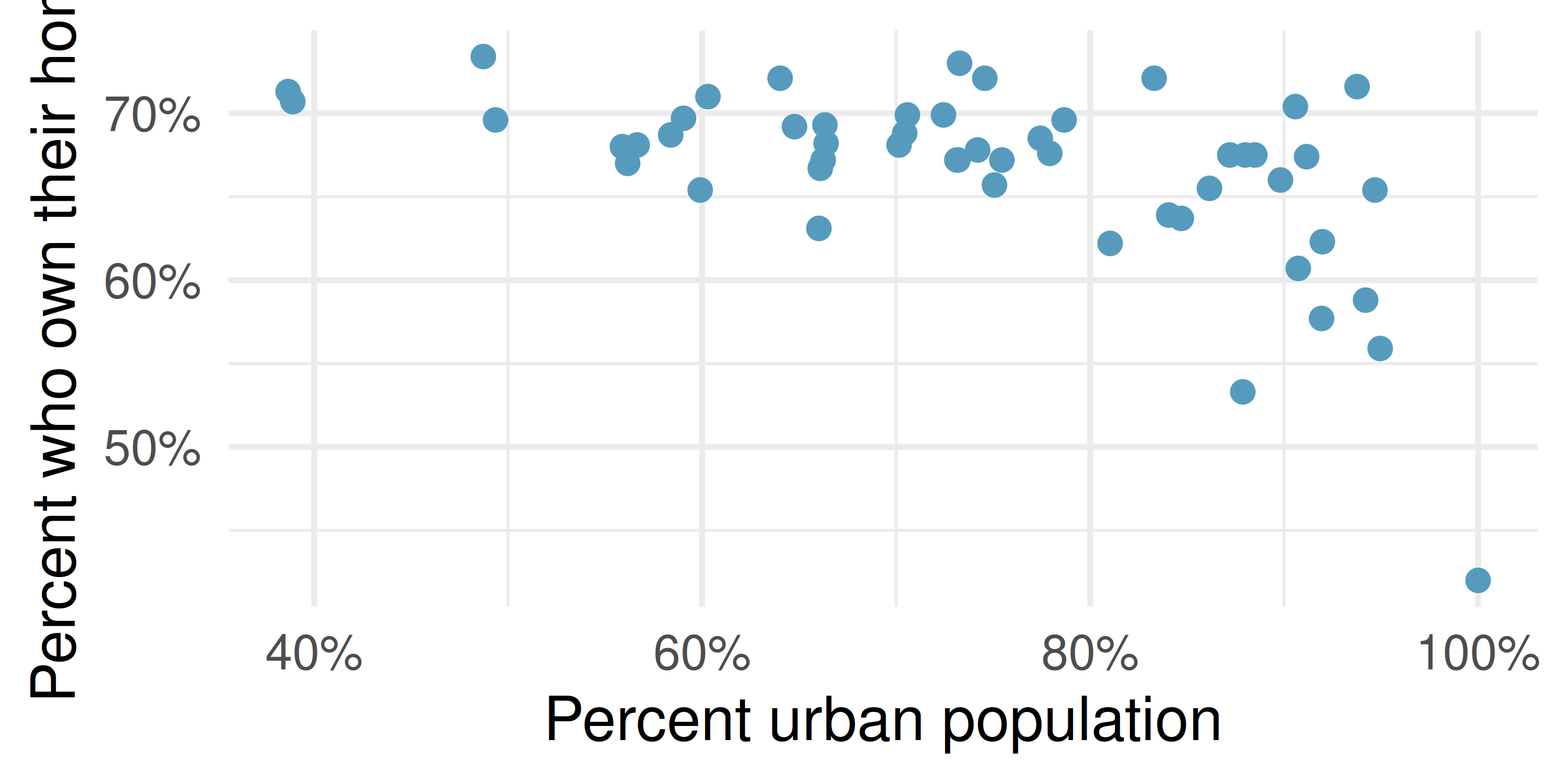
- Urban homeowners, outliers. The scatterplot below shows the percent of families who own their home vs. the percent of the population living in urban areas. There are 52 observations, each corresponding to a state in the US. Puerto Rico and District of Columbia are also included.
Describe the relationship between the percent of families who own their home and the percent of the population living in urban areas.
The outlier at the bottom right corner is District of Columbia, where 100% of the population is considered urban. What type of an outlier is this observation?
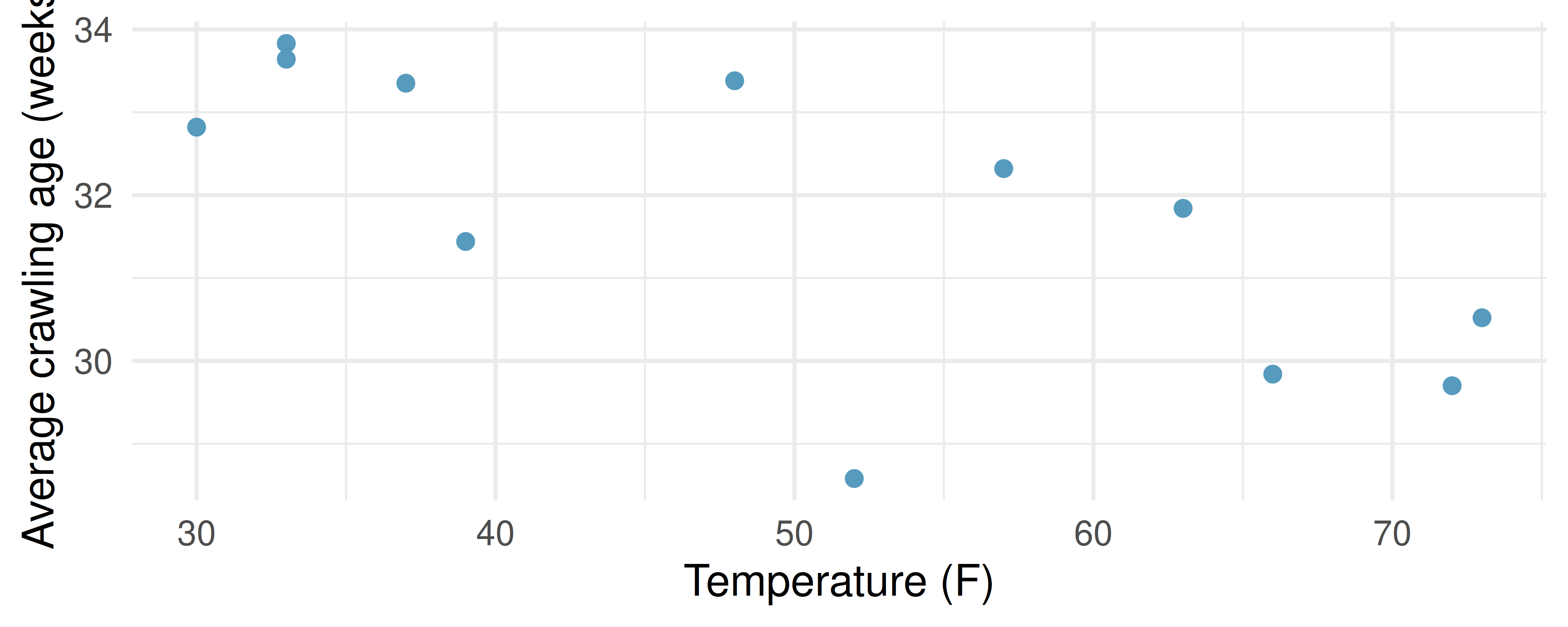
- Crawling babies, outliers. A study conducted at the University of Denver investigated whether babies take longer to learn to crawl in cold months, when they are often bundled in clothes that restrict their movement, than in warmer months. The plot below shows the relationship between average crawling age of babies born in each month and the average temperature in the month when the babies are six months old. The plot reveals a potential outlying month when the average temperature is about 53F and average crawling age is about 28.5 weeks. Does this point have high leverage? Is it an influential point? (Benson 1993)
- Body measurements, conditions. The scatterplot below shows the residuals (on the y-axis) from the linear model of weight vs. height from a dataset of body measurements from 507 physically active individuals. The x-axis is the height of the individuals, in cm. (Heinz et al. 2003)
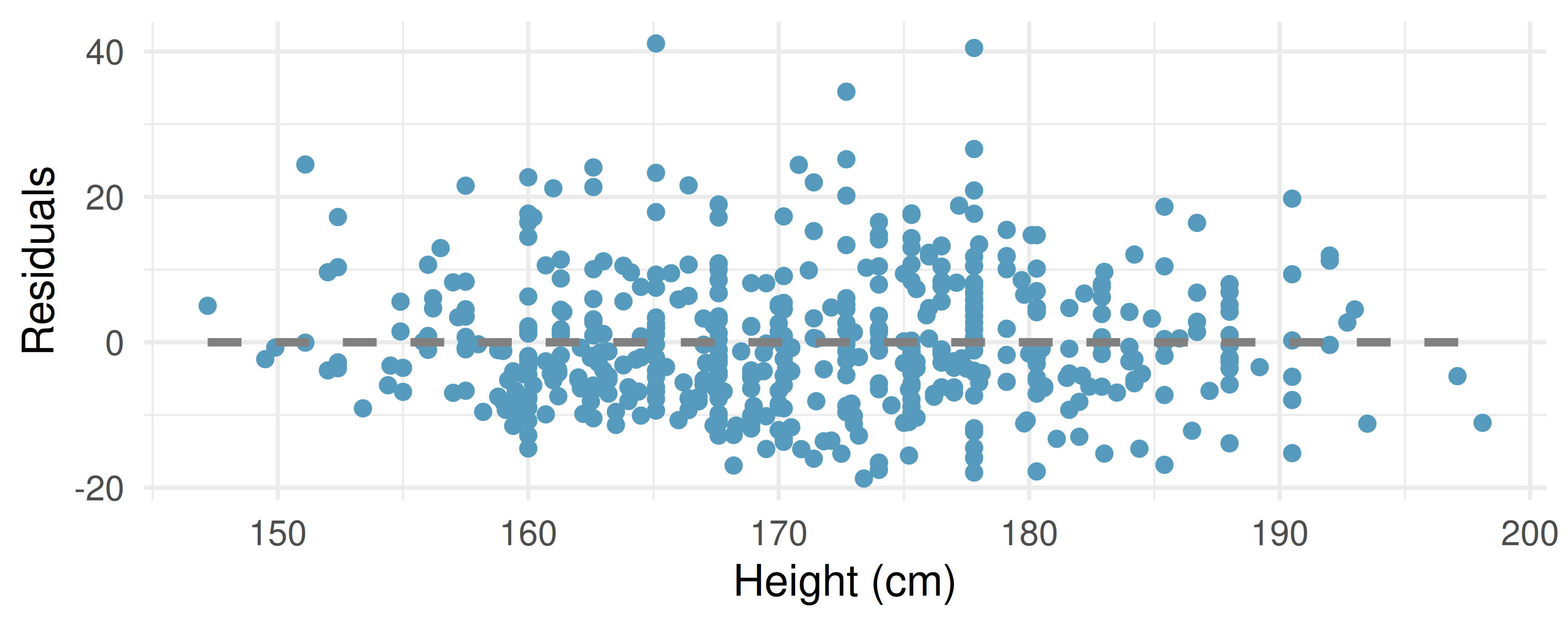
For these data, \(R^2\) is 51.84%. What is the value of the correlation coefficient? How can you tell if it is positive or negative? (Hint: you may need to look at a previous exercise.)
Examine the residual plot. What do you observe? Is a simple least squares fit appropriate for these data? Which of the LINE conditions are met or not met?
- Baby’s weight and father’s age, conditions. The scatterplot below shows the residuals (on the y-axis) from the linear model of baby’s weight (measured in pounds) vs. father’s age for a random sample of babies. Father’s age is on the x-axis. (ICPSR 2014)
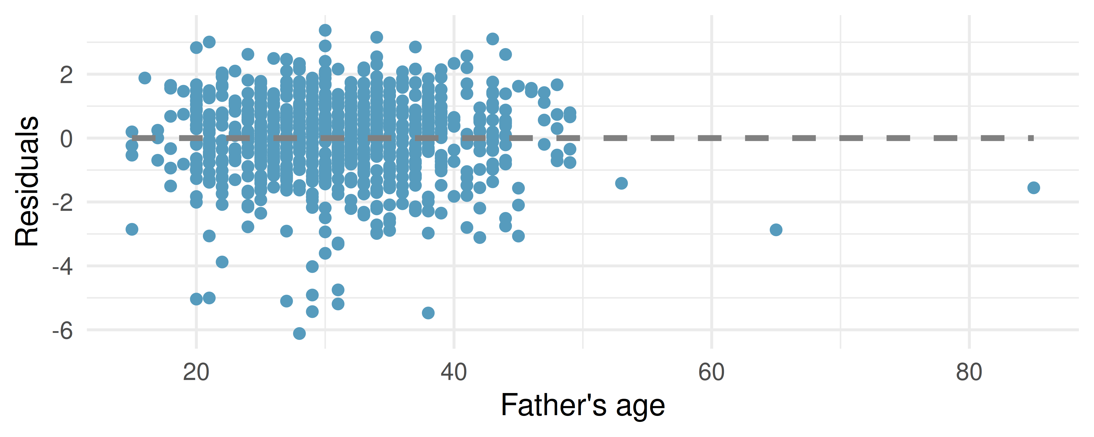
For these data, \(R^2\) is 0.09%. What is the value of the correlation coefficient? How can you tell if it is positive or negative? (Hint: you may need to look at a previous exercise.)
Examine the residual plot. What do you observe? Is a simple least squares fit appropriate for these data? Which of the LINE conditions are met or not met?
- Murders and poverty, conditions. The scatterplot below shows the annual murders per million vs. percentage living in poverty in a random sample of 20 metropolitan areas. The second figure plots residuals on the y-axis and percent living in poverty on the x-axis.
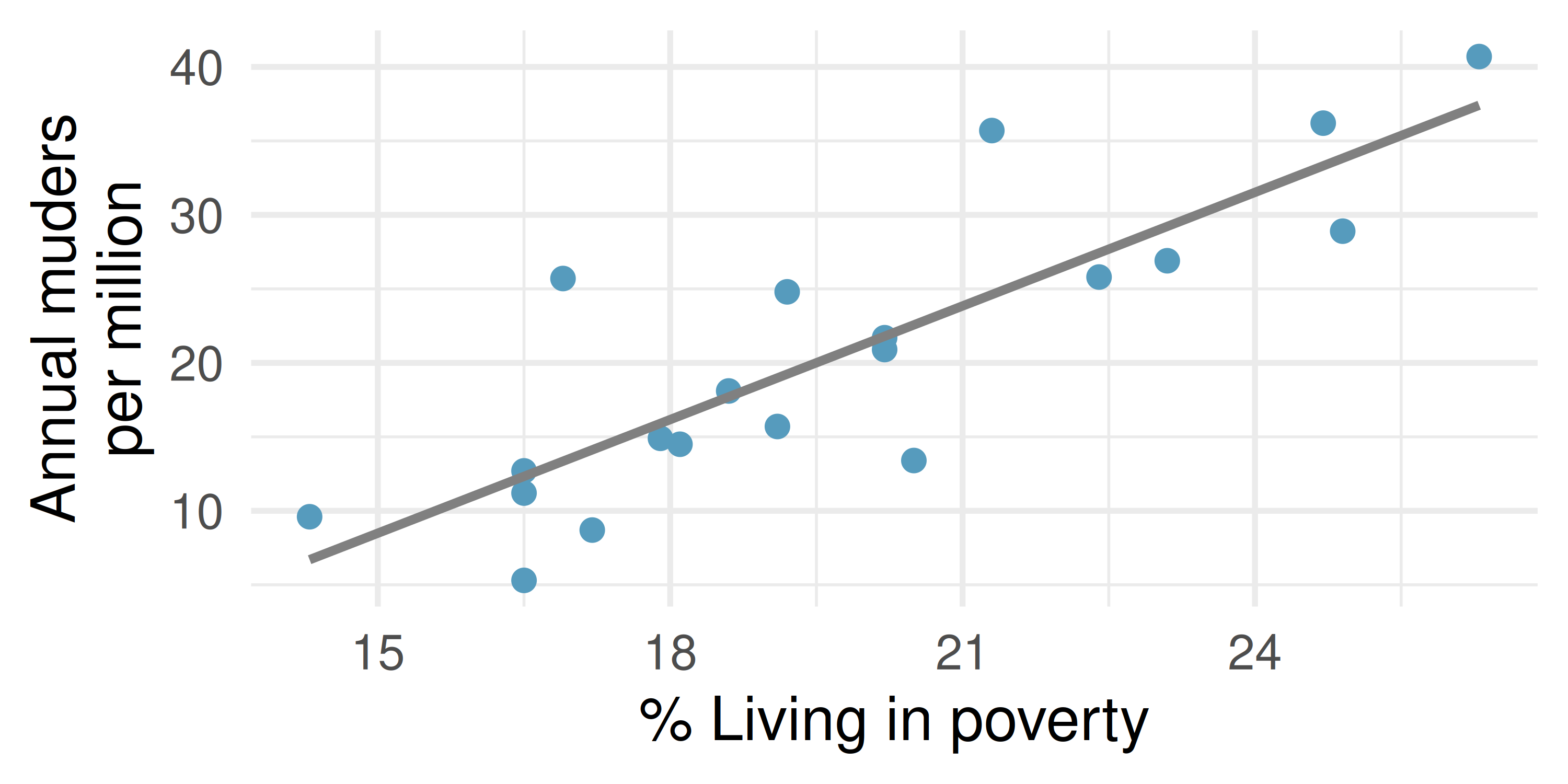
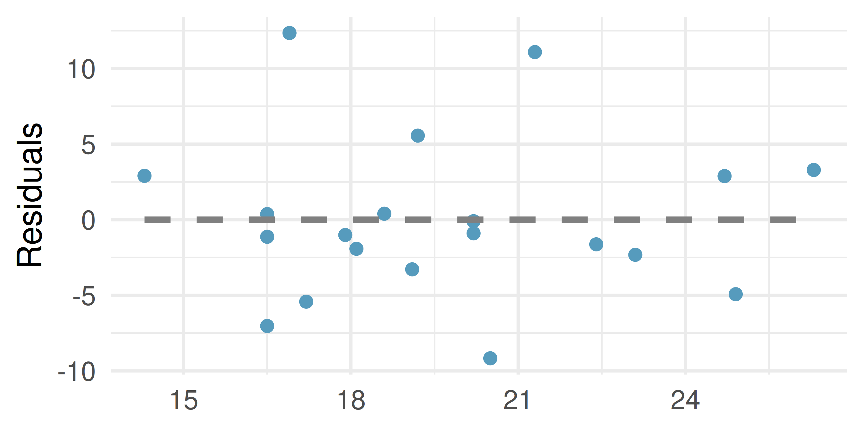
For these data, \(R^2\) is 70.56%. What is the value of the correlation coefficient? How can you tell if it is positive or negative?
Examine the residual plot. What do you observe? Is a simple least squares fit appropriate for the data? Which of the LINE conditions are met or not met?
- Urban homeowners, conditions. The scatterplot below shows the percent of families who own their home vs. the percent of the population living in urban areas. (US Census Bureau 2010) There are 52 observations, each corresponding to a state in the US. Puerto Rico and District of Columbia are also included. The second figure plots residuals on the y-axis and percent of the population living in urban areas on the x-axis.
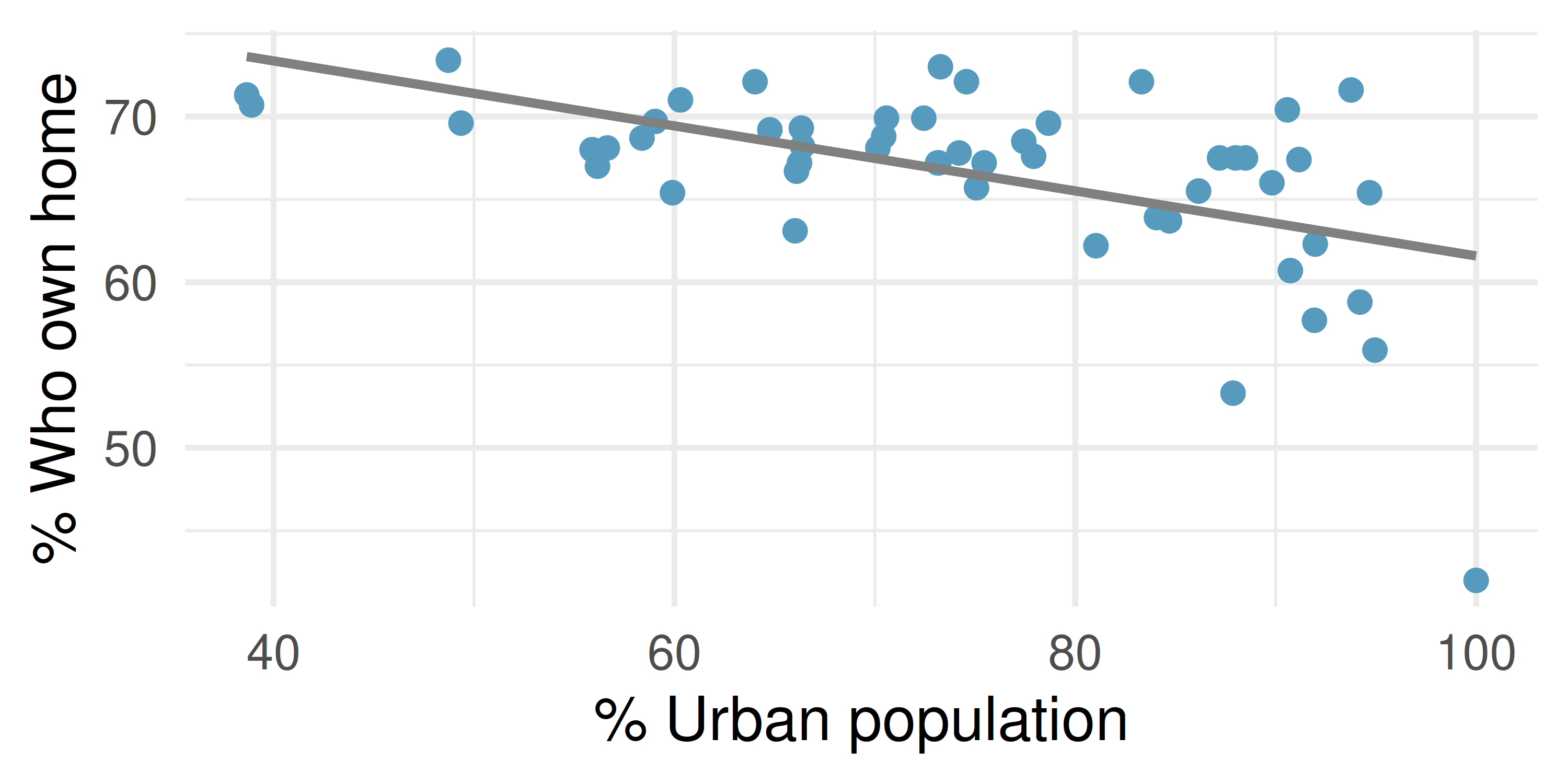
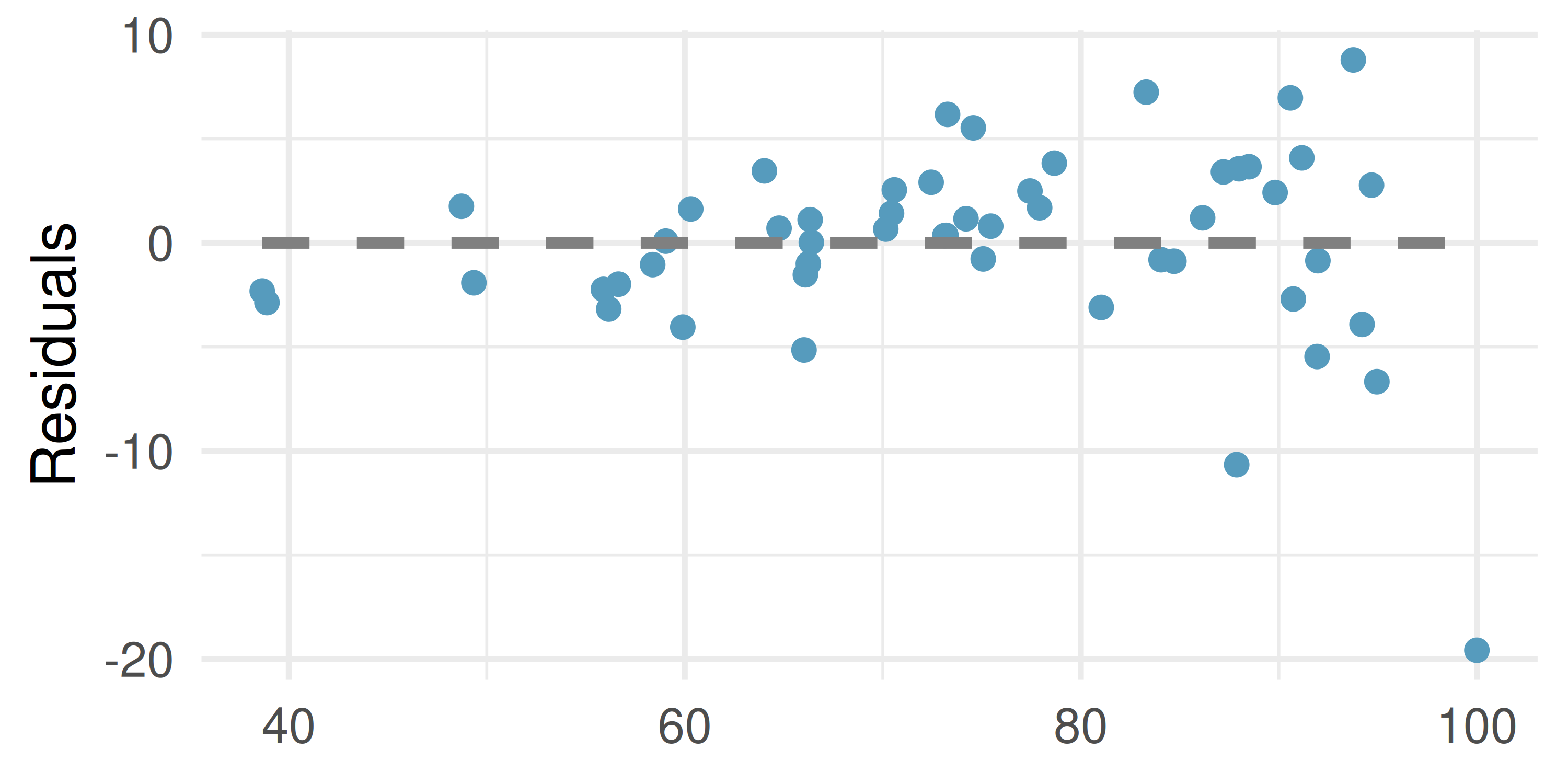
For these data, \(R^2\) is 29.16%. What is the value of the correlation coefficient? How can you tell if it is positive or negative?
Examine the residual plot. What do you observe? Is a simple least squares fit appropriate for the data? Which of the LINE conditions are met or not met?
- I heart cats, LINE conditions. Researchers collected data on heart and body weights of 144 domestic adult cats. The figure below shows the output of the predicted values and residuals generated from a linear model predicting heart weight (measured in grams) from body weight (measured in kilograms) of these cats.
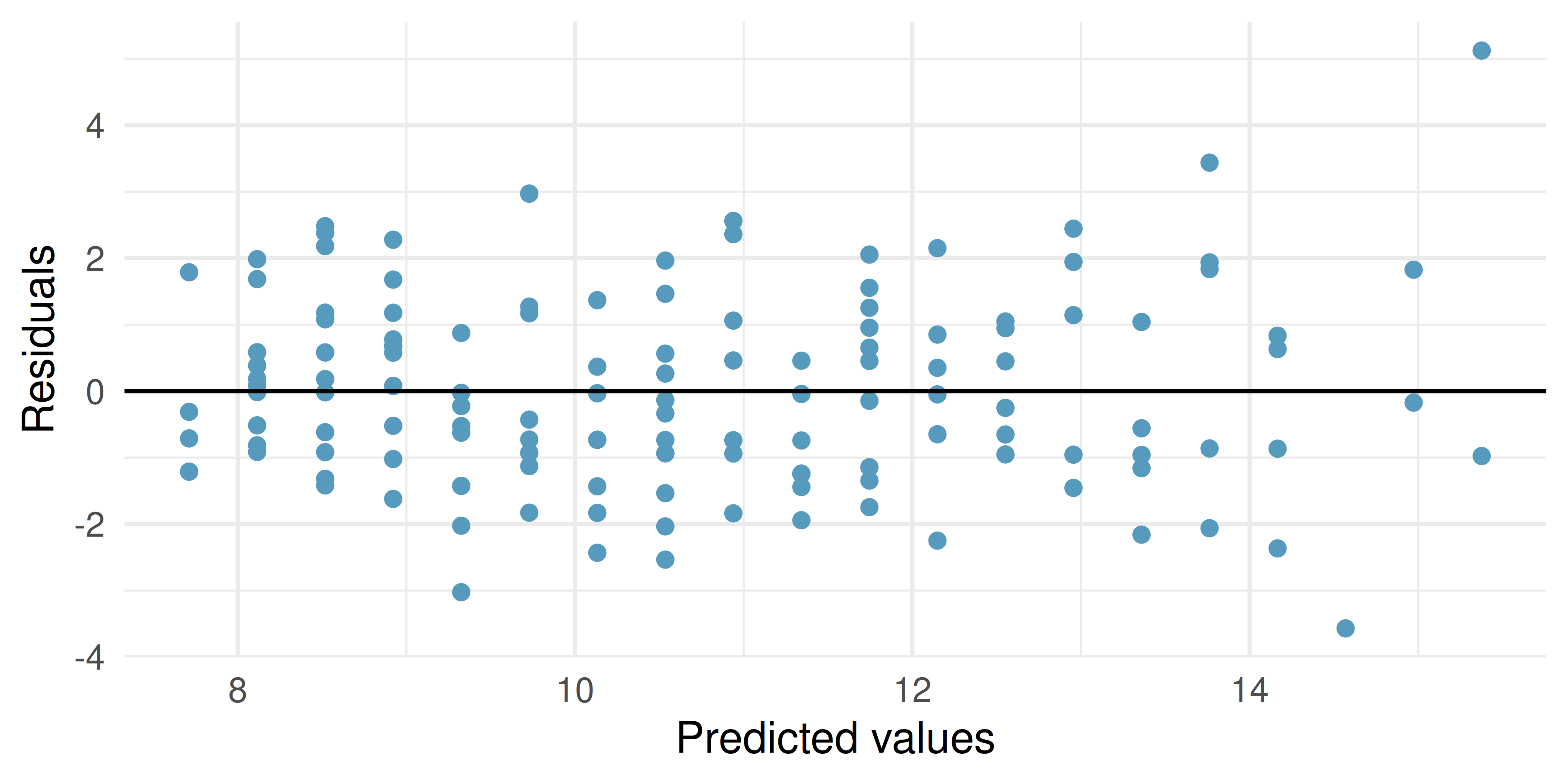
Examine the residual plot. Notice that for the small predicted values the residuals have a smaller magnitude than the larger residuals seen with the larger predicted values. The change in magnitude of the residuals across the predicted values is an indication of violation of which LINE technical condition?
If the LINE condtion described in part (a) is violated, might it lead to an incorrect conclusion about the model (i.e., the least squares regression line itself), the inference of the model (i.e., the p-value associated with the least squares regression line), neither, or both? Explain your reasoning.
- Beer and blood alcohol content, LINE conditions. The figure below shows the output of the predicted values and residuals generated from a linear model predicting the blood alcohol content (BAC) from number of cans of beer drunk by sixteen student volunteers at Ohio State University. (Malkevitch and Lesser 2008)
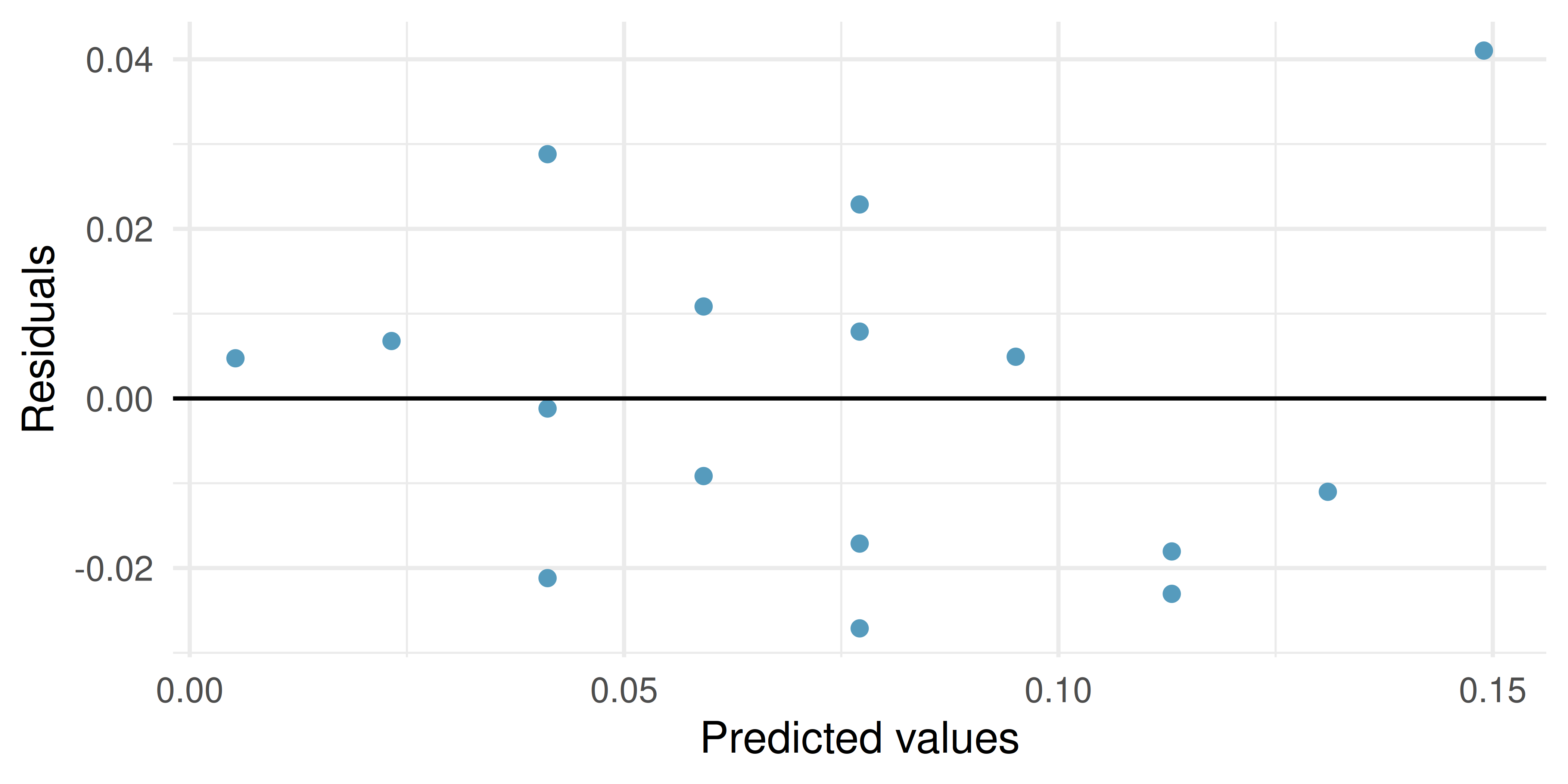
Examine the residual plot. Notice that it is difficult to identify any convincing patterns for or against violation of the LINE technical conditions. What is it about the residual plot that makes it difficult to assess the LINE technical conditions?
Is there anything about the residual plot which would make you hesitate about using the linear model for inference about all students? Is there anything about the experimental design of the study which would make you hesitate about using the linear model for inference about all students?
Dataset sources
starbucks (openintro) | urban_owner (usdata) | babies_crawl (openintro) | bac (openintro)
StatLens Exercises
Let StatLens do the arithmetic; spend your effort on the reasoning a calculator can’t do.
Read residuals. Open a regression dataset in the Regression Explorer and inspect the residual plot.
- What does a “good” residual plot look like? Sketch three features in words.
- Identify three bad patterns and name what each one tells you about the model.
- A student says: “If the residuals are small, the model is good.” Why is the size of residuals not the main thing to look at?
- Suppose you see a fan-shaped residual plot (spread grows with \(x\)). Which regression assumption has failed? What does this do to the trust you can place in the reported \(t\)-test for the slope and its CI?
R² in plain English. A regression of campus weekly food spending on monthly income reports \(R^2 = 0.41\).
- Translate “\(R^2 = 0.41\)” into one plain-English sentence about what fraction of variability in food spending is explained.
- Does \(R^2 = 0.41\) mean the regression is “weak” or “strong”? Why is this judgment context-dependent?
- Adding a second predictor (e.g., number of dining-out trips) raises \(R^2\) to 0.55. Is this always a sign that the new predictor matters? What does adding a random variable do to \(R^2\)?
- A student concludes: “\(R^2 = 0.41\) means 41% of food spending is caused by income.” What’s wrong with this?
Extrapolation: don’t trust the line outside the data. A regression of city temperature on month of year (1–12) gives a fitted line over the year.
- Why is using the line to predict the temperature at month 25 not just unreliable, but conceptually wrong?
- In a regression of test score on hours studied (in a sample where hours range 0–10), would you trust a prediction at 15 hours? At 5 hours? At \(-2\) hours? Rank the trust.
- Open any regression dataset in the Regression Explorer and note the range of \(x\) values. What would extrapolating the fitted line beyond that range tell you about the prediction — and what would it not tell you?
- A real-estate analyst predicts the price of a 50000-square-foot mansion using a regression fit to homes 500–3500 sqft. Why is even a “narrow” prediction interval at \(x = 50000\) deeply misleading?
CI for the mean response vs. prediction interval for a new \(y\). These two intervals answer different questions at the same \(x_0\).
- In words, what does a CI for the mean response at \(x_0\) estimate? Use a real-estate example to make it concrete.
- In words, what does a prediction interval for a new \(y\) at \(x_0\) estimate? Same example.
- Which interval is wider, and why? (Hint: the prediction interval has two sources of uncertainty; the mean-response CI has only one.)
- An analyst quotes the mean-response CI but speaks as if it were a prediction interval (e.g., “we’re 95% sure the next house at 2000 sqft sells for between $280k and $320k”). What’s wrong, and what is the right way to state each interval?
Leverage and influential observations. Open the Regression by Eye lab and generate a scatter with \(n = 20\) near a moderate slope. Then mentally add a single extra point with very large \(x\).
- Define leverage. Why does an observation at extreme \(x\) have high leverage even before you look at its \(y\)?
- Suppose your extra extreme-\(x\) point sits on the fitted line (it’s high-leverage but consistent). Does removing it change the slope much? What does that tell you about high leverage in isolation?
- Suppose instead the extra point sits far off the line — high leverage and high residual. Now does removing it change the slope? What’s the buzzword for this kind of point?
- In the Regression Explorer, find a real dataset and identify any potential high-leverage points by eye. What two questions should you ask before deciding whether to keep or remove them?
Apply-unit capstone — write conclusions across every procedure in the book. You have now met every inferential procedure this course covers: the one- and two-proportion \(z\), the one-sample / two-sample / paired \(t\), the chi-square goodness-of-fit and independence tests, one-way ANOVA, and slope inference. This capstone exercises the writing skill across all of them.
Open Conclusion Practice — Apply scope. The pool now includes chi-square scenarios in addition to the Calculate-unit scenarios you saw at the end of Ch 13. (As of this printing, the practice tool does not yet include ANOVA or slope scenarios — see contract REQ-035 for planned additions. When those land, the same link picks them up automatically.)
- Play at least 8 rounds across a mix of procedures. Track which procedures give you the most trouble and which come naturally.
- For at least one round where you scored poorly, re-read the scenario and identify the specific misinterpretation. Was it a p-value trap, a CI trap, a causation-vs-association slip, or a scope-of-inference issue?
- Compare your performance now to the ch 13 Calculate-scope capstone (if you did that one). Have you internalized the reasoning skills better, or did the added chi-square scenarios trip you up? What does that tell you about your understanding of “one framework, many procedures”?
- Finally: in one paragraph, write your own summary of the inference framework that unifies every procedure you learned this term. What are the four moves that appear in every test, regardless of the specific tool?
Benson, J. B. 1993. “Season of Birth and Onset of Locomotion: Theoretical and Methodological Implications.” Infant Behavior and Development 16 (1): 69–81. https://doi.org/10.1016/0163-6383(93)80029-8.
Heinz, G., L. J. Peterson, R. W. Johnson, and C. J. Kerk. 2003. “Exploring Relationships in Body Dimensions.” Journal of Statistics Education 11 (2). http://www.openintro.org/redirect.php?go=textbook-body_dim_2003.
ICPSR. 2014. “United States Department of Health and Human Services. Centers for Disease Control and Prevention. National Center for Health Statistics. Natality Detail File, 2014 United States. Inter-University Consortium for Political and Social Research, 2016-10-07.” https://doi.org/10.3886/ICPSR36461.v1.
Malkevitch, J., and L. M. Lesser. 2008. For All Practical Purposes: Mathematical Literacy in Today’s World. WH Freeman & Co.
US Census Bureau. 2010. “2010 Census Urban and Rural Classification and Urban Area Criteria Housing Characteristics.” http://www.openintro.org/redirect.php?go=textbook-housing_char_2010.