1 Introduction to Data
Scientists seek to answer questions using rigorous methods and careful observations. These observations — collected from the likes of field notes, surveys, and experiments — form the backbone of a statistical investigation and are called data. Statistics is the study of how best to collect, analyze, and draw conclusions from data. In this first chapter, we focus on both the properties of data and on the collection of data. We will introduce the building blocks of statistical thinking: observations, variables, data frames, and the types of questions that statistics can help us answer.
1.1 Case study: Using stents to prevent strokes
In this section we introduce a classic challenge in statistics: evaluating the efficacy of a medical treatment. The terms and ideas introduced here will be revisited throughout the course. For now, the goal is simply to get a sense of the role statistics can play in practice.
A stent is a small mesh tube that is placed inside a narrow or weak artery to assist in patient recovery after cardiac events and reduce the risk of an additional heart attack or death. Many doctors have hoped that there would be similar benefits for patients at risk of stroke. This leads to the principal question the researchers hoped to answer:
Does the use of stents reduce the risk of stroke?
The researchers who asked this question conducted an experiment with 451 at-risk patients.1 Each volunteer patient was randomly assigned to one of two groups:
- Treatment group. Patients in the treatment group received a stent and medical management. The medical management included medications, management of risk factors, and help in lifestyle modification.
- Control group. Patients in the control group received the same medical management as the treatment group, but they did not receive stents.
Researchers randomly assigned 224 patients to the treatment group and 227 to the control group. In this study, the control group provides a reference point against which we can measure the medical impact of stents in the treatment group.
1.1.1 Examining the data
Researchers studied the effect of stents at two time points: 30 days after enrollment and 365 days after enrollment. Patient outcomes were recorded as “stroke” or “no event,” representing whether the patient had a stroke during that time period.
It would be difficult to answer the research question by looking at individual patient records one at a time. Instead, we organize the results into a summary table that lets us quickly compare the two groups.
| 30 days: Stroke | 30 days: No event | 365 days: Stroke | 365 days: No event | |
|---|---|---|---|---|
| Treatment | 33 | 191 | 45 | 179 |
| Control | 13 | 214 | 28 | 199 |
| Total | 46 | 405 | 73 | 378 |
Of the 224 patients in the treatment group, 45 had a stroke by the end of the first year. Using these two numbers, compute the proportion of patients in the treatment group who had a stroke by the end of their first year. (Note: answers to all Guided Practice exercises are provided in footnotes!)
Show answer
The proportion of the 224 patients who had a stroke within 365 days: \(45/224 = 0.20 = 20\%\).1.1.2 Drawing conclusions from the data
We can compute sample statistics from Table 1.1 to give us a better idea of how the impact of the stent treatment differed between the two groups.
A sample statistic is a single number that summarizes data from a sample. Sample statistics condense a large amount of information into a form that is easy to digest and compare.
For instance, the primary results of the study after one year could be described by two sample statistics: the proportion of people who had a stroke in the treatment and control groups.
- Proportion who had a stroke in the treatment (stent) group: \(45/224 = 0.20 = 20\%\).
- Proportion who had a stroke in the control group: \(28/227 = 0.12 = 12\%\).
These two sample statistics are useful in looking for differences between the groups, and we are in for a surprise: an additional 8% of patients in the treatment group had a stroke! This is important for two reasons. First, it is contrary to what doctors expected, which was that stents would reduce the rate of strokes. Second, it leads to a statistical question: do the data show a “real” difference between the groups?
This second question is subtle. Suppose you flip a coin 100 times. While the chance a coin lands heads in any given coin flip is 50%, we probably will not observe exactly 50 heads. This type of variation is part of almost any type of data generating process. It is possible that the 8% difference in the stent study is due to this natural variation. However, the larger the difference we observe (for a particular sample size), the less believable it is that the difference is due to chance. So what we are really asking is the following: if in fact stents have no effect, how unlikely is it that we would observe such a large difference?
While we do not yet have the statistical tools to fully address this question on our own, we can state the conclusion of the published analysis: there was compelling evidence of harm by stents in this study of stroke patients.
Be careful about overgeneralizing. Do not generalize the results of this study to all patients and all stents. This study looked at patients with very specific characteristics who volunteered to be part of the study and who may not be representative of all stroke patients. In addition, there are many types of stents, and this study considered only the self-expanding Wingspan stent (Boston Scientific). However, the study does leave us with an important lesson: we should keep our eyes open for surprises.
Does this study prove that stents cause strokes? What features of the study design might strengthen or weaken this conclusion?
Show answer
Because patients were randomly assigned to treatment and control groups, this is a randomized experiment. Random assignment helps ensure the groups are similar in all respects except the treatment itself. This strengthens the case for a causal conclusion. However, we should still ask: could the difference (20% vs. 12%) have arisen by chance alone? We will develop tools to answer this question rigorously later in the course.This case study highlights a key principle that will guide much of our work in this course: a single study’s results can be surprising, and statistics gives us the tools to evaluate whether an observed result reflects a genuine effect or could be due to random chance. We will return to this idea again and again as we develop the tools of statistical inference.
1.2 Data basics
Effective presentation and description of data is a first step in most analyses. This section introduces one structure for organizing data as well as some terminology that will be used throughout the course.
1.2.1 Observations, variables, and data matrices
An observation (also called a case or unit of observation) is a single entity in a dataset — one person, one county, one transaction. A variable is a characteristic that is measured or recorded for each observation. A data frame (or data matrix) organizes observations as rows and variables as columns. Each cell holds a single value.
Consider data for 50 randomly sampled loans offered through a peer-to-peer lending company. Each row in the table represents a single loan — that is the observation, or unit of observation. The columns represent characteristics of each loan, and each column is a variable. For example, the first row might represent a loan of $22,000 with an interest rate of 10.90%, where the borrower is based in New Jersey (NJ) and has an income of $59,000.
| loan_amount | interest_rate | term | grade | state | total_income | homeownership | |
|---|---|---|---|---|---|---|---|
| 1 | 22,000 | 10.90 | 60 | B | NJ | 59,000 | rent |
| 2 | 6,000 | 9.92 | 36 | B | CA | 60,000 | rent |
| 3 | 25,000 | 26.30 | 36 | E | SC | 75,000 | mortgage |
| 4 | 6,000 | 9.92 | 36 | B | CA | 75,000 | rent |
| 5 | 25,000 | 9.43 | 60 | B | OH | 254,000 | mortgage |
| 6 | 6,400 | 9.92 | 36 | B | IN | 67,000 | mortgage |
In practice, it is especially important to ask clarifying questions to ensure important aspects of the data are understood. For instance, it is always important to be sure we know what each variable means and its units of measurement. Table 1.3 describes each variable in the loan dataset.
| Variable | Description |
|---|---|
| loan_amount | Amount of the loan received, in US dollars. |
| interest_rate | Interest rate on the loan, in an annual percentage. |
| term | The length of the loan, which is always set as a whole number of months. |
| grade | Loan grade, which takes values A through G and represents the quality of the loan and its likelihood of being repaid. |
| state | US state where the borrower resides. |
| total_income | Borrower’s total income, including any second income, in US dollars. |
| homeownership | Indicates whether the person owns, owns but has a mortgage, or rents. |
What is the grade of the first loan in Table 1.2? And what is the homeownership status of the borrower for that first loan?
Show answer
The loan’s grade is B, and the borrower rents their residence.1.2.2 Tidy data
A data frame where each row is a unique case (observational unit), each column is a variable, and each cell is a single value is commonly referred to as tidy data.
Tidy data is a standard way of mapping the meaning of a dataset to its structure. A dataset is tidy when:
- Each row represents a single observation.
- Each column represents a single variable.
- Each cell contains a single value.
When recording data, use a tidy data frame unless you have a very good reason to use a different structure. This structure allows new cases to be added as rows or new variables as new columns and facilitates visualization, summarization, and other statistical analyses.
The grades for assignments, quizzes, and exams in a course are often recorded in a gradebook that takes the form of a data frame. How might you organize a course’s grade data using a data frame? Describe the observational units and variables.
Show answer
There are multiple strategies that can be followed. One common strategy is to have each student represented by a row, and then add a column for each assignment, quiz, or exam. Under this setup, it is easy to review a single line to understand the grade history of a student. There should also be columns to include student information, such as one column to list student names.1.2.3 A larger dataset: US counties
We consider data for 3,142 counties in the United States, which includes the name of each county, the state where it resides, its population in 2017, the population change from 2010 to 2017, poverty rate, and several additional characteristics.
How might these data be organized in a data frame? What are the observations and variables?
Show answer
Each county may be viewed as a case, and there are multiple pieces of information recorded for each case. A table with 3,142 rows and 14 columns could hold these data, where each row represents a county and each column represents a particular piece of information.| name | state | pop2017 | pop_change | unemployment_rate | median_edu |
|---|---|---|---|---|---|
| Autauga County | Alabama | 55,504 | 1.48 | 3.86 | some_college |
| Baldwin County | Alabama | 212,628 | 9.19 | 3.83 | some_college |
| Barbour County | Alabama | 25,270 | -6.22 | 6.44 | hs_diploma |
| Bibb County | Alabama | 22,668 | 0.73 | 4.39 | hs_diploma |
| Blount County | Alabama | 58,013 | 0.68 | 4.02 | hs_diploma |
| Bullock County | Alabama | 10,309 | -2.28 | 7.72 | hs_diploma |
| Variable | Description |
|---|---|
| name | Name of county. |
| state | Name of state. |
| pop2000 | Population in 2000. |
| pop2010 | Population in 2010. |
| pop2017 | Population in 2017. |
| pop_change | Population change from 2010 to 2017 (in percent). |
| poverty | Percent of population in poverty in 2017. |
| homeownership | Homeownership rate, 2006–2010. |
| multi_unit | Percent of housing units that are in multi-unit structures, 2006–2010. |
| unemployment_rate | Unemployment rate in 2017. |
| metro | Whether the county contains a metropolitan area (yes or no). |
| median_edu | Median education level (2013–2017): below_hs, hs_diploma, some_college, or bachelors. |
| per_capita_income | Per capita (per person) income (2013–2017). |
| median_hh_income | Median household income. |
| smoking_ban | Type of county-level smoking ban in place in 2010: none, partial, or comprehensive. |
1.3 Types of variables
Examine the variables unemployment_rate, pop2017, state, and median_edu in the county dataset. Each of these variables is inherently different from the other three, yet some share certain characteristics. Understanding these distinctions is fundamental to choosing the right analysis tools.
1.3.1 Numerical variables
A quantitative variable (also called a numerical variable) takes on values where arithmetic operations like adding, subtracting, or averaging make sense.
Consider unemployment_rate, which can take a wide range of numerical values, and it is sensible to add, subtract, or take averages with those values. On the other hand, we would not classify a variable reporting telephone area codes as quantitative since the average, sum, and difference of area codes does not have any clear meaning.
Quantitative variables can be further subdivided:
- Continuous variables can take any value within a range, including decimals. The
unemployment_rateis continuous — it could be 3.86%, 4.127%, or any value in between. - Discrete variables can only take counting values (typically whole numbers: 0, 1, 2, …). The variable
pop2017(population count) is discrete — you cannot have 55,504.7 people.
The key test for quantitative vs. categorical. Ask yourself: does it make sense to compute the average of this variable? If you can meaningfully average the values, it is quantitative. If averaging does not make sense (as with zip codes or phone numbers), the variable is categorical, even if it happens to be recorded using digits.
1.3.2 Categorical variables
A categorical variable (also called a qualitative variable) takes on values that are category names or labels. The possible values of a categorical variable are called its levels.
The variable state can take up to 51 values (after accounting for Washington, DC): Alabama, Alaska, …, and Wyoming. Because the responses themselves are categories, state is a categorical variable, and the possible values (states) are the variable’s levels.
Categorical variables can be further subdivided:
- Nominal variables have categories with no natural ordering. The variable
stateis nominal — there is no inherent reason to rank Alabama above Alaska or Wyoming. - Ordinal variables have categories with a meaningful order. The variable
median_edutakes valuesbelow_hs,hs_diploma,some_college, orbachelors. These categories have a natural ordering (less education to more education), makingmedian_eduordinal.
In most of this course, we will treat categorical variables as nominal (unordered). The distinction between nominal and ordinal becomes more important in advanced courses when special methods are used to take advantage of the ordering.
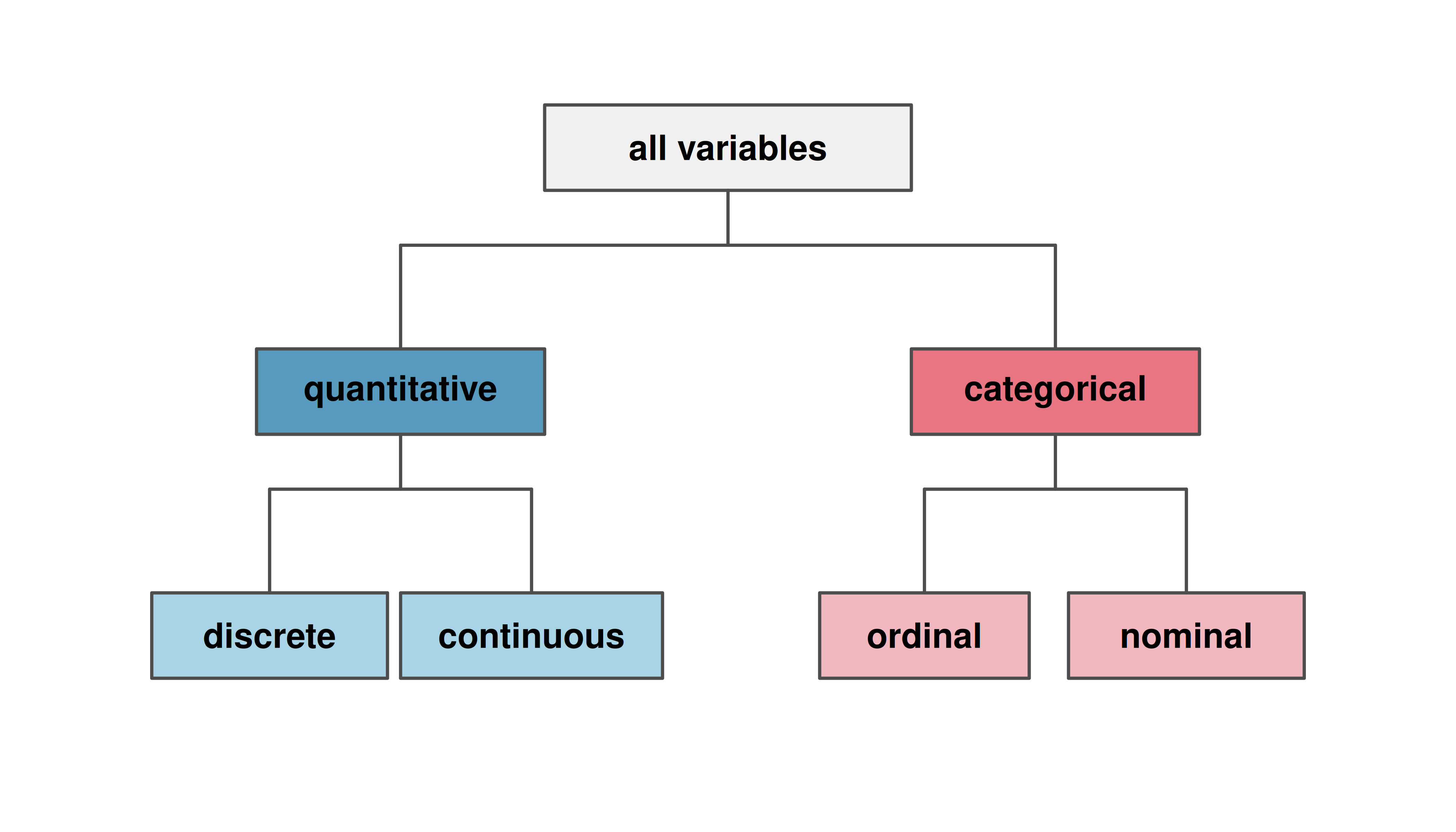
1.3.3 Variable type hierarchy
The breakdown of variable types is summarized in the diagram below.
Data were collected about students in a statistics course. Three variables were recorded for each student: number of siblings, student height, and whether the student had previously taken a statistics course. Classify each of the variables as continuous quantitative, discrete quantitative, or categorical.
The number of siblings and student height represent quantitative variables. Because the number of siblings is a count, it is discrete. Height varies continuously, so it is a continuous quantitative variable. The last variable classifies students into two categories — those who have and those who have not taken a statistics course — which makes this variable categorical.
An experiment is evaluating the effectiveness of a new drug in treating migraines. A group variable is used to indicate the experiment group for each patient: treatment or control. The num_migraines variable represents the number of migraines the patient experienced during a 3-month period. Classify each variable as either quantitative or categorical.
Show answer
Thegroup variable can take just one of two group names, making it categorical. The num_migraines variable describes a count of the number of migraines, which is an outcome where basic arithmetic is sensible, which means this is a quantitative outcome; more specifically, since it represents a count, num_migraines is a discrete quantitative variable.
Classify each variable as continuous quantitative, discrete quantitative, nominal categorical, or ordinal categorical:
- Number of text messages sent per day
- Favorite type of music
- Temperature in Fahrenheit
- Satisfaction rating (1 = very unsatisfied, …, 5 = very satisfied)
Show answer
- Discrete quantitative — it is a count. b. Nominal categorical — the categories (rock, jazz, classical, etc.) have no natural ordering. c. Continuous quantitative — temperature can take any value in a range. d. Ordinal categorical — the numbers have a meaningful order, but the intervals between them may not be equal, and averaging satisfaction ratings is debatable.
1.4 Relationships between variables
Many analyses are motivated by a researcher looking for a relationship between two or more variables. A social scientist might like to answer questions such as:
Does a higher-than-average increase in county population tend to correspond to counties with higher or lower median household incomes?
If homeownership in one county is lower than the national average, will the percent of housing units that are in multi-unit structures in that county tend to be above or below the national average?
How much can the median education level explain the median household income for counties in the US?
To answer these questions, data must be collected, such as the county dataset shown in Table 1.4. Examining sample statistics can provide numerical insights about the specifics of each of these questions. Alternatively, graphs can be used to visually explore the data, potentially providing more insight than a sample statistic.
1.4.1 Scatterplots
A scatterplot is a graph that displays the relationship between two quantitative variables. Each observation is represented by a point, with one variable on the horizontal axis and the other on the vertical axis.
The figure below displays the relationship between homeownership and multi_unit (the percent of housing units that are in multi-unit structures such as apartments and condos) for US counties. Each point on the plot represents a single county. For instance, one highlighted point corresponds to Chattahoochee County, Georgia, which has 39.4% of housing units in multi-unit structures and a homeownership rate of 31.3%.
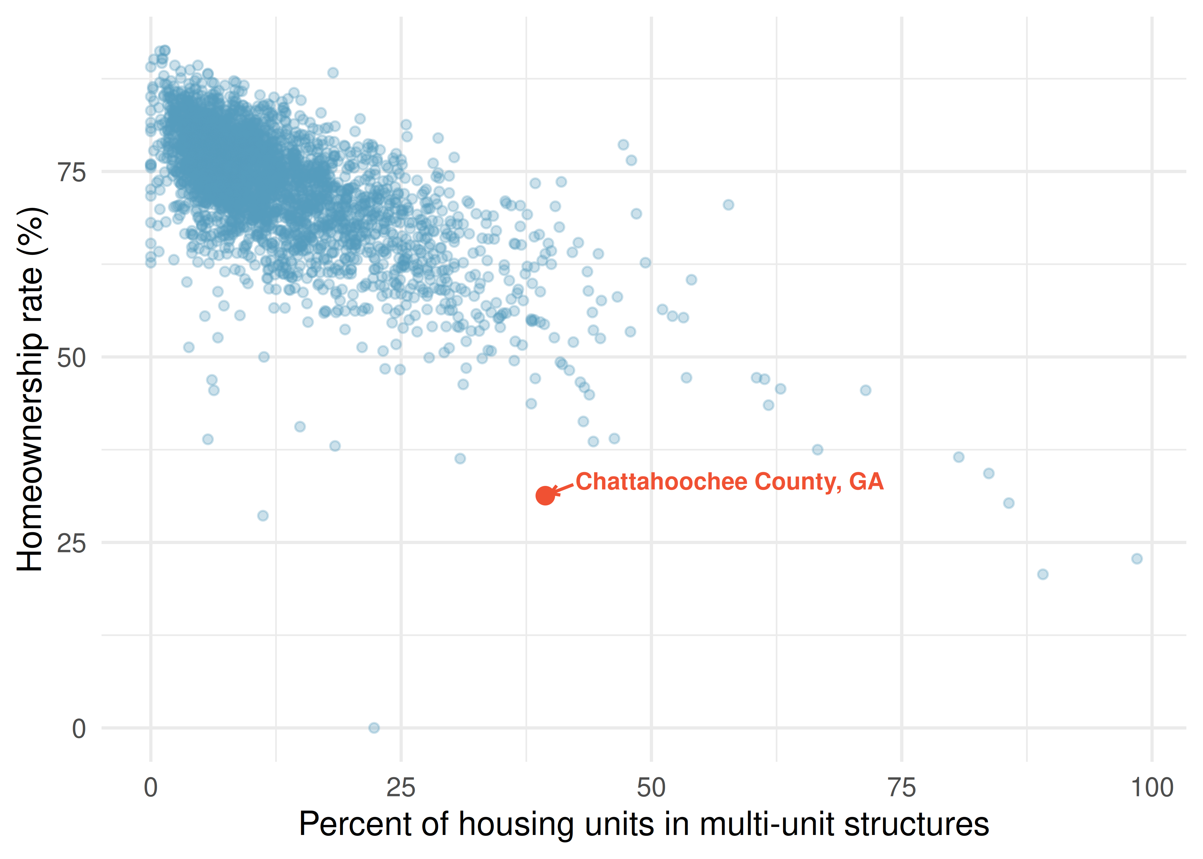
The scatterplot suggests a relationship between the two variables: counties with a higher rate of housing units in multi-unit structures tend to have lower homeownership rates. We might brainstorm as to why this relationship exists and investigate each idea to determine which are the most reasonable explanations.
1.4.2 Associated and independent variables
When two variables show some connection or pattern with one another, they are called associated variables (or related variables). If two variables are not associated — there is no evident relationship between them — they are said to be independent.
Because there is a downward trend in the homeownership vs. multi-unit scatterplot — counties with more multi-unit housing are associated with lower homeownership — these variables are said to be negatively associated.
A positive association means that as one variable increases, the other tends to increase as well. A negative association means that as one variable increases, the other tends to decrease.
Consider the relationship between the percent change in population from 2010 to 2017 and median household income for counties, as shown in the scatterplot below. Are these variables associated?
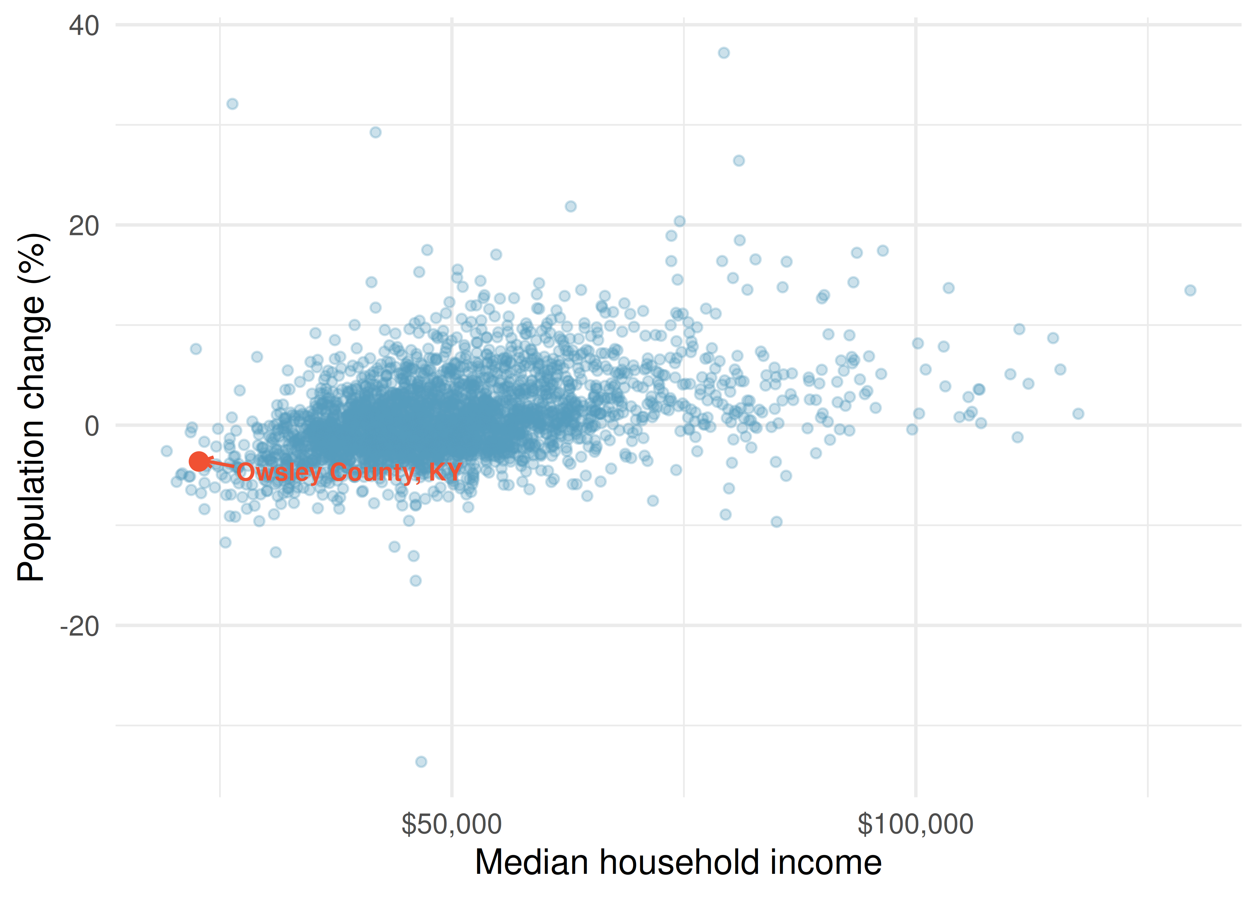
The larger the median household income for a county, the higher the population growth observed for the county. While it is not true that every county with a higher median household income has higher population growth, the trend in the plot is evident. Since there is some relationship between the variables, they are associated. Because both variables tend to increase together, this is a positive association.
Associated or independent, not both. A pair of variables are either related in some way (associated) or not (independent). No pair of variables is both associated and independent.
Examine the variables in the loan dataset, which are described in Table 1.3. Create two questions about possible relationships between variables in the loan data that are of interest to you.
Show answer
Two example questions: (1) What is the relationship between loan amount and total income? (2) If someone’s income is above the average, will their interest rate tend to be above or below the average?1.5 Explanatory and response variables
When we ask questions about the relationship between two variables, we sometimes also want to determine if the change in one variable causes a change in the other. Consider the following rephrasing of an earlier question about the county dataset:
If there is an increase in the median household income in a county, does this drive an increase in its population?
In this question, we are asking whether one variable affects another.
When we suspect one variable might causally affect another, we label the first variable the explanatory variable and the second the response variable.
\[\text{explanatory variable} \;\longrightarrow\; \text{might affect} \;\longrightarrow\; \text{response variable}\]
We also use the terms explanatory and response to describe variables where the response might be predicted using the explanatory variable, even if there is no causal relationship.
For many pairs of variables, there is no hypothesized relationship, and these labels would not be applied to either variable.
In the stent study from Section 1.1, identify the explanatory and response variables.
The explanatory variable is the treatment group assignment (stent or control), because this is the factor that the researchers manipulated. The response variable is whether the patient had a stroke, because this is the outcome the researchers measured to evaluate the treatment’s effect.
Labeling one variable as “explanatory” does not guarantee that it causes changes in the response. A formal evaluation of whether one variable causes changes in another requires an experiment. We discuss this distinction further in Section 1.6.
Some disciplines use the terms independent variable and dependent variable instead of explanatory and response. We avoid this language because the word “independent” has a different technical meaning in statistics — it refers to variables that are not associated. Using “independent” in two different ways can cause confusion.
A researcher is studying whether hours spent studying for an exam are related to exam scores. Identify the explanatory and response variables.
Show answer
The explanatory variable is hours spent studying, because this is the factor that might influence the outcome. The response variable is exam score, because this is the outcome being measured.1.6 Observational studies and experiments
There are two primary types of data collection: experiments and observational studies. Understanding the difference is critical, because the type of study determines what conclusions we can draw.
1.6.1 Experiments
Studies where the researchers assign treatments to cases are called experiments. When individuals are randomly assigned to treatment groups, the experiment is called a randomized experiment.
For instance, we may suspect that drinking a high-calorie energy drink will improve performance in a race. To check if there really is a causal relationship between the explanatory variable (whether the runner drank an energy drink or not) and the response variable (the race time), researchers identify a sample of individuals and split them into groups. The individuals in each group are assigned a treatment. Random assignment organizes the participants into groups that are roughly equal on all aspects, thus allowing us to control for any other variables that might affect the outcome (such as fitness level, racing experience, or age).
For example, each runner in the experiment could be randomly assigned — perhaps by flipping a coin — into one of two groups: the first group receives a placebo (a fake treatment, in this case a no-calorie drink that looks identical to the energy drink) and the second group receives the high-calorie energy drink.
A placebo is a fake treatment that is made to look like the real treatment. Placebos are used so that subjects in the control group have the same experience as those in the treatment group (except for the actual treatment), which helps researchers isolate the effect of the treatment itself.
See the stent case study in Section 1.1 for another example of an experiment, though that study did not employ a placebo.
1.6.2 Observational studies
Researchers perform an observational study when they collect data in a way that does not directly interfere with how the data arise. In an observational study, the researcher merely observes what happens naturally.
Researchers perform observational studies when they collect data via surveys, review medical or company records, or follow a cohort (a group of similar individuals) over time to form hypotheses about why certain outcomes might occur. In each of these situations, researchers merely observe the data that arise — they do not assign treatments to subjects.
A researcher wants to know if smoking causes lung cancer. She follows 10,000 adults over 20 years, recording whether each person smokes and whether they develop lung cancer. Is this an experiment or an observational study?
This is an observational study. The researcher did not assign anyone to smoke or not smoke — she simply observed the participants’ behavior and health outcomes. While the study might reveal an association between smoking and lung cancer, it cannot by itself prove causation, because there may be other differences between smokers and non-smokers (such as diet, exercise habits, or genetics) that contribute to the outcome.
1.6.3 The key distinction: association vs. causation
In general, observational studies can provide evidence of a naturally occurring association between variables, but they cannot by themselves show a causal connection. This is because in observational studies, researchers cannot control for all the other variables that might be influencing the outcome.
Association does not imply causation.
In general, association does not imply causation. An advantage of a randomized experiment is that it is easier to establish causal relationships, because random assignment tends to balance out the effects of other variables across treatment groups. Establishing causation from observational studies requires advanced statistical methods that are beyond the scope of this course. We revisit these ideas when we discuss study design in the study design chapter.
Determine whether each of the following is an experiment or an observational study:
- A pharmaceutical company randomly assigns 200 patients to receive either a new drug or a placebo and measures their cholesterol levels after 6 months.
- A university surveys its graduates to determine whether those who participated in study-abroad programs earn higher salaries five years after graduation.
- A teacher assigns students in her morning class to use a new learning app and students in her afternoon class to study using traditional methods, then compares exam scores.
- This is an experiment — the company randomly assigns patients to treatments.
- This is an observational study — the university simply collects data on students who chose (or chose not) to study abroad. The students were not randomly assigned.
- This is tricky. The teacher assigns groups, so it might seem like an experiment. However, because students were not randomly assigned (they ended up in morning vs. afternoon classes for their own reasons), this is better described as a quasi-experiment or an observational study. Differences in outcomes could be due to the app, or they could be due to systematic differences between the types of students who take morning vs. afternoon classes.
1.6.4 Putting it all together
The table below summarizes the key differences between experiments and observational studies.
| Experiment | Observational Study | |
|---|---|---|
| Researcher’s role | Assigns treatments | Observes what happens naturally |
| Random assignment? | Yes (in a randomized experiment) | No |
| Can establish causation? | Yes, if randomized (for subjects like those in the study) | Generally no |
| Example | Randomly assign patients to drug vs. placebo | Survey people about their exercise habits and health |
1.7 Chapter review
1.7.1 Summary
This chapter introduced you to the world of data. Here are the key ideas:
- Data are observations collected about the world around us. Statistics is the study of how best to collect, analyze, and draw conclusions from data.
- A data frame organizes data so that each row represents an observation and each column represents a variable. Data organized this way is called tidy data.
- Variables come in two fundamental types: quantitative (continuous or discrete) and categorical (nominal or ordinal).
- When two variables show a pattern together, they are associated; if not, they are independent. Associations can be positive (both increase together) or negative (one increases while the other decreases).
- The explanatory variable is the variable we think might influence the response variable.
- Randomized experiments randomly assign subjects to treatments and can establish causation for subjects like those in the study. Observational studies merely observe what happens and can identify associations, but generally cannot establish causation.
- Association does not imply causation — this is one of the most important principles in statistics.
Many of the ideas from this chapter will be revisited as we move on to doing end-to-end data analyses. In the next chapter, you will learn about how we can design studies to collect the data we need to make conclusions with the desired scope of inference.
1.7.2 Key terms
The following terms were introduced in this chapter. You should be able to define and give an example of each.
| Term | Term | Term |
|---|---|---|
| associated | data | data frame |
| case | categorical variable | cohort |
| continuous | dependent variable | discrete |
| experiment | explanatory variable | independent |
| level | negative association | nominal |
| quantitative variable | observation | observational study |
| ordinal | placebo | positive association |
| randomized experiment | response variable | sample statistic |
| tidy data | unit of observation | variable |
1.8 Exercises
Answers to odd-numbered exercises are provided in the Exercise Solutions appendix at the back of the book.
- Marvel Cinematic Universe films. The data frame below contains information on Marvel Cinematic Universe films through the Infinity saga (a movie storyline spanning from Ironman in 2008 to Endgame in 2019). Box office totals are given in millions of US Dollars. How many observations and how many variables does this data frame have?
| Title | Hrs | Mins | Release Date | Opening Wknd US | US | World | |
|---|---|---|---|---|---|---|---|
| 1 | Iron Man | 2 | 6 | 5/2/2008 | 98.62 | 319.03 | 585.8 |
| 2 | The Incredible Hulk | 1 | 52 | 6/12/2008 | 55.41 | 134.81 | 264.77 |
| 3 | Iron Man 2 | 2 | 4 | 5/7/2010 | 128.12 | 312.43 | 623.93 |
| 4 | Thor | 1 | 55 | 5/6/2011 | 65.72 | 181.03 | 449.33 |
| 5 | Captain America: The First Avenger | 2 | 4 | 7/22/2011 | 65.06 | 176.65 | 370.57 |
| ... | ... | ... | ... | ... | ... | ... | ... |
| 23 | Spiderman: Far from Home | 2 | 9 | 7/2/2019 | 92.58 | 390.53 | 1131.93 |
- Cherry Blossom Run. The data frame below contains information on runners in the 2017 Cherry Blossom Run, which is an annual road race that takes place in Washington, DC. Most runners participate in a 10-mile run while a smaller fraction take part in a 5k run or walk. How many observations and how many variables does this data frame have?
| Bib | Name | Sex | Age | City / Country | Net | Clock | Pace | Event | |
|---|---|---|---|---|---|---|---|---|---|
| 1 | 6 | Hiwot G. | F | 21 | Ethiopia | 3217 | 3217 | 321 | 10 Mile |
| 2 | 22 | Buze D. | F | 22 | Ethiopia | 3232 | 3232 | 323 | 10 Mile |
| 3 | 16 | Gladys K. | F | 31 | Kenya | 3276 | 3276 | 327 | 10 Mile |
| 4 | 4 | Mamitu D. | F | 33 | Ethiopia | 3285 | 3285 | 328 | 10 Mile |
| 5 | 20 | Karolina N. | F | 35 | Poland | 3288 | 3288 | 328 | 10 Mile |
| ... | ... | ... | ... | ... | ... | ... | ... | ... | ... |
| 19961 | 25153 | Andres E. | M | 33 | Woodbridge, VA | 5287 | 5334 | 1700 | 5K |
- Air pollution and birth outcomes, study components. Researchers collected data to examine the relationship between air pollutants and preterm births in Southern California. During the study, air pollution levels were measured by air quality monitoring stations. Specifically, levels of carbon monoxide were recorded in parts per million, nitrogen dioxide and ozone in parts per hundred million, and inhalable particulate matter (PM\(_{10}\)) in \(\mu g/m^3\). Length of gestation data were collected on 143,196 births between the years 1989 and 1993, and air pollution exposure during gestation was calculated for each birth. The analysis suggested that increased ambient PM\(_{10}\) and, to a lesser degree, CO concentrations may be associated with the occurrence of preterm births. (Ritz et al. 2000)
Identify the main research question of the study.
Who are the subjects in this study, and how many are included?
What are the variables in the study? Identify each variable as numerical or categorical. If numerical, state whether the variable is discrete or continuous. If categorical, state whether the variable is ordinal.
- Cheaters, study components. Researchers studying the relationship between honesty, age and self-control conducted an experiment on 160 children between the ages of 5 and 15. Participants reported their age, sex, and whether they were an only child or not. The researchers asked each child to toss a fair coin in private and to record the outcome (white or black) on a paper sheet, and said they would only reward children who report white. (Bucciol and Piovesan 2011)
Identify the main research question of the study.
Who are the subjects in this study, and how many are included?
The study’s findings can be summarized as follows: “Half the students were explicitly told not to cheat and the others were not given any explicit instructions. In the no instruction group probability of cheating was found to be uniform across groups based on child’s characteristics. In the group that was explicitly told to not cheat, girls were less likely to cheat, and while rate of cheating didn’t vary by age for boys, it decreased with age for girls.” How many variables were recorded for each subject in the study in order to conclude these findings? State the variables and their types.
- Gamification and statistics, study components. Gamification is the application of game-design elements and game principles in non-game contexts. In educational settings, gamification is often implemented as educational activities to solve problems by using characteristics of game elements. Researchers investigating the effects of gamification on learning statistics conducted a study where they split college students in a statistics class into four groups: (1) no reading exercises and no gamification, (2) reading exercises but no gamification, (3) gamification but no reading exercises, and (4) gamification and reading exercises. Students in all groups also attended lectures. Students in the class were from two majors: Electrical and Computer Engineering (n = 279) and Business Administration (n = 86). After their assigned learning experience, each student took a final evaluation comprised of 30 multiple choice question and their score was measured as the number of questions they answered correctly. The researchers considered students’ gender, level of studies (first through fourth year) and academic major. Other variables considered were expertise in the English language and use of personal computers and games, both of which were measured on a scale of 1 (beginner) to 5 (proficient). The study found that gamification had a positive effect on student learning compared to traditional teaching methods involving lectures and reading exercises. They also found that the effect was larger for females and Engineering students. (Legaki et al. 2020)
Identify the main research question of the study.
Who were the subjects in this study, and how many were included?
What are the variables in the study? Identify each variable as numerical or categorical. If numerical, state whether the variable is discrete or continuous. If categorical, state whether the variable is ordinal.
- Stealers, study components. In a study of the relationship between socio-economic class and unethical behavior, 129 University of California undergraduates at Berkeley were asked to identify themselves as having low or high social-class by comparing themselves to others with the most (least) money, most (least) education, and most (least) respected jobs. They were also presented with a jar of individually wrapped candies and informed that the candies were for children in a nearby laboratory, but that they could take some if they wanted. After completing some unrelated tasks, participants reported the number of candies they had taken. (Piff et al. 2012)
Identify the main research question of the study.
Who were the subjects in this study, and how many were included?
The study found that students who were identified as upper-class took more candy than others. How many variables were recorded for each subject in the study in order to conclude these findings? State the variables and their types.
- Migraine and acupuncture. A migraine is a particularly painful type of headache, which patients sometimes wish to treat with acupuncture. To determine whether acupuncture relieves migraine pain, researchers conducted a randomized controlled study where 89 individuals who identified as female diagnosed with migraine headaches were randomly assigned to one of two groups: treatment or control. Forty-three (43) patients in the treatment group received acupuncture that is specifically designed to treat migraines. Forty-six (46) patients in the control group received placebo acupuncture (needle insertion at non-acupoint locations). Twenty-four (24) hours after patients received acupuncture, they were asked if they were pain free. Results are summarized in the contingency table below. Also provided is a figure from the original paper displaying the appropriate area (M) versus the inappropriate area (S) used in the treatment of migraine attacks. (Allais et al. 2011)
| Group | No | Yes |
|---|---|---|
| Control | 44 | 2 |
| Treatment | 33 | 10 |
What percent of patients in the treatment group were pain free 24 hours after receiving acupuncture?
What percent were pain free in the control group?
In which group did a higher percent of patients become pain free 24 hours after receiving acupuncture?
Your findings so far might suggest that acupuncture is an effective treatment for migraines for all people who suffer from migraines. However this is not the only possible conclusion. What is one other possible explanation for the observed difference between the percentages of patients that are pain free 24 hours after receiving acupuncture in the two groups?
What are the explanatory and response variables in this study?
- Sinusitis and antibiotics. Researchers studying the effect of antibiotic treatment for acute sinusitis compared to symptomatic treatments randomly assigned 166 adults diagnosed with acute sinusitis to one of two groups: treatment or control. Study participants received either a 10-day course of amoxicillin (an antibiotic) or a placebo similar in appearance and taste. The placebo consisted of symptomatic treatments such as acetaminophen, nasal decongestants, etc. At the end of the 10-day period, patients were asked if they experienced improvement in symptoms. The distribution of responses is summarized below. (Garbutt et al. 2012)
| Group | No | Yes |
|---|---|---|
| Control | 16 | 65 |
| Treatment | 19 | 66 |
What percent of patients in the treatment group experienced improvement in symptoms?
What percent experienced improvement in symptoms in the control group?
In which group did a higher percentage of patients experience improvement in symptoms?
Your findings so far might suggest a real difference in the effectiveness of antibiotic and placebo treatments for improving symptoms of sinusitis. However this is not the only possible conclusion. What is one other possible explanation for the observed difference between the percentages patients who experienced improvement in symptoms?
What are the explanatory and response variables in this study?
- Daycare fines, study components. Researchers tested the deterrence hypothesis which predicts that the introduction of a penalty will reduce the occurrence of the behavior subject to the fine, with the condition that the fine leaves everything else unchanged, by instituting a fine for late pickup at daycare centers. For this study, they worked with 10 volunteer daycare centers that did not originally impose a fine to parents for picking up their kids late. They randomly selected 6 of these daycare centers and instituted a monetary fine (of a considerable amount) for picking up children late and then removed it. In the remaining 4 daycare centers no fine was introduced. The study period was divided into four: before the fine (weeks 1–4), the first 4 weeks with the fine (weeks 5-8), the last 8 weeks with fine (weeks 9–16), and the after fine period (weeks 17-20). Throughout the study, the number of kids who were picked up late was recorded each week for each daycare. The study found that the number of late-coming parents increased discernibly when the fine was introduced, and no reduction occurred after the fine was removed. (Gneezy and Rustichini 2000)
| center | week | group | late_pickups | study_period |
|---|---|---|---|---|
| 1 | 1 | test | 8 | before fine |
| 1 | 2 | test | 8 | before fine |
| 1 | 3 | test | 7 | before fine |
| 1 | 4 | test | 6 | before fine |
| 1 | 5 | test | 8 | first 4 weeks with fine |
| ... | ... | ... | ... | ... |
| 10 | 20 | control | 13 | after fine |
Is this an observational study or an experiment? Explain your reasoning.
What are the cases in this study and how many are included?
What is the response variable in the study and what type of variable is it?
What are the explanatory variables in the study and what types of variables are they?
- Efficacy of COVID-19 vaccine on adolescents, study components. Results of a Phase 3 trial announced in March 2021 show that the Pfizer-BioNTech COVID-19 vaccine demonstrated 100% efficacy and robust antibody responses on 12 to 15 years old adolescents with or without prior evidence of SARS-CoV-2 infection. In this trial 2,260 adolescents were randomly assigned to two groups: one group got the vaccine (n = 1,131) and the other got a placebo (n = 1,129). While 18 cases of COVID-19 were observed in the placebo group, none were observed in the vaccine group. (Pfizer 2021)
Is this an observational study or an experiment? Explain your reasoning.
What are the cases in this study and how many are included?
What is the response variable in the study and what type of variable is it?
What are the explanatory variables in the study and what types of variables are they?
- Palmer penguins. Data were collected on 344 penguins living on three islands (Torgersen, Biscoe, and Dream) in the Palmer Archipelago, Antarctica. In addition to which island each penguin lives on, the data contains information on the species of the penguin (Adelie, Chinstrap, or Gentoo), its bill length, bill depth, and flipper length (measured in millimeters), its body mass (measured in grams), and the sex of the penguin (female or male). (Gorman, Williams, and Fraser 2014)
- How many cases were included in the data?
- How many numerical variables are included in the data? Indicate what they are, and if they are continuous or discrete.
- How many categorical variables are included in the data, and what are they? List the corresponding levels (categories) for each.
- Smoking habits of UK residents. A survey was conducted to study the smoking habits of 1,691 UK residents. Below is a data frame displaying a portion of the data collected in this survey. A blank cell indicates that data for that variable was not available for a given respondent.
| sex | age | marital_status | gross_income | smoke | weekend | weekday | |
|---|---|---|---|---|---|---|---|
| 1 | Female | 61 | Married | 2,600 to 5,200 | No | NA | NA |
| 2 | Female | 61 | Divorced | 10,400 to 15,600 | Yes | 5 | 4 |
| 3 | Female | 69 | Widowed | 5,200 to 10,400 | No | NA | NA |
| 4 | Female | 50 | Married | 5,200 to 10,400 | No | NA | NA |
| 5 | Male | 31 | Single | 10,400 to 15,600 | Yes | 10 | 20 |
| ... | ... | ... | ... | ... | ... | NA | NA |
| 1691 | Male | 49 | Divorced | Above 36,400 | Yes | 15 | 10 |
What does each row of the data frame represent?
How many participants were included in the survey?
Indicate whether each variable is numerical or categorical. If numerical, identify as continuous or discrete. If categorical, indicate if the variable is ordinal.
- US Airports. The visualization below shows the geographical distribution of airports in the contiguous United States and Washington, DC. This visualization was constructed based on a dataset where each observation is an airport.
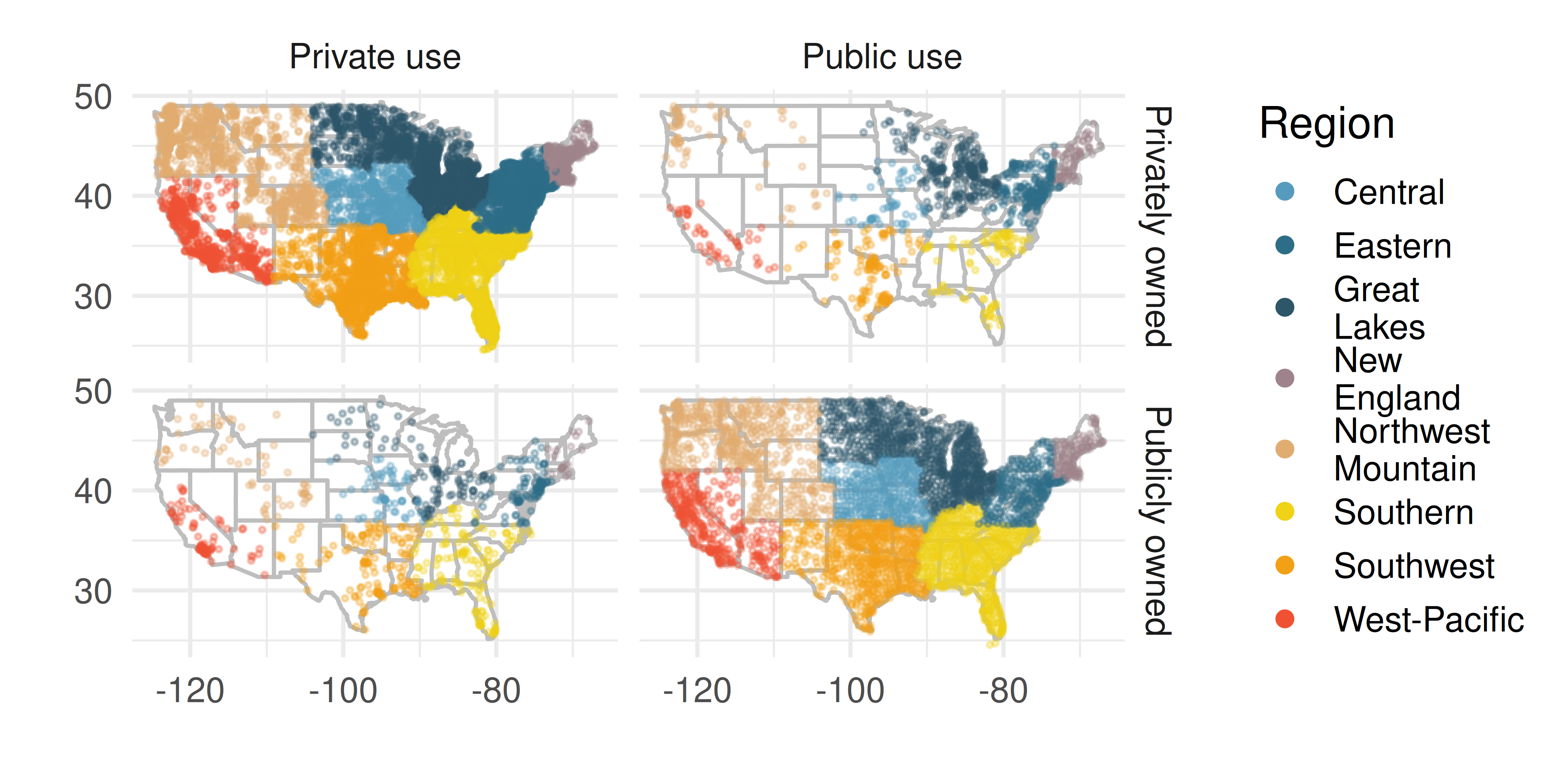
List the variables you believe were necessary to create this visualization.
Indicate whether each variable is numerical or categorical. If numerical, identify as continuous or discrete. If categorical, indicate if the variable is ordinal.
- UN Votes. The visualization below shows voting patterns in the United States, Canada, and Mexico in the United Nations General Assembly on a variety of issues. Specifically, for a given year between 1946 and 2019, it displays the percentage of roll calls in which the country voted yes for each issue. This visualization was constructed based on a dataset where each observation is a country/year pair.
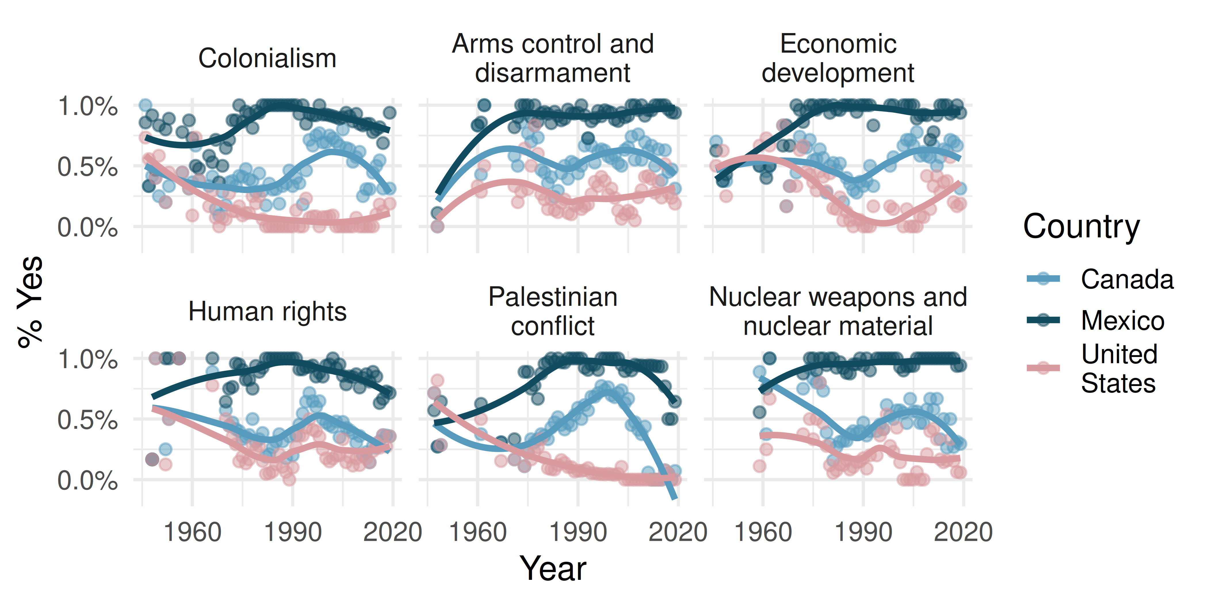
List the variables used in creating this visualization.
Indicate whether each variable is numerical or categorical. If numerical, identify as continuous or discrete. If categorical, indicate if the variable is ordinal.
- UK baby names. The visualization below shows the number of baby girls born in the United Kingdom (comprised of England & Wales, Northern Ireland, and Scotland) who were given the name “Fiona” over the years.
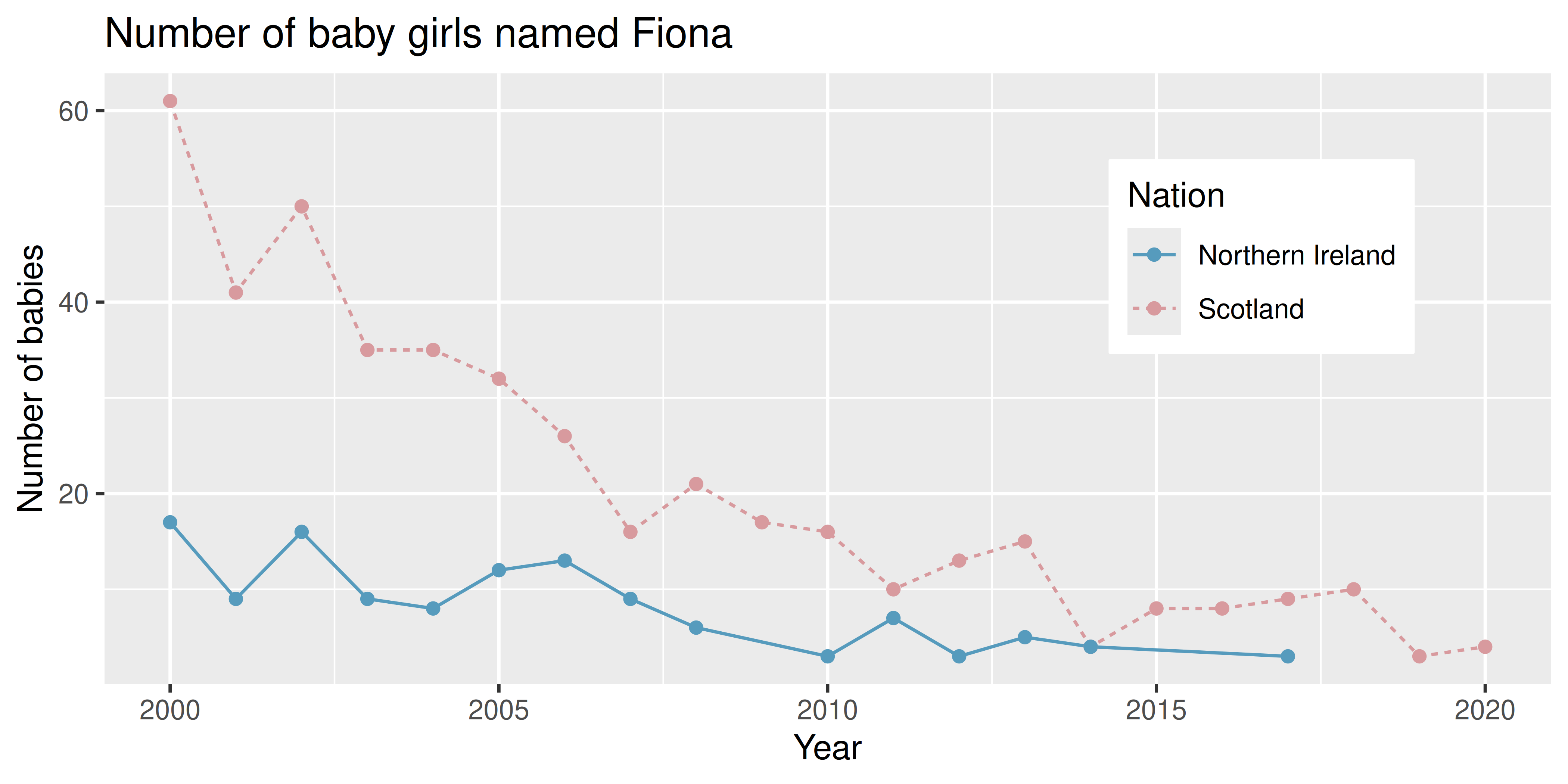
List the variables you believe were necessary to create this visualization.
Indicate whether each variable is numerical or categorical. If numerical, identify as continuous or discrete. If categorical, indicate if the variable is ordinal.
- Shows on Netflix. The visualization below shows the distribution of ratings of TV shows on Netflix (a streaming entertainment service) based on the decade they were released in and the country they were produced in. In the dataset, each observation is a TV show.
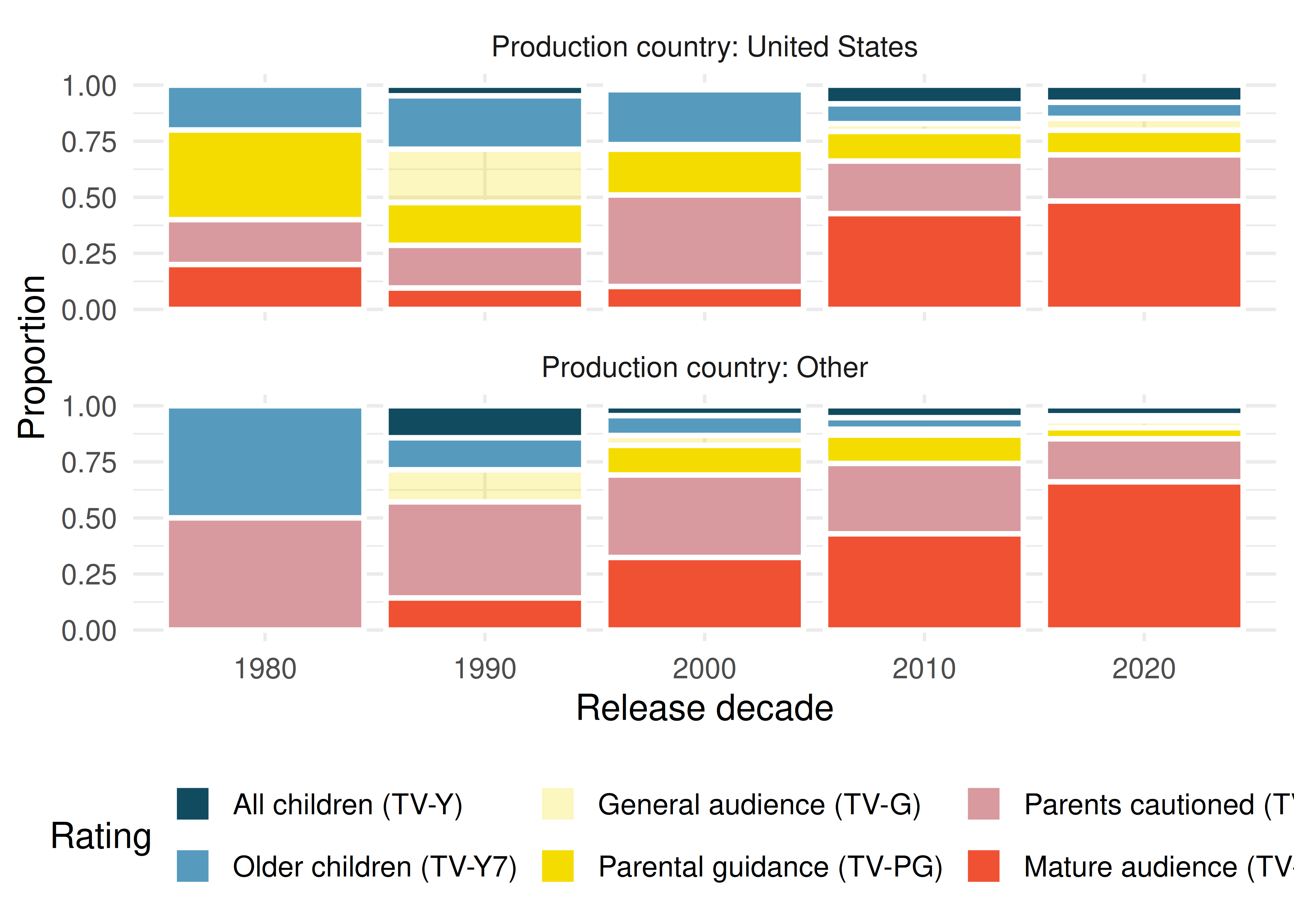
List the variables you believe were necessary to create this visualization.
Indicate whether each variable is numerical or categorical. If numerical, identify as continuous or discrete. If categorical, indicate if the variable is ordinal.
- Stanford Open Policing. The Stanford Open Policing project gathers, analyzes, and releases records from traffic stops by law enforcement agencies across the United States. Their goal is to help researchers, journalists, and policy makers investigate and improve interactions between police and the public. The following is an excerpt from a summary table created based off of the data collected as part of this project. (Pierson et al. 2020)
| County | State | Race / Ethnicity | Arrest rate | Stops / year | Search rate |
|---|---|---|---|---|---|
| Apache County | AZ | Black | 0.016 | 266 | 0.077 |
| Apache County | AZ | Hispanic | 0.018 | 1008 | 0.053 |
| Apache County | AZ | White | 0.006 | 6322 | 0.017 |
| Cochise County | AZ | Black | 0.015 | 1169 | 0.047 |
| ... | ... | ... | ... | ... | ... |
| Wood County | WI | Hispanic | 0.029 | 27 | 0.036 |
| Wood County | WI | White | 0.029 | 1157 | 0.033 |
What variables were collected on each individual traffic stop in order to create the summary table above?
State whether each variable is numerical or categorical. If numerical, state whether it is continuous or discrete. If categorical, state whether it is ordinal or not.
Suppose we wanted to evaluate whether vehicle search rates are different for drivers of different races. In this analysis, which variable would be the response variable and which variable would be the explanatory variable?
- Space launches. The following summary table shows the number of space launches in the US by the type of launching agency and the outcome of the launch (success or failure).
| Failure | Success | Failure | Success | |
|---|---|---|---|---|
| Private | 13 | 295 | 10 | 562 |
| State | 281 | 3751 | 33 | 711 |
| Startup | 0 | 0 | 5 | 65 |
What variables were collected on each launch in order to create to the summary table above?
State whether each variable is numerical or categorical. If numerical, state whether it is continuous or discrete. If categorical, state whether it is ordinal or not.
Suppose we wanted to study how the success rate of launches vary between launching agencies and over time. In this analysis, which variable would be the response variable and which variable would be the explanatory variable?
- Pet names. The city of Seattle, WA has an open data portal that includes pets registered in the city. For each registered pet, we have information on the pet’s name and species. The following visualization plots the proportion of dogs with a given name versus the proportion of cats with the same name. The 20 most common cat and dog names are displayed. The diagonal line on the plot is the \(x = y\) line; if a name appeared on this line, the name’s popularity would be exactly the same for dogs and cats.
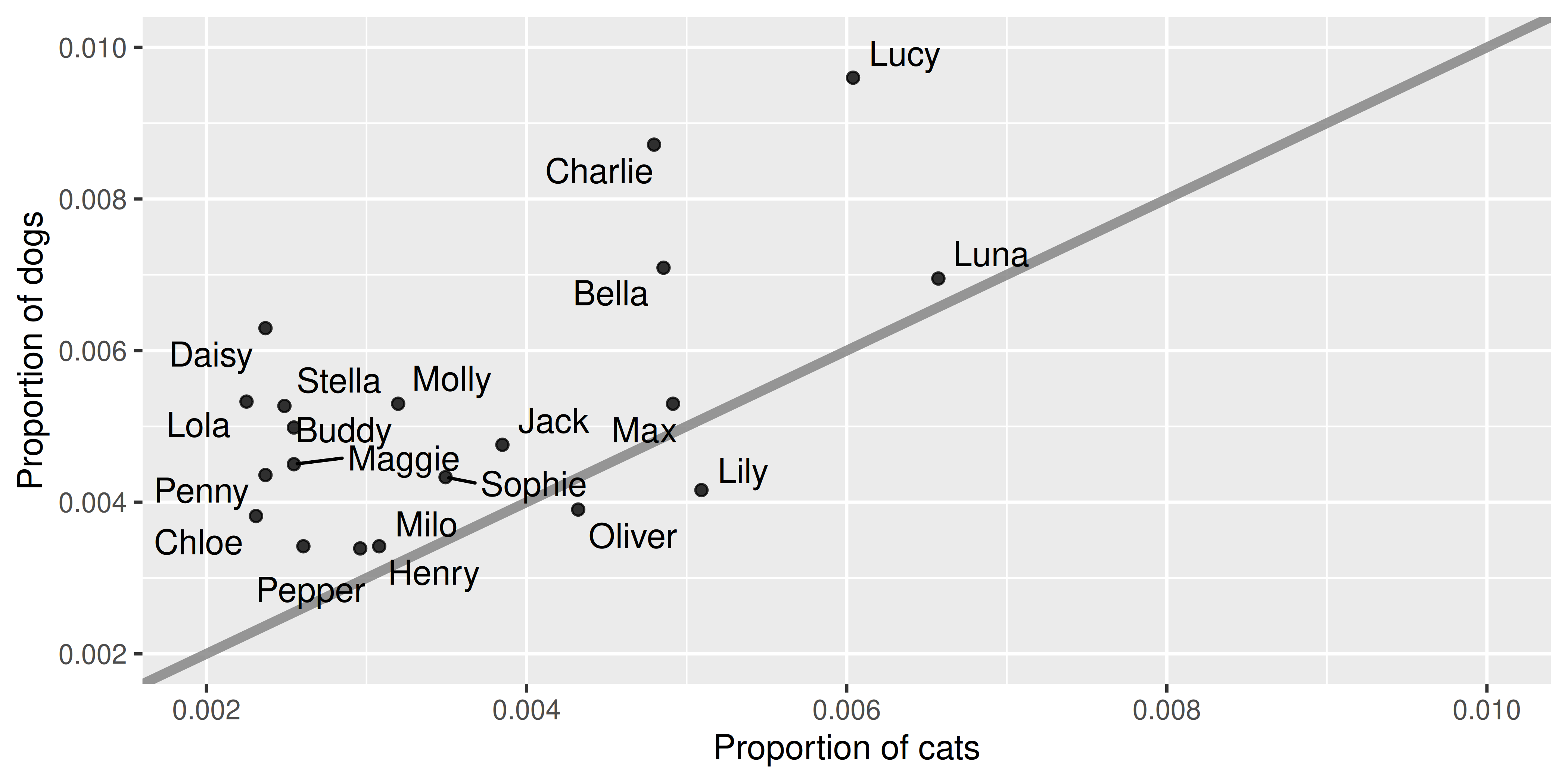
Are these data collected as part of an experiment or an observational study?
What is the most common dog name? What is the most common cat name?
What names are more common for cats than dogs?
Is the relationship between the two variables positive or negative? What does this mean in context of the data?
- Stressed out in an elevator. In a study evaluating the relationship between stress and muscle cramps, half the subjects are randomly assigned to be exposed to increased stress by being placed into an elevator that falls rapidly and stops abruptly and the other half are left at no or baseline stress.
What type of study is this?
Can this study be used to conclude a causal relationship between increased stress and muscle cramps?
Dataset sources
mcu_films (openintro) | run17 (cherryblossom) | migraine (openintro) | sinusitis (openintro) | daycare_fines (openintro) | biontech_adolescents (openintro) | smoking (openintro) | usairports (airports) | ukbabynames (ukbabynames) | netflix_titles (tidytuesdayR) | seattlepets (openintro)
Allais, G., M. Romoli, S. Rolando, G. Airola, I. Castagnoli Gabellari, R. Allais, and C. Benedetto. 2011. “Ear Acupuncture in the Treatment of Migraine Attacks: A Randomized Trial on the Efficacy of Appropriate Versus Inappropriate Acupoints.” Neurological Sciences 32 (1): 173–75. https://doi.org/10.1007/s10072-011-0525-4.
Bucciol, Alessandro, and Marco Piovesan. 2011. “Luck or Cheating? A Field Experiment on Honesty with Children.” Journal of Economic Psychology 32 (1): 73–78. https://doi.org/10.1016/j.joep.2010.12.001.
Garbutt, J. M., C. Banister, E. Spitznagel, and J. F. Piccirillo. 2012. “Amoxicillin for Acute Rhinosinusitis: A Randomized Controlled Trial.” JAMA: The Journal of the American Medical Association 307 (7): 685–92. https://doi.org/10.1001/jama.2012.138.
Gneezy, Uri, and Aldo Rustichini. 2000. “A Fine Is a Price.” The Journal of Legal Studies 29 (1): 1–17. https://doi.org/10.1086/468061.
Gorman, K. B., T. D. Williams, and W. R. Fraser. 2014. “Ecological Sexual Dimorphism and Environmental Variability Within a Community of Antarctic Penguins (Genus Pygoscelis).” PLoS ONE 9(3) (e90081): –13. https://doi.org/10.1371/journal.pone.0090081.
Legaki, Nikoletta-Zampeta, Nannan Xi, Juho Hamari, Kostas Karpouzis, and Vassilios Assimakopoulos. 2020. “The Effect of Challenge-Based Gamification on Learning: An Experiment in the Context of Statistics Education.” International Journal of Human-Computer Studies 144. https://doi.org/10.1016/j.ijhcs.2020.102496.
Pfizer. 2021. “Pfizer-Biontech Announce Positive Topline Results of Pivotal Covid-19 Vaccine Study in Adolescents.” https://www.openintro.org/go?id=textbook-pfizer-2021-adolescent-covid-vaccine.
Pierson, Emma, Camelia Simoiu, Jan Overgoor, Sam Corbett-Davies, Daniel Jenson, Amy Shoemaker, Vignesh Ramachandran, et al. 2020. “A Large-Scale Analysis of Racial Disparities in Police Stops Across the United States.” Nature Human Behaviour 4 (7): 736–45. https://doi.org/10.1038/s41562-020-0858-1.
Piff, P. K., D. M. Stancato, S. Côté, R. Mendoza-Denton, and D. Keltner. 2012. “Higher Social Class Predicts Increased Unethical Behavior.” Proceedings of the National Academy of Sciences. https://doi.org/10.1073/pnas.1118373109.
Ritz, B., F. Yu, G. Chapa, and S. Fruin. 2000. “Effect of Air Pollution on Preterm Birth Among Children Born in Southern California Between 1989 and 1993.” Epidemiology 11 (5): 502–11. http://www.jstor.org/stable/3703990.
Chimowitz MI, Lynn MJ, Derdeyn CP, et al. 2011. Stenting versus Aggressive Medical Therapy for Intracranial Arterial Stenosis. New England Journal of Medicine 365:993–1003.↩︎